Analyze your data in graphic visualizations
In addition to the data table where you can edit and filter your data, you can display your data in many different graphic visualizations including Gantt charts (timelines), bar charts, line charts, spine charts, radar charts, pie charts, area charts, spine area charts, waterfall charts, doughnut charts, and Kanban reports.
The objects displayed in the data table can also be visualized in all types of analytics in the data workbench. This enables you to create an ad-hoc data source that is relevant for a visualization like a bar chart, Gantt chart, Kanban board, etc. Therefore, it is important to think about the filters that have been set or that you need to set before you leave the data table and go to view the graphic visualization. You should set filters to reduce the data so that your visualization is meaningful. The following visualizations are available for a data workbench:
Click a chart in the infographic to find out more about what to do next.
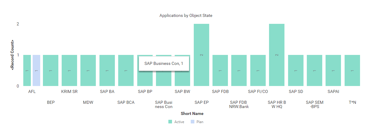
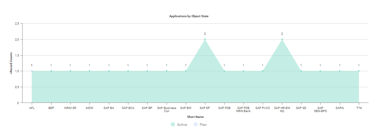
Click Visualize > Business Charts > Bar Chart. Click Business Chart Settings to set up the bar chart.

|
Click Visualize > Data Table to modify the filters of the data workbench to add or remove objects in the chart. For more information, see Decide which data you want to see. |
- X-Value Definition: Select one or more attributes to show as the value on the X-axis.
- Y-Value Definition: Select either <Record Count> to show the total number of records or a different number value to display on the Y-axis.
- Series Definition: Select one or more attributes to specify a data series to further distinguish the results based on a selected attribute. The series is represented by bars of the same color in a bar chart.
- Graphic Title: Enter a title to display for the visualization.
-
Bar Series Placement: The default value is Normal.
- Normal: Place simple bars next to one another to render a bundle of bars for each X-value. Each data series point is represented as a separate bar.
- Stacked: Display a single stacked bar for each X-value where the data series points are represented as stack elements of the bar.
- Overlapped: Display a single bar for each X-value where the two data series points are represented as an overlapped and an overlapping bar positioned in front of one another.
- Bars Orientation: Set a checkmark to orient the bars vertically. Clear the checkmark to orient the bars horizontally.
- Hide Value Labels: Set a checkmark to hide value labels on bars providing information about the number the bar represents.
- Vertical Value Tag: Set a checkmark to show the text of the value label on each bar in vertical orientation.
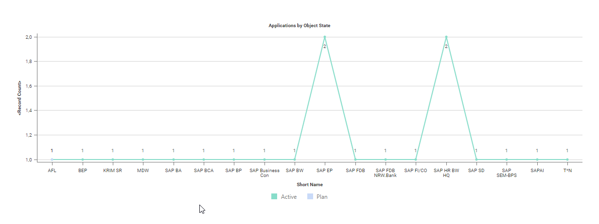
Click Visualize > Business Charts > Line Chart. Click Business Chart Settings to set up the line chart.
|
|
Click Visualize > Data Table to modify the filters of the data workbench to add or remove objects in the chart. For more information, see Decide which data you want to see. |
- X-Value Definition: Select one or more attributes to show as the value on the X-axis.
- Y-Value Definition: Select either <RecordCount> to show the total number of records or a different number value to display on the Y-axis.
- Series Definition: Select one or more attributes to specify a data series to further distinguish the results based on a selected attribute. The series is represented by different lines in the line chart.
- Graphic Title: Enter a title to display for the visualization.
- Hide Value Labels: Set a checkmark to hide value labels on data points on the line providing information about the number the point represents.
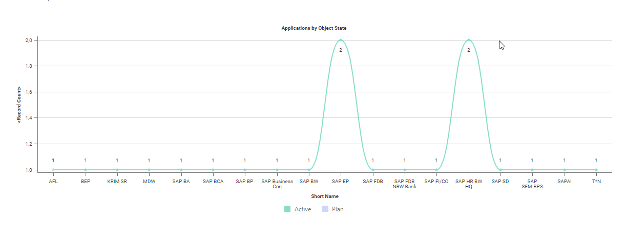
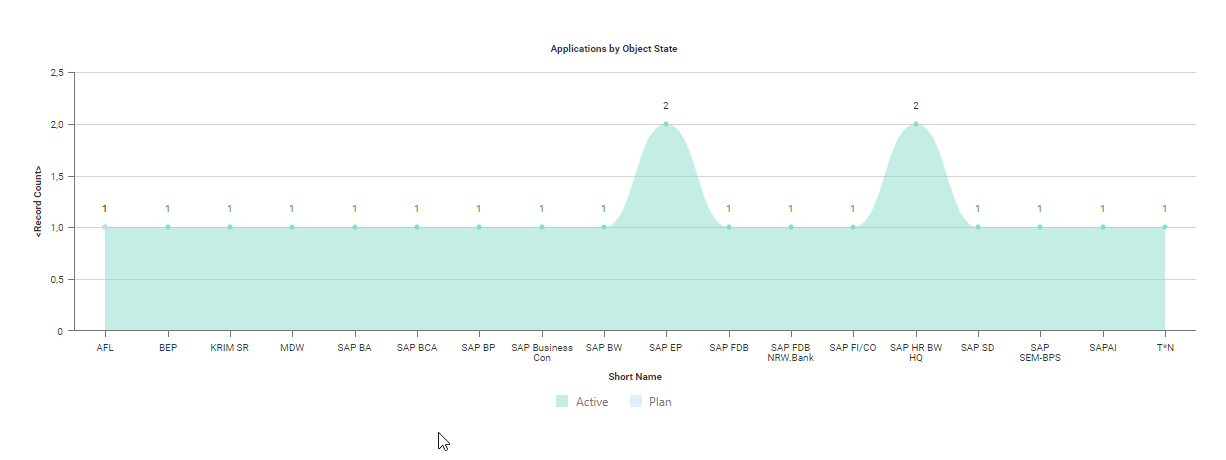
Click Visualize > Business Charts > Spline Chart. Click Business Chart Settings to set up the spline chart.
|
|
Click Visualize > Data Table to modify the filters of the data workbench to add or remove objects in the chart. For more information, see Decide which data you want to see. |
- X-Value Definition: Select one or more attributes to show as the value on the X-axis.
- Y-Value Definition: Select either <RecordCount> to show the total number of records or a different number value to display on the Y-axis.
- Series Definition: Select one or more attributes to specify a data series to further distinguish the results based on a selected attribute. The series is represented by different lines in the spline chart.
- Graphic Title: Enter a title to display for the visualization.
- Hide Value Labels: Set a checkmark to hide value labels on data points on the line providing information about the number the point represents.
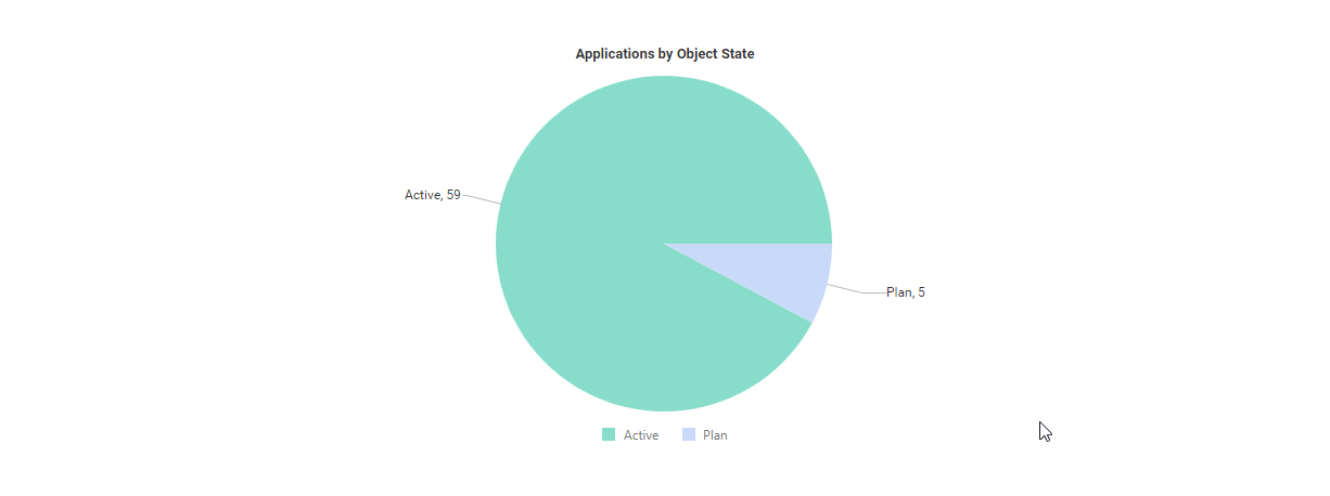
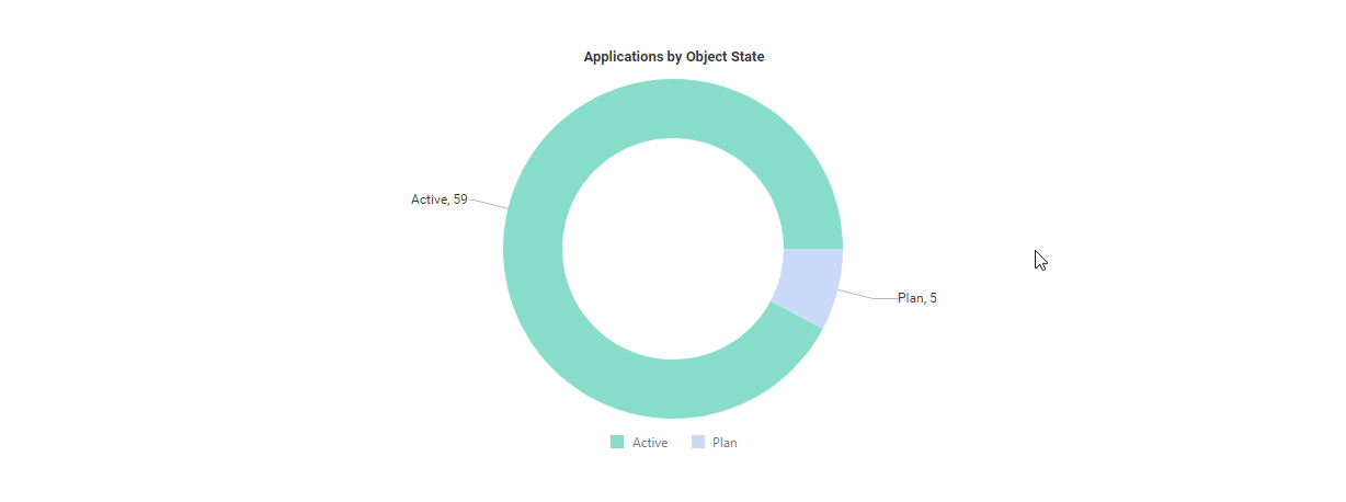
Click Visualize > Business Charts > Pie Chart. Click Business Chart Settings to set up the pie chart.
|
|
Click Visualize > Data Table to modify the filters of the data workbench to add or remove objects in the chart. For more information, see Decide which data you want to see. |
-
X-Value Definition: Select one or more attributes to show as the value on the X-axis. X-values are shown as sections in the pie chart.
- For pie charts or doughnut charts: X-values are shown as sections.
- For waterfall charts: X-values are used as labels on the X-axis.
- Y-Value Definition: Select either <RecordCount> to show the total number of records or a different number value to display on the Y-axis.
- Graphic Title: Enter a title to display for the visualization.
- Hide Value Labels: Set a checkmark to hide value labels on segments of the pie providing information about the number the segment represents.
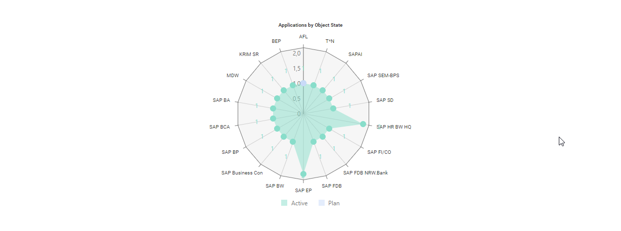
Click Visualize Data > Business Charts > Radar Chart. Click Business Chart Settings to set up the radar chart.
|
|
Click Visualize > Data Table to modify the filters of the data workbench to add or remove objects in the chart. For more information, see Decide which data you want to see. |
- X-Value Definition: Select one or more attributes to show as the value on the X-axis. X-values correspond to the radiuses of the radar chart.
- Y-Value Definition: Select either <RecordCount> to show the total number of records or a different number value to display on the Y-axis.
- Series Definition: Select one or more attributes to specify a data series to further distinguish the results based on a selected attribute. The series is represented by colors in the radius chart.
- Graphic Title: Enter a title to display for the visualization.
- Hide Value Labels: Set a checkmark to hide value labels on the Y-axis and X-axis.
Click Visualize > Business Charts > Area Chart. Click Business Chart Settings to set up the area chart.
|
|
Click Visualize > Data Table to modify the filters of the data workbench to add or remove objects in the chart. For more information, see Decide which data you want to see. |
- X-Value Definition: Select one or more attributes to show as the value on the X-axis.
- Y-Value Definition: Select either <RecordCount> to show the total number of records or a different number value to display on the Y-axis.
- Series Definition: Select one or more attributes to specify a data series to further distinguish the results based on a selected attribute. If more than one attribute is specified for the Series Attributes field, set a checkmark for the Stacked Area Chart attribute if multiple series shall be stacked on each other. Clear the checkbox if the series shall be displayed independently from one another.
- Graphic Title: Enter a title to display for the visualization.
- Hide Value Labels: Set a checkmark to hide value labels on data points on the line providing information about the number the point represents.
Click Visualize Data > Business Charts > Spline Area Chart. Click Business Chart Settings to set up the spline area chart.
|
|
Click Visualize > Data Table to modify the filters of the data workbench to add or remove objects in the chart. For more information, see Decide which data you want to see. |
- X-Value Definition: Select one or more attributes to show as the value on the X-axis. X-values are used as labels on the X-axis.
- Y-Value Definition: Select either <RecordCount> to show the total number of records or a different number value to display on the Y-axis.
- Graphic Title: Enter a title to display for the visualization.
- Hide Value Labels: Set a checkmark to hide value labels on data points on the line providing information about the number the point represents.
Click Visualize Data > Business Charts > Doughnut Chart. Click Business Chart Settings to set up the doughnut chart.
|
|
Click Visualize > Data Table to modify the filters of the data workbench to add or remove objects in the chart. For more information, see Decide which data you want to see. |
- X-Value Definition: Select one or more attributes to show as the value on the X-axis. X-values are shown as sections in the doughnut chart.
- Y-Value Definition: Select either <RecordCount> to show the total number of records or a different number value to display on the Y-axis.
- Graphic Title: Enter a title to display for the visualization.
- Hide Value Labels: Set a checkmark to hide value labels on segments providing information about the number the segment represents.
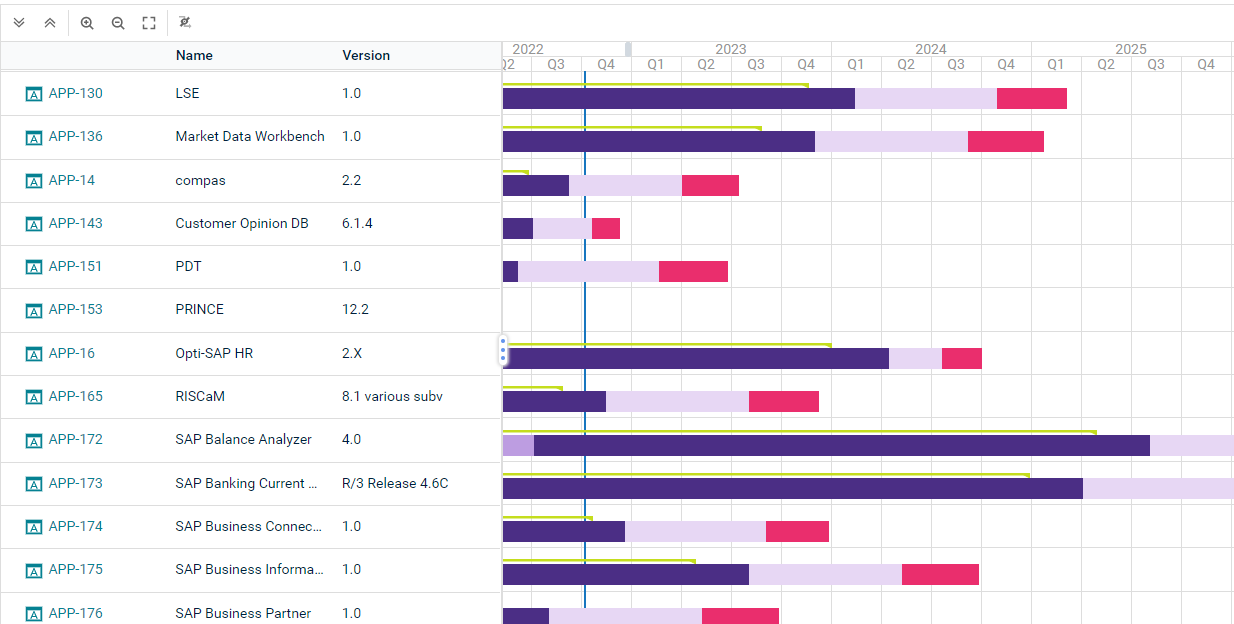
A Gantt chart displays objects on a timeline. A Gantt chart is only meaningful for object classes that have start and end dates, a lifecycle with lifecycle phases, or other date attributes.
If both start and end dates and lifecycle phases are defined, the timeline for start and end date is displayed beneath the timeline for the lifecycle phases. Click Hide Lifecycle Phases to show only the timeline with the start and end dates.
Click Visualize > Gantt Chart. Click Gantt Settings to set up the visualization.
|
|
Click Visualize > Data Table to return to the data table to modify the filters of the data workbench to add or remove objects in the Gantt chart. For more information, see Decide which data you want to see. |
-
Define the time schedule settings:
- Calendar Unit: Specify whether to display the timeline in years, quarters, months, or weeks.
- Start with Current Year: Select if the current year shall be the start year of the Gantt chart. To focus on a different timeframe, define a specific start year in the Calendar Start Year and end year in the Calendar End Year fields.
-
Define the display of object information:
- Column Caption: Specify an caption for the column displaying the object information.
- Object Attributes to Display: Select the attributes to display for the objects. You can either have each attribute displayed in its own column or select the Object Attributes in One Column checkbox to display them in only the first column.
If attributes are not displayed, they may be hidden because the field for the object attributes is too small. Increase the size of the field to see all attributes.
- Attribute for Start Date and Attribute for End Date: Define the date attribute to use to determine the start and end dates of the bars in the Gantt chart.
- Relevant only for Gantt charts showing project data: Show Enterprise Milestones: Set a checkmark to display project milestones. To create project milestones for a project, select a project to navigate and go to Monitoring > Project Milestones.
Click Visualize > Kanban Report. The following is possible in Kanban reports:
|
|
Click Visualize > Data Table to return to the data table to change the attributes available for the columns, or to modify the filters of the data workbench to add or remove objects in the Kanban report. For more information, see Decide which data you want to see. |
-
Define the content of the Kanban. Click Kanban Settings to design the Kanban board.
- Visualize lanes in the Kanban: Define the Column Definition field. A column is displayed for each value of the selected attribute. For example, if you select Status, then a column is added for each status value. If you select a role, a column will be created for each user assigned the role.
- Visualize a matrix in the Kanban: Define the Column Definition and Row Definition fields.
- The same value should not be defined in both fields.
- To remove the value for the row or column, select the empty row in the drop-down of the relevant field.
- Show information on the items: Select the attributes to show in the Item Definition field. It is recommended to only show a few attributes on the matrix items.
-
Edit values in the Kanban: You can change the value for the attribute (or indicator, role, etc.) represented by the columns. For example, if Status is selected for the column definition, you can move an object from one column to another to change its status value.
- If one or more objects in the Kanban board does not have a value defined for the selected attribute (or indicator, role, etc.), the first column will display those objects under an empty header. These objects can be assigned the missing value by moving them to the relevant column. For example, if the role Architect is selected for the column definition, all objects that do not have the role Architect defined are displayed in the first column.
- Move an object via drag-and-drop to another column to easily redefine the object. Objects can only be moved if the attributes specified for the corresponding column and row definitions are configured to have read-write access permissions.
- Press CTRL+C to copy a selected object to multiple columns. This is only possible if the attribute specified for the column definition supports multiple references. For example, an application can be assigned to multiple application groups or an application may be specified to have multiple users responsible for it via a role.