
This document covers the following topics:
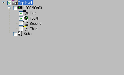
A tree view control is used to display data in hierarchical form. Each node in the hierarchy is represented internally as a tree view item. The following shows a simple tree view (with optional check boxes) displaying a 3-level hierarchy containing seven tree view items:
The tree view control shown above is specified with the "+/- buttons
(b)", "Lines (l)", "Lines at root
(r)" and "Check boxes (c)"
STYLE flags.
The height of each item and the indentation between levels can be set via the ITEM-H and SPACING attributes, respectively. If either
of these are zero, the default setting is used.
Images for the tree view items may be defined by creating and associating an image list control with the tree view control, then (for each item) selecting the required image from the image list via its index and/or image handle, as described in the section Working with Image List Controls.
Please note that it is not necessary to set the image list control's "Large images (L)" style, unless you are additionally using the same image list for a list view control, because the tree view control only uses small images.
Unlike the list view control, the tree view control only supports one selected item. The
current selection (if any) may be retrieved by querying the tree view control's
(read-only) SELECTED-SUCCESSOR attribute.
In addition to being selected by the user, items may be selected or deselected
programmatically by setting or clearing their SELECTED attribute.
When an item is selected, a CLICK event is raised for the list view control
(if not suppressed),
with the handle of the corresponding item being set in the control's ITEM
attribute.
When a user double-clicks on an item, an ACTIVATE event is raised (unless suppressed) for the tree view
control. The application, if it decides to handle this event, normally performs a
user-defined default action on the selected item, the handle to which may be obtained via
either the ITEM or SELECTED-SUCCESSOR attributes of the tree
view control. Note that there may be other, non-default, actions applicable to the
selected item, but these are typically accessed via other mechanisms. For example, they
may be listed (typically along with the default action) in a context menu displayed by the
application.
If the "Dbl. click expand (d)"
STYLE flag is set, double clicking a tree
view item that has child items expands the item in addition to activating it.
The ACTIVATE event can also be triggered via the keyboard. This
can be done in either of two ways:
By pressing the key or key combination defined for the tree view control's ACCELERATOR attribute. The control need
not currently have the focus.
By pressing the ENTER key, if the tree view control currently has the
focus. This method only works if the dialog neither contains a default pushbutton, nor a
pushbutton with the "OK Button (O)"
STYLE flag set.
In either case, no ACTIVATE event is raised if no item is currently
selected.
In order to be able to support sorting correctly (see next section), a tree view item's
data does not need to be alphanumeric, as it is per default, but can be one of any of the
pre-defined types supported by the column's FORMAT attribute. In addition,
an edit mask can be applied to the item by setting its EDIT-MASK attribute. The item's label, as
seen by the user for the item, is the alphanumeric representation of the item's internal
data, using the associated edit mask (if any). The conversion between the item's internal
data and the displayed data is compatible with the MOVE EDITED statement if an edit mask is supplied. Otherwise,
the conversion between the internal and displayed data, and vice-versa, is compatible with
the conversion involved in copying the data to and from the Natural stack (see the
STACK TOP DATA and INPUT statements). For example, numeric
values are displayed using the current decimal character (as defined by the DC parameter) if necessary, with
a leading minus character if negative, date values are displayed in the format defined by
the DTFORM parameter
setting, logical values are displayed as an "X" if true and as
a blank if false, and so on.
An example of use of a non-alpha tree view item is shown below:
PROCESS GUI ACTION ADD WITH
PARAMETERS
   HANDLE-VARIABLE = #TVITEM-DATE
   TYPE = TREEVIEWITEM
   PARENT = #TV-1
   STRING = '+123.456'
   FORMAT = FT-DECIMAL
   EDIT-MASK = '+ZZZ,ZZ9.999'
END-PARAMETERS GIVING *ERROR
In this case, the specified item label (STRING attribute value) must of
course be a valid number of a form compatible with the specified edit mask (+ZZZ,ZZ9.999).
Internally, the label is converted to the data type and length corresponding to the
specified format, FT-DECIMAL (= P10.5).
Note that it is not possible to access the underlying data for a tree view item directly. The item's data can only be set or retrieved via the item's label.
Tree view items can either be inserted in sorted sequence or explicitly sorted after
insertion, by calling the SORT-ITEMS action. Items are inserted in ascending
alphabetical sequence if either the tree view control or the tree view item being inserted
have their SORTED attribute set to TRUE.
In the latter case, the items are optionally sorted in ascending or descending sequence
according to their internal data (see last section). See the documentation for the
SORT-ITEMS action for more information. Note that it is the
responsibility of the programmer to ensure that the underlying item formats of the items
concerned (as defined by the FORMAT attribute) are of comparable types.
For example, it is possible to mix integers and floating point values, but not integers
and dates.
The process of label editing for tree view controls is the same as for list view controls. Therefore, for more information on this subject, please refer to the section Label Editing in Tree View and List View Controls.
Note that even if the SORTED attribute is set, the items are not
automatically re-sequenced after a label editing operation has been completed. If this is
required, this can be done as shown in the example below. Firstly, we define some
variables for later use:
01 #CONTROL HANDLE OF GUI 01 #ITEM HANDLE OF TREEVIEWITEM
01 #SORTITEM HANDLE OF TREEVIEWITEM
In addition, it is assumed that the tree view control is named #TV-1.
In the tree view control's AFTER-EDIT event, we cannot do the re-sequencing
asynchronously, as this would interfere with the (as yet incomplete) editing process.
Instead, we simply set the #SORTITEM variable to indicate that the
re-sequencing should occur at a later time, after the editing process has been completed.
This only needs to be done if the tree view items are sorted:
#CONTROL := *CONTROL #ITEM := #CONTROL.ITEM IF #CONTROL.SORTED OR #ITEM.SORTED
#SORTITEM := #ITEM ELSE #SORTITEM := NULL-HANDLE END-IF
Note that this examples assumes the use of the default (ascending alphabetical) sorting provided by the tree view control itself.
The actual work of re-sequencing the items is done asynchronously in the dialog's
IDLE event:
IF #SORTITEM <> NULL-HANDLE PROCESS GUI ACTION SORT-ITEMS WITH #SORTITEM.PARENT
GIVING *ERROR RESET #SORTITEM END-IF
If you wish to support just a single context menu for the control, you can simply set the
control's CONTEXT-MENU attribute to the handle of the
context menu you wish to display, and leave it set to this value. However, it is often
required to be able to display more than one context menu for list view controls, whereby
this approach is too inflexible.
To address the above problem, the CONTEXT-MENU
event was introduced (not to be confused with the attribute of the same name
as mentioned above!). This event (if not suppressed) is raised for the target control
immediately before its CONTEXT-MENU attribute is evaluated,
allowing the application to dynamically set this attribute to the handle of the
appropriate context menu first.
As an example, assume that we have defined two context menus in the dialog editor: one
containing item-related commands, #CTXMENU-ITEMS, and one containing generic
commands (e.g., for switching the view mode), #CTXMENU-DEFAULT. In this case,
the following CONTEXT-MENU event could be used:
#CONTROL := *CONTROL IF #CONTROL.SELECTED-SUCCESSOR
<> NULL-HANDLE #CONTROL.CONTEXT-MENU := #CTXMENU-ITEMS ELSE #CONTROL.CONTEXT-MENU
:= #CTXMENU-DEFAULT END-IF
where the following local data definition is assumed:
01 #CONTROL HANDLE OF GUI
In this example, the context menu #CTXMENU-ITEMS will be displayed if the
user right clicks at a position occupied by an item, or #CTXMENU-DEFAULT
otherwise.
Of course, this technique can be refined further to display context menus specific to the type(s) of the selected item(s).
When a tree view item is expanded or collapsed, an EXPAND
event or COLLAPSE event (respectively) is raised for the control, if
the event is not suppressed. Amongst other things, these events allow tree-view items to
be dynamically created and deleted on demand.
For example, the following code demonstrates the dynamic creation of three items in
response to the EXPAND event. It assumes that a dummy placeholder item with
an empty STRING attribute value is already in place
at the position where the items should be inserted. The placeholder can either have been
statically defined in the dialog editor, or dynamically-defined during the initial tree
view item creation. The purpose of the placeholder is to ensure that a
"+" button (if button display enabled via the
"+/- buttons (b)"
STYLE) appears next to the parent node.
The following EXPAND event code assumes that the variable
#TGT-ITEM contains the handle of the tree view item under which the dynamic
tree view items are to be created:
#CONTROL := *CONTROL
#ITEM := #CONTROL.ITEM
IF #ITEM = #TGT-ITEM
  #TVITEM-DYN := #ITEM.FIRST-CHILD
  IF #TVITEM-DYN <> NULL-HANDLE AND
     #TVITEM-DYN.STRING = ' '
    PROCESS GUI ACTION DELETE WITH #TVITEM-DYN GIVING *ERROR
    FOR #I 1 3
      COMPRESS 'Dynamic Item' #I INTO #A
      PROCESS GUI ACTION ADD WITH PARAMETERS
        HANDLE-VARIABLE = #TVITEM-DYN
        TYPE = TREEVIEWITEM
        PARENT = #ITEM
        STRING = #A
      END-PARAMETERS GIVING *ERROR
    END-FOR
  END-IF
END-IF
where the following local data definitions are assumed:
01 #CONTROL HANDLE OF GUI
01 #ITEM HANDLE OF TREEVIEWITEM
01 #TVITEM-DYN HANDLE OF TREEVIEWITEM
01 #TGT-ITEM HANDLE OF TREEVIEWITEM
01 #I (I4)
01 #A (A) DYNAMIC
The above code first looks to see whether the item being expanded is the target item. If
so, it queries the STRING attribute of the first child, to
find out whether a placeholder is present. If this is the case, the placeholder is
deleted, and three dynamic tree view items are created. The STRING attribute value for the inserted items
is specified on creation, rather than modified afterwards, to ensure that the code also
works correctly for SORTED tree views.
To save resources, the dynamically-created items could optionally be deleted again in the
COLLAPSE
event handler, being replaced by a placeholder item:
#CONTROL := *CONTROL
#ITEM := #CONTROL.ITEM
IF #ITEM = #TGT-ITEM
  PROCESS GUI ACTION DELETE-CHILDREN WITH #ITEM GIVING *ERROR
  PROCESS GUI ACTION ADD WITH PARAMETERS /* placeholder
    TYPE = TREEVIEWITEM
    PARENT = #ITEM
  END-PARAMETERS GIVING *ERROR
END-IF
The basic technique for providing drag and drop support is described in the section Using the Clipboard and Drag and Drop.
Note that it is the responsibility of the programmer to (if required) highlight the item
(if any) under the mouse cursor by setting its SELECTED attribute, and to
restore the original selection (if any) afterwards.
The following example provides some code for demonstrating a tree view control acting as a drop target, in order to support dragging and dropping text from another application (e.g. WordPad) onto a tree view item in order to change its label.
The first step is to ensure that the drop mode is set correctly for the tree view
control. In the Tree View Control Attributes window in
the dialog editor, set the Drop mode selection box to
Copy+Move. This causes the control's DROP-MODE attribute to be set to
DM-COPYMOVE in the generated source code for the dialog.
Next, the required local variables that are going to be used below must be defined:
01 #CONTROL HANDLE OF GUI
01 #DROP-ITEM HANDLE OF GUI
01 #ITEM HANDLE OF GUI
01 #SELECTED HANDLE OF GUI
01 #AVAIL (L)
01 #X (I4)
01 #Y (I4)
Having done this, we can write the necessary event handlers. The logical place to start
is with the DRAG-ENTER event:
#CONTROL := *CONTROL
#CONTROL.CLIENT-HANDLE := #CONTROL.SELECTED-SUCCESSOR
PROCESS GUI ACTION INQ-FORMAT-AVAILABLE WITH CF-TEXT #AVAIL GIVING *ERROR
IF #AVAIL
  #CONTROL.SUPPRESS-DRAG-DROP-EVENT := NOT-SUPPRESSED
ELSE
  #CONTROL.SUPPRESS-DRAG-DROP-EVENT := SUPPRESSED
END-IF
The above code first saves the handle of the currently selected item in the control's
CLIENT-HANDLE attribute for the purposes of restoring the
selection to this item later. The event handler then checks whether text data is available
on the drag-drop clipboard. If it is, the DRAG-DROP
event is unsuppressed in order to allow a drop. Otherwise, we suppress this
event in order to prohibit a drop such that the "no drop" drag cursor
appears.
To provide drop emphasis during the dragging of external data across the tree view
control, a DRAG-OVER event handler is supplied:
#CONTROL := *CONTROL
IF #CONTROL.SUPPRESS-DRAG-DROP-EVENT = NOT-SUPPRESSED
  PROCESS GUI ACTION INQ-DRAG-DROP WITH
    3X #X #Y GIVING *ERROR
  PROCESS GUI ACTION INQ-ITEM-BY-POSITION WITH
    #CONTROL #X #Y #ITEM GIVING *ERROR
  IF #ITEM <> #DROP-ITEM
    #DROP-ITEM := #ITEM
    IF #DROP-ITEM <> NULL-HANDLE
      #DROP-ITEM.SELECTED := TRUE
    END-IF
  END-IF
END-IF
The above code performs the following:
If a drop was disallowed in the DRAG-ENTER
event, the event is ignored, as no drag emphasis is required in this
case.
Otherwise, the INQ-DRAG-DROP action is called to determine the current
drop position.
The INQ-ITEM-BY-POSITION action is used to find the tree view
item (if any) at the current drop position. This item is tracked in
#DROP-ITEM.
The tree view item (if any) under the cursor is selected to provide the drop emphasis
by setting its SELECTED attribute to
TRUE.
To perform the actual drop, a DRAG-DROP event handler is supplied:
IF #DROP-ITEM <> NULL-HANDLE
  PROCESS GUI ACTION GET-CLIPBOARD-DATA WITH CF-TEXT #DROP-ITEM.STRING
    GIVING *ERROR
END-IF
#CONTROL := CONTROL  /* "parameter" for subroutine below
PERFORM RESET-SELECTION
If there is a tree view item representing the drop target, the above code retrieves the
text from the drag-drop clipboard directly into the item's caption. Afterwards, the
original selection state of the tree view control is restored. The
RESET-SELECTION subroutine used for this purpose can be written as
follows:
#ITEM := #CONTROL.CLIENT-HANDLE
IF #ITEM <> NULL-HANDLE
  /* Restore original selection:
  #ITEM.SELECTED := TRUE
ELSE
  /* Nothing was originally selected,
  /* so clear any existing selection:
  #ITEM := #CONTROL.SELECTED-SUCCESSOR
  #ITEM.SELECTED := FALSE
END-IF
RESET #DROP-ITEM
To satisfy the logic provided for the other event handlers, #DROP-ITEM is
also reset, indicating the absence of a drop item.
Lastly, in the case that the user cancels the drag operation, or exits the bounds of the
tree view control without having performed a drop, a DRAG-LEAVE
event handler is supplied:
#CONTROL := CONTROL  /* "parameter" for subroutine below
PERFORM RESET-SELECTION
The above code simply invokes the inline subroutine listed above in order to clear the drop emphasis (if any), and to restore the original selection state.
