
This document covers the following topics:
Tab controls are created in the dialog editor in the same way as other standard controls (such as list boxes
or push buttons) are. That is, they are either created statically in the dialog editor via the
menu or by drag and drop from the Insert tool bar, or
dynamically at run-time by using a PROCESS GUI ACTION
ADD
statement with the TYPE attribute set to
TABCTRL.
Alternatively, dialogs containing tab controls may be generated with the Dialog Wizard. In this case, many of the techniques described in this section are applied automatically by the wizard, and either do not need to be explicitly implemented, or simply need to be extended or "filled-out", whilst retaining the generated structure. This can significantly reduce the programming effort required.
A tab control may have zero or more tabs associated with it. Tabs may be defined in the
dialog editor from within the tab control's attribute window, or at run-time by performing
a PROCESS GUI ACTION
ADD
statement with the TYPE attribute set to
TABCTRLTAB.
The tab control is a container. However, the individual tabs are not containers, in the
Natural implementation of this control. When controls are created within the tab control
in the dialog editor, the control's PARENT attribute is automatically set to
the handle of the tab control, and not to the handle of the currently active tab (if any).
In order to associate a child control with a particular tab, the child control's OWNER
attribute is set to the handle of the tab with which the control should be associated. The
control is then automatically hidden by Natural when the tab is deactivated, and
automatically re-shown when it is re-activated.
Note, however, that the dialog editor only automatically sets the child control's
OWNER attribute if the tab control's
"UI active (U)"
STYLE flag is set, which is the default
setting. Otherwise the child control's OWNER attribute is left unset (i.e.,
NULL-HANDLE). In the latter case, the child control is not automatically
shown and hidden when switching between tabs. Note that the "UI active
(U)"
STYLE has no effect at run-time.
As stated above, all child controls within a tab control have a tab control as their parent, regardless of the tab to which they belong. Whilst this is sufficient, it may be preferable to separate the controls on different tabs into separate sub-hierarchies.
The most convenient way of achieving this is to create a child control box for each tab
to represent the tab "pages". All other child controls are then created as
child controls of the respective control box. Assuming that the tab control's
"UI active (U)"
STYLE flag is set, the control boxes will be
automatically hidden and shown during tab switching, and thus t heir respective child
controls with them (child controls are automatically hidden if any ancestor window is
hidden). Otherwise, the program must do the page switching explicitly, as described in the
next section.
The control's organization is shown in the following diagram:
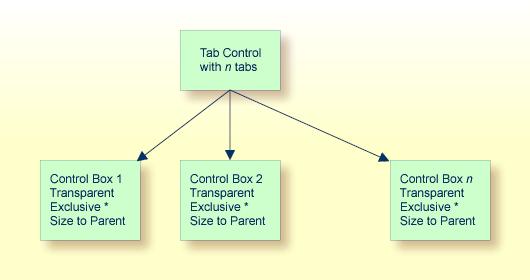
As shown in the diagram, each child control box should be transparent, that the tab
control's background texture (if any) shows through, and have the "size to
parent (z)"
STYLE, so that the control boxes
automatically exactly fill the interior area of the tab control, both immediately and
whenever the size of the tab control is changed. In addition, each control box should be
"exclusive" if the tab control is not UI active, such that only one child
control box is visible at any time.
Note
This section only relates to tab controls that are not UI active. Otherwise, the
control switching is done automatically by Natural.
In the dialog editor, this is performed automatically by the dialog editor when a control belonging to an exclusive control box (or the control box itself) is selected, which is not currently being displayed. The dialog editor makes the currently visible exclusive control box (if any) invisible (thus also hiding any controls placed within it) and makes the control box containing the selected control visible (thus also showing any controls placed within it). This process is independent of how the selection is made (for example, explicitly, from the selection box in the status bar, or implicitly, by simply tabbing through the controls).
Note
If the status bar is not shown, set the Status Bar under the
Dialog Editor tab of the Options dialog opened via the
command.
At run-time, the control boxes must, of course, be shown or hidden in response to the
user selecting the corresponding tab. This can be achieved by querying the active tab in
the tab control's CHANGE event and setting the VISIBLE attribute of the corresponding
control box to TRUE. One way of making the tab/control box associations is to
store the handle of the control box in the CLIENT-HANDLE attribute of the
corresponding tab in the AFTER-OPEN event of the dialog.
For example:
/* Map control boxes to tabs:
#TAB-1.CLIENT-HANDLE := #CTLBOX-1
#TAB-2.CLIENT-HANDLE := #CTLBOX-2
..
#TAB-N.CLIENT-HANDLE := #CTLBOX-N
Then, assuming #CONTROL is defined as HANDLE OF GUI, the
CHANGE event of the tab control (#TABCTRL-1) could
look like this:
/* Get active tab
#CONTROL := #TABCTRL-1.SELECTED-SUCCESSOR
/* Switch to control box belonging to active tab:
#CONTROL := #CONTROL.CLIENT-HANDLE
IF #CONTROL <> NULL-HANDLE
  #CONTROL.VISIBLE := TRUE
END-IF
In some situations, it may be desirable to display controls that remain visible, irrespective of which tab is currently selected.
There are two ways of achieving this:
If control boxes are being used, the control boxes can be made smaller in order to
cover only part of the tab control's interior area, leaving the remaining space
available for controls that should be permanently displayed. The "size to
parent (z)"
STYLE must be switched off for the
control boxes.
If control boxes are not being used and the tab control is UI active, permanently
displayed controls may be created by ensuring that the "UI active
(U)"
STYLE for the tab control is
temporarily switched off whilst creating the child control(s) that are to be
permanently displayed.
If the tab control is not UI active, a two-layer control box hierarchy can be used, where the child control boxes described above are created as child controls of a transparent top-level control box, which in turn is created as a child of the tab control. The top-level control box (which does not have the "size to parent" flag set), can then be positioned and sized appropriately to define the replaceable region.
Note
This is very similar to the technique used for wizard dialogs. See the section
Working with Control
Boxes for more information
There are three methods of navigating between the tabs of a tab control via the keyboard, any combination of which can be applied simultaneously:
If the tab control is assigned the "browsable (z)"
STYLE flag, the tab control is included
in the tab sequence (i.e., can be navigated to via the TAB key). When the
tab control receives the focus, navigation between the tabs is possible via the arrow
keys. There is no "wrap-around" between the first and last tabs in this
case.
The tab captions (STRING attribute) may contain an
ampersand (&), indicating that the following character is a mnemonic character.
The tab is selected when the mnemonic character is pressed together with the
ALT key. This allows for "direct" keyboard navigation to the
desired tab.
If the dialog has the "Property Sheet (p)"
STYLE set, the keyboard shortcuts
CTRL+TAB and CTRL+SHIFT+TAB may be used to navigate to the
next and previous tab (respectively), with wrap-around.
Note that the focus does not have to be on the tab control or a dialog element within it
in order for the last technique to work. Starting from the focus control, Natural examines
each container (ancestor), until a container (if any) is found that contains one or more
tab controls. If this container contains exactly one tab control, the keyboard shortcuts
are then applied to this tab control. If it contains two or more tab controls, these
shortcuts have no effect. If the dialog does not contain a tab control, the shortcuts
perform their usual function, as if the "Property Sheet (p)"
STYLE had not been set.
Note that this default usage of the CTRL+TAB and CTRL+SHIFT+TAB key
combinations may be overridden by redefining them via the ACCELERATOR attribute.
Whenever a tab switch is performed (either by the user or programmatically), the following sequence of events occurs:
The currently selected tab receives a LEAVE
event, if not suppressed. This event is typically used for data validation and/or
committing the data on the tab page.
The MODIFIABLE attribute of the tab control
is then examined. If it is set to FALSE, the tab switch is not performed.
The currently selected tab remains selected and no further events are raised. This can
be useful if data validation performed during the LEAVE
event found an error, which should be corrected by the user before continuing.
All direct child controls (if any) that have currently selected tab as their
OWNER are automatically hidden.
The new tab is selected.
All direct child controls (if any) that have the newly-selected tab as their
OWNER are automatically shown, if their
VISIBLE attribute is set to
TRUE.
The newly-selected tab receives an ENTER event. If not suppressed. This event is
typically used for initializing controls on the new tab page.
The tab control receives a CHANGE event. This is convenient for tracking
tab switches and responding to them without having to modify the event handlers for
each tab.
Note that no initial ENTER event is raised for the selected tab when the control
is created, and that the tab control does not receive an initial CHANGE
event either. Furthermore, when the dialog containing the tab control is closed, the
currently-selected tab does not receive a LEAVE
event.
