 App Framework for Workspace and Custom Apps
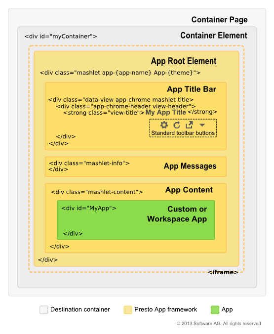 <iframe>: in desktop browsers, the app can be rendered inline within the container element or secured within an <iframe> to isolate the JavaScript and CSS for the app from the container page.Root Element: the root node that entirely wraps the app itself and all elements supplied by the App Framework. Apps can get a reference to this node using the getRootElement method in the MashZone NextGen App API.App Title Bar: by default this element displays the app title and a set of toolbar buttons:
 Tools: opens the input form in both desktop and mobile devices to allow users to change input parameters for the app. Only present if the app has input parameters. Basic apps may have additional forms.
 Refresh: in desktop browsers, allows users to manually refresh the app. Always present for basic apps. See Enable User-Initiated or Automatic Refreshes for instructions on enabling this button in custom apps.
 Open in New Window: in desktop browsers, allows the app to open in a separate window or tab outside of the container.
 Collaboration Menu: in desktop browsers, contains menu options to share the app, get embed code for the app, publish the app to SharePoint or edit user preferences for the app, if appropriate.
Note: | Hiding the title bar also hides the standard toolbar buttons. This prevents users from updating input parameters for apps or handling other functions such as refreshing data. |
App Messages: a default element to display exceptions or error messages using the MashZone NextGen App API. See Handle Exceptions for more information and examples.App Content: the parent within the App Framework where the app is rendered. Apps can listen to this wrapper for resize events or use the App API to handle size changes. See App Dimensions and Resizing for more information and examples.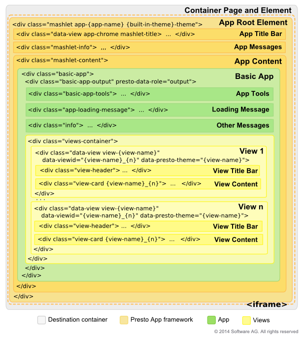 Basic App Tools: this may include forms for input parameters, sorting and filtering based on configuration for the basic app. This opens from the Tools button in the app title bar.Messages: an area for the text of the standard "loading data" message and another for other messages.Views Container: wrapping all views in the basic app.View 1-n: a wrapper for each view. This contains areas for both the:View Title Bar which may be disabled based on user configuration. It is also disabled by default when basic apps are included in workspaces, although users can override that.View Content for the grid, chart or map for that view.