 For mobile devices, apps always use the full dimensions of the device and orientation. Resizing due to orientation changes is handled automatically.For mobile devices, apps always use the full dimensions of the device and orientation. Resizing due to orientation changes is handled automatically.For desktop devices, however, apps are published to a container page that can be in a variety of destinations. The container page may have several apps or other content that affect what space is available to the app in addition to the basic dimensions for the desktop device.
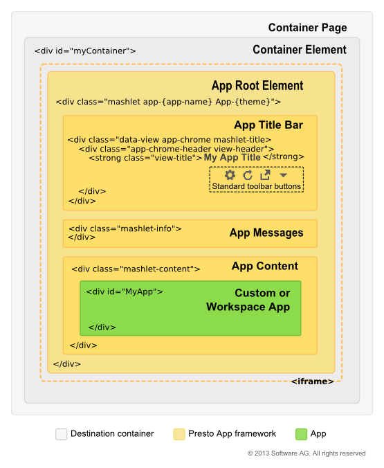
Note: | Both destination containers or the app itself can hide the app title bar and either provide their own title bar or omit it entirely. |
