
The REPORT control can be considered as a white sheet of paper in which you render reporting output. The output may consist of:
grids
text
images (jpg/svg)
From the control definition point of view, the REPORT control is very easy: you just have to define the size of the control and a reference to an adapter property that represents the control on the server side. Let us start building up a simple report step by step.
This document covers the following topics:
Let us first define the page layout:
The layout definition is:
<page model="Demo_Report_Adapter">
    <titlebar name="Demo Report">
    </titlebar>
    <pagebody takefullheight="true">
        <rowarea name="Demo Report" height="100%">
            <report reportprop="report" height="100%" showpdf="true">
            </report>
        </rowarea>
    </pagebody>
    <statusbar withdistance="false">
    </statusbar>
</page>
The adapter code is:
// This class is a generated one.

import com.softwareag.cis.server.Adapter;
import com.softwareag.cis.server.util.REPORTCellFormat;
import com.softwareag.cis.server.util.REPORTInfo;

public class Demo_Report_Adapter
    extends Adapter
{
    // property >report<
    REPORTInfo m_report = new REPORTInfo(this);
    public REPORTInfo getReport() { return m_report; }
}
On the layout side, you see the REPORT control referencing the property
report. The property itself is of type
REPORTInfo.
Please note: in the XML layout definition, the property
showpdf is set to
"true". If you do so, you also have to create the
instance of REPORTInfo by calling the constructor in
which the instance of the adapter object that manages the control is
passed.
The following extension is done to the adapter class:
public void init()
{
    renderGrid();
}

/**
 * Renders a grid with 4 columns and 3 data rows.
 */
private void renderGrid()
{
    m_report.addHeadlineCell("Title 1","150");
    m_report.addHeadlineCell("Title 2","70");
    m_report.addHeadlineCell("Title 3","100");
    m_report.addHeadlineCell("Title 4","80");
    m_report.addNewLine();
    for (int i=0; i<3; i++)
    {
        m_report.addContentCell("A Cell " + i);
        m_report.addContentCell("B Cell " + i);
        m_report.addContentCell("C Cell " + i);
        m_report.addContentCell("D Cell " + i);
        m_report.addNewLine();
    }
}
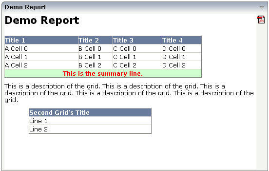
The control now looks as follows:
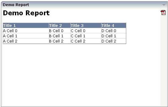
You see that grids are rendered in a simple way. By using the API of
REPORTInfo, you can add headline and content cells. You
append the grid information cell by cell, indicating new lines between.
The grid uses style sheet definitions that are part of the normal Application Designer style sheet files. They are taken from the TEXTGRID definitions inside the style sheet file.
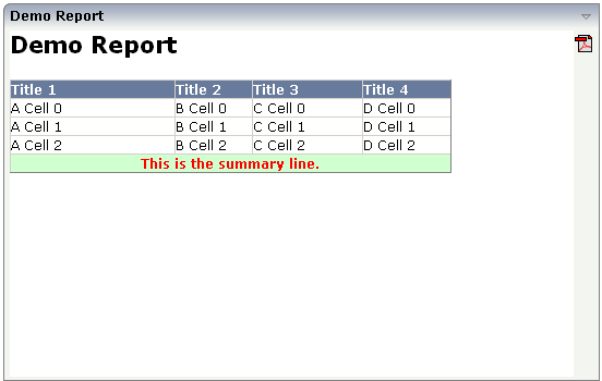
You can override these style definitions explicitly. In the following
example, the renderGrid() method is extended to
display a summary line at the end of the grid:
The code is:
private void renderGrid()
 {
     m_report.addHeadlineCell("Title 1","150");
     m_report.addHeadlineCell("Title 2","70");
     m_report.addHeadlineCell("Title 3","100");
     m_report.addHeadlineCell("Title 4","80");
     m_report.addNewLine();
     for (int i=0; i<3; i++)
     {
         m_report.addContentCell("A Cell " + i);
         m_report.addContentCell("B Cell " + i);
         m_report.addContentCell("C Cell " + i);
         m_report.addContentCell("D Cell " + i);
         m_report.addNewLine();
     }
     REPORTCellFormat sumFormat = new REPORTCellFormat();
     sumFormat.setBackgroundColor("#D0FFD0"); // light green
     sumFormat.setTextColor("#FF0000"); // red
     sumFormat.setFontWeight(REPORTCellFormat.FONTWEIGHT_BOLD);
     sumFormat.setAlign(REPORTCellFormat.ALIGN_CENTER);
     m_report.addContentCell("This is the summary line.", // text
                              4, // cellspan
                              sumFormat); // cell format
 }
You see that the API for adding cells offers a variant by which you can pass a columns span definition and a REPORTCellFormat object.
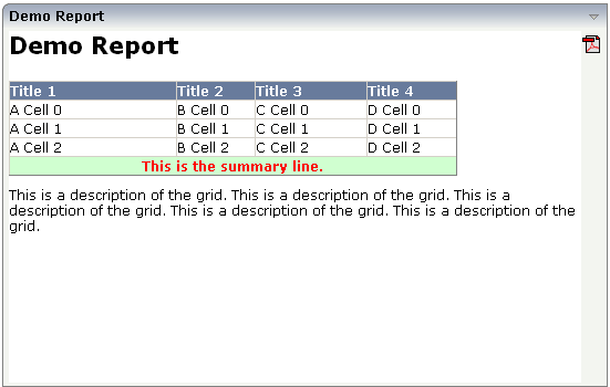
By using the addText(...) methods of
REPORTInfo, you can add text to the reporting area:
The adapter code is:
private void renderGrid()
{
    // headline
    REPORTCellFormat hlFormat = new REPORTCellFormat();
    hlFormat.setFontSize("16pt");
    hlFormat.setFontWeight(REPORTCellFormat.FONTWEIGHT_BOLD);
    m_report.addText("Demo Report",hlFormat);
    m_report.addVerticalDistance("10");

    // grid
    ...
    ...
    ... see coding above
    ...
    ...

    // description
    m_report.addVerticalDistance("10");
    m_report.addText("This is a description of the grid. " +
                     "This is a description of the grid. " +
                     "This is a description of the grid. " +
                     "This is a description of the grid. " +
                     "This is a description of the grid. ");
}
In the code, you see the usage of the
addText(...) method. Text can be combined with an
explicit cell format object (as done in the title) or can be output straight
forward (as done in the description). In order to keep a certain distance
between the texts and the grid, the method
addVerticalDistance(...) is called.
You can repeat the add methods for rendering grids, texts, etc. multiple times. The formats (column width etc.) of each grid are completely independent from one another:
The code of the example was changed in the following way:
public void init()
{
    renderGrid();
    renderGrid2();
}

private void renderGrid()
{
    ...see coding above
}

private void renderGrid2()
{
    m_report.addVerticalDistance("10");

    m_report.setIndent("50");
    m_report.addHeadlineCell("Second Grid's Title","250");
    m_report.addNewLine();
    m_report.addContentCell("Line 1");
    m_report.addNewLine();
    m_report.addContentCell("Line 2");
    m_report.addNewLine();
}
By using the method REPORInfo.setIndent(...),
the second grid was indented by 50 pixels.
Images that are part of your web application can be added by using the
addGIFGraphic(...) or
addJPEGGraphic(...) interface. If adding the following
code to your example
public void init()
{
    renderLogo();
    renderGrid();
    renderGrid2();
}

private void renderLogo()
{
    m_report.addGIFGraphic("../HTMLBasedGUI/images/logo.gif","550");
}
then the report will look like:
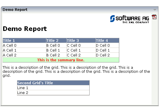
Pay attention: only add images that are accessible through your web application, e.g. that are part of your Application Designer project in which you are working. Do not add images by defining an absolute URL (http://.....) - this will cause problems when transferring the result to PDF.
When clicking on the PDF icon in the right top corner of the REPORT controls, the report will be rendered into PDF:
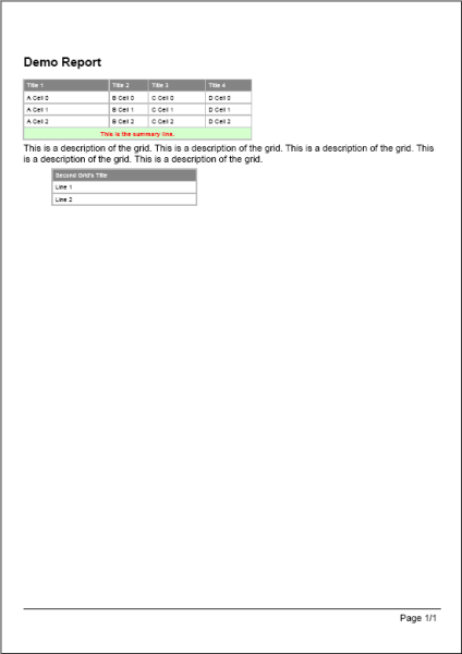
The PDF output is not a 100% match to the HTML output but a "as much as possible" match. When specifying sizes (e.g. column sizes, indent sizes) always use straight values representing pixels - as done in the examples above. There is a certain calculation factor (that can also be explicitly set by an API) between "Pixels" and PDF centimeters.
HTML tables are quite forgiving when specifying non-fitting pixel widths - there are optimisation rules that recalculate widths, e.g. if a text of a cell exceeds the size of the cell. FOP/PDF rendering is not as forgiving but will let your text overlap into the next cell. Consequence: keep an eye on your PDF output during development.
The sizing of the PDF document is done in the following way.
First the system tries to render the report into an A4 paper, portrait.
If the document exceeds the width, then the document is switched to landscape.
If the document still exceeds the width, then the document size is increased accordingly. The page width and height will always keep the A4 relationships.
This all happens automatically - you do not have to take care of this.
The examples up to now only showed one way reporting. A report was just produced and output.
The REPORT controls also offer the possibility to react on mouse clicks. When a grid is clicked, certain information is passed to the adapter program that identifies the clicked object. You can either identify whole rows or single cells within rows.
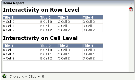
If clicking onto a row in the top grid, then a corresponding ID is output in the status bar. The same happens if clicking onto a cell in the bottom grid.
The adapter code is:
// This class is a generated one.

import com.softwareag.cis.server.Adapter;
import com.softwareag.cis.server.util.REPORTCellFormat;
import com.softwareag.cis.server.util.REPORTInfo;

public class Demo_Report__interactive_Adapter
    extends Adapter
{
    public class MyREPORTInfo
    extends REPORTInfo
    {
        public MyREPORTInfo(Adapter Adapter)
        {
            super(model);
        }
        public void reactOnClick(String id)
        {
            outputMessage(MT_SUCCESS, "Clicked id = " + id);
        }
    }

    // property >report<
    REPORTInfo m_report = new MyREPORTInfo(this);
    public REPORTInfo getReport() { return m_report; }

    private void renderGrid1()
    {
        //     headline
        REPORTCellFormat hlFormat = new REPORTCellFormat();
        hlFormat.setFontSize("16pt");
        hlFormat.setFontWeight(REPORTCellFormat.FONTWEIGHT_BOLD);
        m_report.addText("Interactivity on Row Level", hlFormat);
        m_report.addVerticalDistance("10");
        //     grid
        m_report.addHeadlineCell("Title 1", "150");
        m_report.addHeadlineCell("Title 2", "70");
        m_report.addHeadlineCell("Title 3", "100");
        m_report.addHeadlineCell("Title 4", "80");
        for (int i = 0; i < 3; i++)
        {
            m_report.addNewLine("ROWID_" + i);
            m_report.addContentCell("A Cell " + i);
            m_report.addContentCell("B Cell " + i);
            m_report.addContentCell("C Cell " + i);
            m_report.addContentCell("D Cell " + i);
        }
    }

    private void renderGrid2()
    {
        //     headline
        m_report.addVerticalDistance("10");
        REPORTCellFormat hlFormat = new REPORTCellFormat();
        hlFormat.setFontSize("16pt");
        hlFormat.setFontWeight(REPORTCellFormat.FONTWEIGHT_BOLD);
        m_report.addText("Interactivity on Cell Level", hlFormat);
        m_report.addVerticalDistance("10");
        //     grid
        m_report.addHeadlineCell("Title 1", "150");
        m_report.addHeadlineCell("Title 2", "70");
        m_report.addHeadlineCell("Title 3", "100");
        m_report.addHeadlineCell("Title 4", "80");
        for (int i = 0; i < 3; i++)
        {
            m_report.addNewLine();
            m_report.addContentCell("A Cell " + i,"CELL_A_" + i);
            m_report.addContentCell("B Cell " + i,"CELL_B_" + i);
            m_report.addContentCell("C Cell " + i,"CELL_C_" + i);
            m_report.addContentCell("D Cell " + i,"CELL_D_" + i);
        }
    }

    /** initialisation - called when creating this instance*/
    public void init()
    {
        renderGrid1();
        renderGrid2();
    }
}
You see that there is an own subclass of
REPORTInfo that is used within the adapter program. The
subclass has overridden the method reactOnClick(...).
Through the method, it receives an ID.
The ID is set either when creating a new line or when creating a cell. You are responsible for defining the format and the semantics behind the ID.
The previous topics showed you by example how to build reports. They
did not cover the full interface of REPORTInfo and
related classes. See the corresponding Java API documentation.
The REPORT is designed to produce flexible output lists. Compared to the text grid, it has the following advantages:
It is easier to program. The report list is generated inside the Java Code; you do not have to work both in the Layout Painter and in your Java editor.
It is more flexible. You can span cells, and you can individually colorize them.
It is faster. The HTML for the REPORT is created on the client side and plugged into the client's area. There is no additional dynamic rendering at the client side.
It has the following disadvantages:
It does not offer server side scrolling, i.e. the whole report list result is always transferred to the client in one step. If it is a really large report, this may take a while, especially in WAN scenarios.
It does not offer the same kind of interactivity but is more static. You can only click on rows. It does not offer right mouse button pop-up menus, highlighting of selections, roll over effects, switching columns, etc.
| Basic | |||
| reportprop |
Name of adapter property that is referenced by the REPORT control. The adapter property must be of type "REPORTInfo". See the corresponding Java API documentation in order to get more information how to define report output for this control. |
Obligatory | |
| height |
Height of the control. There are three possibilities to define the height: (A) You do not define a height at all. As consequence the control will be rendered with its default height. If the control is a container control (containing) other controls then the height of the control will follow the height of its content. (B) Pixel sizing: just input a number value (e.g. "20"). (C) Percentage sizing: input a percantage value (e.g. "50%"). Pay attention: percentage sizing will only bring up correct results if the parent element of the control properly defines a height this control can reference. If you specify this control to have a height of 50% then the parent element (e.g. an ITR-row) may itself define a height of "100%". If the parent element does not specify a width then the rendering result may not represent what you expect. |
Obligatory |
100 150 200 250 300 250 400 50% 100% |
| name |
A report can be downloaded as pdf file. If you specify a value, this value will be used as file name of the pdf file. Otherwise a default file name is used. |
Optional | |
| showpdf |
If set to "true" then a PDF icon is rendered in the right top corner of the control. When the user clicks on the icon then the report is automatically rendered as PDF - and the result will show up in a popup window. Pay attention: if setting this property to "true" then you also have to choose a special constructor when creating the REPORTInfo instance on server side, in which the instance of the model is passed as argument. Example: public class XYZAdapter extends Adapter { REPORTInfo m_report = new REPORTInfo(this) ... } |
Optional |
true false |
| showprintversion |
If switched to "true" then a small print icon will appear right from the report area. The print icon opens up a modal popup from which the HTML produced inside the report can be directly sent to the printer. Pay attention: if specifying "true" then the adapter property holding the REPORTInfo object must create the REPORTInfo instance with passing "this" in the constructor. |
Optional |
true false |
| showupload |
NATPAGE layouts only: If set to "true" then a PDF icon is rendered in the right top corner of the control. When the user clicks on the icon then the report is automatically rendered as PDF and the PDF content is added to the NJX:OBJECTS cache for an upload to the Natural server. The event value-of-reportprop.onUploadPDF is triggered in the Natural application. The Natural application can access the PDF in the NJX:OBJECTS data structure during this event. |
Optional |
true false |
| areastyle |
CSS style definition that is directly passed into this control. With the style you can individually influence the rendering of the control. You can specify any style sheet expressions. Examples are: border: 1px solid #FF0000 background-color: #808080 You can combine expressions by appending and separating them with a semicolon. Sometimes it is useful to have a look into the generated HTML code in order to know where direct style definitions are applied. Press right mouse-button in your browser and select the "View source" or "View frame's source" function. |
Optional |
background-color: #FF0000 color: #0000FF font-weight: bold |
| areastyleclass |
CSS style class used for rendering. |
Optional | |
| fixlayout |
The fixlayout property is important for saving rendering performance inside your browser. To become effective it requires to have specified the height and the width (if available as property) of the control. If setting fixlayout to "true" then the control's area is defined as area which is not sized dependent on its content (as normally done with table rendering). Instead the size is predefined from outside without letting the browser "look" into the content of the area. If the content is not fitting into the area then it is cut. You typically use this control if the content of the control's area is flexibly sizable. E.g. if the content (e.g. a TEXTGRID control) is following the size of the container. When using vertical percentage based sizing you should pay attention to set the fixlayout-property to "true" as often as possible. - The browser as consequence will be much faster in doing its rendering because a screen consists out of "building blocks" with simple to calculate sizes. |
Optional |
true false |