The TOGGLE control is used to display and to edit a selection status. In principle, it acts similar to a CHECKBOX control, but it
allows to define different icon images for the "true" and "false" representations;
allows being informed when the user presses the CTRL or SHIFT key when clicking the icon. With this information, you can react on a combination of SHIFT and click in a different way than to a normal click or a combination of CTRL and click. This is especially useful inside grid processing when you want to allow the user to do mass selections.
The following topics are covered below:
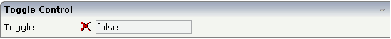
In the following example, the value of a boolean property is displayed by a TOGGLE control and a FIELD control.
The XML layout definition is:
<rowarea name="Toggle Control">
    <itr>
        <label name="Toggle" width="100" asplaintext="true">
        </label>
        <hdist width="5">
        </hdist>
        <toggle valueprop="toggleValue" flush="server"
                trueimage="images/newWithDistance.gif" falseimage="images/remove.gif"
                shiftmethod="onToggleShift" controlmethod="onToggleControl">
        </toggle>
        <hdist width="5">
        </hdist>
        <field valueprop="toggleValue" displayonly="true">
        </field>
    </itr>
</rowarea>
The Java adapter code is:
import com.softwareag.cis.server.Adapter;

// This class is a generated one.

public class CheckBoRadioButtonAdapter
    extends Adapter
{
    // ------------------------------------------------------------------------
    // property access
    // ------------------------------------------------------------------------

    // property >toggleValue<
    boolean m_toggleValue;
    public boolean getToggleValue() { return m_toggleValue; }
    public void setToggleValue(boolean value) { m_toggleValue = value; }

    // ------------------------------------------------------------------------
    // public adapter methods
    // ------------------------------------------------------------------------

    public void onToggleControl()
    {
        outputMessage(MT_WARNING, "Control was pressed when clicking");
    }

    public void onToggleShift()
    {
        outputMessage(MT_WARNING, "Shift was pressed when clicking");
    }
}
When the user presses the SHIFT or CTRL key, a corresponding method is called inside the adapter. In the example, the adapter displays the information which key was pressed in the status bar.
Have a look at the following example:
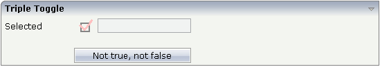
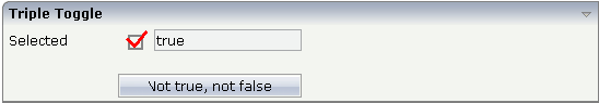
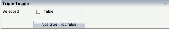
The XML layout definition is:
<rowarea name="Triple Toggle">
    <itr>
        <label name="Selected" width="100" asplaintext="true">
        </label>
        <hdist width="5">
        </hdist>
        <toggle valueprop="selected_semi" flush="screen" trueimage="images/tripletrue.gif"
                falseimage="images/triplefalse.gif" shiftmethod="onToggleShift"
                controlmethod="onToggleControl" partialimage="images/triplesemi.gif">
        </toggle>
        <hdist width="5">
        </hdist>
        <field valueprop="selected_semi" displayonly="true">
        </field>
    </itr>
    <vdist height="20">
    </vdist>
    <itr>
        <hdist width="100">
        </hdist>
        <button name="Not true, not false" method="onPartialSelection_semi">
        </button>
    </itr>
</rowarea>
In the code, each status of the TOGGLE control is represented by a value: "true", "false" and "null".
import com.softwareag.cis.server.Adapter;

// This class is a generated one.

public class CheckBoRadioButtonAdapter
    extends Adapter
{
    // property >selected<
    String m_selected="true";
    public String getSelected() { return m_selected; }
    public void setSelected(String value) { m_selected = value; }

    public void onPartialSelection()
    {
        m_selected = null;
    }
}
| Basic | |||
| valueprop |
Name of the adapter property that represents the value of the control. Must be of type "boolean" or "Boolean". Typically the TOGGLE control knows one image to represent "true" and one image to represent "false". If using "Boolean" objects on server side (not "boolean" values) then you can also use a third image that is defined within the property PARTIALIMAGE. This image is shown if the corresponding value is "null". As consequence you can define a "triple-state-toggle" switching between "true", "false" and "null". |
Obligatory | |
| trueimage |
Image URL that is shown if the corresponding property value is "true". |
Obligatory |
gif jpg jpeg |
| falseimage |
Image URL that is shown if the corresponding property value is "true". |
Obligatory |
gif jpg jpeg |
| comment |
Comment without any effect on rendering and behaviour. The comment is shown in the layout editor's tree view. |
Optional | |
| Appearance | |||
| width |
Width of the control. There are three possibilities to define the width: (A) You do not define a width at all. In this case the width of the control will either be a default width or - in case of container controls - it will follow the width that is occupied by its content. (B) Pixel sizing: just input a number value (e.g. "100"). (C) Percentage sizing: input a percantage value (e.g. "50%"). Pay attention: percentage sizing will only bring up correct results if the parent element of the control properly defines a width this control can reference. If you specify this control to have a width of 50% then the parent element (e.g. an ITR-row) may itself define a width of "100%". If the parent element does not specify a width then the rendering result may not represent what you expect. |
Optional |
100 120 140 160 180 200 50% 100% |
| height |
Height of the control. There are three possibilities to define the height: (A) You do not define a height at all. As consequence the control will be rendered with its default height. If the control is a container control (containing) other controls then the height of the control will follow the height of its content. (B) Pixel sizing: just input a number value (e.g. "20"). (C) Percentage sizing: input a percantage value (e.g. "50%"). Pay attention: percentage sizing will only bring up correct results if the parent element of the control properly defines a height this control can reference. If you specify this control to have a height of 50% then the parent element (e.g. an ITR-row) may itself define a height of "100%". If the parent element does not specify a width then the rendering result may not represent what you expect. |
Optional | |
| partialimage |
Image URL that is shown if the corresponding property value is "null". |
Optional | |
| colspan |
Column spanning of control. If you use TR table rows then you may sometimes want to control the number of columns your control occupies. By default it is "1" - but you may want to define the control to span over more than one columns. The property only makes sense in table rows that are snychronized within one container (i.e. TR, STR table rows). It does not make sense in ITR rows, because these rows are explicitly not synched. |
Optional |
1 2 3 4 5 50 int-value |
| rowspan |
Row spanning of control. If you use TR table rows then you may sometimes want to control the number of rows your control occupies. By default it is "1" - but you may want to define the control to span over more than one columns. The property only makes sense in table rows that are snychronized within one container (i.e. TR, STR table rows). It does not make sense in ITR rows, because these rows are explicitly not synched. |
Optional |
1 2 3 4 5 50 int-value |
| tabindex |
Index that defines the tab order of the control. Controls are selected in increasing index order and in source order to resolve duplicates. |
Optional |
-1 0 1 2 5 10 32767 |
| backgroundclass |
CSS style class definition that is directly passed into this control. The style class can be either one which is part of the "normal" CIS style sheet files (i.e. the ones that you maintain with the style sheet editor) - or it can be one of an other style sheet file that you may reference via the ADDSTYLESHEET property of the PAGE tag. |
Optional | |
| Binding | |||
| valueprop | (already explained above) | ||
| statusprop |
Name of the adapter property that dynamically passes information how the field should be rendered and how it should act. |
Optional | |
| shiftmethod |
Name of adapter method that is invoked if the user clicks on the toggle control and presses the Shift-key the same time. |
Optional | |
| controlmethod |
Name of adapter method that is invoked if the user clicks on the toggle control and presses the Ctrl-key the same time. |
Optional | |
| flush |
Flushing behaviour of the input control. By default an input into the control is registered within the browser client - and communicated to the server adapter object when a user e.g. presses a button. By using the FLUSH property you can change this behaviour. Setting FLUSH to "server" means that directly after changing the input a synchronization with the server adapter is triggered. As consequence you directly can react inside your adapter logic onto the change of the corresponding value. - Please be aware of that during the synchronization always all changed properties - also the ones that were changed before - are transferred to the adapter object, not only the one that triggered the synchonization. Setting FLUSH to "screen" means that the changed value is populated inside the page. You use this option if you have redundant usage of the same property inside one page and if you want to pass one changed value to all its representaion directly after changing the value. |
Optional |
screen server |
| flushmethod |
When the data synchronization of the control is set to FLUSH="server" then you can specify an explicit method to be called when the user updates the content of the control. By doing so you can distinguish on the server side from which control the flush of data was triggered. |
Optional | |
| Online Help | |||
| title |
Text that is shown as tooltip for the control. Either specify the text "hard" by using this TITLE property - or use the TITLETEXTID in order to define a language dependent literal. |
Optional | |
| titletextid |
Text ID that is passed to the multi lanaguage management - representing the tooltip text that is used for the control. |
Optional | |
| Miscellaneous | |||
| testtoolid |
Use this attribute to assign a fixed control identifier that can be later on used within your test tool in order to do the object identification |
Optional | |