The TEXTOUT control is used to display plain text. The text is not statically defined (as a label) but is derived from a property of the adapter class.
The following topics are covered below:
The XML layout definition is:
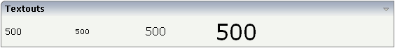
<rowarea name="Textouts">
    <itr>
        <textout valueprop="factor1" width="100">
        </textout>
        <textout valueprop="factor1" width="100" textsize="1">
        </textout>
        <textout valueprop="factor1" width="100" textsize="3">
        </textout>
        <textout valueprop="factor1" width="100" textsize="6">
        </textout>
    </itr>
</rowarea>
By using the styleclass property of the
TEXTOUT control, you can define text output that looks like a normal LABEL
control. However, instead of a fixed text, it has a text that is dynamically
derived from the adapter logic:

The layout definitions is:
<rowarea name="Text">
    <itr>
        <textout valueprop="dynprop" width="120" textoutclass="LABELCellNormal">
        </textout>
        <field valueprop="dynlabel" width="200">
        </field>
    </itr>
</rowarea>
In the above example, the left First Name is not a
label but a TEXTOUT control, referencing to the style class
LABELCellNormal that normally is a style class belonging
to the LABEL control.
By extending the previous example, you can also add tooltips to the dynamic label:
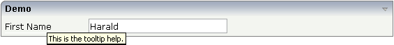
The implementation of the adapter property is:
// property >dynlabel<
String m_dynlabel ="Harald";
public String getDynlabel() { return m_dynlabel; }
public void setDynlabel(String value) { m_dynlabel = value; }
The text of the value that is passed back is encapsulated within an HTML
span. The span itself provides the property
title.
| Basic | |||
| width |
Width of the control. There are three possibilities to define the width: (A) You do not define a width at all. In this case the width of the control will either be a default width or - in case of container controls - it will follow the width that is occupied by its content. (B) Pixel sizing: just input a number value (e.g. "100"). (C) Percentage sizing: input a percantage value (e.g. "50%"). Pay attention: percentage sizing will only bring up correct results if the parent element of the control properly defines a width this control can reference. If you specify this control to have a width of 50% then the parent element (e.g. an ITR-row) may itself define a width of "100%". If the parent element does not specify a width then the rendering result may not represent what you expect. |
Sometimes obligatory |
100 120 140 160 180 200 50% 100% |
| valueprop |
Server side property representation of the control. |
Obligatory | |
| comment |
Comment without any effect on rendering and behaviour. The comment is shown in the layout editor's tree view. |
Optional | |
| Appearance | |||
| width | (already explained above) | ||
| height |
Height of the control. There are three possibilities to define the height: (A) You do not define a height at all. As consequence the control will be rendered with its default height. If the control is a container control (containing) other controls then the height of the control will follow the height of its content. (B) Pixel sizing: just input a number value (e.g. "20"). (C) Percentage sizing: input a percantage value (e.g. "50%"). Pay attention: percentage sizing will only bring up correct results if the parent element of the control properly defines a height this control can reference. If you specify this control to have a height of 50% then the parent element (e.g. an ITR-row) may itself define a height of "100%". If the parent element does not specify a width then the rendering result may not represent what you expect. |
Optional |
100 150 200 250 300 250 400 50% 100% |
| nowrap |
If the textual content of the control exceeds the size of the control then the browser automatically breaks the line and arranges the text accordingly. You can avoid this behaviour by setting NOWRAP to "true". No line break will be performed by the browser. |
Optional |
true false |
| textsize |
The HTML font size of the text. Corresponding to the HTML definition "1" means "smallest" and "6" means "biggest". |
Optional |
1 2 3 4 5 6 |
| textcolor |
Colour of the text. Input a value like "#FF0000". |
Optional |
#FF0000 #00FF00 #0000FF #FFFFFF #808080 #000000 |
| datatype |
By default, the control is managing its content as string. By explicitly setting a datatype you can define that the control will format the data coming from the server: if the field has datatype "date" and the user inputs "010304" then the input will be translated into "01.03.2004" (or other representation, dependent on date format settings). Please note: the datatype "float" is named a bit misleading - it represents any decimal format number. The server side representation may be a float value, but also can be a double or a BigDecimal property. |
Optional |
date float int long time timestamp color xs:decimal xs:double xs:date xs:dateTime xs:time ------------------------ N n.n P n.n string n L xs:boolean xs:byte xs:short |
| straighttext |
If the text of the control contains HTML tags then these are by default interpreted by the browser. Specifiying STRAIGHTTEXT as "true" means that the browser will directly render the characters without HTML interpretation. Example: if you want to output the source of an HTML text then STRAIGHTTEXT should be set to "true". |
Optional |
true false |
| align |
Horizontal alignment of control in its column. Each control is "packaged" into a column. The column itself is part of a row (e.g. ITR or TR). Sometimes the size of the column is bigger than the size of the control itself. In this case the "align" property specifies the position of the control inside the column. In most cases you do not require the align control to be explicitly defined because the size of the column around the controls exactly is sized in the same way as the contained control. If you want to directly control the alignment of text: in most text based controls there is an explicit property "textalign" in which you align the control's contained text. |
Optional |
left center right |
| valign |
Vertical alignment of control in its column. Each control is "packaged" into a column. The column itself is part of a row (e.g. ITR or TR). Sometimtes the size of the column is bigger than the size of the control. In this case the "align" property specify the position of the control inside the column. |
Optional |
top middle bottom |
| colspan |
Column spanning of control. If you use TR table rows then you may sometimes want to control the number of columns your control occupies. By default it is "1" - but you may want to define the control to span over more than one columns. The property only makes sense in table rows that are snychronized within one container (i.e. TR, STR table rows). It does not make sense in ITR rows, because these rows are explicitly not synched. |
Optional |
1 2 3 4 5 50 int-value |
| rowspan |
Row spanning of control. If you use TR table rows then you may sometimes want to control the number of rows your control occupies. By default it is "1" - but you may want to define the control to span over more than one columns. The property only makes sense in table rows that are snychronized within one container (i.e. TR, STR table rows). It does not make sense in ITR rows, because these rows are explicitly not synched. |
Optional |
1 2 3 4 5 50 int-value |
| bgcolorprop |
Name of adapter property that passes back a color value (e.g. "#FF0000" for red color). The color value is used as background color in the control. - The color of the text color is automatically chosen dependent from the background color: for light background colors the text color is black, for dark background colors the color is white. Use FGCOLORPROP to choose the text color on your own. |
Optional | |
| fgcolorprop |
Name of adapter property that passes back a color value (e.g. "#FF0000" for red color). The color value is used as text color in the control. - The background color is automatically chosen dependent from the text color: for dark text colors the background color is transparent (default), for light text colors the color is black. Use BGCOLORPROP to choose both - the text and background color. |
Optional | |
| textoutstyle |
CSS style definition that is directly passed into this control. With the style you can individually influence the rendering of the control. You can specify any style sheet expressions. Examples are: border: 1px solid #FF0000 background-color: #808080 You can combine expressions by appending and separating them with a semicolon. Sometimes it is useful to have a look into the generated HTML code in order to know where direct style definitions are applied. Press right mouse-button in your browser and select the "View source" or "View frame's source" function. |
Optional |
background-color: #FF0000 color: #0000FF font-weight: bold |
| textoutclass |
CSS style class definition that is directly passed into this control. The style class can be either one which is part of the "normal" CIS style sheet files (i.e. the ones that you maintain with the style sheet editor) - or it can be one of an other style sheet file that you may reference via the ADDSTYLESHEET property of the PAGE tag. |
Optional | |
| stylevariant |
Some controls offer the possibility to define style variants. By this style variant you can address different styles inside your style sheet definition file (.css). If not defined "normal" styles are chosen, if defined (e.g. "VAR1") then other style definitions (xxxVAR1xxx) are chosen. Purpose: you can set up style variants in the style sheet defintion and use them multiple times by addressing them via the "stylevariant" property. CIS currently offerst two variants "VAR1" and "VAR2" but does not predefine any semantics behind - this is up to you! |
Optional |
VAR1 VAR2 VAR3 VAR4 |
| Binding | |||
| valueprop | (already explained above) | ||
| titleprop |
Property of adapter that dynamically defines the title of the control. The title is displayed as tool tip when ther user moves the mouse onto the control. |
Optional | |
| bgcolorprop | (already explained above) | ||
| fgcolorprop | (already explained above) | ||
| visibleprop |
Name of an adapter property that provides the information if this control is displayed or not. As consequence you can control the visibility of the control dynamically. The server side property needs to be of type "boolean". |
Optional | |
| invisiblemode |
If the visibility of the control is determined dynamically by an adapter property then there are two rendering modes if the visibility is "false": (1) "invisible": the control is not visible. (2)"cleared": the control is not visible but it still occupies space. |
Optional |
invisible cleared |
| Miscellaneous | |||
| testtoolid |
Use this attribute to assign a fixed control identifier that can be later on used within your test tool in order to do the object identification |
Optional | |