This is a "hot topic": embedding ActiveX controls in pages. Before telling you what the control does, let us explain why we do it:
Of course, the client integration of ActiveX controls has - from browser or SWT perspective - only disadvantages:
ActiveX controls are not secure: you decide to run one control or not. But do not have a "sandbox" as you have with JavaScript or with applets. Using an ActiveX control means that this contol - once running - has native access to your computer, just as any other native program.
ActiveX controls are bound to the Microsoft Windows platform.
ActiveX controls need to be explicitly installed on the client side - maybe automated in some way, but still an explicit installation is necessary.
But - and this is why we support them - in some cases, they are a nice way to integrate other software which runs out of the scope of the browser.
Example: you may want to integrate your user interface with a barcode reader which is connected to your client via a serial interface. In this case, there is no way to access this barcode reader via JavaScript. You need to use an ActiveX control (or a signed applet) to connect to the serial device.
There is a simple interface between HTML/JavaScript and ActiveX, and vice versa. ActiveX controls can be embedded into an HTML page and it is possible to directly access properties of the ActiveX control from JavaScript. This interface was used for building the ACTIVEX control that you can use as an Application Designer control. Calling methods in the ACTIVEX or send/receive events is not supported.
The following topics are covered below:
Have a look at the following screen:
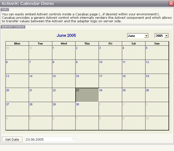
Within the normal Application Designer controls, you see a calendar control: this calendar control is an ActiveX control. When choosing the button, the date of the calendar is displayed within the field below.
Let us have a look at the XML layout definition:
<rowarea name="ActiveX Control" height="100%">
    <itr takefullwidth="true" height="100%">
        <activex classid="8E27C92B-1264-101C-8A2F-040224009C02"
                 progid="MSCAL.Calendar"
                 getxparams="year;adapterYear;month;adapterMonth;day;adapterDay"
                 width="100%" height="100%">
        </activex>
    </itr>
    <vdist height="12">
    </vdist>
    <itr>
        <button name="Get Date" method="onGetDate">
        </button>
        <hdist width="12">
        </hdist>
        <field valueprop="date" width="200" datatype="date">
        </field>
    </itr>
</rowarea>
The ActiveX control links via a classid and
a progid to the ActiveX component that is used. It
has a property getxparams: in this property, pairs
of properties are listed, each pair being the name of the ActiveX component's
property and the one of the adapter property. When using
getxparams, the ActiveX properties are transferred
into the adapter properties with every roundtrip (and only when changed). There
is also a setxparams property (not used in the
example) that transfers values into the other direction: from the adapter
object into the ActiveX component.
The adapter code is quite simple:
package com.softwareag.cis.test40;

import java.util.Date;
import com.softwareag.cis.server.Adapter;
import com.softwareag.cis.util.CDate;

public class ActiveXCalendarAdapter
    extends Adapter
{
    CDate m_date = new CDate(new Date());
    public CDate getDate() { return m_date; }
    public void setDate(CDate value) { m_date = value; }

    String m_adapterDay;
    public String getAdapterDay() { return m_adapterDay; }
    public void setAdapterDay(String value) { m_adapterDay = value; }

    String m_adapterMonth;
    public String getAdapterMonth() { return m_adapterMonth; }
    public void setAdapterMonth(String value) { m_adapterMonth = value; }

    String m_selectedDate;
    public String getSelectedDate() { return m_selectedDate; }
    public void setSelectedDate(String value) { m_selectedDate = value; }

    String m_adapterYear;
    public String getAdapterYear() { return m_adapterYear; }
    public void setAdapterYear(String value) { m_adapterYear = value; }

    public void onGetDate()
    {
        String day = m_adapterDay;
        if (day.length() == 1) day = "0" + day;
        String month = m_adapterMonth;
        if (month.length() == 1) month = "0" + month;
        m_date.setDate(m_adapterYear+month+day);
    }
}
The adapter's properties are automatically filled. The
onGetDate() method assembles the properties to form a
Application Designer date.
| Basic | |||
| classid |
Class id of the ActiveX control. A string in the format "8E27C92B-1264-101C-8A2F-040224009C02" representing the UUID of the ActiveX component. The CLASSID is used inside the HTML client to reference the ActiveX control. |
Optional | |
| progid |
The unique program identifier which has been registered for this ActiveX Control like "Shell.Explorer" |
Optional | |
| xinitparams |
Init parameters that are used for creating an instance of the ActiveX control. Values are passed as semicolon separated string: property;value;property;value etc. The property is the name of the ActiveX control's property that is initialized with the corresponding value. |
Optional | |
| setxparams |
Same as GETXPARAMS but now the other direction. Adapter properties that are transferred (on change) into corresponding ActiveX properties with each repsonse. The string format is the same: activeXProperty;adapterProperty;activeXProperty;adapterProperty etc. |
Optional | |
| getxparams |
Semicolon separated list of which ActiveX control are linked with which adapter properties. The format is: activeXProperty;adapterProperty;activeXProperty;adapterProperty etc. With each request send from the browser the ActiveX properties are collected in from the ActiveX control and are transferred (if they have changed) into the corresponding adapter properties.activex_attr_progid"Program id of the ActiveX control. E.g. "MSCAL.Calendar" for the Microsoft calendar. The PROGID is used inside the SWT client to access the ActiveX control. |
Optional | |
| width |
Width of the control. There are three possibilities to define the width: (A) You do not define a width at all. In this case the width of the control will either be a default width or - in case of container controls - it will follow the width that is occupied by its content. (B) Pixel sizing: just input a number value (e.g. "100"). (C) Percentage sizing: input a percantage value (e.g. "50%"). Pay attention: percentage sizing will only bring up correct results if the parent element of the control properly defines a width this control can reference. If you specify this control to have a width of 50% then the parent element (e.g. an ITR-row) may itself define a width of "100%". If the parent element does not specify a width then the rendering result may not represent what you expect. |
Optional |
100 120 140 160 180 200 50% 100% |
| height |
Height of the control. There are three possibilities to define the height: (A) You do not define a height at all. As consequence the control will be rendered with its default height. If the control is a container control (containing) other controls then the height of the control will follow the height of its content. (B) Pixel sizing: just input a number value (e.g. "20"). (C) Percentage sizing: input a percantage value (e.g. "50%"). Pay attention: percentage sizing will only bring up correct results if the parent element of the control properly defines a height this control can reference. If you specify this control to have a height of 50% then the parent element (e.g. an ITR-row) may itself define a height of "100%". If the parent element does not specify a width then the rendering result may not represent what you expect. |
Optional |
100 150 200 250 300 250 400 50% 100% |
| reloadprop |
Inidicates that the ActiveX component is reloaded with every repsonse from the server that changed data of the ActiveX component. |
Optional | |
| useparamtag |
Set to false if setting the parameters in your ActiveX does not work using the html param tag. Normally you don't have to set this attribute. |
Optional |
true false |
| comment |
Comment without any effect on rendering and behaviour. The comment is shown in the layout editor's tree view. |
Optional | |