The TEXTGRIDSSS2 control is a variant of the TEXTGRID2 control which is explained in the previous section. "SSS" is the abbreviation for "server-side scrolling".
This document covers the following topics:
The TEXTGRID2 control fetches all items belonging to the grid and renders them according to its layout definition. If there are more items available than the grid can display, a vertical scroll bar is displayed and you can scroll through the list.
From scrolling perspective, this is very effective - the browser is very fast when scrolling is needed. But there are two disadvantages, especially for long lists:
All the data that are to be displayed inside the grid must be available on the client side. Therefore, the data must be transferred from the server to the client at least one time. Imagine you have a grid of 10,000 lines: even if Application Designer transfers only "net data" and even if this happens in "delta transfer mode", it must be transferred.
In addition, the grid must be built completely in order to allow fast scrolling. This means - taking the above example - that 10,000 lines have to be rendered before the grid can be displayed. Table rendering is time-consuming and needs a lot of the client's CPU performance.
Consequence: text grids of the TEXTGRID2 control are easy to use, but they have their limitations in terms of scalability. You should use it only if a limited amount of information is to be displayed.
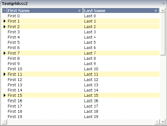
The TEXTGRIDSSS2 is very similar to the TEXTGRID2 control it is even based on the same code. However, some special behavior has been built in. The main differences are "in the background". The TEXTGRIDSSS2 control only receives the data of the visible items. In this example, only the data of the first 20 items are returned and rendered. When scrolling down, the next 20 items are fetched and rendered. This means: the control requests always the data which are currently displayed.
Consequence: every scrolling step requires an interaction with the server. However, only a small amount of data - which is visible - is requested, not the data of all available items. The performance of the grid does not change with the number of items which are available. There is no time difference in rendering a text grid containing 100 or 10,000 items.
The layout definition is:
<rowarea name="textgridsss2">
    <itr>
        <textgridsss2 griddataprop="lines" rowcount="20" width="100%"
                      selectprop="selected" singleselect="false" hscroll="true"
                      directselectmethod="onDirectSelection"
                      directselectevent="ondblClick">
            <column name="First Name" property="firstname" width="50%">
            </column>
            <column name="Last Name" property="lastname" width="50%">
            </column>
        </textgridsss2>
    </itr>
</rowarea>
The definition is nearly the same as for the TEXTGRID2
control - with the exception that there is a property
rowcount to be used. The property
rowcount defines the number of rows that are
fetched from the server. All the other properties are the same as with
TEXTGRID2.
No changes are required for the adapter source. You can use the same
adapter code for TEXTGRID2 as for TEXTGRIDSSS2 controls. The server-side
scrolling is completely done by the TEXTGRIDCollection
class, already explained in section TEXTGRID2.
Note:
In older versions you had to program server-side scrolling by
yourself, and the code was not the same between TEXTGRID and
TEXTGRIDSSS.
Maybe you have noticed that in the TEXTGRIDSSS2 control, there are two
properties for defining the height of the text grid:
rowcount and height.
The usage of the properties is as follows:
rowcount="20", height="" (undefined)
The text grid is rendered with exactly 20 lines. The height of the text grid is the height of the 20 lines.
rowcount="20", height="100%" (or pixel value)
The height is determined by the height
definition. The text grid will only show these items which fit into the height.
If the height only allows 12 lines to be shown, server-side scrolling always
picks 12 items from the server instead of 20 as defined. The
rowcount property defines the maximum number of
items to be picked, i.e. if the height allows 25 lines to be displayed, only
the maximum of 20 are picked.
By using rowcount and
height together, you can have both server-side
scrolling and dynamic vertical sizing of a text grid.
As an alternative to server-side scrolling, you can customize the
client-side loading behavior. Setting the property
onloadbehaviour="collection" activates performance-optimized
client-side scrolling in the JavaScript/SWT client. As with the TEXTGRID2
control, the application must pass all items to the client at the beginning.
But other than with the TEXTGRID2 control, these items are not immediately
rendered in the grid. Instead, the JavaScript/SWT client caches the items and
only renders the items that are currently visible. If you have a limited number
of items, the TEXTGRIDSSS2 control thus combines the advantage of the
easy-to-use TEXTGRID2 control with better performance. For a really large
number of items, however, server-side scrolling is still the best solution.
Sometimes, the number of items is not yet known at design-time. In such
a case, you can set onloadbehaviour="collectionorblock". Up to a
defined number of items, the behavior is identical to
onloadbehaviour="collection". The maximum number of items for
which client-side scrolling is to be done can be specified in the
cisconfig.xml file. For a higher number of items,
server-side scrolling is done. Switching between client-side scrolling and
server-side scrolling is done automatically. You need not program anything to
make it work.
| Basic | |||
| griddataprop |
Name of adapter property that represents the grid on server side. The property must be of type "TEXTGRIDCollection". var m_items = new TEXTGRIDCollection() Pay attention: once you have created an instance of TEXTGRIDCollection inside your adapter always exactly use this one instance. Do not re-instantiate collection objects! - Example: Instead of... WRONG: m_items = new TEXTGRIDCollection(); ...use... CORRECT: m_items.clear(); |
Obligatory | |
| rowcount |
Number of rows that are rendered inside the control. There are two ways of using this property - dependent on whether you in addition define the HEIGHT property: If you do NOT define the HEIGHT property then the control is rendered with exactly the number of rows that are defined as ROWCOUNT value. If a HEIGHT value is defined in addition (e.g. as percentage value "100%") then the number of rows depend on the actual height of the control. The ROWCOUNT value in this case indicates the maximum number of rows that are picked from the server. You should define this value in a way so that it is not too low - otherwise your grid will not be fully filled. On the other hand it should not be defined too high ("100") because this causes more communication traffic and more rendering effort inside the browser. |
Obligatory | |
| width |
Width of the control. There are three possibilities to define the width: (A) You do not define a width at all. In this case the width of the control will either be a default width or - in case of container controls - it will follow the width that is occupied by its content. (B) Pixel sizing: just input a number value (e.g. "100"). (C) Percentage sizing: input a percantage value (e.g. "50%"). Pay attention: percentage sizing will only bring up correct results if the parent element of the control properly defines a width this control can reference. If you specify this control to have a width of 50% then the parent element (e.g. an ITR-row) may itself define a width of "100%". If the parent element does not specify a width then the rendering result may not represent what you expect. |
Obligatory |
100 120 140 160 180 200 50% 100% |
| height |
Height of the control. There are three possibilities to define the height: (A) You do not define a height at all. As consequence the control will be rendered with its default height. If the control is a container control (containing) other controls then the height of the control will follow the height of its content. (B) Pixel sizing: just input a number value (e.g. "20"). (C) Percentage sizing: input a percantage value (e.g. "50%"). Pay attention: percentage sizing will only bring up correct results if the parent element of the control properly defines a height this control can reference. If you specify this control to have a height of 50% then the parent element (e.g. an ITR-row) may itself define a height of "100%". If the parent element does not specify a width then the rendering result may not represent what you expect. |
Optional |
100 150 200 250 300 250 400 50% 100% |
| onloadbehaviour |
Loading behaviour of the items into the client. "block" (=default) means that the client always requests the currently visible items from the server (=Server-Side Scrolling). "collection" means that the client requests all items at the beginning from the server. The client itself implements the scrolling in the JavaScript/SWT (=Client-Side Scrolling) New in CIT81: "collectionorblock" means that the runtime automicatically switches between Client-Side Scrolling and Server-Side Scrolling. |
Optional |
block collection collectionorblock |
| comment |
Comment without any effect on rendering and behaviour. The comment is shown in the layout editor's tree view. |
Optional | |
| Selection | |||
| selectableprop |
Name of the adapter parameter used for selectable property for the textgrid(textgridsss) control. |
Optional | |
| selectprop |
Name of property of the item objects - representing the individual rows of the text grid - that is used for selecting rows. Must be of type "boolean"/ "Boolean". If the user selects a text grid row then the value "true" is passed into the corresponding row object's property. |
Optional | |
| singleselect |
If set to "true" then only one row can be selected inside the text grid. - If set to "false" then multiple lines can be selected by using Ctrl- and Shift-key during mouse selection. Default is "false". |
Optional |
true false |
| singleselectprop |
Name of adapter property that dynamically defined whether SINGLESELECT is true or false. Must return 'true' or 'false'. |
Optional | |
| onclickmethod |
Adapter method that is called when the user selects a row. Inside the adapter you can find the selected rows by iterating through the row objects and finding out which one's selection-property is switched to "true". In case of multiple row selection you can also use the method "findLastSelectedItem()" of your corresponding TEXTGRIDCollection object. |
Optional | |
| ondblclickmethod |
Adapter method that is called when the user selects a row by a double click. Inside the adapter you can find the selected rows by iterating through the row objects and finding out which one's selection-property is switched to "true". In case of multiple row selection you can also use the method "findLastSelectedItem()" of your corresponding TEXTGRIDCollection object. |
Optional | |
| withselectioncolumn |
When defining a SELECTPROP property then automatically a selection column is added as first left column of the grid. Inside the column an icon inidicates if a row is currently selected. Set this property to "false" in order to avoid the selection column. |
Optional |
true false |
| withselectioncolumnicon |
Flag that indicates whether the selection column shows a "select all" icon on top. Default is true. |
Optional |
true false |
| fgselect |
if switched to true then an additional "graying" of selected lines will be activated. Switch this property to "true" if you have coloured textgrid cells: the selection colour will not override the colour of each cell, as consequence you require an additional effect in order to make the user see which row is selected. |
Optional |
true false |
| focusedprop |
Name of property of the item objects - representing the individual rows of the text grid - that indicates if the line should receive focus. Must be of type "boolean"/ "Boolean". |
Optional | |
| Right Mouse Button | |||
| oncontextmenumethod |
If clicking on a row of the text grid with the right mouse button then always the method "reactOnContexMenuRequest()" is called inside the corresponding row item object (that itself is kept inside the TEXTGRIDCollection object). If the user clicks with the right mouse button onto an empty area of the grid then there is no object to call - instead the adapter method that is specified by this property is called. |
Optional | |
| singleselectcontextmenu |
With SHIFT and CTRL key the user can select multiple lines (use property SINGLESELECT to suppress this feature). Use this property to ensure that the context menu is requested only for a single line. Default is "false". |
Optional |
true false noselection |
| enabledefaultcontextmenu |
Use this property to enable the default context menu of the browser within the textgrid. Please note: do not enable the browser's context menu if your application itself provides for a context menu. Default is "false". |
Optional |
true false |
| Appearance | |||
| width | (already explained above) | ||
| height | (already explained above) | ||
| hscroll |
Definition of the horizontal scrollbar's appearance. You can define that the scrollbars only are shown if the content is exceeding the control's area ("auto"). Or scrollbars can be shown always ("scroll"). Or scrollbars are never shown - and the content is cut ("hidden"). Default is "hidden". |
Optional |
auto scroll hidden |
| vscroll |
Definition of the vertical scrollbar's appearance. You can define that scrollbars only are shown if the content is exceeding the control's area ("auto"). Or scrollbars can be shown always ("scroll"). Or scrollbars are never shown - and the content is cut ("hidden"). Default is "scroll". |
Optional |
auto scroll hidden |
| touchpadinput |
Boolean property that decides if touch pad support is offered for the TEXTGRID control. The default is "false". If switched to "true" then you can scroll the grid via a touch pad. As consequence you can use this control for making inputs through a touch terminal. |
Optional |
true false |
| withtitlerow |
If defined as "false" then no top title row is shown. "True" is default. |
Optional |
true false |
| colspan |
Column spanning of control. If you use TR table rows then you may sometimes want to control the number of columns your control occupies. By default it is "1" - but you may want to define the control to span over more than one columns. The property only makes sense in table rows that are snychronized within one container (i.e. TR, STR table rows). It does not make sense in ITR rows, because these rows are explicitly not synched. |
Optional |
1 2 3 4 5 50 int-value |
| rowspan |
Row spanning of control. If you use TR table rows then you may sometimes want to control the number of rows your control occupies. By default it is "1" - but you may want to define the control to span over more than one columns. The property only makes sense in table rows that are snychronized within one container (i.e. TR, STR table rows). It does not make sense in ITR rows, because these rows are explicitly not synched. |
Optional |
1 2 3 4 5 50 int-value |
| personalizable |
If defined to "false" then no re-arranging of columns is offered to the user. Default is "true". This means: if using COLUMN controls inside the grid definition then the user can re-arrange the sequence of columns by dragging and dropping them within the top title row. |
Optional |
true false |
| stylevariant |
Some controls offer the possibility to define style variants. By this style variant you can address different styles inside your style sheet definition file (.css). If not defined "normal" styles are chosen, if defined (e.g. "VAR1") then other style definitions (xxxVAR1xxx) are chosen. Purpose: you can set up style variants in the style sheet defintion and use them multiple times by addressing them via the "stylevariant" property. CIS currently offerst two variants "VAR1" and "VAR2" but does not predefine any semantics behind - this is up to you! |
Optional | |
| stylevariantprop |
Name of the adapter property which dynamically defines the STYLEVARIANT value at runtime. |
Optional |
VAR1 VAR2 |
| backgroundstyle |
CSS style definition that is directly passed into this control. With the style you can individually influence the rendering of the control. You can specify any style sheet expressions. Examples are: border: 1px solid #FF0000 background-color: #808080 You can combine expressions by appending and separating them with a semicolon. Sometimes it is useful to have a look into the generated HTML code in order to know where direct style definitions are applied. Press right mouse-button in your browser and select the "View source" or "View frame's source" function. |
Optional | |
| withblockscrolling |
If switched to "true" then the grid will show small scroll icons by which the user can scroll the grid's content. Scrolling typically is done by using the grid's scrollbar - the scroll icons that are switched on by this property are an additional possibility to scroll. |
Optional |
true false |
| withrollover |
The textgrid controls provide for a so called "roll over" effect. The row that is currently below the mouse pointer is highlighted in a certain way. Use this property to disable the roll over effect (Default is TRUE). |
Optional |
true false |
| fixedcolumnsizes |
When switching the FIXEDCOLUMNSIZES property to value "true" then internally the grid is arranged in a way that the area always determines its size out of the width specification of the COLUMN controls. The browser does not look into the column contents in order to try to optimise the size of the area - but always follows the width that you define. |
Optional |
true false |
| requiredheight |
Minimum height of the control in pixels. Use this property to ensure a minimum height if the overall control's height is a percentage of the available space - i.e. if value of property HEIGHT is a percentage (e.g. 100%). Please note:You must not use FIXLAYOUT at the surrounding row container (ITR and ROWAREA). Otherwise: if the available space is less than the required height the end of the control is just cut off. |
Optional |
1 2 3 int-value |
| minapparentrows |
Minimum number of apparent rows. Insert a valid number to make sure that (e.g. 10) rows are shown for sure. |
Optional |
1 2 3 int-value |
| disablecolumnresizing |
Flag that indicates if the user can change the width of the grid columns. Default is false. |
Optional |
true false |
| disablecolumnmoving |
Flag that indicates if the user can change the order of grid columns. Default is false. |
Optional |
true false |
| tabindex |
Index that defines the tab order of the control. Controls are selected in increasing index order and in source order to resolve duplicates. |
Optional |
-1 0 1 2 5 10 32767 |
| showemptylines |
If set to false, no empty line will be rendered. By default empty lines are shown. |
Optional |
true false |
| withsliderfreeze |
Setting this to "true" prevents unwisched slider jumps while scrolling up/down in a grid with a huge number of lines (for example 20000). |
Optional |
true false |
| Drag And Drop | |||
| draginfoprop |
Name of the row item property that passes back the line's "drag info". When using this attribute the grid lines can be dragged onto "drop targets" (e.g. DROPICON control). The dragged line is identified by its "drag info". Use any string/information applicable. |
Optional | |
| Miscellaneous | |||
| testtoolid |
Use this attribute to assign a fixed control identifier that can be later on used within your test tool in order to do the object identification |
Optional | |
| Deprecated | |||
| directselectmethod |
Use ONCLICKMETHOD and ONDBLCLICKMETHOD instead. |
Optional | |
| directselectevent |
Use ONCLICKMETHOD and ONDBLCLICKMETHOD instead. |
Optional |
ondblclick onclick |
Inside the TEXTGRIDSSS2 definitions, COLUMN tags are also used to define its content. There is no difference in COLUMN tag usage between TEXTGRIDSSS2 and TEXTGRID2 definition.