This document covers the following topics:
The following example shows a TEXTGRID2 control:
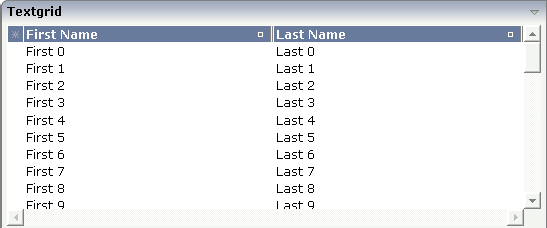
There are two columns which hold data. There is one column at the very left which displays a selection icon - in addition to a yellow background for a selected line. Even and odd lines are displayed in slightly different colors. At the very right of each title column, there is a symbol which indicates the sorting status; if you double-click on this symbol, the column is sorted first in ascending direction and, when clicking again, in descending direction. Change the sequence of columns by dragging the title of a column and dropping it on another column's title. Depending from where you drop, the column is either moved left or right.
The asterisk in the upper left corner of the grid is used to
select/deselect all lines in the grid. The behavior depends on the setting of
the singleselect property which determines whether
multiple lines can be selected in the grid (default) or whether only one line
can be selected:
Multiple Line Selection Mode
When you choose the asterisk for the first time, all lines are
selected. When you choose the asterisk a second time, all lines are
deselected.
Single Line Selection Mode
When you choose the asterisk (no matter how often), an existing
selected line is deselected.
The XML layout definition is:
<rowarea name="Textgrid">
    <itr takefullwidth="true" fixlayout="true">
        <textgrid2 griddataprop="lines" width="100%" height="200" selectprop="selected"
                   hscroll="true">
            <column name="First Name" property="firstName" width="50%">
            </column>
            <column name="Last Name" property="lastName" width="50%">
            </column>
        </textgrid2>
    </itr>
    <vdist height="5">
    </vdist>
</rowarea>
The TEXTGRID2 definition is bound to a grid data property
lines. This is a special
collection that mirrors the server data. Technically, it is treated in the same
way as a normal collection. It supports the Collection
and List interface.
Inside the TEXTGRID2 control definition there are two columns. These
columns are bound to the properties firstName and
lastName.
This is the Java adapter source:
import com.softwareag.cis.server.Adapter;
import com.softwareag.cis.server.util.SelectableLine;
import com.softwareag.cis.server.util.TEXTGRIDCollection;

// This class is a generated one.

public class TextGridAdapter
    extends Adapter
{
    // class >LinesItem<
    public class LinesItem
    extends SelectableLine
    {
        // property >firstName<
        String m_firstName;
        public String getFirstName() { return m_firstName; }

        // property >lastName<
        String m_lastName;
        public String getLastName() { return m_lastName; }

        // property >selected<
        boolean m_selected;
        public boolean getSelected() { return m_selected; }
        public void setSelected(boolean value) { m_selected = value; }
    }

    // property >lines<
    TEXTGRIDCollection m_lines = new TEXTGRIDCollection();
    public TEXTGRIDCollection getLines() { return m_lines; }

    /** initialisation - called when creating this instance*/
    public void init()
    {
        for (int i=0; i< 50; i++)
        {
            LinesItem l = new LinesItem();
            l.m_firstName = "First " + i;
            l.m_lastName = "Last " + i;
            m_lines.add(l);
        }
    }
}
The adapter class provides a property
lines. This property returns an instance of the
class TEXTGRIDCollection which itself is a special
collection and comes with the Application Designer runtime. The instance is filled in the
init() method of the adapter - just as a normal
collection. But it automatically brings in all the functions for sorting and -
if desired - server-side scrolling (see the
TEXTGRIDSSS2
description).
The collection is filled with objects of the inner class
Line. Each object supports a property
firstName, lastName
and selected. (The class
Line is an inner class in the example - but of course it
could also be a normal class). Make sure to make the class publicly accessible,
because the Application Designer runtime requires public access to the corresponding
properties.
The whole TEXTGRID2 definition is bound by the
griddataprop property to the
lines collection - and each COLUMN definition is
bound to a property of class Line, i.e. the class
representing elements of the collection.
Maybe you wonder why there is a selected
property
in the class
Line of the previous example.
This property is required for indicating which lines are
currently selected and which are not. Each line which is displayed in the
TEXTGRID2 control is represented at the server side
by an object of the class Line. Therefore, the selection status of the grid (which
lines are selected and which lines are not) is mirrored by the corresponding
selected property of each
line.
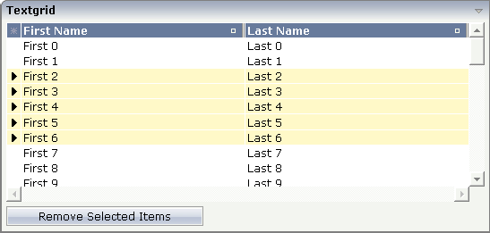
The code below shows an extension of the previous example. It demonstrates how to build a method for taking the line selection into consideration.
Below the TEXTGRID2 definition, there is a button that triggers a method for removing the selected lines.
The XML layout definition is improved in the following way:
<rowarea name="Textgrid">
    <itr takefullwidth="true" fixlayout="true">
        <textgrid2 griddataprop="lines" width="100%" height="200" selectprop="selected"
                   hscroll="true">
            <column name="First Name" property="firstName" width="50%">
            </column>
            <column name="Last Name" property="lastName" width="50%">
            </column>
        </textgrid2>
    </itr>
    <vdist height="5">
    </vdist>
    <itr>
        <button name="Remove Selected Items" method="onRemoveSelectedItems">
        </button>
    </itr>
    <vdist>
    </vdist>
</rowarea>
Note that inside the TEXTGRID2 definition, there is a property
selectprop that points to the name of the item
property used for storing the selection information accordingly.
The method onRemoveSelectedItems was added
into the adapter code of the previous example:
public void onRemoveSelectedItems()
{
    for (int i=m_lines.size()-1; i>=0; i--)
    {
    LinesItem l = (LinesItem)m_lines.get(i);
    if (l.getSelected() == true)
    m_lines.remove(i);
}
The collection is iterated from its last element to its first. All
elements which hold a selected property with value
"true" are removed.
Note:
In this example, you are able to select multiple rows inside the
grid. If you want to allow selecting only one item, use the property
singleselect inside the TEXTGRID2
definition.
In the previous section, you saw how to manage selections inside a TEXTGRID2 control. Sometimes, you want to trigger a certain function when selecting a row - maybe you want to react directly to the selected item.
To do so, you can use some additional properties inside the TEXTGRID2 definition:
The onclickmethod property is used to
point to a method of your adapter class which is called when a click event
occurs.
The ondblclickmethod property is used
when the user double-clicks a grid row.
You can use "direct triggering of method" together with single line selection mode or with multiple line selection mode. In case of using it with multiple line selection, you have to find out which was the "last selected index", i.e. the line index of the clicked/double-clicked line.
There is a property lastselectedprop inside
the TEXTGRID2 definition. Using this definition, you can bind the value to an
integer property of your adapter class. The index value which is selected is
passed into this property.
| Basic | |||
| griddataprop |
Name of adapter property that represents the grid on server side. The property must be of type "TEXTGRIDCollection". var m_items = new TEXTGRIDCollection() Pay attention: once you have created an instance of TEXTGRIDCollection inside your adapter always exactly use this one instance. Do not re-instantiate collection objects! - Example: Instead of... WRONG: m_items = new TEXTGRIDCollection(); ...use... CORRECT: m_items.clear(); |
Obligatory | |
| width |
Width of the control. There are three possibilities to define the width: (A) You do not define a width at all. In this case the width of the control will either be a default width or - in case of container controls - it will follow the width that is occupied by its content. (B) Pixel sizing: just input a number value (e.g. "100"). (C) Percentage sizing: input a percantage value (e.g. "50%"). Pay attention: percentage sizing will only bring up correct results if the parent element of the control properly defines a width this control can reference. If you specify this control to have a width of 50% then the parent element (e.g. an ITR-row) may itself define a width of "100%". If the parent element does not specify a width then the rendering result may not represent what you expect. |
Obligatory |
100 120 140 160 180 200 50% 100% |
| height |
Height of the control. There are three possibilities to define the height: (A) You do not define a height at all. As consequence the control will be rendered with its default height. If the control is a container control (containing) other controls then the height of the control will follow the height of its content. (B) Pixel sizing: just input a number value (e.g. "20"). (C) Percentage sizing: input a percantage value (e.g. "50%"). Pay attention: percentage sizing will only bring up correct results if the parent element of the control properly defines a height this control can reference. If you specify this control to have a height of 50% then the parent element (e.g. an ITR-row) may itself define a height of "100%". If the parent element does not specify a width then the rendering result may not represent what you expect. |
Obligatory |
100 150 200 250 300 250 400 50% 100% |
| comment |
Comment without any effect on rendering and behaviour. The comment is shown in the layout editor's tree view. |
Optional | |
| Selection | |||
| selectableprop |
Name of the adapter parameter used for selectable property for the textgrid(textgridsss) control. |
Optional | |
| selectprop |
Name of property of the item objects - representing the individual rows of the text grid - that is used for selecting rows. Must be of type "boolean"/ "Boolean". If the user selects a text grid row then the value "true" is passed into the corresponding row object's property. |
Optional | |
| singleselect |
If set to "true" then only one row can be selected inside the text grid. - If set to "false" then multiple lines can be selected by using Ctrl- and Shift-key during mouse selection. Default is "false". |
Optional |
true false |
| singleselectprop |
Name of adapter property that dynamically defined whether SINGLESELECT is true or false. Must return 'true' or 'false'. |
Optional | |
| onclickmethod |
Adapter method that is called when the user selects a row. Inside the adapter you can find the selected rows by iterating through the row objects and finding out which one's selection-property is switched to "true". In case of multiple row selection you can also use the method "findLastSelectedItem()" of your corresponding TEXTGRIDCollection object. |
Optional | |
| ondblclickmethod |
Adapter method that is called when the user selects a row by a double click. Inside the adapter you can find the selected rows by iterating through the row objects and finding out which one's selection-property is switched to "true". In case of multiple row selection you can also use the method "findLastSelectedItem()" of your corresponding TEXTGRIDCollection object. |
Optional | |
| withselectioncolumn |
When defining a SELECTPROP property then automatically a selection column is added as first left column of the grid. Inside the column an icon inidicates if a row is currently selected. Set this property to "false" in order to avoid the selection column. |
Optional |
true false |
| withselectioncolumnicon |
Flag that indicates whether the selection column shows a "select all" icon on top. Default is true. |
Optional |
true false |
| fgselect |
if switched to true then an additional "graying" of selected lines will be activated. Switch this property to "true" if you have coloured textgrid cells: the selection colour will not override the colour of each cell, as consequence you require an additional effect in order to make the user see which row is selected. |
Optional |
true false |
| focusedprop |
Name of property of the item objects - representing the individual rows of the text grid - that indicates if the line should receive focus. Must be of type "boolean"/ "Boolean". |
Optional | |
| Right Mouse Button | |||
| oncontextmenumethod |
If clicking on a row of the text grid with the right mouse button then always the method "reactOnContexMenuRequest()" is called inside the corresponding row item object (that itself is kept inside the TEXTGRIDCollection object). If the user clicks with the right mouse button onto an empty area of the grid then there is no object to call - instead the adapter method that is specified by this property is called. |
Optional | |
| singleselectcontextmenu |
With SHIFT and CTRL key the user can select multiple lines (use property SINGLESELECT to suppress this feature). Use this property to ensure that the context menu is requested only for a single line. Default is "false". |
Optional |
true false noselection |
| enabledefaultcontextmenu |
Use this property to enable the default context menu of the browser within the textgrid. Please note: do not enable the browser's context menu if your application itself provides for a context menu. Default is "false". |
Optional |
true false |
| Appearance | |||
| width | (already explained above) | ||
| height | (already explained above) | ||
| minapparentrows |
Number of rows that are displayed independent of the size of the server side collection. |
Optional |
1 2 3 int-value |
| hscroll |
Definition of the horizontal scrollbar's appearance. You can define that the scrollbars only are shown if the content is exceeding the control's area ("auto"). Or scrollbars can be shown always ("scroll"). Or scrollbars are never shown - and the content is cut ("hidden"). Default is "auto". |
Sometimes obligatory |
auto scroll hidden |
| withtitlerow |
If defined as "false" then no top title row is shown. "True" is default. |
Optional |
true false |
| colspan |
Column spanning of control. If you use TR table rows then you may sometimes want to control the number of columns your control occupies. By default it is "1" - but you may want to define the control to span over more than one columns. The property only makes sense in table rows that are snychronized within one container (i.e. TR, STR table rows). It does not make sense in ITR rows, because these rows are explicitly not synched. |
Optional |
1 2 3 4 5 50 int-value |
| rowspan |
Row spanning of control. If you use TR table rows then you may sometimes want to control the number of rows your control occupies. By default it is "1" - but you may want to define the control to span over more than one columns. The property only makes sense in table rows that are snychronized within one container (i.e. TR, STR table rows). It does not make sense in ITR rows, because these rows are explicitly not synched. |
Optional |
1 2 3 4 5 50 int-value |
| personalizable |
If defined to "false" then no re-arranging of columns is offered to the user. Default is "true". This means: if using COLUMN controls inside the grid definition then the user can re-arrange the sequence of columns by dragging and dropping them within the top title row. |
Optional |
true false |
| stylevariant |
Some controls offer the possibility to define style variants. By this style variant you can address different styles inside your style sheet definition file (.css). If not defined "normal" styles are chosen, if defined (e.g. "VAR1") then other style definitions (xxxVAR1xxx) are chosen. Purpose: you can set up style variants in the style sheet defintion and use them multiple times by addressing them via the "stylevariant" property. CIS currently offerst two variants "VAR1" and "VAR2" but does not predefine any semantics behind - this is up to you! |
Optional |
VAR1 VAR2 |
| stylevariantprop |
Name of the adapter property which dynamically defines the STYLEVARIANT value at runtime. |
Optional |
VAR1 VAR2 |
| backgroundstyle |
CSS style definition that is directly passed into this control. With the style you can individually influence the rendering of the control. You can specify any style sheet expressions. Examples are: border: 1px solid #FF0000 background-color: #808080 You can combine expressions by appending and separating them with a semicolon. Sometimes it is useful to have a look into the generated HTML code in order to know where direct style definitions are applied. Press right mouse-button in your browser and select the "View source" or "View frame's source" function. |
Optional | |
| vscroll |
Definition of the vertical scrollbar's appearance. You can define that scrollbars only are shown if the content is exceeding the control's area ("auto"). Or scrollbars can be shown always ("scroll"). Or scrollbars are never shown - and the content is cut ("hidden"). Default is "scroll". |
Optional |
auto scroll hidden |
| withrollover |
The textgrid controls provide for a so called "roll over" effect. The row that is currently below the mouse pointer is highlighted in a certain way. Use this property to disable the roll over effect (Default is TRUE). |
Optional |
true false |
| fixedcolumnsizes |
When switching the FIXEDCOLUMNSIZES property to value "true" then internally the grid is arranged in a way that the area always determines its size out of the width specification of the COLUMN controls. The browser does not look into the column contents in order to try to optimise the size of the area - but always follows the width that you define. |
Optional |
true false |
| requiredheight |
Minimum height of the control in pixels. Use this property to ensure a minimum height if the overall control's height is a percentage of the available space - i.e. if value of property HEIGHT is a percentage (e.g. 100%). Please note:You must not use FIXLAYOUT at the surrounding row container (ITR and ROWAREA). Otherwise: if the available space is less than the required height the end of the control is just cut off. |
Optional |
1 2 3 int-value |
| disablecolumnresizing |
Flag that indicates if the user can change the width of the grid columns. Default is false. |
Optional |
true false |
| disablecolumnmoving |
Flag that indicates if the user can change the order of grid columns. Default is false. |
Optional |
true false |
| tabindex |
Index that defines the tab order of the control. Controls are selected in increasing index order and in source order to resolve duplicates. |
Optional |
-1 0 1 2 5 10 32767 |
| Drag And Drop | |||
| draginfoprop |
Name of the row item property that passes back the line's "drag info". When using this attribute the grid lines can be dragged onto "drop targets" (e.g. DROPICON control). The dragged line is identified by its "drag info". Use any string/information applicable. |
Optional | |
| Miscellaneous | |||
| testtoolid |
Use this attribute to assign a fixed control identifier that can be later on used within your test tool in order to do the object identification |
Optional | |
| Deprecated | |||
| directselectevent |
Use ONCLICKMETHOD and ONDBLCLICKMETHOD instead. |
Optional |
ondblclick onclick |
| directselectmethod |
Use ONCLICKMETHOD and ONDBLCLICKMETHOD instead. |
Optional | |
The COLUMN tag is the typical tag that is placed inside a TEXTGRID2 definition. The COLUMN definition defines a column with its binding to a property of the collection elements.
Tip:
If you set the property headernowrap="false", you usually
have to increase the height of the header in the style sheet of your layout
page. You can do this in the Style Sheet Editor: Go to the Style
Details tab, expand the tree for TEXTGRID and then adjust the
height value for
TEXTGRIDCellHeaderUnsorted.
| Basic | |||
| name |
Text that is displayed inside the control. Please do not specify the name when using the multi language management - but specify a "textid" instead. |
Sometimes obligatory | |
| textid |
Multi language dependent text that is displayed inside the control. The "textid" is translated into a corresponding string at runtime. Do not specify a "name" inside the control if specifying a "textid". |
Sometimes obligatory | |
| property |
Property of the row item object that represents the column's content. The content typically is straight text but can also be "complex HTML". |
Obligatory | |
| width |
Width of the control. There are two possibilities to define the width: (A) Pixel sizing: just input a number value (e.g. "100"). (B) Percentage sizing: input a percentage value (e.g. "50%"). Pay attention: percentage sizing will only bring up correct results if the parent element (textgrid2, textgridsss2) of the control properly defines a width this control can reference. |
Obligatory |
100 120 140 160 180 200 50% 100% |
| comment |
Comment without any effect on rendering and behaviour. The comment is shown in the layout editor's tree view. |
Optional | |
| Appearance | |||
| datatype |
By default, the control is managing its content as string. By explicitly setting a datatype you can define that the control will format the data coming from the server: if the field has datatype "date" and the user inputs "010304" then the input will be translated into "01.03.2004" (or other representation, dependent on date format settings). Please note: the datatype "float" is named a bit misleading - it represents any decimal format number. The server side representation may be a float value, but also can be a double or a BigDecimal property. |
Optional |
date float int long time timestamp color xs:decimal xs:double xs:date xs:dateTime xs:time ------------------------ N n.n P n.n string n L xs:boolean xs:byte xs:short |
| align |
Horizontal alignment of the control's content. Default is "center". |
Optional |
left center right |
| straighttext |
If the text of the control contains HTML tags then these are by default interpreted by the browser. Specifiying STRAIGHTTEXT as "true" means that the browser will directly render the characters without HTML interpretation. Example: if you want to output the source of an HTML text then STRAIGHTTEXT should be set to "true". |
Optional |
true false |
| convertspaces |
If switched to "true" then all spaces inside the text that is rendered into the column are converted to non breakable spaces (andnbsp\"). Use this option if you have "meaningful" spaces inside the values you return from the server adapter object, e.g. if outputting some ASCII protocol inside a column. |
Optional |
true false |
| cuttextline |
If switched to "false" then the content of the column is broken if it excceeds the column's width definition. Default is "true" i.e. if the content is too big for the column cell then it is cut. |
Optional |
true false |
| withsorticon |
Flag that indicates if a small sort indicator is shown within the right corner of the control. Default is TRUE. |
Optional |
true false |
| headerimage |
URL of image that is displayed inside the control. Any image type (.gif, .jpg, ...) that your browser does understand is valid. Use the following options to specify the URL: (A) Define the URL relative to your page. Your page is generated directly into your project's folder. Specifiying "images/xyz.gif" will point into a directory parallel to your page. Specifying "../HTMLBasedGUI/images/new.gif" will point to an image of a neighbour project. (B) Define a complete URL, like "http://www.softwareag.com/images/logo.gif". |
Optional | |
| headernowrap |
The textual content of the header is not wrapped automatically. No line break will be performed automatically by the browser. If you want the text of the header to be wrapped, set the value to "false". |
Optional |
true false |
| Binding | |||
| property | (already explained above) | ||
| textstyleprop |
Name of the property of the row item object that passes back a style-string that is used for rendering the column's content. As consequence you can indiviudally assign a CSS-style to each cell of your text grid. |
Optional | |
| textclassprop |
Name of the property of the row item object that defines a style class to be used for rendering the content. You can set up a limited number of style classes inside your style sheet definition - and dynamically reference them per grid cell. |
Optional | |
| imageprop |
Name of the property of the row item object passing back an image URL. The image is rendered at the very left of the column's area - in front of the text (PROPERTY property definition). |
Optional | |
| linkmethod |
Name of a method within the row item object that is called if user clicks the column's text. |
Optional | |
| celllinkmethodprop |
Name of the row item property that passes back the name of a method or null. If the method name is not null then the corresponding column (cells) will show the text as method link. On click the provided row item cell method is called. |
Optional | |
| celltitleprop |
Name of the property of the row item object that passes back the tooltip of this cell. |
Optional | |
| Online help | |||
| title |
Text that is shown as tooltip for the control. Either specify the text "hard" by using this TITLE property - or use the TITLETEXTID in order to define a language dependent literal. |
Optional | |
| titletextid |
Text ID that is passed to the multi lanaguage management - representing the tooltip text that is used for the control. |
Optional | |
| sorttitle |
Text that is shown as tooltip for the sort indicator. Either input text by using this SORTTITLE property - or use the SORTTITLETEXTID in order to define a language dependent literal. |
Optional | |
| sorttitletextid |
Text ID that is passed to the multi lanaguage management - representing the tooltip text for the sort indicator. |
Optional | |
| celltitleprop | (already explained above) | ||
The example from the previous sections will now be enhanced in order to demonstrate how to control the style of cells inside a TEXTGRID2 control dynamically:
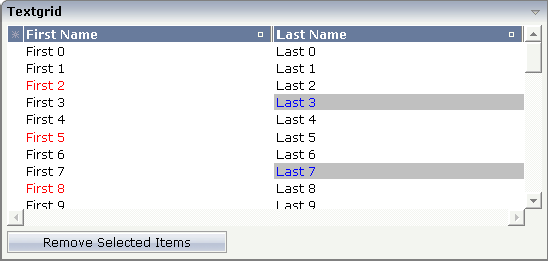
Some of the cells in the TEXTGRID2 control are rendered with a different
style than the normal one. Each COLUMN definition has the property
textstyleprop:
<rowarea name="Textgrid">
    <itr takefullwidth="true" fixlayout="true">
        <textgrid2 griddataprop="lines" width="100%" height="200" selectprop="selected"
                   hscroll="true">
            <column name="First Name" property="firstName" width="50%"
                    textstyleprop="firstNameStyle">
            </column>
            <column name="Last Name" property="lastname" width="50%"
                    textstyleprop="lastNameStyle">
            </column>
        </textgrid2>
    </itr>
    <vdist height="5">
    </vdist>
    <itr>
        <button name="Remove Selected Items" method="onRemoveSelectedItems">
        </button>
    </itr>
</rowarea>
The referenced property inside the COLUMN definition is on the same
level as the normal property that is responsible for the content of the columns
and which is referenced by the normal property
property. Have a look at the Java source:
// This class is a generated one.

import com.softwareag.cis.server.Adapter;
import com.softwareag.cis.server.util.SelectableLine;
import com.softwareag.cis.server.util.TEXTGRIDCollection;

// This class is a generated one.

public class TextGridAdapter
    extends Adapter
{
    // class >LinesItem<
    public class LinesItem
    extends SelectableLine
    {
        // property >firstName<
        String m_firstName;
        public String getFirstName() { return m_firstName; }

        // property >lastName<
        String m_lastName;
        public String getLastName() { return m_lastName; }

        // property >selected<
        boolean m_selected;
        public boolean getSelected() { return m_selected; }
        public void setSelected(boolean value) { m_selected = value; }

        // property >firstNameStyle<
        String m_firstNameStyle;
        public String getFirstNameStyle() { return m_firstNameStyle; }
        public void setFirstNameStyle(String value) { m_firstNameStyle = value; }

        // property >lastNameStyle<
        String m_lastNameStyle;
        public String getLastNameStyle() { return m_lastNameStyle; }
        public void setLastNameStyle(String value) { m_lastNameStyle = value; }
    }

    // property >lines<
    TEXTGRIDCollection m_lines = new TEXTGRIDCollection();
    public TEXTGRIDCollection getLines() { return m_lines; }

    ...

    /** initialisation - called when creating this instance*/
    public void init()
    {
        for (int i=0; i< 50; i++)
        {
        LinesItem l = new LinesItem();
        l.m_firstName = "First " + i;
        l.m_lastName = "Last " + i;
        if (i%3 == 2)
            l.setFirstNameStyle("color: #FF0000;");
        if (i%4 == 3)
            l.setLastNameStyle("color: #0000FF; background-color: #C0C0C0");
        m_lines.add(l);
        }
    }
}
The properties lastNameStyle and
firstNameStyle are available on item level. They
are filled in the init() method.
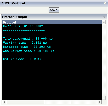
The following example shows the output of an ASCII protocol. The example
demonstrates the usage of the COLUMN properties
textstyleprop and
convertspaces.
The XML layout definition looks as follows:
<page model="Ascii_Protocol_Adapter">
    <titlebar name="ASCII Protocol">
    </titlebar>
    <header withdistance="false">
        <button name="Save">
        </button>
    </header>
    <pagebody>
        <rowarea name="Protocol Output">
            <itr takefullwidth="false" height="350" fixlayout="true">
                <textgrid2 griddataprop="items" width="100%" height="100%" hscroll="true"
                           vscroll="true" backgroundstyle="background-color:#000000">
                    <column name="Protocol" property="protocolText" width="1000"
                            textstyleprop="protocolStyle" convertspaces="true">
                    </column>
                </textgrid2>
            </itr>
        </rowarea>
    </pagebody>
    <statusbar withdistance="false">
    </statusbar>
</page>
The following is defined in the above layout definition:
Inside the TEXTGRID2 definition, a black background is defined
(backgroundstyle property).
Inside the COLUMN definition, a style property is referenced
(textstyleprop property).
Inside the COLUMN definition, the property
convertspaces is set to
"true".
The Java source looks as follows:
import com.softwareag.cis.server.Adapter;
import com.softwareag.cis.server.util.TEXTGRIDCollection;

// This class is a generated one.

public class Ascii_Protocol_Adapter
    extends Adapter
{
    // ------------------------------------------------------------------------
    // inner classes
    // ------------------------------------------------------------------------

    // class >ItemsItem<
    public class Item
    {
        // property >protocolStyle<
        String m_centralStyle = "font-family: courier; color: #00FFFF; background-color: #000000;";
        String m_protocolStyle;
        public String getProtocolStyle() { return m_centralStyle; }

        // property >protocolText<
        String m_protocolText;
        public String getProtocolText() { return m_protocolText; }
        public void setProtocolText(String value) { m_protocolText = value; }
    }
    // ------------------------------------------------------------------------
    // property access
    // ------------------------------------------------------------------------

    // property >items<
    TEXTGRIDCollection m_items = new TEXTGRIDCollection();
    public TEXTGRIDCollection getItems() { return m_items; }

    // ------------------------------------------------------------------------
    // standard adapter methods
    // ------------------------------------------------------------------------

    /** initialisation - called when creating this instance*/
    public void init()
    {
        Item item;
        item = new Item(); item.setProtocolText("BATCH RUN (01.04.2002)"); m_items.add(item);
        item = new Item(); item.setProtocolText("======================"); m_items.add(item);
        item = new Item(); item.setProtocolText(""); m_items.add(item);
        item = new Item(); item.setProtocolText("Time consuumed : 48.000 ms");
        m_items.add(item);
        item = new Item(); item.setProtocolText("Waiting time : 3.452 ms");
        m_items.add(item);
        item = new Item(); item.setProtocolText("Database time : 32.203 ms");
        m_items.add(item);
        item = new Item(); item.setProtocolText("App Server time : 10.485 ms");
        m_items.add(item);
        item = new Item(); item.setProtocolText(""); m_items.add(item);
        item = new Item(); item.setProtocolText("Return Code : 0 (OK)"); m_items.add(item);
    }
}
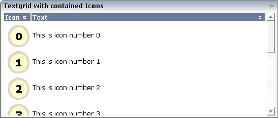
In the following text grid, graphical information and text information are mixed:
The layout definition looks as follows:
<rowarea name="Textgrid with contained Icons">
    <itr takefullwidth="tue">
        <textgrid2 griddataprop="lines" width="100%" height="200">
            <column name="Icon" width="53" imageprop="iconURL">
            </column>
            <column name="Text" property="text" width="100%">
            </column>
        </textgrid2>
    </itr>
</rowarea>
In the definition of the left column, the property
imageprop is used to reference to a property that
provides the URL string of the image to be displayed. The definition of the
right column contains the property property that
points to a property providing text information.
The adapter class looks as follows:
// This class is a generated one.

import com.softwareag.cis.server.Adapter;
import com.softwareag.cis.server.util.TEXTGRIDCollection;

public class Textgrid_02_Adapter
    extends Adapter
    {
    // ------------------------------------------------------------------------
    // inner classes
    // ------------------------------------------------------------------------
    // class >LinesItem<
    public class LinesItem
    {
        // property >iconURL<
        String m_iconURL;
        public String getIconURL() { return m_iconURL; }
        public void setIconURL(String value) { m_iconURL = value; }

        // property >text<
        String m_text;
        public String getText() { return m_text; }
        public void setText(String value) { m_text = value; }
    }
    // ------------------------------------------------------------------------
    // property access
    // ------------------------------------------------------------------------
    // property >lines<
    TEXTGRIDCollection m_lines = new TEXTGRIDCollection();
    public TEXTGRIDCollection getLines() { return m_lines; }

    // ------------------------------------------------------------------------
    // standard adapter methods
    // ------------------------------------------------------------------------
   /** initialisation - called when creating this instance*/
    public void init()
    {
        for (int i=0; i<10; i++)
        {
        LinesItem l = new LinesItem();
        l.setIconURL("images/touch_"+i+".gif");
        l.setText("This is icon number " + i);
        m_lines.add(l);
        }
    }
You can also mix text and image by specifying the
property and the
imageprop property. In this case, the image will
be drawn on the left and the text will be placed to the right of the image.
The sizing of text grids was improved with a previous release: now you can simply set a width of e.g. "100%" if the text grid should cover the complete width that is available.
Pay attention to the following:
If you do not specify a width inside the TEXTGRID2 definition, the width of the grid will be as wide as defined by its content. Of course, it does not make sense to define a percentage value inside the COLUMN definitions - there is nothing to refer to.
If you specify a width in the TEXTGRID2 and you already know that the
size of the columns does not fit into the given width, you must set the flag
HSCROLL to "true". Otherwise, there
will be no scrolling at all and the grid will be rendered as wide as required
by its content.
If you specify a percentage value as a width for the TEXTGRID2
control, you must place the grid into an ITR definition that itself has also a
WIDTH definition (typically of "100%"). In addition,
you must set the flag FIXLAYOUT to
"true" on ITR level. Otherwise the grid will follow
the width of its contained columns.
In order to improve performance on the client side, there is a so-called change index management: a text grid binds to an array of data records. Every time when the browser client receives updated data from the server, it finds out whether a text grid has to be updated or not. Updating a text grid is a quite expensive operation for the client - consequently, it is done only if really necessary.
For this reason, each TEXTGRIDCollection object
implicitly administers a change index. A change index is a property of type
long. The value of the property always changes if something inside
the collection changes. The client reads this property and only refreshes the
text grid if the property has changed.
Normally, the property is managed internally - without you being
involved. If a TEXTGRIDCollection is manipulated via its
methods (e.g. add or clear),
then the property is automatically updated - and consequently, the client
refreshes. But: if a change of data happens inside one item of a
TEXTGRIDCollection, then the call does not go through
the TEXTGRIDCollection API. Consequently, you have to
explicitly trigger the update by your program. Inside the
TEXTGRIDCollection, there is a method
itemChanged() which indicates that due to the change
of data within one item the grid has to be updated.
The following example shows how to control the change index. In this example, a text grid is built and manipulated by three buttons:
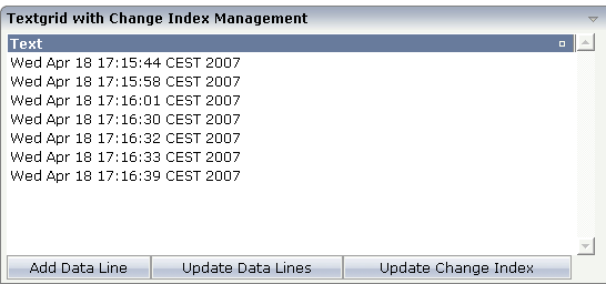
With the first button, new items are added to the grid. With the second button, all items receive new content. With the third button, the change index will be updated.
The XML code is:
<rowarea name="Textgrid with Change Index Management">
    <itr>
        <textgrid2 griddataprop="lines_02" width="100%" height="200">
            <column name="Text" property="text" width="100%">
            </column>
        </textgrid2>
    </itr>
    <itr>
        <button name="Add Data Line" method="onAddDataLine">
        </button>
        <button name="Update Data Lines" method="onUpdateDataLines">
        </button>
        <button name="Update Change Index" method="onUpdateChangeIndex">
        </button>
    </itr>
</rowarea>
The Java adapter source is shown below. Pay attention to the constructor
of the m_lines member (which passes
"true" as a parameter) and to the method
m_lines.itemChanged() that is called in order to
update the change index implicitly.
// This class is a generated one.

import java.util.Date;
import java.util.Iterator;

import com.softwareag.cis.server.Adapter;
import com.softwareag.cis.server.util.TEXTGRIDCollection;

public class Textgrid_02_Adapter
    extends Adapter
{
    // ------------------------------------------------------------------------
    // inner classes
    // ------------------------------------------------------------------------
    // class >Lines_02Item<
    public class Lines_02Item
    {
        // property >text<
        String m_text;
        public String getText() { return m_text; }
        public void setText(String value) { m_text = value; }
    }
    // ------------------------------------------------------------------------
    // property access
    // ------------------------------------------------------------------------

    // property >lines_02<
    TEXTGRIDCollection m_lines_02 = new TEXTGRIDCollection();
    public TEXTGRIDCollection getLines_02() { return m_lines_02; }

    // ------------------------------------------------------------------------
    // public adapter methods
    // ------------------------------------------------------------------------
    /** */
    public void onAddDataLine()
    {
        Lines_02Item l = new Lines_02Item();
        l.setText((new Date()).toString());
        m_lines_02.add(l);
    }

    /** */
    public void onUpdateChangeIndex()
    {
        m_lines_02.itemChanged();
    }

    /** */
    public void onUpdateDataLines()
    {
        Iterator iter = m_lines_02.iterator();
        while (iter.hasNext())
        {
        Lines_02Item l = (Lines_02Item)iter.next();
        l.setText((new Date()).toString());
        }
    }
}
The behavior of the text grid control is as follows:
If a new line is added (method
onAddDataLine()), the change index will be updated
internally - you do not have to explicitly tell the text grid management that
something has changed.
If the lines are updated (method
onUpdateDataLines()), changes will not be reflected in
the grid - until you explicitly trigger the method
onUpdateChanngeIndex().
Consequence: every time you change the inner content of the grid data, you have to update the change index by yourself.
There are situations in which the number and the format of the columns of a text grid cannot be defined in a fixed way inside the layout definition. The column type CSVCOLUMN allows you to dynamically define columns of a grid by your adapter program.
Have a look at the following example:
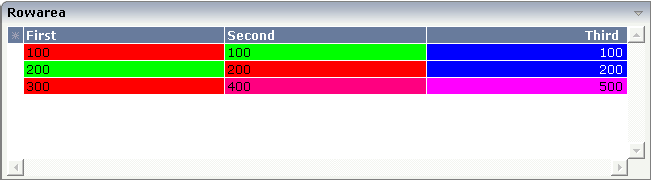
The control looks like a normal text grid. When looking inside the XML layout definition, you find out that instead of three fixed columns there is one dynamic column definition:
<rowarea name="Rowarea">
    <itr>
        <textgrid2 griddataprop="lines" width="100%" height="150" selectprop="selected"
                   singleselect="true" hscroll="true">
            <csvcolumn titlesprop="gridTitles" valuesprop="values" widthsprop="gridWidths"
                       alignsprop="gridAligns" backgroundsprop="backgrounds">
            </csvcolumn>
        </textgrid2>
    </itr>
</rowarea>
Inside the CSVCOLUMN definition, there is a binding to various properties that are provided for by the corresponding adapter:
// This class is a generated one.

import com.softwareag.cis.file.CSVManager;
import com.softwareag.cis.server.Adapter;
import com.softwareag.cis.server.util.TEXTGRIDCollection;


public class textgrid_03_Adapter
    extends Adapter
{
    // ------------------------------------------------------------------------
    // inner classes
    // ------------------------------------------------------------------------
   // class >LinesItem<
    public class LinesItem
    {
        public LinesItem (String values, String backgrounds)
        {
            m_values = values;
            m_backgrounds = backgrounds;
        }

        // property >backgrounds<
        String m_backgrounds;
        public String getBackgrounds() { return m_backgrounds; }
        public void setBackgrounds(String value) { m_backgrounds = value; }

        // property >selected<
        boolean m_selected;
        public boolean getSelected() { return m_selected; }
        public void setSelected(boolean value) { m_selected = value; }

        // property >values<
        String m_values;
        public String getValues() { return m_values; }
        public void setValues(String value) { m_values = value; }
    }
    // ------------------------------------------------------------------------
    // property access
    // ------------------------------------------------------------------------
    String m_gridAligns = CSVManager.encodeString(new String[] {
            "left",
            "left",
            "right"
            });
    public String getGridAligns() { return m_gridAligns; }

    String m_gridTitles = CSVManager.encodeString(new String[] {
            "First",
            "Second",
            "Third"
            });
    public String getGridTitles() { return m_gridTitles; }

    String m_gridWidths = CSVManager.encodeString(new String[] {
            "200",
            "200",
            "200"
            });
     public String getGridWidths() { return m_gridWidths; }

    // property >lines<
    TEXTGRIDCollection m_lines = new TEXTGRIDCollection();
    public TEXTGRIDCollection getLines() { return m_lines; }

    // ------------------------------------------------------------------------
    // public adapter methods
    // ------------------------------------------------------------------------
    /** initialisation - called when creating this instance*/
    public void init()
    {
        m_lines.add(new LinesItem("100;100;100","#FF0000;#00FF00;#0000FF"));
        m_lines.add(new LinesItem("200;200;200","#00FF00;#FF0000;#0000FF"));
        m_lines.add(new LinesItem("300;400;500","#FF0000;#FF0080;#FF00FF"));
    }
}
The information for creating dynamic columns is passed as comma
separated values. Comma separated values are either created directly as a
string or by calling a static method of the class
com.softwareag.cis.file.CSVManager.
Note:
When using the CSVManager methods for creating
comma separated value strings, this always pays attention to what happens if
strings already include one or more semicolons.
Example: the CSVManager will encode the strings
"A", "B1;B2" and
"C" to "A;B1\;B2;C". On
the client side, the "\;" is decoded back to
";".
Compare the layout definition with the code example in order to find out the exact binding technique between the control and the adapter properties.
Tip:
If you set the property headernowrap="false", you usually
have to increase the height of the header in the style sheet of your layout
page. You can do this in the Style Sheet Editor: Go to the Style
Details tab, expand the tree for TEXTGRID and then adjust the
height value for
TEXTGRIDCellHeaderUnsorted.
The properties of the CSVCOLUMN control are:
| Basic | |||
| titlesprop |
Name of adapter property provding a semicolon-separated string containing the titles to be displayed. Example for a value that is passed back by the property: "First Name;Last Name;Street"" |
Obligatory | |
| valuesprop |
Name of row item property that passes back the content of the cells - as semicolon-separated string. |
Obligatory | |
| widthsprop |
Name of adapter property provding a semicolon-separated string containing the widths of the columns to be displayed. Example for a value that is passed back by the property: "100;200;100%"" |
Obligatory | |
| alignsprop |
Name of adapter property provding a semicolon-separated string containing the horizontal alignment of the columns to be displayed. Example for a value that is passed back by the property: "left\"center;right"" |
Sometimes obligatory | |
| backgroundsprop |
Name of adapter property provding a semicolon-separated string containing the background color of the columns to be displayed. Example for a value that is passed back by the property: "\"#C0C0C0;#FF0000"" |
Optional | |
| proprefsprop |
Name of adapter property provding a semicolon-separated string containing the row item properties that are internally used to build up the value string. The property names are used for sorting: if the user invoke the sorting of the grid by clicking on the corresponding icons inside the title cell then this column needs to be associated with an internal property that is used for sorting. Example: "firstName\"lastName;street"" |
Optional | |
| comment |
Comment without any effect on rendering and behaviour. The comment is shown in the layout editor's tree view. |
Optional | |
| Appearance | |||
| straighttext |
If the text of the control contains HTML tags then these are by default interpreted by the browser. Specifiying STRAIGHTTEXT as "true" means that the browser will directly render the characters without HTML interpretation. Example: if you want to output the source of an HTML text then STRAIGHTTEXT should be set to "true". |
Optional |
true false |
| cuttextline |
If switched to "false" then the content of the column is broken if it excceeds the column's width definition. Default is "true" i.e. if the content is too big for the column cell then it is cut. |
Optional |
true false |
| headernowrap |
The textual content of the header is not wrapped automatically. No line break will be performed automatically by the browser. If you want the text of the header to be wrapped, set the value to "false". |
Optional |
true false |
| withgridcolheaders |
Flag that indicates if the user can resize column widths and re-order columns by drag and drop. Default is false. If set to true the corresponding adapter program must register as "column change event" listener. Use method TEXTGRIDCollection.registerGridColHeaderChangeListener for that. |
Optional |
true false |
| Additional Binding | |||
| textstyleprop |
Name of the property of the row item object that passes back a style-string that is used for rendering the column's content. As consequence you can indiviudally assign a CSS-style to each cell of your text grid. |
Optional | |
| textclassprop |
Name of the property of the row item object that defines a style class to be used for rendering the content. You can set up a limited number of style classes inside your style sheet definition - and dynamically reference them per grid cell. |
Optional | |
| straighttextprop |
Name of the property which dynamicalle defines whether STRAIGHTTEXT is true or false. |
Optional | |
| sorttitlesprop |
Name of adapter property provding a semicolon-separated string containing the titles to be displayed. Example for a value that is passed back by the property: "Click here to sort column First Name\" Click here to sort column Last Name; Click here to sort column Street"" |
Optional | |
| tooltiptitlesprop |
Name of adapter property provding a semicolon-separated string containing the tooltip tip texts to be displayed when the mouse is moved over the column headers. |
Optional | |
| linkmethodsprop |
Name of the property of the row item object that passes back (comma separated) names of row item methods. The corresponding columns will show the text as method links. On click the provided row item method is called. |
Optional | |
| celllinkmethodsprop |
Name of the row item property that passes back (comma separated) names of cell methods. The corresponding columns (cells) will show the text as method links. On click the provided row item cell method is called. |
Optional | |
| celltooltiptitleprop |
Name of the property of the row item object that passes back (comma separated) tool tip titles. The titles will show up if the user is moving slowly the mouse over the grid cells. |
Optional | |
| imageprop |
Name of the property of the row item object that passes back (comma separated) image URLs. The URL must either be an absolute URL or a relative URL. |
Optional | |
| headerimageprop |
Name of the property that passed back (comma separated) image URLs. The images are applied to the header. |
Optional | |