The ROWTABLEAREA2 is a container control that allows other controls to be arranged inside its grid management.
This document covers the following topics:
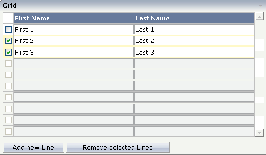
There is a grid that contains a header row and 10 lines. Each line contains one check box and two fields. Some of the lines are highlighted.
The XML layout definition is:
<rowarea name="Grid">
    <rowtablearea2 griddataprop="lines" rowcount="10" width="100%" withborder="true">
        <tr>
            <hdist>
            </hdist>
            <label name="First Name" asheadline="true">
            </label>
            <label name="Last Name" asheadline="true">
            </label>
        </tr>
        <repeat>
            <str valueprop="selected">
                <checkbox valueprop="selected" flush="screen" width="30">
                </checkbox>
                <field valueprop="firstname" width="50%">
                </field>
                <field valueprop="lastname" width="50%">
                </field>
            </str>
        </repeat>
    </rowtablearea2>
    <vdist height="10">
    </vdist>
    <itr>
        <button name="Add new Line" method="onAddLine">
        </button>
        <hdist>
        </hdist>
        <button name="Remove selected Lines" method="onRemoveLines">
        </button>
    </itr>
</rowarea>
Note the following:
There is a ROWTABLEAREA2 definition with the property
griddataprop="lines". There is a
rowcount definition of
"10". This is the same as for the text grid
processing: the grid container is bound to a server-side collection. Similar to
the TEXTGRIDSSS2 definition, there is a row count that defines the number of
lines.
Inside the ROWTABLEAREA2 definition, there is first the definition of
a normal table row (TR) in which a distance and two labels are defined. The
labels are rendered with asheadline="true".
Inside the REPEAT definition, there is a special table row definition "STR" (selectable table row) that itself contains one CHECKBOX and two FIELD definitions. CHECKBOX and FIELDs are bound to properties themselves.
After the ROWTABLEAREA2 definition, there is a vertical distance and a row that contains two buttons with which a user can manipulate the grid.
The content of the REPEAT block is repeated as many times as defined
inside the rowcount definition of ROWTABLEAREA2.
The content holds a table row (STR) - therefore the result is a grid.
The Java code of the adapter is:
// This class is a generated one.

import java.util.Iterator;
import java.util.Vector;

import com.softwareag.cis.server.Adapter;
import com.softwareag.cis.server.util.GRIDCollection;

public class rowtabarea2_adapterAdapter
    extends Adapter
{
    // ------------------------------------------------------------------------
    // inner classes
    // ------------------------------------------------------------------------
    // class >LinesItem<
    public class LinesItem
    {
        // property >firstname<
        String m_firstname;
        public String getFirstname() { return m_firstname; }
        public void setFirstname(String value) { m_firstname = value; }

        // property >lastname<
        String m_lastname;
        public String getLastname() { return m_lastname; }
        public void setLastname(String value) { m_lastname = value; }

        // property >selected<
        boolean m_selected;
        public boolean getSelected() { return m_selected; }
        public void setSelected(boolean value) { m_selected = value; }
    }
    // ------------------------------------------------------------------------
    // property access
    // ------------------------------------------------------------------------
    // property >lines<
    GRIDCollection m_lines = new GRIDCollection();
    GRIDCollection getLines() { return m_lines; }

    // ------------------------------------------------------------------------
    // public adapter methods
    // ------------------------------------------------------------------------
    /** */
    public void onAddLine()
    {
        LinesItem l = new LinesItem();
        m_lines.add(l);
    }

    /** */
    public void onRemoveLines()
    {
        Vector v = new Vector();
//      collect all elements to be deleted
        Iterator iter = m_lines.iterator();
        while (iter.hasNext())
        {
            LinesItem l = (LinesItem)iter.next();
            if (l.getSelected() == true)
                v.addElement(l);
        }
//      delete elements
        iter = v.iterator();
        while (iter.hasNext())
            m_lines.remove(iter.next());
    }
}
Programming the grid is very simple. Define an instance of the class
GRIDCollection in which you hold the items. This
instance is referenced by the griddataprop
definition inside the ROWTABLEAREA2 tag.
Each element inside the collection itself supports the properties that are referenced by the controls inside the REPEAT block. In our example, the properties are referenced by the STR, CHECKBOX and FIELD controls.
Use any "normal controls" inside the REPEAT block. For
example, use either the BUTTON control or the ICON control. Properties of these
included controls are called inside the item class lines
and not directly in the adapter class.
The class GRIDCollection is the parent of
TEXTGRIDCollection. It manages all aspects of
server-side scrolling that is used internally.
Similar to the TEXTGRIDSSS2 control, the ROWTABLEAREA2 controls offers two properties for defining its height:
rowcount and
height
If only rowcount is defined, the control
will be always rendered with exactly the same number of lines - the one defined
by the rowcount property.
If the height is specified additionally,
the height of the grid will follow the height
definition. The number of rows consequently follows the available vertical
space. In this case, rowcount is the maximum
number of rows that is exchanged.
Background information: if you have a look at the generated HTML page for an XML layout definition containing a ROWTABLEAREA2 grid, then you will see that each row of the grid is rendered into corresponding controls. If a ROWTABLEAREA2 contains 10 lines where each line has three FIELD controls, then the result will be an HTML page containing 30 fields.
Consequently, the rowcount property - when
also specifying the height - should be carefully
selected. You must not simply define a rowcount of
"100" because then you will get very large HTML
pages that become too large to be operated in a fast way. On the other hand,
the rowcount should fit into normal screen sizes
and should not be too low. Have in mind the screen sizes of your users and
decide accordingly.
When does it make sense to have a height
and a rowcount definition? Typically, it does not
make sense to define a fixed height (for example,
"200") for ROWTABLEAREA2 controls: instead of
defining fixed heights, you should size the grid by using
rowcount only. But it makes sense if you have
flexible heights, for example, a height of "100%".
In this case, the actual height depends on the size of the user's screen and
the grid can thus be sized in a flexible way.
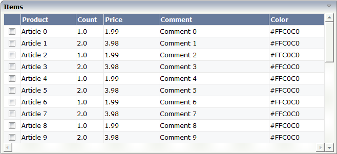
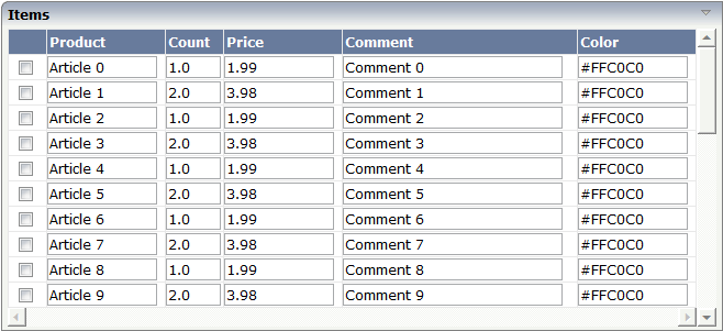
Fields typically contain a high number of FIELD controls. Typically, a FIELD control has a certain rendering that renders a field with a border and with a certain background color.
Be aware that inside the FIELD definition, there are two important properties:
noborder - if set to
"true", no border will be drawn
transparentbackground - if set to
"true", the field will always take over the
background of the controls in which it is positioned (e.g. STR row).
Have a look at the difference between the following screens. One screen uses the properties, the other screen does not use them.
This is a grid:
This is collection of fields:
For information on how to build the lines of a grid dynamically, see the description of the FLEXLINE control.
If using input controls (FIELD, CHECKBOX, COMBOBOX) inside a grid, then there are two special events that may be passed to your application.
FWDTABKEYMETHOD of ROWTABLEAREA2: this is the
method that is called when the user presses the TAB key within the
rightmost field of the grid.
BWDTABKEYMETHOD of ROWTABLEAREA2: this is the
method that is called when the user presses SHIFT+TAB on the
leftmost control of the grid.
You can use these events for various purposes:
You may create a new item below the existing one when the user leaves the rightmost field.
You may want to trigger the scrolling of the grid if the user tabs through the last right field.
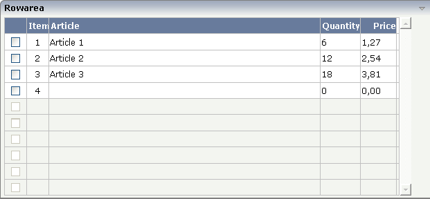
In the following example, every time the user leaves the rightmost field of the grid, a new item is created:
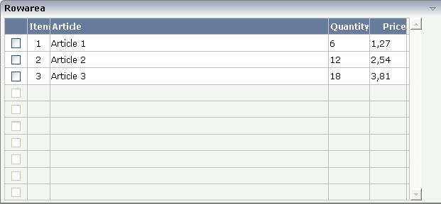
When the user now presses TAB in the last field, the screen will look as follows:
The XML layout is:
...
...
...
<rowtablearea2 griddataprop="lines" rowcount="10" fwdtabkeymethod="endofLineProcessing">
    <tr>
        <label name=" " width="30" asheadline="true" labelstyle="text-align:center">
        </label>
        <label name="Item" width="30" asheadline="true">
        </label>
        <label name="Article" width="400" asheadline="true">
        </label>
        <label name="Quantity" asheadline="true" labelstyle="text-align:right">
        </label>
        <label name="Price" width="50" asheadline="true" labelstyle="text-align:right">
        </label>
    </tr>
    <repeat>
        <str valueprop="selected">
            <checkbox valueprop="selected" flush="screen" width="30">
            </checkbox>
            <textout valueprop="itemNumber" width="30" textoutstyle="text-align:center">
            </textout>
            <field valueprop="article" width="100%" noborder="true"
                   transparentbackground="true">
            </field>
            <field valueprop="quantity" width="50" noborder="true"
                   transparentbackground="true">
            </field>
            <field valueprop="price" width="50" noborder="true"
                   transparentbackground="true" datatype="float" decimaldigits="2">
            </field>
            <hdist>
            </hdist>
        </str>
    </repeat>
</rowtablearea2>
...
...
Be aware that the method that is associated with the "tab" event is called in the item object in which the "tab" event was thrown.
The server-side processing looks as follows:
...
...
public class rowtab2_specEventsAdapter
    extends Adapter
{
    // class >LinesItem<
    public class LinesItem
    {
        public LinesItem(int itemNumber)
        {
            	m_itemNumber = itemNumber;
            	m_focussedItemNumber = itemNumber;
        }

        public String getArticleStatus()
        {
            if (m_itemNumber == m_focussedItemNumber)
                return "FOCUS";
            else
                return "EDIT";
        }

        int m_itemNumber;
        public int getItemNumber() { return m_itemNumber; }
        public void setItemNumber(int value) { m_itemNumber = value; }

        int m_focussedItemNumber;
        public int getfocussedItemNumber() { return m_itemNumber; }
        public void setfocussedItemNumber(int value) { m_itemNumber = value; }

        // property >article<
        String m_article;
        public String getArticle() { return m_article; }

        // property >price<
        double m_price;
        public double getPrice() { return m_price; }

        // property >quantity<
        int m_quantity;
        public int getQuantity() { return m_quantity; }

        // property >selected<
        boolean m_selected;
        public boolean getSelected() { return m_selected; }
        public void setSelected(boolean value) { m_selected = value; }

        public void endOfLineProcessing()
        {
            if (m_itemNumber == m_lines.size())
            {
                LinesItem item = new LinesItem(m_lines.size() + 1);
                m_lines.add(item);
                m_lines.displayItem(item);
            }
        }
    }
...
...
Inside the method endOfLineProcessing() that is
defined on item level, the new item is created. In addition, you see that there
is a certain focus management behind the field representing the article: the
focus management is used in a way that the focus is directly set into the
article field when a new item is created.
The full XML and code is available inside the project cisdemos.
| Basic | |||
| griddataprop |
Name of adapter property representing the grid on server side. Must be of type "GRIDCollection". The whole grid is represented by the GRIDCollection-object, each individual row of the grid is represented by one item inside the collection. If using the control for building trees (TREENODE-control inside the grid's items) then use "TREECollection" on server side. |
Obligatory | |
| rowcount |
Number of rows that are rendered inside the control. There are two ways of using this property - dependent on whether you in addition define the HEIGHT property: If you do NOT define the HEIGHT property then the control is rendered with exactly the number of rows that are defined as ROWCOUNT value. If a HEIGHT value is defined in addition (e.g. as percentage value "100%") then the number of rows depend on the actual height of the control. The ROWCOUNT value in this case indicates the maximum number of rows that are picked from the server. You should define this value in a way so that it is not too low - otherwise your grid will not be fully filled. On the other hand it should not be defined too high ("100") because this causes more communication traffic and more rendering effort inside the browser. |
Optional | |
| height |
Height of the control. There are three possibilities to define the height: (A) You do not define a height at all. As consequence the control will be rendered with its default height. If the control is a container control (containing) other controls then the height of the control will follow the height of its content. (B) Pixel sizing: just input a number value (e.g. "20"). (C) Percentage sizing: input a percantage value (e.g. "50%"). Pay attention: percentage sizing will only bring up correct results if the parent element of the control properly defines a height this control can reference. If you specify this control to have a height of 50% then the parent element (e.g. an ITR-row) may itself define a height of "100%". If the parent element does not specify a width then the rendering result may not represent what you expect. |
Optional |
100 150 200 250 300 250 400 50% 100% |
| width |
Width of the control. There are three possibilities to define the width: (A) You do not define a width at all. In this case the width of the control will either be a default width or - in case of container controls - it will follow the width that is occupied by its content. (B) Pixel sizing: just input a number value (e.g. "100"). (C) Percentage sizing: input a percantage value (e.g. "50%"). Pay attention: percentage sizing will only bring up correct results if the parent element of the control properly defines a width this control can reference. If you specify this control to have a width of 50% then the parent element (e.g. an ITR-row) may itself define a width of "100%". If the parent element does not specify a width then the rendering result may not represent what you expect. |
Sometimes obligatory |
100 120 140 160 180 200 50% 100% |
| firstrowcolwidths |
If set to "true" then the grid is sized according to its first row. This first row typically is a header-TR-row in which GRIDCOLHEADER controls are used as column headers for the subsequent rows. Default is "false", i.e. the grid is sized according to its "whole content". Please note: when using the GRIDCOLHEADER control within the header-TR-row this property must be set to "true" - otherwise column resizing (by drag and drop) does not work correctly. |
Sometimes obligatory |
true false |
| onloadbehaviour |
Loading behaviour of the items into the client. "block" (=default) means that the client always requests the currently visible items from the server (=Server-Side Scrolling). "collection" means that the client requests all items at the beginning from the server. The client itself implements the scrolling in the JavaScript/SWT (=Client-Side Scrolling) New in CIT81: "collectionorblock" means that the runtime automicatically switches between Client-Side Scrolling and Server-Side Scrolling. |
Optional |
block collection collectionorblock |
| comment |
Comment without any effect on rendering and behaviour. The comment is shown in the layout editor's tree view. |
Optional | |
| Appearance | |||
| withborder |
If set to "false" then no thin border is drawn around the controls that are contained in the grid. Default is "true". |
Optional |
true false |
| hscroll |
Definition of the horizontal scrollbar's appearance. You can define that the scrollbars only are shown if the content is exceeding the control's area ("auto"). Or scrollbars can be shown always ("scroll"). Or scrollbars are never shown - and the content is cut ("hidden"). Default is "hidden". |
Optional |
auto scroll hidden |
| vscroll |
Definition of the vertical scrollbar's appearance. You can define that scrollbars only are shown if the content is exceeding the control's area ("auto"). Or scrollbars can be shown always ("scroll"). Or scrollbars are never shown - and the content is cut ("hidden"). Default is "scroll". |
Optional |
auto scroll hidden |
| firstrowcolwidths | (already explained above) | ||
| clipboardaccess |
If switched to true then the content of the grid can be selected and exported into the client's clipboard. |
Optional |
true false |
| withblockscrolling |
If switched to "true" then the grid will show small scroll icons by which the user can scroll the grid's content. Scrolling typically is done by using the grid's scrollbar - the scroll icons that are switched on by this property are an additional possibility to scroll. |
Optional |
true false |
| touchpadinput |
If set to "true" then touch screen icons for scrolling are displayed in addition. Default is "false". |
Optional |
true false |
| requiredheight |
Minimum height of the control in pixels. Use this property to ensure a minimum height if the overall control's height is a percentage of the available space - i.e. if value of property HEIGHT is a percentage (e.g. 100%). Please note:You must not use FIXLAYOUT at the surrounding row container (ITR and ROWAREA). Otherwise: if the available space is less than the required height the end of the control is just cut off. |
Optional |
1 2 3 int-value |
| tablestyle |
CSS style definition that is directly passed into this control. With the style you can individually influence the rendering of the control. You can specify any style sheet expressions. Examples are: border: 1px solid #FF0000 background-color: #808080 You can combine expressions by appending and separating them with a semicolon. Sometimes it is useful to have a look into the generated HTML code in order to know where direct style definitions are applied. Press right mouse-button in your browser and select the "View source" or "View frame's source" function. |
Optional |
background-color: #FF0000 color: #0000FF font-weight: bold |
| darkbackground |
Normally the background is in light colour but the CIS style sheets also have a dark(er) grey colour to be used. If DARKBACKGROUND is set to true then the darker background colour is chosen. This property typically is used to integrate light coloured controls into darker container areas. |
Optional |
true false |
| invisiblemodeincompletelastrow |
If set to "invisible" an incomplete last row is not shown. |
Optional |
invisible visible |
| withsliderfreeze |
Setting this to "true" prevents unwisched slider jumps while scrolling up/down in a grid with a huge number of lines (for example 20000). |
Optional |
true false |
| Binding | |||
| oncontextmenumethod |
Name of adapter method that is called when the user presses right mouse button into the grid - but not on an existing row (then the row item object is responsible for handling the right mouse button) but on "empty area" of the grid. |
Optional | |
| fwdtabkeymethod |
Name of an adapter method that is called if the user presses the TAB key within the very last cell of the grid (last cell within the last line). Use property FWDTABKEYFILTER to associate this call with a grid column. |
Optional | |
| fwdtabkeyfilter |
By default the FWDTABKEYMETHOD is called if the user presses the TAB key within the veryfirst cell of the grid. Input the name of a cell's VALUEPROP to associate the method call with any other column. |
Optional | |
| bwdtabkeymethod |
Name of an adapter method that is called if the user presses SHIFT and TAB keys within the first cell of a grid line. Use property BWDTABKEYFILTER to associate this call with a cell of choice. |
Optional | |
| bwdtabkeyfilter |
By default the BWDTABKEYMETHOD is called if the user presses the SHIFT and TAB keys within the very first cell of the grid. Input the name of a cell's VALUEPROP to associate the method call with any other column. |
Optional | |
| Hot Keys | |||
| hotkeys |
Comma separated list of hot keys. A hotkey consists of a list of keys and a method name. Separate the keys by "-" and the method name again with a comma Example: ctrl-alt-65;onCtrlAltA;13;onEnter ...defines two hot keys. Method onCtrlAltA is invoked if the user presses Ctrl-Alt-A. Method "onEnter" is called if the user presses the ENTER key. Use the popup help within the Layout Painter to input hot keys. |
Optional | |
STR (selectable table row) is a normal table row (TR) that highlights its background depending on an adapter property.
| Basic | |||
| valueprop |
Name of the adapter property that defines if the row is selected (value "true") or not selected ("false"). |
Obligatory | |
| withalterbackground |
Flag that indicates if the grid line shows alternating background color (like rows within a textgrids). Default is false. Please note: controls inside the row must have transparent background. In case of the FIELD control simply set property TRANSPARENTBACKGROUND to true. |
Optional |
true false |
| showifempty |
Flag that indicates if an unused row is visible. Example: if set to false a grid with rowcount ten and a server side collection size of seven will hide the three remaining rows. Default is false. |
Optional |
true false |
| comment |
Comment without any effect on rendering and behaviour. The comment is shown in the layout editor's tree view. |
Optional | |
| Binding | |||
| valueprop | (already explained above) | ||
| onclickmethod |
Name of the method inside the row item class that is called if the user clicks a line. |
Optional | |
| ondblclickmethod |
Name of the method inside the row item class that is called if the user double clicks a line. |
Optional | |
| contextmenumethod |
Name of the method on adapter level that is called when the user presses the right mouse button in an empty area. |
Optional | |
| proprefprop |
Name of the property inside the row item class that is called if the user clicks a FIELD control. The VALUEPROP of the clicked field control will passed. |
Optional | |
| backgroundcolorprop |
Name of the adapter property that dynamically sets the background color for the control. |
Optional | |
In the above example,
the selection itself is done by a CHECKBOX. Both CHECKBOX and STR definitions
are bound to the same Boolean value property
(selected). Because of the
flush definition inside the CHECKBOX, the table
row is highlighted immediately after clicking the check box.
Inside the REPEAT definition, you can use also normal table rows (TR instead of STR). You cannot use ITR table rows to form a well-structured grid, because all columns have to be synchronized in their width.
It is recommended to use STR rows. The reasons are:
The STR row refers to a property representing its selection status
(property valueprop). If this property is not
available, the STR row automatically deactivates its contained controls. This
means: if the STR row is not represented by a corresponding data object on the
server side (because the grid contains more rows than are made available by the
grid collection), then all controls of the STR row are automatically
deactivated.
Special grid functions like up/down cursor navigation and cut/paste operations with the right mouse button are only available with the STR row, not with TR.