In a previous example, the grid was completely defined as part of the layout definition: the sequence of columns was internally defined by defining the controls that are part of an STR row.
The FLEXLINE control offers the option to define the columns of a grid dynamically at runtime. That is: the application decides at runtime which column controls to use with which properties. Consequently, you can build a control grid with some system configuration in mind, in which the layout of control grids is customized.
This document covers the following topics:
Have a look at the following example:
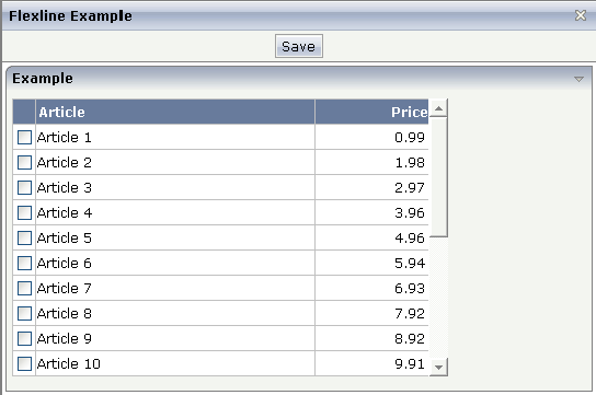
The grid looks like a normal ROWTABLEAREA2 grid, but it is built in a more dynamic way.
The XML layout definition is:
<page model="flexline_01Adapter">
    <titlebar name="Flexline Example">
    </titlebar>
    <header withdistance="false">
        <button name="Save">
        </button>
    </header>
    <pagebody>
        <rowarea name="Example">
            <vdist height="5">
            </vdist>
            <rowtablearea2 griddataprop="lines" rowcount="10" width="395" withborder="true">
                <tr>
                    <label name=" " asheadline="true">
                    </label>
                    <flexline infoprop="headline">
                    </flexline>
                </tr>
                <repeat>
                    <str valueprop="selected">
                        <checkbox valueprop="selected" flush="screen" width="30">
                        </checkbox>
                        <flexline infoprop="/rowline">
                        </flexline>
                        <hdist width="100%">
                        </hdist>
                    </str>
                </repeat>
            </rowtablearea2>
            <vdist height="10">
            </vdist>
        </rowarea>
        <vdist height="5">
        </vdist>
    </pagebody>
    <statusbar withdistance="false">
    </statusbar>
</page>
You see that there are two FLEXLINE control definitions inside the ROWTABLEAREA2 definition:
One definition represents the headline of the grid.
The other definition is part of each row's content.
Each definition points to a property that passes the configuration at
runtime. Within the second definition, you may see something which is new for
you: the VALUEPROP references to a property
/rowline. The "/"
character at the beginning indicates that this property is always picked from
the adapter - and not from the object representing the row item.
This is the Java code on the server side:
// This class is a generated one.

import java.math.BigDecimal;

import com.softwareag.cis.file.CSVManager;
import com.softwareag.cis.server.Adapter;
import com.softwareag.cis.server.util.FLEXLINEInfo;
import com.softwareag.cis.server.util.GRIDCollection;

public class flexline_01Adapter
    extends Adapter
{
    // class >LinesItem<
    public class LinesItem
    {
        // property >selected<
        boolean m_selected;
        public boolean getSelected() { return m_selected; }
        public void setSelected(boolean value) { m_selected = value; }

        String m_article;
        BigDecimal m_price;

        public void remove()
        {
            m_lines.remove(this);
        }

        public String getArticle() { return m_article; }
        public void setArticle(String article) { m_article = article; }
        public BigDecimal getPrice() { return m_price; }
        public void setPrice(BigDecimal price)
        {
            m_price = price.setScale(2,BigDecimal.ROUND_UP);
        }
    }

    // property >headline<
    FLEXLINEInfo m_headline = new FLEXLINEInfo();
    public FLEXLINEInfo getHeadline() { return m_headline; }

    // property >rowline<
    FLEXLINEInfo m_rowline = new FLEXLINEInfo();
    public FLEXLINEInfo getRowline() { return m_rowline; }

    // property >lines<
    GRIDCollection m_lines = new GRIDCollection();
    public GRIDCollection getLines() { return m_lines; }

    /** initialisation - called when creating this instance*/
    public void init()
    {
        // configure controls in headline
        m_headline.addLabel(this,CSVManager.encodeString(new String[]
        {
                "name","Article",
                "width","250",
                "asheadline","true"
        }));
        m_headline.addLabel(this,CSVManager.encodeString(new String[]
        {
                "name","Price",
                "width","100",
                "textalign","right",
                "asheadline","true"
        }));
        // configure controls in row
        m_rowline.addField(this,CSVManager.encodeString(new String[]
        {
                "valueprop","article",
                "width","250",
                "flush","server",
                "noborder","true",
                "transparentbackground","true"
        }));
        m_rowline.addField(this,CSVManager.encodeString(new String[]
        {
                "valueprop","price",
                "width","100",
                "textalign","right",
                "noborder","true",
                "transparentbackground","true"
        }));
        // create lines
        for (int i=1; i<=20; i++)
        {
            LinesItem li = new LinesItem();
            li.setArticle("Article " + i);
            li.setPrice(new BigDecimal(i*0.99));
            m_lines.add(li);
        }
    }
}
For each FLEXLINE control, there is a
FLEXLINEInfo property. The properties are
initialized during the init() phase of the adapter. Of
course, you can also change the FLEXLINEInfo
configuration later: there is a corresponding clear()
method for doing so.
Inside the FLEXLINEInfo class, there is a Java
interface with which you can add:
labels
check boxes
buttons
combo boxes
There is a method for each object. As part of the method, you always pass the owner (i.e. the current model) and the configuration of the control.
The configuration is passed as a comma-separated string that is built
using the CSVManager class. You could also directly
write the CSV string (valueprop;price;width;100;noborder;true) but
then have to be careful to replace every "real" semicolon
character with "\;". You can use and combine any
properties that are available for the controls. This means there is no
difference in managing controls that you flexibly add and controls that are
defined in a fixed way inside a layout definition.
All the other processing around the FLEXLINE management is the same as you know it from layouts that are defined in a fixed way.
Note:
Application Designer now provides a FLEXGRID control. While FLEXLINE still is
supported (and necessary), FLEXGRID offers a simpler API to build dynamically
controlled control grids. Basically, FLEXGRID is a combination of
ROWTABLEAREA2, FLEXLINE and GRIDCOLHEADER. See the description of the
FLEXGRID
control.
| Basic | |||
| infoprop |
Name of the adapter property that provides the server side information for this control. The adapter property must be of type "FLEXLINEInfo". Inside the property the sequence of controls is defined. |
Obligatory | |
| withborder |
Flag that indicates if a border is drawn between the controls that are rendered inside the FLEXLINE control. Default is "false", i.e. no border is drawn. |
Optional |
true false |
| comment |
Comment without any effect on rendering and behaviour. The comment is shown in the layout editor's tree view. |
Optional | |
In the above example, the grid was filled by adding FIELD controls into
a FLEXLINE control. In larger grids with a high number of columns and rows, you
may consider displaying your data within plain
<TD> elements. Thus, the grid becomes more
lightweight and the performance increases significantly. You can output images
and use your own cell style. Direct cell input, however, is not possible.
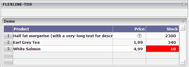
In the following example, the grid looks like a ROWTABLEAREA2 grid, but it is built in a more dynamic way.
The XML layout definition is:
<page model="FlexlineTDSAdapter">
<titlebar name="FLEXLINE-TDS">
</titlebar>
<header withdistance="false">
</header>
<pagebody>
<rowarea name="Demo">
<rowtablearea2 griddataprop="lines" rowcount="5" width="100%" firstrowcolwidths="true">
<tr>
<label name=" " width="30" asheadline="true">
</label>
<label name="Product" width="60%" asheadline="true">
</label>
<label name="Price&amp;nbsp;" width="20%" asheadline="true" textalign="right">
</label>
<label name="Stock&amp;nbsp;" width="20%" asheadline="true" textalign="right">
</label>
</tr>
<repeat>
<str valueprop="selected" withalterbackground="true">
<selector valueprop="selected">
</selector>
<flexline infoprop="/contentFL">
</flexline>
</str>
</repeat>
</rowtablearea2>
</rowarea>
</pagebody>
<statusbar withdistance="false">
</statusbar>
</page>
You see that there is one FLEXLINE control definition inside the
ROWTABLEAREA2 definition. This definition points to a property that passes the
configuration at runtime. Within the definition, the
infoprop references to a property
"/contentFL". The slash (/) at the beginning
indicates that this property is always picked from the adapter (it is not
picked up from the object representing the row item).
This is the Java code on the server side:
// This class is a generated one.

import java.util.*;
import com.softwareag.cis.server.*;
import com.softwareag.cis.server.util.*;
import com.softwareag.cis.util.*;

public class FlexlineTDSAdapter extends Adapter
{
  // class >LinesItem<
  public class LinesItem
  {
    // property >selected<
    boolean m_selected;

    public boolean getSelected()
    {
      return m_selected;
    }

    public void setSelected(boolean value)
    {
      m_selected = value;
    }

    // property >tdsValue<
    String m_tdsValue;

    public String getTdsValue()
    {
      return m_tdsValue;
    }

    // property >tdsColors<
    String m_tdsColor;

    public String getTdsColor()
    {
      return m_tdsColor;
    }

    // property >tdsBGColors<
    String m_tdsBGColor;

    public String getTdsBGColor()
    {
      return m_tdsBGColor;
    }

    // property >tdsAlign<
    String m_tdsAlign;

    public String getTdsAlign()
    {
      return m_tdsAlign;
    }

    // property >imageURL<
    String m_imageURL;

    public String getImageURL()
    {
      return m_imageURL;
    }
  }

  // property >contentFL<
  FLEXLINEInfo m_contentFL = new FLEXLINEInfo();

  public FLEXLINEInfo getContentFL()
  {
    return m_contentFL;
  }

  // property >lines<
  GRIDCollection m_lines = new GRIDCollection();

  public GRIDCollection getLines()
  {
    return m_lines;
  }

  /** initialization - called when creating this instance */
  public void init()
  {
    m_contentFL.addTds(this,
           "colcount;5;" +
           "valueprop;tdsValue;" +
           "fgcolorprop;tdsColor;" +
           "bgcolorprop;tdsBGColor;" +
           "alignprop;tdsAlign;" +
           "imageprop;imageURL;" +
           "font-weight;bold");

    LinesItem item = new LinesItem();
    item.m_tdsValue = "Half fat margarine (with a very-long text for description);0,99;2300";
    item.m_tdsColor = "#000000;#000000;#000000";
    item.m_tdsBGColor = ";;";
    item.m_imageURL = ";../HTMLBasedGUI/images/helpiconblue.gif;";
    item.m_tdsAlign = "left;right;right";
    m_lines.add(item);

    item = new LinesItem();
    item.m_tdsValue = "Earl Grey Tea;1,99;340";
    item.m_tdsColor = "#000000;#000000;#000000";
    item.m_tdsBGColor = ";;";
    item.m_imageURL = ";;";
    item.m_tdsAlign = "left;right;right";
    m_lines.add(item);

    item = new LinesItem();
    item.m_tdsValue = "White Salmon;4,99;10";
    item.m_tdsColor = "#000000;#000000;#FFFFFF";
    item.m_tdsBGColor = ";;#FF0000";
    item.m_imageURL = ";;";
    item.m_tdsAlign = "left;right;right";
    m_lines.add(item);

  }
}
For each FLEXLINE control, there is a
FLEXLINEInfo property. The properties are
initialized during the init() phase of the adapter.
You can also change the FLEXLINEInfo configuration
later: there is a corresponding clear() method for
doing so.
Inside the FLEXLINEInfo class, there is a Java
interface with which you can add the following:
addTds(Adapter owner, String properties);
Semicolons are used to separate the values in the property list. The properties may contain the following values:
The number of columns that have to be provided for the contents.
The property name of the row item class that returns a list of column values which are separated by semicolons.
The property name of the row item class that returns a list of foreground color values which are separated by semicolons.
The property name of the row item class that returns a list of background color values which are separated by semicolons.
The property name of the row item class that returns a list of cell alignment values which are separated by semicolons. Possible values: left, center, right.
The property name of the row item class that returns a list of image
URLs which are separated by semicolons. A single TD contains either text (see
valueprop) or an image. If you provide an image
URL and text for same cell, the text is suppressed.
The weight of the font.
A width is not passed. It is assumed that the width is defined by the environment (for example, by a ROWTABLEAREA2 control where the columns have a fixed size).
Note:
It is currently only possible to add exactly one Tds
control to one FLEXLINE control.