
Our main application page will contain:
A responsive application bar
A responsive data grid.
We will use a template which already contains a basic application bar.
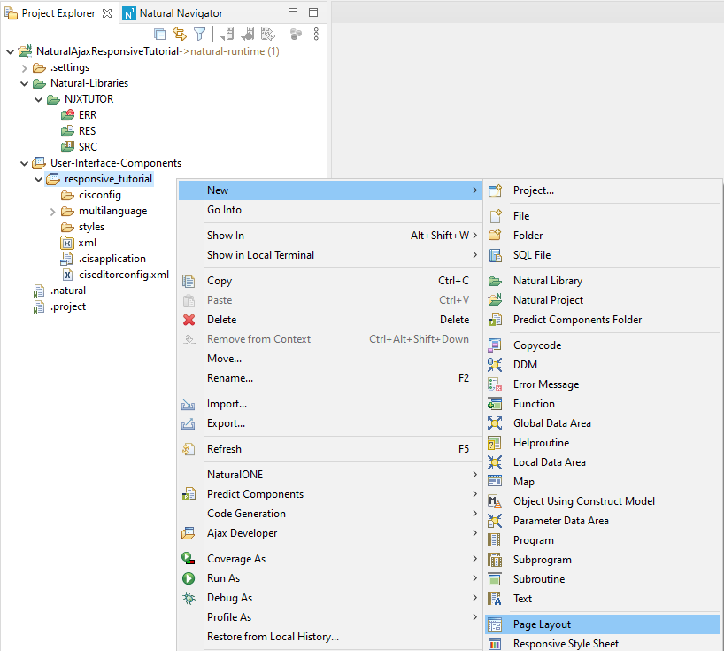
Right click the folder responsive_tutorial in Project Explorer and select New > Page Layout
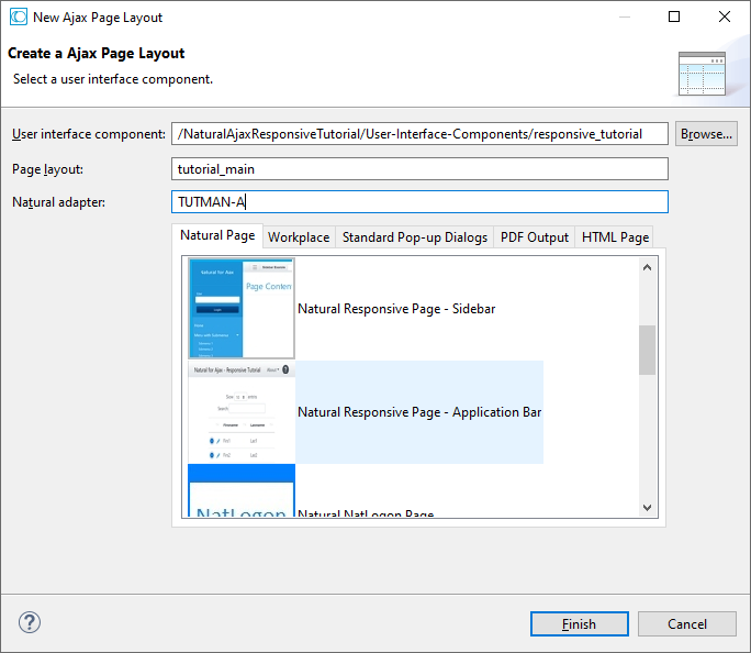
In the Natural Page tab scroll a little bit down and select the template Natural Responsive Page - Application Bar. Set tutorial_main in the Page layout field. Set TUTMAIN-A in the Natural adapter field. Click the button.
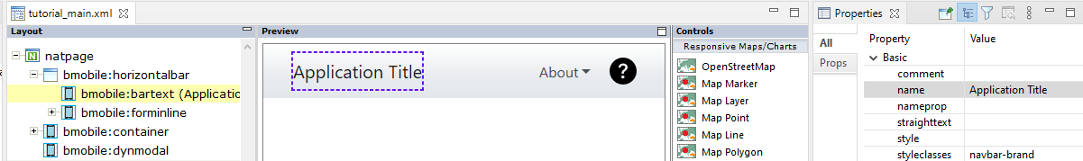
The tutorial_main layout is opened in Layout Painter Editor. It contains an application bar with a text at the left-hand side and a drop-down button and an icon at the right.
In this step the controls in the application bar will be explained and we will adapt the application bar.
You see a BMOBILE:HORIZONTALBAR control, which contains a BMOBILE:BARTEXT, a BMOBILE:FORMINLINE and a BMOBILE:ICON control.
Click on the text Application Title in the Preview Area (middle). This will select the BMOBILE:BARTEXT control. You can now see and modify the properties of this control.
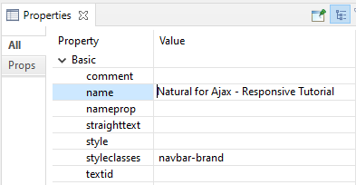
The BMOBILE:BARTEXT is a control to render texts in bars. In our example we want to add our application title as text here. You see that as styleclasses the css class navbar-brand is set. This increases the font-size and adds some shadow and padding. We keep this setting.
Our application name is "Natural for Ajax - Responsive Tutorial". Change the name property to Natural for Ajax - Responsive Tutorial.
Press <ctrl s> to save the change. This will refresh the Preview Area.
Click on the button in the Preview Area (middle). In the Layout Area (left) a BMOBILE:DROPDOWN control is selected and you can now see and modify the properties of this control in the Properties v .
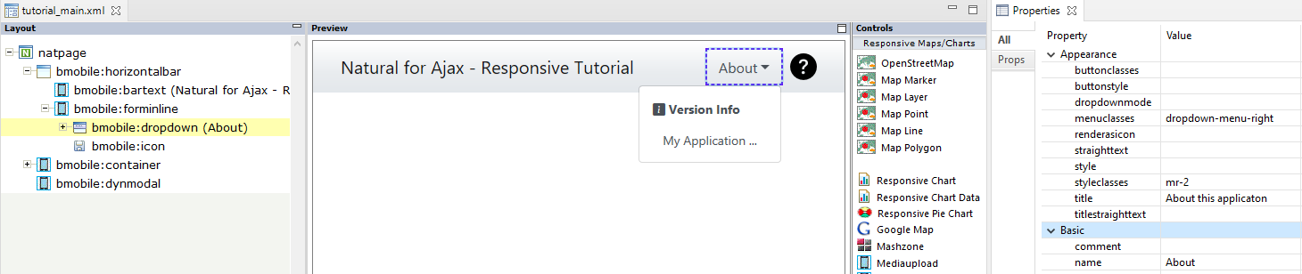
The BMOBILE :DROPDOWN and the BMOBILE:ICON control are grouped in a BMOBILE:FORMINLINE container control. Use a BMOBILE:FORMINLINE container whenever you want to render several form controls – like buttons, texts, fields, icons,... – side by side on a single horizontal row or bar.
Have a look at the properties of the BMOBILE:DROPDOWN: As menuclasses the css class dropdown-menu-right is set. This aligns the opened dropdown on the right side of the dropdown button. As buttonclasses property you can set classes to change the rendering of the dropdown button itself. We keep the default rendering. As styleclasses the css class mr-2 is set. Click on the small button right to the text “mr-2”. This will open the “Select styleclasses” dialog. In the lower half of this dialog there is a dropdown box. This dropdown contains the most frequently used responsive classes for this control. Select mr-*. Now you can see a help text below the dropdown which explains the class.
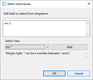
Click the button to close the dialog. In our example the mr-2 class puts a vertical distance between the dropdown button and the icon.
In the Preview Area click on the text My Application of the opened dropdown. This will select a BMOBILE:FLABEL control. In a BMOBILE:DROPDOWN control you can have rows with all kinds of controls. We simply apply a different text to the name attribute.
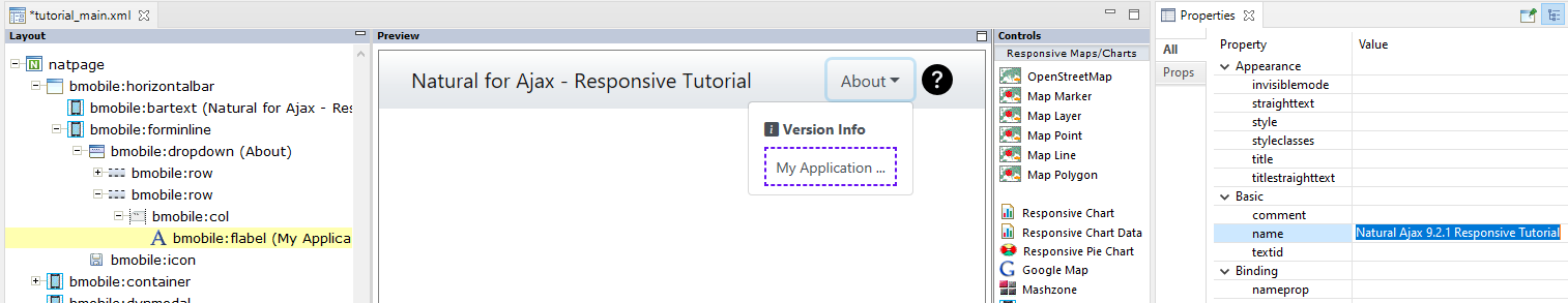
Press <ctrl s>. In the Preview Area click on the icon to the right of the dropdown. This will open a modal dialog in the Preview Area and will show the properties of the BMOBILE:ICON control in the Properties view.
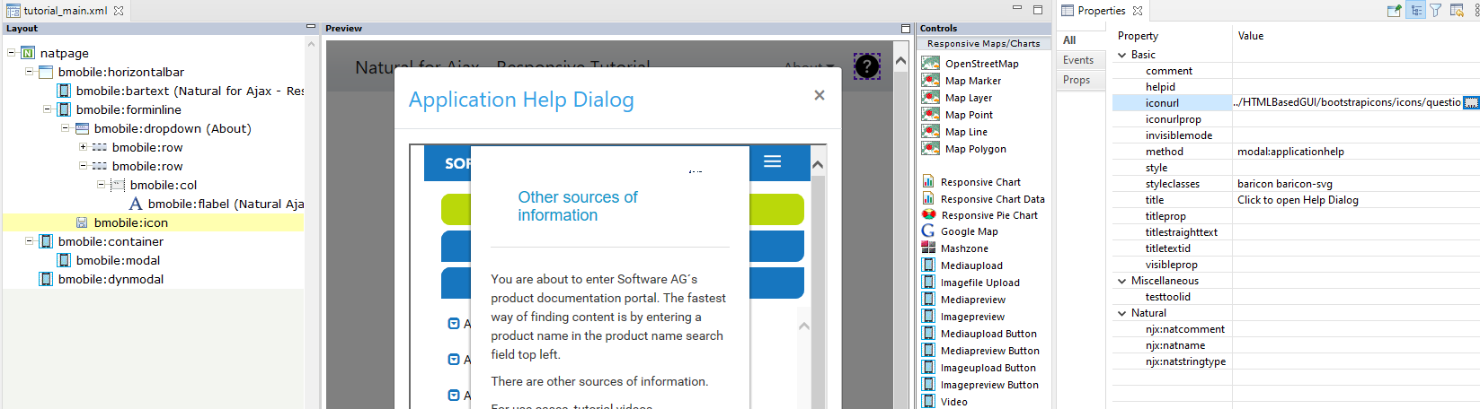
The iconurl property sets the icon image. Natural for Ajax contains an icon library with SVG icons and icon fonts. Click on the small button next to the property value “../HTMLBasedGUI/bootstrapicons/icons/question-circle-fill.svg”. The dialog Enter Image URL opens.
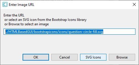
When clicking the button you can select among more than 1300 SVG icons. Click the button.
The value of the method property defines which modal is opened. Each modal has a modalid. The method to open the modal is always “modal:<themodalid>”. To see the corresponding BMOBILE:MODAL control with its properties, select it in the Layout Area.
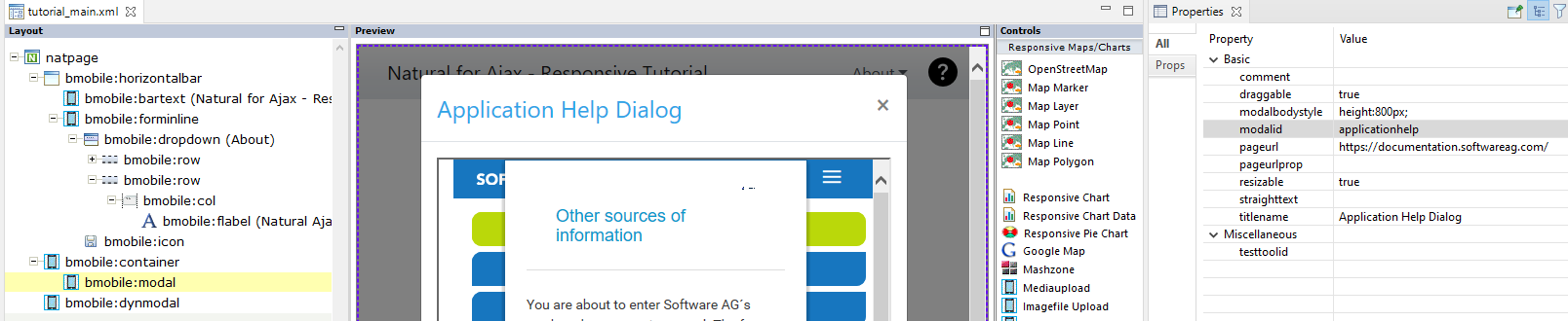
Underneath the modalid is the pageurl property. Here you can set any URL to a valid page accessible as URL in your browser.
We have built a simple application bar showing:
Application Name
Version Information (Dropdown)
Help Icon with a Help Pop-Up.
We only had to adapt an existing template for this.
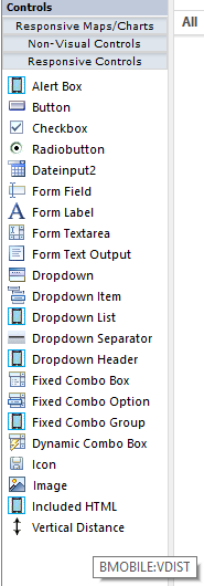
We will use the controls palette to add a data grid with several different columns and behavior to our page.
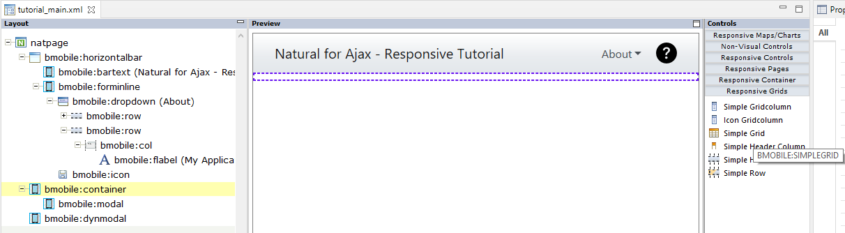
In the Controls Palette (right) open the Responsive Grids section. Drag and drop the Simple Grid to the bmobile:container node in the Layout Area (left).
Press . Open all child nodes of the bmobile:simplegrid node.
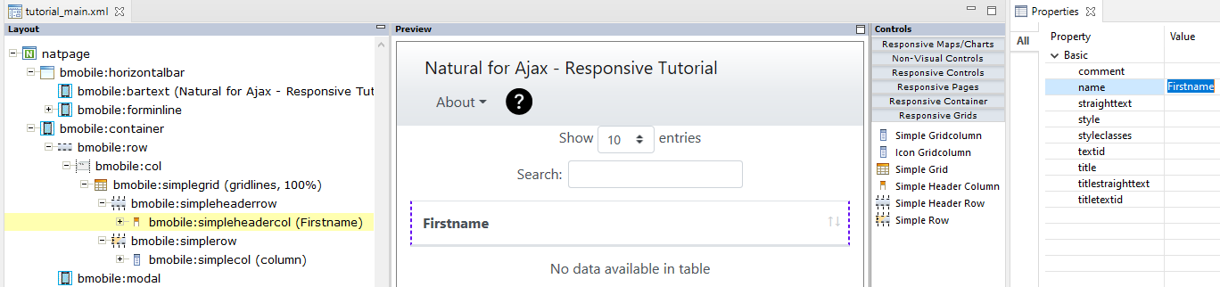
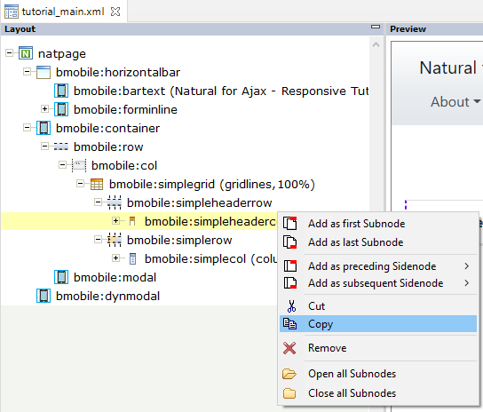
The BMOBILE :SIMPLEGRID control contains a row with grid header columns (BMOBILE:SIMPLEHEADERROW) and a row with data columns (BMOBILE:SIMPLEROW). Click on the bmobile:simpleheadercol node and change the value of the property name to Firstname. Press .
Copy and paste the bmobile:simpleheadercol twice
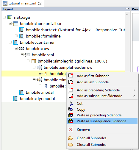
Modify the property name so that you have three header columns: Firstname, Lastname, E-Mail. Press . In the Layout Area click on the node bmobile:simplecol. The colprop property is the Natural fieldname for your data column. Change it to firstname.
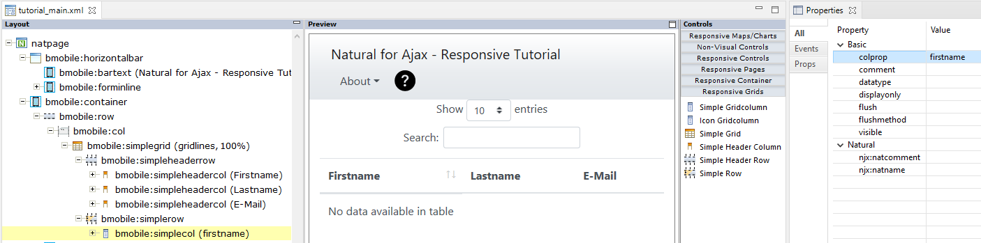
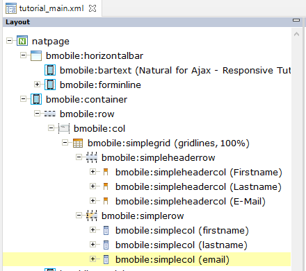
Copy and paste the bmobile:simplecol twice and change the colprop correspondingly so that you see:
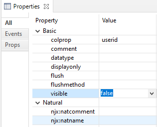
We now add an additional invisible id column. Drag and drop a Simple Header Column from the Controls palette and leave the name empty.
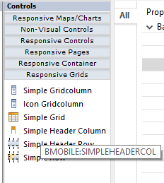
Drag and drop a Simple Gridcolumn from the Controls palette and apply the following properties:
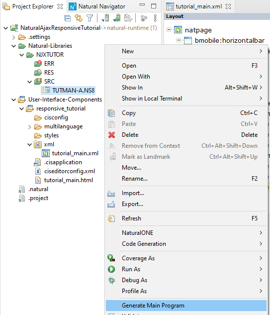
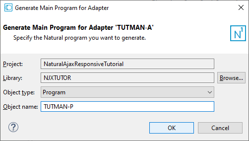
Press . Whenever a layout is saved, the corresponding Natural adapter is updated. We will now generate a Natural program from the adapter. In Project Explorer right click on TUTMAN-A.NS8 and select Generate Main Program.
In the dialog add TUTMAN-P as Object name and click the button.
Fill some items into your grid. Example code:
…
1 #II (I2)
END-DEFINE
EXPAND ARRAY GRIDLINES TO (1:30)
FOR #II:=1 TO 30
    COMPRESS 'First ' #II INTO GRIDLINES.FIRSTNAME(#II) LEAVING NO
    COMPRESS 'Last ' #II INTO GRIDLINES.LASTNAME(#II) LEAVING NO
    COMPRESS 'First.Last' #II '@email.com' INTO GRIDLINES.EMAIL(#II) LEAVING NO
    COMPRESS 'User' #II INTO GRIDLINES.USERID(#II) LEAVING NO
END-FOR
PROCESS PAGE USING "TUTMAN-A"
…
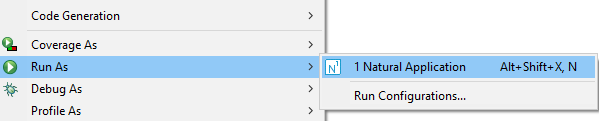
Right click and select Run As > Natural Application
We have developed a data grid with visible and invisible data columns and corresponding header columns, added the Natural code to fill the grid and ran our main application page.
If you look at your running page in the browser, you will notice that some parts of the rendering do not look good. For instance, there is no space between the application bar and your grid. If you are not familiar with the Bootstrap grid system, take some minutes to read the chapter Responsive Pages Basics.
Open tutorial_main.xml in Layout Painter. In the Layout Area (left) select the bmobile:container node. Drag and drop a Vertical Distance control from the Controls palette (right) under the bmobile:container node as first sub node.
In the Properties view click the small button right to the styleclasses property. We will now add a device dependent vertical distance: For smaller devices we add a smaller distance than for larger devices. In the dropdown select mt-2 and click the button. Now select mt-md-* and press the button.
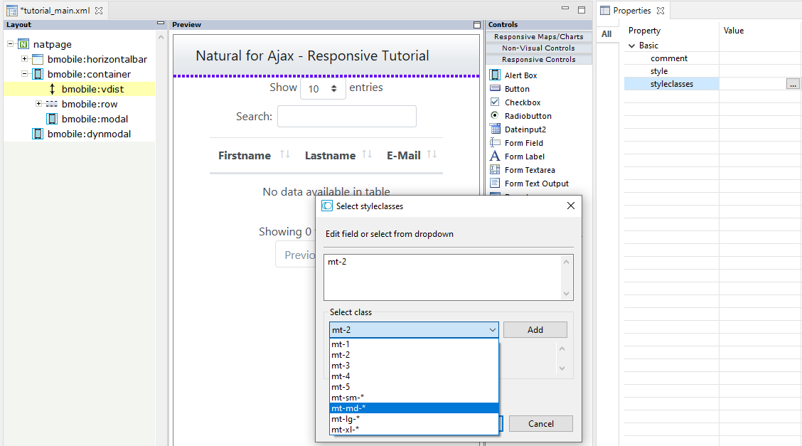
In the field change mt-md-* to mt-md-5 and click the button.
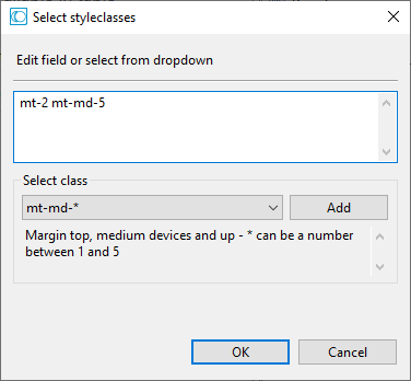
What we have done means the following: For all devices we set mt-2 sets a distance of about 8px. For medium devices and up we overwrite this default setting with mt-5 which sets a distance of about 48px.
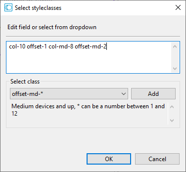
In the Layout Area (left) select the bmobile:col node above the bmobile:simplegrid node. In Properties view click the small button right to the styleclasses property. We will now apply a device dependent width and horizontal distance for our grid. Remove the col in the field. In the dropdown select col-* and click the button. In the field modify col-* to col-10.
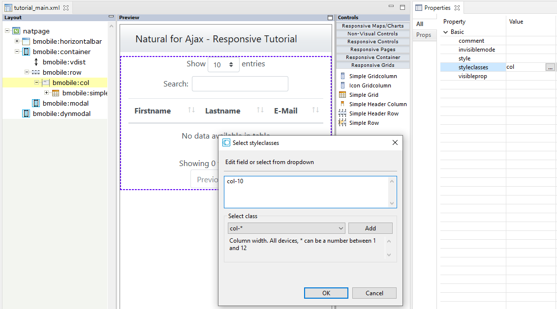
In the same way add col-offset-1, col-md-8 and col-offset-md-2.
Click the button and press .
What we have done means the following: For all devices our BMOBILE:SIMPLEGRID takes 10 of the 12 Bootstrap grid columns. We set a horizontal distance of 1 Bootstrap grid column. For medium devices and up we overwrite this default setting so that our BMOBILE:SIMPLEGRID takes 8 of the 12 Bootstrap grid columns and has a horizontal distance of 2 Bootstrap grid columns.
On larger devices you can show more information than on smaller devices. For our application bar we only want to show the About button and the Help icon for larger devices. This makes sure that our application bar is not “wrapped”.
In the Layout Area (left) select the bmobile:forminline node. Apply the styleclasses d-none d-md-block.
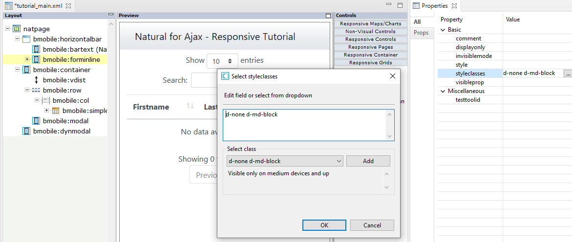
Now the BMOBILE :FORMINLINE container with its sub controls is only shown for medium devices and up.
Be sure you pressed . Run your TUTMAN-P program, resize your browser window and see how the rendering adapts to the size of the browser window.
We have applied device dependent spaces (vertical and horizontal) and device dependent showing/hiding of controls by simply applying css styleclasses to our layout.