
In this part we will develop a page with a responsive form. We will prepare everything so that we can open the page also as a pop-up from our main application page.
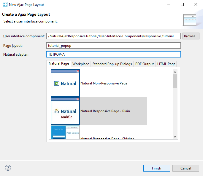
In the File menu click New > User Interface Component, select the Natural Responsive Page - Plain template and enter layout and adapter name as shown below.
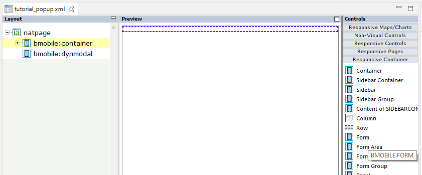
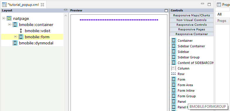
Click the button. Drag and drop a Form container from the Controls palette (right) under the bmobile:container node.
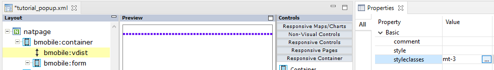
We want a little bit spacing left and right of our form. In the Properties view set mx-3 as styleclasses as described in PART1 of this tutorial. The “x” stands for “left and right”.
Drag and drop a Vertical Distance control from the Responsive Grids section of the Controls palette (right) under the bmobile:container node as first sub node. In the Properties view set mt-3 as styleclasses.
Tip:
Don’t forget to press after changes to refresh the
Preview Area (middle).
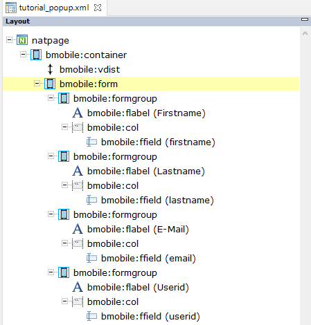
A Form is a container for different types of input elements, such as: text fields, checkboxes, radio buttons, submit buttons, etc. Use Form Group containers inside a form to get some grouping of labels, inputs, validation etc.
Drag and drop a Form Group container from the Controls palette (right) under the bmobile:form node.
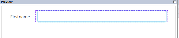
On larger devices we want to render the label and the input control for a value side by side. For smaller devices we want to render the label above the input control. To do so we set the property renderasrow to true. Then we can use the Bootstrap grid system with its col* classes to define when to render side-by-side and when to break the row.
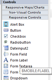
Drag and drop a Form Label control from the Controls palette (right) under the bmobile:formgroup node.
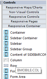
Drag and drop a Column container from the Controls palette (right) under the bmobile:formgroup node – after the bmobile:flabel node.
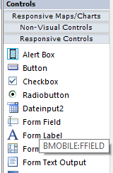
Drag and drop a Form Field control from the Controls palette (right) under the bmobile:col node.
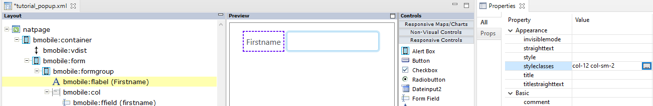
Select the bmobile:flabel node. In the Properties view apply Firstname for the name property.
Select the bmobile:ffield node. In the Properties view apply firstname for the valueprop property. This will be the name used for the corresponding Natural field. It must start with a lower-case character, but in your Natural program the field will be upper-case.
Select the bmobile:flabel node. In the Properties view apply col-12 col-sm-2 for the styleclasses property. This means: It should span the complete row on very small devices. But it should only span 2 columns on a little bit larger devices and up.
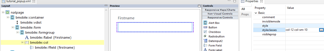
Select the bmobile:flabel node. In the Properties view apply col-12 col-sm-10 for the styleclasses property. This means: It should span the complete row on very small devices. But it should only span 10 columns on a little bit larger devices and up.
With this on a little bit larger devices, our form-group will be rendered in one row and on very small devices our form-group will break into two rows. Resize your Preview Area to see this effect.
In the same way add three more form groups. You can copy and paste the complete bmobile:formgroup node and adapt it correspondingly.
We want our firstname and lastname to be mandatory. Select the corresponding bmobile:ffield nodes. In Properties view set the property required to true.
Our userid should be displayonly. Select the corresponding bmobile:ffield node. In Properties view set the property displayonly to true.
We want that our email is validated for valid email values. Select the corresponding bmobile:ffield node. In Properties view set the property email to true.
For empty fields we want to show a placeholder text. For the bmobile:ffield nodes of firstname, lastname and email, set the property placeholder to Your firstname, Your lastname, Optional: Your E-Mail.
Add another Form Group as last sub node of our bmobile:form node. This will contain our buttons. Add a Vertical Distance before our new bmobile:formgroup node and set the styleclasses property to mt-1. We want just a little bit space between our fields and the buttons.
Add a Column as sub node of the new bmobile:formgroup and set the styleclasses property to mx-auto. We want our buttons to be centered.
Add a Button under the bmobile:col node and set the following properties:
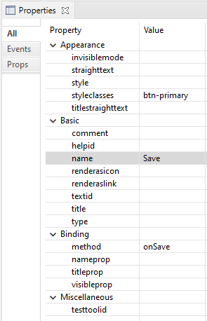
The method is the name of the event, which will be forwarded to your Natural program when the button is clicked. Add a second Button under the bmobile:col node as last sub node and set the following properties:
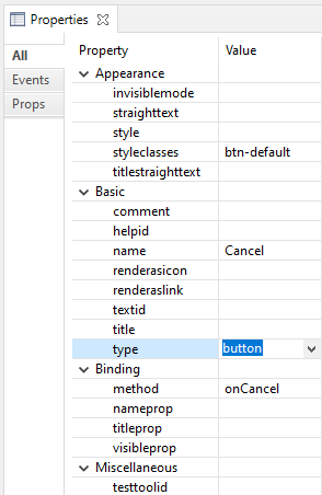
Be sure to set the property type to button. In difference to buttons (=default) this button will not validate the form. This allows you to close the pop-up even in case of invalid field values.
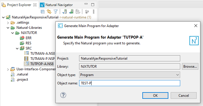
From the generated adapter TUTPOP-A you can simply generate a Natural program and run the generated program – without any modifications. In PART3 of this tutorial we will integrate the form as pop-up into our main application.
We have created a responsive form with several fields, added validation and responsive rendering and we added a submit and a cancel button to the form. We generated a Natural program for it and could run it immediately without any programming.