
A set of controls and containers for building responsive applications is available. The controls and containers support responsiveness, which means that the pages automatically adapt to various screen sizes. The controls are built with Bootstrap (http://getbootstrap.com/). You will find running samples built with these controls and containers in the Natural Ajax Demos.
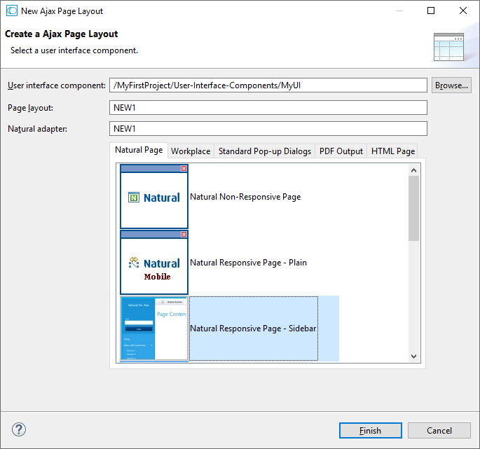
To create layout pages for responsive applications use one of the Natural Responsive Page templates. If you want your application to have a sidebar with navigation menu choose the Natural Responsive Page - Sidebar template.
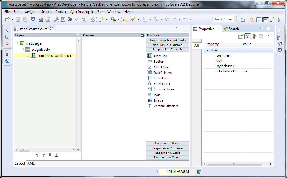
The wizard will create a page layout with responsive containers. The palette shows exactly the controls, which are supported in responsive pages. You can add controls from the palette to your layout in the usual way.
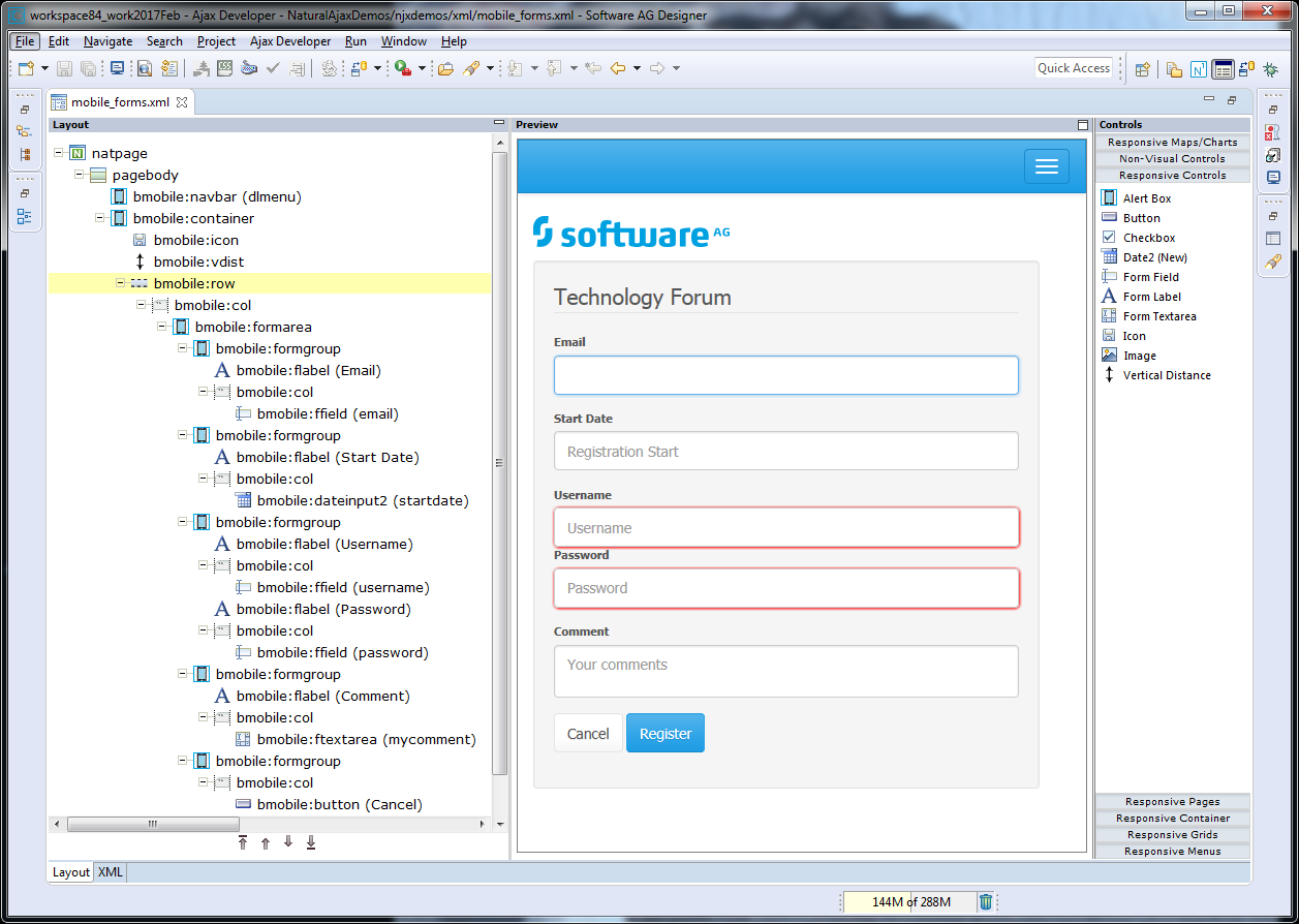
To see the rendering in the preview area set HTML as Layout display mode in the Ajax Developer properties of your project. The following shows the mobile_forms.xml example layout of the Natural Ajax Demos in the Layout Painter.
The responsiveness of a layout is based on style classes. For controls and containers the major responsive style classes are applied automatically, which defines the basic functionality for this control/container in a responsive way.
The responsive sizing of rows and columns in a page is also based on style classes. The basis for this is the grid system of Bootstrap. This system allows up to 12 columns across the page. You can specify different dimensions for your rows and columns depending on the devices. This means: Instead of directly applying pixel or percentage width to your controls, you specify style classes defining the number of columns this control is supposed to occupy on a device.
For more information see Responsive Page Layout and Controls.
You can add your own additional style classes or style classes supported by the Bootstrap framework to the controls to customize the rendering. The Bootstrap framework contains a variety of ready-to-use classes. For controls and containers, the Layout Painter will offer you the most frequently used classes for this specific control/container.
The best way to get started is by using the Natural Ajax Demos with a large set of simple samples.
A responsive control to render a page header.
| Basic | |||
| name |
Text that is displayed inside the control. Please do not specify the name when using the multi language management - but specify a "textid" instead. |
Sometimes obligatory | |
| nameprop |
Name of adapter parameter which dynamically provides the text that is shown inside the control. |
Optional | |
| textid |
Multi language dependent text that is displayed inside the control. The "textid" is translated into a corresponding string at runtime. Do not specify a "name" inside the control if specifying a "textid". |
Sometimes obligatory | |
| straighttext |
If the text of the control contains HTML tags then these are by default interpreted by the browser. Specifiying STRAIGHTTEXT as "true" means that the browser will directly render the characters without HTML interpretation. Example: if you want to output the source of an HTML text then STRAIGHTTEXT should be set to "true". |
Optional |
true false |
| htmlheading |
The rendering of the heading: H1-H6 |
Optional |
h1 h2 h3 h4 h5 h6 |
| comment |
Comment without any effect on rendering and behaviour. The comment is shown in the layout editor's tree view. |
Optional | |
| styleclasses |
CSS style classes separated by a blank. |
Optional | |
| style |
CSS style definition that is directly passed into this control. With the style you can individually influence the rendering of the control. You can specify any style sheet expressions. Examples are: border: 1px solid #FF0000 background-color: #808080 You can combine expressions by appending and separating them with a semicolon. Sometimes it is useful to have a look into the generated HTML code in order to know where direct style definitions are applied. Press right mouse-button in your browser and select the "View source" or "View frame's source" function. |
Optional | |
A responsive control to render a page footer.
Note:
The properties for the BMOBILE:FOOTER control are the same as
for the BMOBILE:PAGEHEADER control but are implemented using different style
sheet classes.
| Basic | |||
| name |
Text that is displayed inside the control. Please do not specify the name when using the multi language management - but specify a "textid" instead. |
Sometimes obligatory | |
| nameprop |
Name of adapter parameter which dynamically provides the text that is shown inside the control. |
Optional | |
| textid |
Multi language dependent text that is displayed inside the control. The "textid" is translated into a corresponding string at runtime. Do not specify a "name" inside the control if specifying a "textid". |
Sometimes obligatory | |
| straighttext |
If the text of the control contains HTML tags then these are by default interpreted by the browser. Specifiying STRAIGHTTEXT as "true" means that the browser will directly render the characters without HTML interpretation. Example: if you want to output the source of an HTML text then STRAIGHTTEXT should be set to "true". |
Optional |
true false |
| htmlheading |
The rendering of the heading: H1-H6 |
Optional |
h1 h2 h3 h4 h5 h6 |
| comment |
Comment without any effect on rendering and behaviour. The comment is shown in the layout editor's tree view. |
Optional | |
| styleclasses |
CSS style classes separated by a blank. |
Optional | |
| style |
CSS style definition that is directly passed into this control. With the style you can individually influence the rendering of the control. You can specify any style sheet expressions. Examples are: border: 1px solid #FF0000 background-color: #808080 You can combine expressions by appending and separating them with a semicolon. Sometimes it is useful to have a look into the generated HTML code in order to know where direct style definitions are applied. Press right mouse-button in your browser and select the "View source" or "View frame's source" function. |
Optional | |
| Miscellaneous | |||
| testtoolid |
Use this attribute to assign a fixed control identifier that can be later on used within your test tool in order to do the object identification |
Optional | |
A control for responsive embedding of non-Ajax pages or other media.
| Basic | |||
| valueprop |
Name of the adapter parameter that provides the content of the control. |
Optional | |
| style |
CSS style definition that is directly passed into this control. With the style you can individually influence the rendering of the control. You can specify any style sheet expressions. Examples are: border: 1px solid #FF0000 background-color: #808080 You can combine expressions by appending and separating them with a semicolon. Sometimes it is useful to have a look into the generated HTML code in order to know where direct style definitions are applied. Press right mouse-button in your browser and select the "View source" or "View frame's source" function. |
Optional | |
| styleclasses |
CSS style classes separated by a blank. |
Optional | |
| comment |
Comment without any effect on rendering and behaviour. The comment is shown in the layout editor's tree view. |
Optional | |
| alwaysreload |
When setting to false, the subpage is not reloaded when a page switch is executed, default is true. |
Optional |
true false |
| aspectratio |
Defines the proportional relationship between width and height of the control. Example: 4by3 |
Optional | |
| width |
Width of the control. There are three possibilities to define the width: (A) You do not define a width at all. In this case the width of the control will either be a default width or - in case of container controls - it will follow the width that is occupied by its content. (B) Pixel sizing: just input a number value (e.g. "100"). (C) Percentage sizing: input a percantage value (e.g. "50%"). Pay attention: percentage sizing will only bring up correct results if the parent element of the control properly defines a width this control can reference. If you specify this control to have a width of 50% then the parent element (e.g. an ITR-row) may itself define a width of "100%". If the parent element does not specify a width then the rendering result may not represent what you expect. |
Optional |
100 120 140 160 180 200 50% 100% |
| height |
Height of the control. There are three possibilities to define the height: (A) You do not define a height at all. As consequence the control will be rendered with its default height. If the control is a container control (containing) other controls then the height of the control will follow the height of its content. (B) Pixel sizing: just input a number value (e.g. "20"). (C) Percentage sizing: input a percentage value (e.g. "50%"). Pay attention: percentage sizing will only bring up correct results if the parent element of the control properly defines a height this control can reference. If you specify this control to have a height of 50% then the parent element (e.g. an ITR-row) may itself define a height of "100%". If the parent element does not specify a width then the rendering result may not represent what you expect. |
Optional |
100 150 200 250 300 250 400 50% 100% |
| Natural | |||
| njx:natname |
If a Natural variable with a name not valid for Application Designer (for instance #FIELD1) shall be bound to the control, a different name (for instance HFIELD1) can be bound instead. If the original name (in this case #FIELD1) is then specified in this attribute, the original name is generated into the parameter data area of the Natural adapter and a mapping between the two names is generated into the PROCESS PAGE statement of the Natural adapter. This mapping must not break a once defined group structure. If for instance a grid control that is bound to a name of GRID1 contains fields that are bound to FIELD1 and FIELD2 respectively, the corresponding njx:natname values may be #GRID1.#FIELD1 and #GRID1.#FIELD2, but not #GRID1.#FIELD1 and #MYGRID1.#FIELD2. |
Optional | |
| njx:natstringtype |
If the control shall be bound to a Natural system variable of string format with the attribute njx:natsysvar, this attribute indicates the format of the string, A (code page) or U (Unicode). The default is A. |
Optional | |
| njx:natcomment |
The value of this attribute is generated as comment line into the parameter data area of the Natural adapter, before the field name. The Map Converter, for instance, uses this attributes to indicate for a generated statusprop variable to which field the statusprop belongs. |
Optional | |
A control for responsive embedding of Ajax subpages.
| Basic | |||
| valueprop |
Name of the adapter parameter that provides the content of the control. |
Optional | |
| style |
CSS style definition that is directly passed into this control. With the style you can individually influence the rendering of the control. You can specify any style sheet expressions. Examples are: border: 1px solid #FF0000 background-color: #808080 You can combine expressions by appending and separating them with a semicolon. Sometimes it is useful to have a look into the generated HTML code in order to know where direct style definitions are applied. Press right mouse-button in your browser and select the "View source" or "View frame's source" function. |
Optional | |
| width |
Width of the control. There are three possibilities to define the width: (A) You do not define a width at all. In this case the width of the control will either be a default width or - in case of container controls - it will follow the width that is occupied by its content. (B) Pixel sizing: just input a number value (e.g. "100"). (C) Percentage sizing: input a percantage value (e.g. "50%"). Pay attention: percentage sizing will only bring up correct results if the parent element of the control properly defines a width this control can reference. If you specify this control to have a width of 50% then the parent element (e.g. an ITR-row) may itself define a width of "100%". If the parent element does not specify a width then the rendering result may not represent what you expect. |
Optional |
100 120 140 160 180 200 50% 100% |
| height |
Height of the control. There are three possibilities to define the height: (A) You do not define a height at all. As consequence the control will be rendered with its default height. If the control is a container control (containing) other controls then the height of the control will follow the height of its content. (B) Pixel sizing: just input a number value (e.g. "20"). (C) Percentage sizing: input a percentage value (e.g. "50%"). Pay attention: percentage sizing will only bring up correct results if the parent element of the control properly defines a height this control can reference. If you specify this control to have a height of 50% then the parent element (e.g. an ITR-row) may itself define a height of "100%". If the parent element does not specify a width then the rendering result may not represent what you expect. |
Optional |
100 150 200 250 300 250 400 50% 100% |
| aspectratio |
Defines the proportional relationship between width and height of the control. Example: 4by3 |
Optional |
1by1 16by9 21by9 4by3 |
| styleclasses |
CSS style classes separated by a blank. |
Optional | |
| comment |
Comment without any effect on rendering and behaviour. The comment is shown in the layout editor's tree view. |
Optional | |
| Natural | |||
| njx:natname |
If a Natural variable with a name not valid for Application Designer (for instance #FIELD1) shall be bound to the control, a different name (for instance HFIELD1) can be bound instead. If the original name (in this case #FIELD1) is then specified in this attribute, the original name is generated into the parameter data area of the Natural adapter and a mapping between the two names is generated into the PROCESS PAGE statement of the Natural adapter. This mapping must not break a once defined group structure. If for instance a grid control that is bound to a name of GRID1 contains fields that are bound to FIELD1 and FIELD2 respectively, the corresponding njx:natname values may be #GRID1.#FIELD1 and #GRID1.#FIELD2, but not #GRID1.#FIELD1 and #MYGRID1.#FIELD2. |
Optional | |
| njx:natstringtype |
If the control shall be bound to a Natural system variable of string format with the attribute njx:natsysvar, this attribute indicates the format of the string, A (code page) or U (Unicode). The default is A. |
Optional | |
| njx:natcomment |
The value of this attribute is generated as comment line into the parameter data area of the Natural adapter, before the field name. The Map Converter, for instance, uses this attributes to indicate for a generated statusprop variable to which field the statusprop belongs. |
Optional | |
A control for responsive embedding of modals. The content of
this modal can be any content reachable via a URL. To integrate Natural
content, use the BMOBILE:INTMODAL* controls. To open a modal via BMOBILE:BUTTON
and BMOBILE:ICON controls apply
"modalid:<mymodalid>" as method.
<bmobile:button method="modal:mymodalid" ....></bmobile:button>
<bmobile:modal modalid="mymodalid"...></bmobile:modal>
| Basic | |||
| comment |
Comment without any effect on rendering and behaviour. The comment is shown in the layout editor's tree view. |
Optional | |
| titlename |
Text that is displayed inside the control. Please do not specify the name when using the multi language management - but specify a "textid" instead. |
Optional | |
| straighttext |
If the text of the control contains HTML tags then these are by default interpreted by the browser. Specifiying STRAIGHTTEXT as "true" means that the browser will directly render the characters without HTML interpretation. Example: if you want to output the source of an HTML text then STRAIGHTTEXT should be set to "true". |
Optional |
true false |
| modalid |
An id string for the modal. You can use this id in buttons to open the modal. For a modalid mymodalid the methodname in a button is modal:mymodalid. |
Optional | |
| resizable |
Per default end-users can resize an open pop-up dialog. Set this property to FALSE if you don't want the end-users to resize the pop-up. |
Optional |
true false |
| draggable |
Per default open pop-up dialogs are draggable within their parent container. Set this property to FALSE if you don't want the end-users to drag the pop-up. |
Optional |
true false |
| pageurl |
The url of an html page. |
Optional | |
| pageurlprop |
Name of the adapter parameter that dynamically defines the url of an html page. |
Optional | |
| modalbodystyle |
CSS style definition that is directly passed into this control. With the style you can individually influence the rendering of the control. You can specify any style sheet expressions. Examples are: border: 1px solid #FF0000 background-color: #808080 You can combine expressions by appending and separating them with a semicolon. Sometimes it is useful to have a look into the generated HTML code in order to know where direct style definitions are applied. Press right mouse-button in your browser and select the "View source" or "View frame's source" function. |
Optional | |
| Natural | |||
| njx:natname |
If a Natural variable with a name not valid for Application Designer (for instance #FIELD1) shall be bound to the control, a different name (for instance HFIELD1) can be bound instead. If the original name (in this case #FIELD1) is then specified in this attribute, the original name is generated into the parameter data area of the Natural adapter and a mapping between the two names is generated into the PROCESS PAGE statement of the Natural adapter. This mapping must not break a once defined group structure. If for instance a grid control that is bound to a name of GRID1 contains fields that are bound to FIELD1 and FIELD2 respectively, the corresponding njx:natname values may be #GRID1.#FIELD1 and #GRID1.#FIELD2, but not #GRID1.#FIELD1 and #MYGRID1.#FIELD2. |
Optional | |
| njx:natstringtype |
If the control shall be bound to a Natural system variable of string format with the attribute njx:natsysvar, this attribute indicates the format of the string, A (code page) or U (Unicode). The default is A. |
Optional | |
| njx:natcomment |
The value of this attribute is generated as comment line into the parameter data area of the Natural adapter, before the field name. The Map Converter, for instance, uses this attributes to indicate for a generated statusprop variable to which field the statusprop belongs. |
Optional | |
| Miscellaneous | |||
| testtoolid |
Use this attribute to assign a fixed control identifier that can be later on used within your test tool in order to do the object identification |
Optional | |
Use these controls to implement responsive modals. The modals are designed and rendered page internal. You can have any container and control inside the BMOBILE:INTMODALBODY. No separate Adapter is generated for the internal modals. The corresponding fields and events are generated into the Adapter of the page containing the BMOBILE:INTMODAL control. This simplifies data exchange between the parent page and the modal.
To open a modal via BMOBILE:BUTTON and BMOBILE:ICON controls
apply "modalid:<mymodalid>" as
method.
<bmobile:button method="modal:mymodalid" ....></bmobile:button>
<bmobile:modal modalid="mymodalid"...></bmobile:modal>
| Basic | |||
| comment |
Comment without any effect on rendering and behaviour. The comment is shown in the layout editor's tree view. |
Optional | |
| valueprop |
Name of the adapter parameter that provides the content of the control. |
Obligatory | |
| modalid |
An id string for the modal. You can use this id in buttons to open the modal. For a modalid mymodalid the methodname in a button is modal:mymodalid. |
Optional | |
| modalsize |
Per default modals have medium size. Set this if you want for instance small size modal-sm, or large size modal-lg. |
Optional |
modal-sm modal-lg |
| closeonclick |
Per default the pop-up dialog is closed when clicking outside of the pop-up. Set this property to FALSE if you don't want the pop-up dialog to automatically close when clicking outside. |
Optional |
true false |
| closeonesc |
Per default the pop-up dialog is closed when the escape key is pressed. Set this property to FALSE if you don't want the he pop-up to automatically close when escape is pressed. |
Optional |
true false |
| resizable |
Per default end-users can resize an open pop-up dialog. Set this property to FALSE if you don't want the end-users to resize the pop-up. |
Optional |
true false |
| draggable |
Per default open pop-up dialogs are draggable within their parent container. Set this property to FALSE if you don't want the end-users to drag the pop-up. |
Optional |
true false |
| centered |
Per default a pop-up dialog is centered witin it's parent container. Set this property to FALSE if you don't want the pop-up to be centered. |
Optional |
true false |
| animatefade |
Per default a fade-in animation is used when the pop-up opens. Set this property to FALSE if you want to switch off animation. |
Optional |
true false |
| styleclasses |
CSS style classes separated by a blank. |
Optional | |
| style |
CSS style definition that is directly passed into this control. With the style you can individually influence the rendering of the control. You can specify any style sheet expressions. Examples are: border: 1px solid #FF0000 background-color: #808080 You can combine expressions by appending and separating them with a semicolon. Sometimes it is useful to have a look into the generated HTML code in order to know where direct style definitions are applied. Press right mouse-button in your browser and select the "View source" or "View frame's source" function. |
Optional | |
| Natural | |||
| njx:natname |
If a Natural variable with a name not valid for Application Designer (for instance #FIELD1) shall be bound to the control, a different name (for instance HFIELD1) can be bound instead. If the original name (in this case #FIELD1) is then specified in this attribute, the original name is generated into the parameter data area of the Natural adapter and a mapping between the two names is generated into the PROCESS PAGE statement of the Natural adapter. This mapping must not break a once defined group structure. If for instance a grid control that is bound to a name of GRID1 contains fields that are bound to FIELD1 and FIELD2 respectively, the corresponding njx:natname values may be #GRID1.#FIELD1 and #GRID1.#FIELD2, but not #GRID1.#FIELD1 and #MYGRID1.#FIELD2. |
Optional | |
| njx:natstringtype |
If the control shall be bound to a Natural system variable of string format with the attribute njx:natsysvar, this attribute indicates the format of the string, A (code page) or U (Unicode). The default is A. |
Optional | |
| njx:natcomment |
The value of this attribute is generated as comment line into the parameter data area of the Natural adapter, before the field name. The Map Converter, for instance, uses this attributes to indicate for a generated statusprop variable to which field the statusprop belongs. |
Optional | |
| Miscellaneous | |||
| testtoolid |
Use this attribute to assign a fixed control identifier that can be later on used within your test tool in order to do the object identification |
Optional | |
This modal is used for showing online help. It is added
automatically to pages in which helpid
attributes have been set for controls. The modal is opened automatically on
help requests.
| Basic | |||
| comment |
Comment without any effect on rendering and behaviour. The comment is shown in the layout editor's tree view. |
Optional | |
| styleclasses |
CSS style classes separated by a blank. |
Optional | |
| style |
CSS style definition that is directly passed into this control. With the style you can individually influence the rendering of the control. You can specify any style sheet expressions. Examples are: border: 1px solid #FF0000 background-color: #808080 You can combine expressions by appending and separating them with a semicolon. Sometimes it is useful to have a look into the generated HTML code in order to know where direct style definitions are applied. Press right mouse-button in your browser and select the "View source" or "View frame's source" function. |
Optional | |
| name |
Text that is displayed inside the control. Please do not specify the name when using the multi language management - but specify a "textid" instead. |
Optional | |
| textid |
Multi language dependent text that is displayed inside the control. The "textid" is translated into a corresponding string at runtime. Do not specify a "name" inside the control if specifying a "textid". |
Optional | |
| nameprop |
Name of adapter parameter which dynamically provides the text that is shown inside the control. |
Optional | |
| straighttext |
If the text of the control contains HTML tags then these are by default interpreted by the browser. Specifiying STRAIGHTTEXT as "true" means that the browser will directly render the characters without HTML interpretation. Example: if you want to output the source of an HTML text then STRAIGHTTEXT should be set to "true". |
Optional |
true false |
| htmlheading |
The rendering of the heading: H1-H6 |
Optional |
h1 h2 h3 h4 h5 h6 |
| Natural | |||
| njx:natname |
If a Natural variable with a name not valid for Application Designer (for instance #FIELD1) shall be bound to the control, a different name (for instance HFIELD1) can be bound instead. If the original name (in this case #FIELD1) is then specified in this attribute, the original name is generated into the parameter data area of the Natural adapter and a mapping between the two names is generated into the PROCESS PAGE statement of the Natural adapter. This mapping must not break a once defined group structure. If for instance a grid control that is bound to a name of GRID1 contains fields that are bound to FIELD1 and FIELD2 respectively, the corresponding njx:natname values may be #GRID1.#FIELD1 and #GRID1.#FIELD2, but not #GRID1.#FIELD1 and #MYGRID1.#FIELD2. |
Optional | |
| njx:natstringtype |
If the control shall be bound to a Natural system variable of string format with the attribute njx:natsysvar, this attribute indicates the format of the string, A (code page) or U (Unicode). The default is A. |
Optional | |
| njx:natcomment |
The value of this attribute is generated as comment line into the parameter data area of the Natural adapter, before the field name. The Map Converter, for instance, uses this attributes to indicate for a generated statusprop variable to which field the statusprop belongs. |
Optional | |
| Miscellaneous | |||
| testtoolid |
Use this attribute to assign a fixed control identifier that can be later on used within your test tool in order to do the object identification |
Optional | |
| Basic | |||
| comment |
Comment without any effect on rendering and behaviour. The comment is shown in the layout editor's tree view. |
Optional | |
| styleclasses |
CSS style classes separated by a blank. |
Optional | |
| style |
CSS style definition that is directly passed into this control. With the style you can individually influence the rendering of the control. You can specify any style sheet expressions. Examples are: border: 1px solid #FF0000 background-color: #808080 You can combine expressions by appending and separating them with a semicolon. Sometimes it is useful to have a look into the generated HTML code in order to know where direct style definitions are applied. Press right mouse-button in your browser and select the "View source" or "View frame's source" function. |
Optional | |
| Miscellaneous | |||
| testtoolid |
Use this attribute to assign a fixed control identifier that can be later on used within your test tool in order to do the object identification |
Optional | |
This control supports dynamic pop-ups.
As with non-responsive pages, you can also open any responsive
page as a pop-up via the Natural PROCESS PAGE MODAL statement. You
can customize the rendering and behavior of the pop-up at design-time and
dynamically at runtime before the pop-up is opened. Dynamic settings will
overwrite design-time settings. From version 9.2.1, each responsive page
contains a BMOBILE:DYNMODAL
control. This control provides the pop-up frame for all pop-ups opened from
this page. You can customize this control at design-time.
Hints:
To have common settings for all pages, you can customize the layout templates. For details, refer to NaturalONE documentation > Ajax Developer > Getting Started with the Layout Painter > Creating Custom Layout Templates.
If you have older responsive layouts which do not contain this BMOBILE:DYNMODAL control yet, you can simply drag this control to the page from the Layout Painter Control Palette.
You can set design-time properties in 2 ways:
Set the properties popupfeatures,
popupheight and popupwidth in the NATPAGE control of
the pop-up layout. See NATPAGE
Properties.
Set the properties of the BMOBILE:DYNMODAL control in the pop-up parent.
The design-time of the page opened as pop-up will overwrite the BMOBILE:DYNMODAL settings of the pop-up parent.
To dynamically customize the pop-up settings at runtime from your Natural program, add an NJX:XCIOPENPOPUP control to your parent page. The data structure generated for this control is identical for responsive and non-responsive pages.
Independently whether you specify the features at design-time or at runtime, the following features are supported:
| Values | Default | Description | |
|---|---|---|---|
| closeonclick | true/false | true | If true clicking outside the pop-up will close the pop-up |
| closeonesc | true/false | true | If true pressing the escape key will close the pop-up |
| resizeable | true/false | true | If true end-users can resize the opened pop-up |
| draggable | true/false | true | If true end-users can drag the opened pop-up |
| sizetocontent | true/false | true | If true the pop-up height is automatically sized to the height of the page shown as pop-up |
| withclosebutton | true/false | true | If true a close button will appear in the header and the footer of the pop-up frame. |
In the popupfeatures design-time property
(NATPAGE) and the Natural XCIOPENPOPUP.FEATURES field you can specify several
of these features separated by “;”. Example:
XCIOPENPOPUP.FEATURES:=’closeonclick:false;closeonesc:false;sizetocontent:true”
| Basic | |||
| comment |
Comment without any effect on rendering and behaviour. The comment is shown in the layout editor's tree view. |
Optional | |
| modalsize |
Per default modals have medium size. Set this if you want for instance small size modal-sm, or large size modal-lg. |
Optional |
modal-sm modal-lg |
| sizetocontent |
If set to TRUE the pop-up dialog is sized according to the content. If set to FALSE and no direct height/width properties are set, a fixed default size is used. Default is TRUE. |
Optional |
true false |
| closeonclick |
Per default the pop-up dialog is closed when clicking outside of the pop-up. Set this property to FALSE if you don't want the pop-up dialog to automatically close when clicking outside. |
Optional |
true false |
| closeonesc |
Per default the pop-up dialog is closed when the escape key is pressed. Set this property to FALSE if you don't want the he pop-up to automatically close when escape is pressed. |
Optional |
true false |
| resizable |
Per default end-users can resize an open pop-up dialog. Set this property to FALSE if you don't want the end-users to resize the pop-up. |
Optional |
true false |
| draggable |
Per default open pop-up dialogs are draggable within their parent container. Set this property to FALSE if you don't want the end-users to drag the pop-up. |
Optional |
true false |
| withclosebutton |
Per default the opened pop-up dialog contains a close button in the footer and in the header. Set this property to FALSE if you don't want close buttons in header of footer of the pop-up. |
Optional |
true false |
| centered |
Per default a pop-up dialog is centered witin it's parent container. Set this property to FALSE if you don't want the pop-up to be centered. |
Optional |
true false |
| animatefade |
Per default a fade-in animation is used when the pop-up opens. Set this property to FALSE if you want to switch off animation. |
Optional |
true false |
| styleclasses |
CSS style classes separated by a blank. |
Optional | |
| style |
CSS style definition that is directly passed into this control. With the style you can individually influence the rendering of the control. You can specify any style sheet expressions. Examples are: border: 1px solid #FF0000 background-color: #808080 You can combine expressions by appending and separating them with a semicolon. Sometimes it is useful to have a look into the generated HTML code in order to know where direct style definitions are applied. Press right mouse-button in your browser and select the "View source" or "View frame's source" function. |
Optional | |
| Natural | |||
| njx:natname |
If a Natural variable with a name not valid for Application Designer (for instance #FIELD1) shall be bound to the control, a different name (for instance HFIELD1) can be bound instead. If the original name (in this case #FIELD1) is then specified in this attribute, the original name is generated into the parameter data area of the Natural adapter and a mapping between the two names is generated into the PROCESS PAGE statement of the Natural adapter. This mapping must not break a once defined group structure. If for instance a grid control that is bound to a name of GRID1 contains fields that are bound to FIELD1 and FIELD2 respectively, the corresponding njx:natname values may be #GRID1.#FIELD1 and #GRID1.#FIELD2, but not #GRID1.#FIELD1 and #MYGRID1.#FIELD2. |
Optional | |
| njx:natstringtype |
If the control shall be bound to a Natural system variable of string format with the attribute njx:natsysvar, this attribute indicates the format of the string, A (code page) or U (Unicode). The default is A. |
Optional | |
| njx:natcomment |
The value of this attribute is generated as comment line into the parameter data area of the Natural adapter, before the field name. The Map Converter, for instance, uses this attributes to indicate for a generated statusprop variable to which field the statusprop belongs. |
Optional | |
| Miscellaneous | |||
| testtoolid |
Use this attribute to assign a fixed control identifier that can be later on used within your test tool in order to do the object identification |
Optional | |
This control is similar to the STATUSBAR control but more
flexible. Use this control to show success or failure of an action.
| Basic | |||
| typeprop |
Name of the adapter parameter that provides as value the type of the alert message. The type defines the style in which the alert box is rendered. |
Obligatory | |
| shorttextprop |
Name of the adapter parameter that provides as value the message text that is visible inside the alert box. |
Obligatory | |
| longtextprop |
Name of the adapter parameter that provides as value the message text that is visible inside the alert box. |
Optional | |
| duration |
The duration of the animation in milliseconds. |
Optional |
500 1000 2000 6000 |
| comment |
Comment without any effect on rendering and behaviour. The comment is shown in the layout editor's tree view. |
Optional | |
Supports text like headlines in containers like the
BMOBILE:HORIZONTALBAR and
the BMOBILE:SIDEBAR.
| Basic | |||
| comment |
Comment without any effect on rendering and behaviour. The comment is shown in the layout editor's tree view. |
Optional | |
| name |
Text that is displayed inside the control. Please do not specify the name when using the multi language management - but specify a "textid" instead. |
Optional | |
| nameprop |
Name of adapter parameter which dynamically provides the text that is shown inside the control. |
Optional | |
| textid |
Multi language dependent text that is displayed inside the control. The "textid" is translated into a corresponding string at runtime. Do not specify a "name" inside the control if specifying a "textid". |
Optional | |
| straighttext |
If the text of the control contains HTML tags then these are by default interpreted by the browser. Specifiying STRAIGHTTEXT as "true" means that the browser will directly render the characters without HTML interpretation. Example: if you want to output the source of an HTML text then STRAIGHTTEXT should be set to "true". |
Optional |
true false |
| styleclasses |
CSS style classes separated by a blank. |
Optional |
lead h1 h2 h3 h4 h5 h6 font-weight-bold font-weight-bolder font-weight-normal font-weight-light font-weight-lighter navbar-brand |
| style |
CSS style definition that is directly passed into this control. With the style you can individually influence the rendering of the control. You can specify any style sheet expressions. Examples are: border: 1px solid #FF0000 background-color: #808080 You can combine expressions by appending and separating them with a semicolon. Sometimes it is useful to have a look into the generated HTML code in order to know where direct style definitions are applied. Press right mouse-button in your browser and select the "View source" or "View frame's source" function. |
Optional | |
| Natural | |||
| njx:natname |
If a Natural variable with a name not valid for Application Designer (for instance #FIELD1) shall be bound to the control, a different name (for instance HFIELD1) can be bound instead. If the original name (in this case #FIELD1) is then specified in this attribute, the original name is generated into the parameter data area of the Natural adapter and a mapping between the two names is generated into the PROCESS PAGE statement of the Natural adapter. This mapping must not break a once defined group structure. If for instance a grid control that is bound to a name of GRID1 contains fields that are bound to FIELD1 and FIELD2 respectively, the corresponding njx:natname values may be #GRID1.#FIELD1 and #GRID1.#FIELD2, but not #GRID1.#FIELD1 and #MYGRID1.#FIELD2. |
Optional | |
| njx:natsysvar |
If the control shall be bound to a Natural system variable, this attribute specifies the name of the system variable. |
Optional | |
| njx:natsysio |
If the control shall be bound to a Natural system variable with the attribute njx:natsysvar, this attribute indicates if the system variable is modifiable. The default is false. |
Optional | |
| njx:natstringtype |
If the control shall be bound to a Natural system variable of string format with the attribute njx:natsysvar, this attribute indicates the format of the string, A (code page) or U (Unicode). The default is A. |
Optional | |
| njx:natcv |
Name of a Natural control variable that shall be assigned to the control. |
Optional | |
| njx:natcomment |
The value of this attribute is generated as comment line into the parameter data area of the Natural adapter, before the field name. The Map Converter, for instance, uses this attributes to indicate for a generated statusprop variable to which field the statusprop belongs. |
Optional | |
| Miscellaneous | |||
| testtoolid |
Use this attribute to assign a fixed control identifier that can be later on used within your test tool in order to do the object identification |
Optional | |
A responsive button.
| Basic | |||
| name |
Text that is displayed inside the control. Please do not specify the name when using the multi language management - but specify a "textid" instead. |
Optional | |
| textid |
Multi language dependent text that is displayed inside the control. The "textid" is translated into a corresponding string at runtime. Do not specify a "name" inside the control if specifying a "textid". |
Optional | |
| comment |
Comment without any effect on rendering and behaviour. The comment is shown in the layout editor's tree view. |
Optional | |
| type |
The type of the button like reset or submit. |
Optional |
button submit file reset |
| renderaslink |
If set to "TRUE" the control is rendered as a link. |
Optional |
true false |
| renderasicon |
Set to TRUE if you specified an icon font without any text. This will render the button like an icon. The margin and padding is reduced and the font-size is adapted. |
Optional |
true false |
| title |
Text that is shown as tooltip for the control. Either specify the text "hard" by using this TITLE property - or use the TITLETEXTID in order to define a language dependent literal. |
Optional | |
| helpid |
Help id that is passed to the online help management in case the user presses F1 on the control. |
Optional | |
| Appearance | |||
| styleclasses |
CSS style classes separated by a blank. |
Optional |
btn-default btn-primary btn-sm btn-lg btn-icon-sm btn-icon-lg btn-responsive close mx-auto |
| style |
CSS style definition that is directly passed into this control. With the style you can individually influence the rendering of the control. You can specify any style sheet expressions. Examples are: border: 1px solid #FF0000 background-color: #808080 You can combine expressions by appending and separating them with a semicolon. Sometimes it is useful to have a look into the generated HTML code in order to know where direct style definitions are applied. Press right mouse-button in your browser and select the "View source" or "View frame's source" function. |
Optional | |
| invisiblemode |
This property has three possible values: (1) "invisible": the control is not visible without occupying any space. (2) "disabled": the control is deactivated: it is "grayed" and does not show any roll over effects any more. (3)"cleared": the control is not visible but it still occupies space. |
Optional |
invisible disabled cleared |
| straighttext |
If the text of the control contains HTML tags then these are by default interpreted by the browser. Specifiying STRAIGHTTEXT as "true" means that the browser will directly render the characters without HTML interpretation. Example: if you want to output the source of an HTML text then STRAIGHTTEXT should be set to "true". |
Optional |
true false |
| titlestraighttext |
If the text of the control contains HTML tags then these are by default interpreted by the browser. Specifiying STRAIGHTTEXT as "true" means that the browser will directly render the characters without HTML interpretation. Example: if you want to output the source of an HTML text then STRAIGHTTEXT should be set to "true". |
Optional |
true false |
| Binding | |||
| method |
Name of the event that is sent to the adapter when the user presses the button. If no method is specified, a default event is sent. If the method starts with javascript: the corresponding javascript method is called. |
Optional | |
| visibleprop |
Name of the adapter parameter that provides the information if this control is displayed or not. As consequence you can control the visibility of the control dynamically. |
Optional | |
| nameprop |
Name of adapter parameter which dynamically provides the text that is shown inside the control. |
Optional | |
| titleprop |
Name of the adapter parameter that dynamically defines the title of the control. The title is displayed as tool tip when ther user moves the mouse onto the control. |
Optional | |
| Miscellaneous | |||
| testtoolid |
Use this attribute to assign a fixed control identifier that can be later on used within your test tool in order to do the object identification |
Optional | |
A responsive checkbox control.
| Basic | |||
| valueprop |
Name of the adapter parameter that represents the control in the adapter. |
Obligatory | |
| name |
Text that is displayed inside the control. Please do not specify the name when using the multi language management - but specify a "textid" instead. |
Optional | |
| textid |
Multi language dependent text that is displayed inside the control. The "textid" is translated into a corresponding string at runtime. Do not specify a "name" inside the control if specifying a "textid". |
Optional | |
| helpid |
Help id that is passed to the online help management in case the user presses F1 on the control. |
Optional | |
| comment |
Comment without any effect on rendering and behaviour. The comment is shown in the layout editor's tree view. |
Optional | |
| Appearance | |||
| displayonly |
If set to true, the FIELD will not be accessible for input. It is just used as an output field. |
Optional |
true false |
| invisiblemode |
This property has three possible values: (1) "invisible": the control is not visible without occupying any space. (2) "disabled": the control is deactivated: it is "grayed" and does not show any roll over effects any more. (3)"cleared": the control is not visible but it still occupies space. |
Optional |
invisible disabled cleared |
| styleclasses |
CSS style classes separated by a blank. |
Optional | |
| style |
CSS style definition that is directly passed into this control. With the style you can individually influence the rendering of the control. You can specify any style sheet expressions. Examples are: border: 1px solid #FF0000 background-color: #808080 You can combine expressions by appending and separating them with a semicolon. Sometimes it is useful to have a look into the generated HTML code in order to know where direct style definitions are applied. Press right mouse-button in your browser and select the "View source" or "View frame's source" function. |
Optional | |
| title |
Text that is shown as tooltip for the control. Either specify the text "hard" by using this TITLE property - or use the TITLETEXTID in order to define a language dependent literal. |
Optional | |
| inline |
Only set this property to true if you see rounding issues when zooming your page in Google Chrome or Edge Chromium browser. The property will force the browser to use a different rendering style for this itr. Use this property only if your ITR only contains the following controls: FIELD, LABEL, HDIST, ICON, BUTTON and/or XCIDATADEF and you are using pixel sizing. |
Optional |
true false |
| straighttext |
If the text of the control contains HTML tags then these are by default interpreted by the browser. Specifiying STRAIGHTTEXT as "true" means that the browser will directly render the characters without HTML interpretation. Example: if you want to output the source of an HTML text then STRAIGHTTEXT should be set to "true". |
Optional |
true false |
| titlestraighttext |
If the text of the control contains HTML tags then these are by default interpreted by the browser. Specifiying STRAIGHTTEXT as "true" means that the browser will directly render the characters without HTML interpretation. Example: if you want to output the source of an HTML text then STRAIGHTTEXT should be set to "true". |
Optional |
true false |
| Binding | |||
| valueprop | (already explained above) | ||
| flush |
Flushing behaviour of the input control. By default an input into the control is registered within the browser client - and communicated to the server adapter object when a user e.g. presses a button. By using the FLUSH property you can change this behaviour. Setting FLUSH to "server" means that directly after changing the input a synchronization with the server adapter is triggered. As consequence you directly can react inside your adapter logic onto the change of the corresponding value. - Please be aware of that during the synchronization always all changed properties - also the ones that were changed before - are transferred to the adapter object, not only the one that triggered the synchonization. Setting FLUSH to "screen" means that the changed value is populated inside the page. You use this option if you have redundant usage of the same property inside one page and if you want to pass one changed value to all its representation directly after changing the value. |
Optional |
screen server |
| flushmethod |
When the data synchronization of the control is set to FLUSH="server" then you can specify an explicit event to be sent when the user updates the content of the control. By doing so you can distinguish on the server side from which control the flush of data was triggered. |
Optional | |
| visibleprop |
Name of the adapter parameter that provides the information if this control is displayed or not. As consequence you can control the visibility of the control dynamically. |
Optional | |
| nameprop |
Name of adapter parameter which dynamically provides the text that is shown inside the control. |
Optional | |
| titleprop |
Name of the adapter parameter that dynamically defines the title of the control. The title is displayed as tool tip when ther user moves the mouse onto the control. |
Optional | |
| statusprop |
Name of the adapter parameter that dynamically passes information how the control should be rendered and how it should act. Valid parameter values at runtime: "INVISIBLE", "FOCUS", "FOCUS_NO_SELECT", "ERROR", "ERROR_NO_FOCUS". In responsive controls additionally the values "WARNING" and "SUCCESS" are supported. The value "INVISIBLE" is only supported if the control does not support an INVISIBLEPROP. Use DISPLAYPROP or VISIBLEPROP if available to render the control displayonly/invisible/cleared. |
Optional | |
| Natural | |||
| njx:natname |
If a Natural variable with a name not valid for Application Designer (for instance #FIELD1) shall be bound to the control, a different name (for instance HFIELD1) can be bound instead. If the original name (in this case #FIELD1) is then specified in this attribute, the original name is generated into the parameter data area of the Natural adapter and a mapping between the two names is generated into the PROCESS PAGE statement of the Natural adapter. This mapping must not break a once defined group structure. If for instance a grid control that is bound to a name of GRID1 contains fields that are bound to FIELD1 and FIELD2 respectively, the corresponding njx:natname values may be #GRID1.#FIELD1 and #GRID1.#FIELD2, but not #GRID1.#FIELD1 and #MYGRID1.#FIELD2. |
Optional | |
| njx:natsysvar |
If the control shall be bound to a Natural system variable, this attribute specifies the name of the system variable. |
Optional | |
| njx:natsysio |
If the control shall be bound to a Natural system variable with the attribute njx:natsysvar, this attribute indicates if the system variable is modifiable. The default is false. |
Optional | |
| njx:natcv |
Name of a Natural control variable that shall be assigned to the control. |
Optional | |
| njx:natcomment |
The value of this attribute is generated as comment line into the parameter data area of the Natural adapter, before the field name. The Map Converter, for instance, uses this attributes to indicate for a generated statusprop variable to which field the statusprop belongs. |
Optional | |
| Miscellaneous | |||
| testtoolid |
Use this attribute to assign a fixed control identifier that can be later on used within your test tool in order to do the object identification |
Optional | |
The BMOBILE:COMBOFIX control allows specifying a
defined set of values which can be selected. This set of values is defined as
part of the layout definition - it cannot be controlled dynamically by the
application. Use the BMOBILE:COMPOOPTION control to define the
selection values. Optionally you can group the selection values by the control
BMOBILE:COMBOGROUP.
| Basic | |||
| valueprop |
Name of the adapter parameter that provides the content of the control. |
Obligatory | |
| helpid |
Help id that is passed to the online help management in case the user presses F1 on the control. |
Optional | |
| comment |
Comment without any effect on rendering and behaviour. The comment is shown in the layout editor's tree view. |
Optional | |
| Appearance | |||
| invisiblemode |
This property has three possible values: (1) "invisible": the control is not visible without occupying any space. (2) "disabled": the control is deactivated: it is "grayed" and does not show any roll over effects any more. (3)"cleared": the control is not visible but it still occupies space. |
Optional |
invisible disabled cleared |
| combomode |
Rendering mode of the control. "basic" is the default rendering style usually used in forms. "modern" has a slightly rendering style. Per default "basic" is used. |
Optional |
basic modern |
| datatype |
By default, the control is managing its content as string. By explicitly setting a datatype you can define that the control will format the data coming from the server: if the field has datatype "date" and the user inputs "010304" then the input will be translated into "01.03.2004" (or other representation, dependent on date format settings). Please note: the datatype "float" is named a bit misleading - it represents any decimal format number. The server side representation may be a float value, but also can be a double or a BigDecimal property. |
Optional |
date float int long time timestamp color xs:decimal xs:double xs:date xs:dateTime xs:time |
| styleclasses |
CSS style classes separated by a blank. |
Optional |
form-control-sm form-control-lg custom-select-sm custom-select-lg |
| style |
CSS style definition that is directly passed into this control. With the style you can individually influence the rendering of the control. You can specify any style sheet expressions. Examples are: border: 1px solid #FF0000 background-color: #808080 You can combine expressions by appending and separating them with a semicolon. Sometimes it is useful to have a look into the generated HTML code in order to know where direct style definitions are applied. Press right mouse-button in your browser and select the "View source" or "View frame's source" function. |
Optional | |
| size |
Number of rows that are displayed inside the control. If specified as "1" (default) then the control is rendered as combo box - if ">1" then the control is rendered as multi line selection. |
Optional |
1 2 3 int-value |
| title |
Text that is shown as tooltip for the control. Either specify the text "hard" by using this TITLE property - or use the TITLETEXTID in order to define a language dependent literal. |
Optional | |
| titlestraighttext |
If the text of the control contains HTML tags then these are by default interpreted by the browser. Specifiying STRAIGHTTEXT as "true" means that the browser will directly render the characters without HTML interpretation. Example: if you want to output the source of an HTML text then STRAIGHTTEXT should be set to "true". |
Optional |
true false |
| placeholder |
The text for the HTML placeholder attribute. The placeholder attribute specifies a short hint that describes the expected value. |
Optional | |
| Binding | |||
| valueprop | (already explained above) | ||
| flush |
Flushing behaviour of the input control. By default an input into the control is registered within the browser client - and communicated to the server adapter object when a user e.g. presses a button. By using the FLUSH property you can change this behaviour. Setting FLUSH to "server" means that directly after changing the input a synchronization with the server adapter is triggered. As consequence you directly can react inside your adapter logic onto the change of the corresponding value. - Please be aware of that during the synchronization always all changed properties - also the ones that were changed before - are transferred to the adapter object, not only the one that triggered the synchonization. Setting FLUSH to "screen" means that the changed value is populated inside the page. You use this option if you have redundant usage of the same property inside one page and if you want to pass one changed value to all its representation directly after changing the value. |
Optional |
screen server |
| flushmethod |
When the data synchronization of the control is set to FLUSH="server" then you can specify an explicit event to be sent when the user updates the content of the control. By doing so you can distinguish on the server side from which control the flush of data was triggered. |
Optional | |
| titleprop |
Name of the adapter parameter that dynamically defines the title of the control. The title is displayed as tool tip when ther user moves the mouse onto the control. |
Optional | |
| statusprop |
Name of the adapter parameter that dynamically passes information how the control should be rendered and how it should act. Valid parameter values at runtime: "INVISIBLE", "FOCUS", "FOCUS_NO_SELECT", "ERROR", "ERROR_NO_FOCUS". In responsive controls additionally the values "WARNING" and "SUCCESS" are supported. The value "INVISIBLE" is only supported if the control does not support an INVISIBLEPROP. Use DISPLAYPROP or VISIBLEPROP if available to render the control displayonly/invisible/cleared. |
Optional | |
| visibleprop |
Name of the adapter parameter that provides the information if this control is displayed or not. As consequence you can control the visibility of the control dynamically. |
Optional | |
| Natural | |||
| njx:natname |
If a Natural variable with a name not valid for Application Designer (for instance #FIELD1) shall be bound to the control, a different name (for instance HFIELD1) can be bound instead. If the original name (in this case #FIELD1) is then specified in this attribute, the original name is generated into the parameter data area of the Natural adapter and a mapping between the two names is generated into the PROCESS PAGE statement of the Natural adapter. This mapping must not break a once defined group structure. If for instance a grid control that is bound to a name of GRID1 contains fields that are bound to FIELD1 and FIELD2 respectively, the corresponding njx:natname values may be #GRID1.#FIELD1 and #GRID1.#FIELD2, but not #GRID1.#FIELD1 and #MYGRID1.#FIELD2. |
Optional | |
| njx:natsysvar |
If the control shall be bound to a Natural system variable, this attribute specifies the name of the system variable. |
Optional | |
| njx:natsysio |
If the control shall be bound to a Natural system variable with the attribute njx:natsysvar, this attribute indicates if the system variable is modifiable. The default is false. |
Optional | |
| njx:natcv |
Name of a Natural control variable that shall be assigned to the control. |
Optional | |
| njx:natcomment |
The value of this attribute is generated as comment line into the parameter data area of the Natural adapter, before the field name. The Map Converter, for instance, uses this attributes to indicate for a generated statusprop variable to which field the statusprop belongs. |
Optional | |
| Miscellaneous | |||
| testtoolid |
Use this attribute to assign a fixed control identifier that can be later on used within your test tool in order to do the object identification |
Optional | |
See BMOBILE:COMBOFIX for the context of use of this
control.
| Basic | |||
| name |
Text that is displayed inside the control. Please do not specify the name when using the multi language management - but specify a "textid" instead. |
Optional | |
| textid |
Multi language dependent text that is displayed inside the control. The "textid" is translated into a corresponding string at runtime. Do not specify a "name" inside the control if specifying a "textid". |
Sometimes obligatory | |
| straighttext |
If the text of the control contains HTML tags then these are by default interpreted by the browser. Specifiying STRAIGHTTEXT as "true" means that the browser will directly render the characters without HTML interpretation. Example: if you want to output the source of an HTML text then STRAIGHTTEXT should be set to "true". |
Optional |
true false |
| comment |
Comment without any effect on rendering and behaviour. The comment is shown in the layout editor's tree view. |
Optional | |
See BMOBILE:COMBOFIX for the context of use of this
control.
| Basic | |||
| value |
Actual value of the option that is passed into the adapter property specified by VALUEPROP inside the COMBOFIX control. |
Obligatory | |
| name |
Name that is displayed as selectable option. Either use the NAME property to specify the text in a "hard" way or use the TEXTID property to define the text in a language dependent way. |
Optional | |
| textid |
Multi language dependent text that is displayed inside the control. The "textid" is translated into a corresponding string at runtime. Do not specify a "name" inside the control if specifying a "textid". |
Sometimes obligatory | |
| straighttext |
If the text of the control contains HTML tags then these are by default interpreted by the browser. Specifiying STRAIGHTTEXT as "true" means that the browser will directly render the characters without HTML interpretation. Example: if you want to output the source of an HTML text then STRAIGHTTEXT should be set to "true". |
Optional |
true false |
| comment |
Comment without any effect on rendering and behaviour. The comment is shown in the layout editor's tree view. |
Optional | |
The BMOBILE:COMBODYN control is the dynamic
counterpart of the BMOBILE:COMBOFIX control. Whereas the selection
options inside the BMOBILE:COMBOFIX control are defined in a fixed
way inside the page definition, the BMOBILE:COMBODYN control
offers the possibility to control the selection options dynamically in the
application.
For a BMOBILE:COMBODYN with
valueprop="selectedvalue" and
validvaluesprop="theoptions" the following is generated:
1 SELECTEDVALUE (U) DYNAMIC
1 THEOPTIONS (1:*)
2 ID (U) DYNAMIC
2 NAME (U) DYNAMIC
| Basic | |||
| valueprop |
Name of the adapter parameter that provides the content of the control. |
Obligatory | |
| validvaluesprop |
Name of the adapter parameter that provides the valid values that are available as selectable options. |
Obligatory | |
| comment |
Comment without any effect on rendering and behaviour. The comment is shown in the layout editor's tree view. |
Optional | |
| Appearance | |||
| invisiblemode |
This property has three possible values: (1) "invisible": the control is not visible without occupying any space. (2) "disabled": the control is deactivated: it is "grayed" and does not show any roll over effects any more. (3)"cleared": the control is not visible but it still occupies space. |
Optional |
invisible disabled cleared |
| combomode |
Rendering mode of the control. "basic" is the default rendering style usually used in forms. "modern" has a slightly rendering style. Per default "basic" is used. |
Optional |
basic modern |
| styleclasses |
CSS style classes separated by a blank. |
Optional |
form-control-sm form-control-lg custom-select-sm custom-select-lg |
| style |
CSS style definition that is directly passed into this control. With the style you can individually influence the rendering of the control. You can specify any style sheet expressions. Examples are: border: 1px solid #FF0000 background-color: #808080 You can combine expressions by appending and separating them with a semicolon. Sometimes it is useful to have a look into the generated HTML code in order to know where direct style definitions are applied. Press right mouse-button in your browser and select the "View source" or "View frame's source" function. |
Optional | |
| size |
Number of rows that are displayed inside the control. If specified as "1" (default) then the control is rendered as combo box - if ">1" then the control is rendered as multi line selection. |
Optional |
1 2 3 int-value |
| title |
Text that is shown as tooltip for the control. Either specify the text "hard" by using this TITLE property - or use the TITLETEXTID in order to define a language dependent literal. |
Optional | |
| titlestraighttext |
If the text of the control contains HTML tags then these are by default interpreted by the browser. Specifiying STRAIGHTTEXT as "true" means that the browser will directly render the characters without HTML interpretation. Example: if you want to output the source of an HTML text then STRAIGHTTEXT should be set to "true". |
Optional |
true false |
| helpid |
Help id that is passed to the online help management in case the user presses F1 on the control. |
Optional | |
| placeholder |
The text for the HTML placeholder attribute. The placeholder attribute specifies a short hint that describes the expected value. |
Optional | |
| Binding | |||
| valueprop | (already explained above) | ||
| flush |
Flushing behaviour of the input control. By default an input into the control is registered within the browser client - and communicated to the server adapter object when a user e.g. presses a button. By using the FLUSH property you can change this behaviour. Setting FLUSH to "server" means that directly after changing the input a synchronization with the server adapter is triggered. As consequence you directly can react inside your adapter logic onto the change of the corresponding value. - Please be aware of that during the synchronization always all changed properties - also the ones that were changed before - are transferred to the adapter object, not only the one that triggered the synchonization. Setting FLUSH to "screen" means that the changed value is populated inside the page. You use this option if you have redundant usage of the same property inside one page and if you want to pass one changed value to all its representation directly after changing the value. |
Optional |
screen server |
| flushmethod |
When the data synchronization of the control is set to FLUSH="server" then you can specify an explicit event to be sent when the user updates the content of the control. By doing so you can distinguish on the server side from which control the flush of data was triggered. |
Optional | |
| titleprop |
Name of the adapter parameter that dynamically defines the title of the control. The title is displayed as tool tip when ther user moves the mouse onto the control. |
Optional | |
| statusprop |
Name of the adapter parameter that dynamically passes information how the control should be rendered and how it should act. Valid parameter values at runtime: "INVISIBLE", "FOCUS", "FOCUS_NO_SELECT", "ERROR", "ERROR_NO_FOCUS". In responsive controls additionally the values "WARNING" and "SUCCESS" are supported. The value "INVISIBLE" is only supported if the control does not support an INVISIBLEPROP. Use DISPLAYPROP or VISIBLEPROP if available to render the control displayonly/invisible/cleared. |
Optional | |
| visibleprop |
Name of the adapter parameter that provides the information if this control is displayed or not. As consequence you can control the visibility of the control dynamically. |
Optional | |
| Natural | |||
| njx:natname |
If a Natural variable with a name not valid for Application Designer (for instance #FIELD1) shall be bound to the control, a different name (for instance HFIELD1) can be bound instead. If the original name (in this case #FIELD1) is then specified in this attribute, the original name is generated into the parameter data area of the Natural adapter and a mapping between the two names is generated into the PROCESS PAGE statement of the Natural adapter. This mapping must not break a once defined group structure. If for instance a grid control that is bound to a name of GRID1 contains fields that are bound to FIELD1 and FIELD2 respectively, the corresponding njx:natname values may be #GRID1.#FIELD1 and #GRID1.#FIELD2, but not #GRID1.#FIELD1 and #MYGRID1.#FIELD2. |
Optional | |
| njx:natsysvar |
If the control shall be bound to a Natural system variable, this attribute specifies the name of the system variable. |
Optional | |
| njx:natsysio |
If the control shall be bound to a Natural system variable with the attribute njx:natsysvar, this attribute indicates if the system variable is modifiable. The default is false. |
Optional | |
| njx:natcv |
Name of a Natural control variable that shall be assigned to the control. |
Optional | |
| njx:natcomment |
The value of this attribute is generated as comment line into the parameter data area of the Natural adapter, before the field name. The Map Converter, for instance, uses this attributes to indicate for a generated statusprop variable to which field the statusprop belongs. |
Optional | |
| Miscellaneous | |||
| testtoolid |
Use this attribute to assign a fixed control identifier that can be later on used within your test tool in order to do the object identification |
Optional | |
A responsive form of the DATEINPUT2 control.
The following topics are covered below:
Default behavior for the date and calendar formats:
Date format in browser:
Per default the dates are shown in the browser according
to the Natural DTFORM parameter.
Date format in Natural program:
Depending on the datatype
property the Natural type D or an (A/U) DYNAMIC type is used. For the latter
the format on the server is YYYYMMDD.
Calendar format:
The first day in week of the calendar is per default
Sunday and can be customized per application and per single page at runtime by
using the NJX:SESSIONPARAMS
control
Some use cases require the formats to be customized
independently of the central Natural format at design time and in a more
flexible way. This is supported by the properties
clientformat,
severformat, and
firstdayinweek. If these properties are set in a
control, they will overwrite the default behavior. For the
clientformat and the
serverformat property a subset of the Natural date
edit masks is supported:
| Character | Usage |
|---|---|
|
DD |
Day |
|
ZD |
Day with zero supression |
|
MM |
Month |
|
ZM |
Month with zero supression |
|
YYYY |
Year, 4 digits |
|
YY |
Year, 2 digits |
| Basic | |||
| comment |
Comment without any effect on rendering and behaviour. The comment is shown in the layout editor's tree view. |
Optional | |
| valueprop |
Name of the adapter parameter that provides the content of the control. |
Obligatory | |
| datatype |
By default, the DATEINPUT control is managing a day. By explicitly setting a datatype you can define that the control is managing a day and time. In the first use type CDATE within your adapter program - in the second case use type CTIMESTAMP. |
Optional |
date datetime |
| serverformat |
For alphanumeric datatypes you can choose the format of the date at design time. Examples: YYYY-MM-DD, DD.MM.YY, YY/MM/DD. A subset of the Natural date edit masks is supported. The serverforma is the format in which the data is sent to Natural. |
Optional |
YYYY-MM-DD DD/MM/YYYY MM-DD-YY |
| clientformat |
You can choose the format of the date in the browser at design time. Examples: YYYY-MM-DD, DD.MM.YY, YY/MM/DD. A subset of the Natural date edit masks is supported. If set the Natural DTFORM parameter will not be used. This setting is only for the rendering in the client. It is independent of the set datatype. |
Optional |
YYYY-MM-DD DD/MM/YYYY MM-DD-YY |
| firstdayinweek |
You can set the first day in week at design time. Valid values are SU - for Sunday - and MO - for Monday. If set the value set by the NJX:SESSIONPARAMS control will not be used. |
Optional |
SU MO |
| helpid |
Help id that is passed to the online help management in case the user presses F1 on the control. |
Optional | |
| Binding | |||
| valueprop | (already explained above) | ||
| fromprop |
Name of the adapter parameter that provides a lower limit for the value of the control. The value is used for client side validation of user input. |
Optional | |
| toprop |
Name of the adapter parameter that provides an upper limit for the value of the control. The value is used for client side validation of user input. |
Optional | |
| statusprop |
Name of the adapter parameter that dynamically passes information how the control should be rendered and how it should act. Valid parameter values at runtime: "INVISIBLE", "FOCUS", "FOCUS_NO_SELECT", "ERROR", "ERROR_NO_FOCUS". In responsive controls additionally the values "WARNING" and "SUCCESS" are supported. The value "INVISIBLE" is only supported if the control does not support an INVISIBLEPROP. Use DISPLAYPROP or VISIBLEPROP if available to render the control displayonly/invisible/cleared. |
Optional | |
| titleprop |
Name of the adapter parameter that dynamically defines the title of the control. The title is displayed as tool tip when ther user moves the mouse onto the control. |
Optional | |
| flush |
Flushing behaviour of the input control. By default an input into the control is registered within the browser client - and communicated to the server adapter object when a user e.g. presses a button. By using the FLUSH property you can change this behaviour. Setting FLUSH to "server" means that directly after changing the input a synchronization with the server adapter is triggered. As consequence you directly can react inside your adapter logic onto the change of the corresponding value. - Please be aware of that during the synchronization always all changed properties - also the ones that were changed before - are transferred to the adapter object, not only the one that triggered the synchonization. Setting FLUSH to "screen" means that the changed value is populated inside the page. You use this option if you have redundant usage of the same property inside one page and if you want to pass one changed value to all its representation directly after changing the value. |
Optional |
screen server |
| flushmethod |
When the data synchronization of the control is set to FLUSH="server" then you can specify an explicit event to be sent when the user updates the content of the control. By doing so you can distinguish on the server side from which control the flush of data was triggered. |
Optional | |
| holidaysurlprop |
Name of the Adapter paramter which provides the URL for a json file with custom holidays dynamically at runtime. |
Optional | |
| Appearance | |||
| displayonly |
If set to true, the FIELD will not be accessible for input. It is just used as an output field. |
Optional |
true false |
| styleclasses |
CSS style classes separated by a blank. |
Optional | |
| style |
CSS style definition that is directly passed into this control. With the style you can individually influence the rendering of the control. You can specify any style sheet expressions. Examples are: border: 1px solid #FF0000 background-color: #808080 You can combine expressions by appending and separating them with a semicolon. Sometimes it is useful to have a look into the generated HTML code in order to know where direct style definitions are applied. Press right mouse-button in your browser and select the "View source" or "View frame's source" function. |
Optional | |
| numberofmonths |
Number of months shown for selection. Default is 1 |
Optional | |
| popuponalt40 |
Value help in a field is triggered either by clicking with the mouse or by pressing a certain key inside the field. The "traditional" keys are "cusrsor-down", "F7" or "F4". Sometimes you do not want to mix other "cursor-down" behaviour (e.g. scrolling in lists) with the value help behaviour. In this case switch this property to "true" - and the value help will only come up anymore when "alt-cursor-down" is pressed. |
Optional |
true false |
| popuponF4F7 |
Per default the calendar is opened on F4 and F7. Set this property to false if you want to use F4 or F7 for other purpose. |
Optional |
true false |
| title |
Text that is shown as tooltip for the control. Either specify the text "hard" by using this TITLE property - or use the TITLETEXTID in order to define a language dependent literal. |
Optional | |
| titlestraighttext |
If the text of the control contains HTML tags then these are by default interpreted by the browser. Specifiying STRAIGHTTEXT as "true" means that the browser will directly render the characters without HTML interpretation. Example: if you want to output the source of an HTML text then STRAIGHTTEXT should be set to "true". |
Optional |
true false |
| popupicon |
URL of image that is displayed inside the right corner of the field to indicate to the user that there is some value help available.. Any image type (.gif, .jpg, ...) that your browser does understand is valid. Use the following options to specify the URL: (A) Define the URL relative to your page. Your page is generated directly into your project's folder. Specifiying "images/xyz.gif" will point into a directory parallel to your page. Specifying "../HTMLBasedGUI/images/new.gif" will point to an image of a neighbour project. (B) Define a complete URL, like "http://www.softwareag.com/images/logo.gif". |
Optional |
gif jpg jpeg |
| placeholder |
The text for the HTML placeholder attribute. The placeholder attribute specifies a short hint that describes the expected value. |
Optional | |
| holidaysurl |
URL for json file, which contains custom holidays. |
Optional | |
| holidaysstyleclass |
Name of the css style class, which is used for the rendering of custom holidays. Default is DATEINPUT2Holidays |
Optional | |
| holidaysdescriptionastooltip |
Set this property to true if you want to show descriptions in the json file as tool tips. |
Optional |
true false |
| Natural | |||
| njx:natname |
If a Natural variable with a name not valid for Application Designer (for instance #FIELD1) shall be bound to the control, a different name (for instance HFIELD1) can be bound instead. If the original name (in this case #FIELD1) is then specified in this attribute, the original name is generated into the parameter data area of the Natural adapter and a mapping between the two names is generated into the PROCESS PAGE statement of the Natural adapter. This mapping must not break a once defined group structure. If for instance a grid control that is bound to a name of GRID1 contains fields that are bound to FIELD1 and FIELD2 respectively, the corresponding njx:natname values may be #GRID1.#FIELD1 and #GRID1.#FIELD2, but not #GRID1.#FIELD1 and #MYGRID1.#FIELD2. |
Optional | |
| njx:natsysvar |
If the control shall be bound to a Natural system variable, this attribute specifies the name of the system variable. |
Optional | |
| njx:natsysio |
If the control shall be bound to a Natural system variable with the attribute njx:natsysvar, this attribute indicates if the system variable is modifiable. The default is false. |
Optional | |
| njx:natcv |
Name of a Natural control variable that shall be assigned to the control. |
Optional | |
| njx:natcomment |
The value of this attribute is generated as comment line into the parameter data area of the Natural adapter, before the field name. The Map Converter, for instance, uses this attributes to indicate for a generated statusprop variable to which field the statusprop belongs. |
Optional | |
| Miscellaneous | |||
| testtoolid |
Use this attribute to assign a fixed control identifier that can be later on used within your test tool in order to do the object identification |
Optional | |
The control BMOBILE:DROPDOWN renders a dropdown
button. Add the dropdown content, i.e. the content you want to show, when the
button is clicked, as sub controls of the BMOBILE:DROPDOWN. Use
the BMOBILE:DROPDOWNITEM to render leight-weight dropdown menus.
You can also add a BMOBILE:FORM as dropdown content. This can be
used for instance to implement a multiselect dropdown with
BMOBILE:CHECKBOX controls. Examples are available in the
NaturalAjaxDemos. Use the BMOBILE:DROPDOWNHEADER and the
BMOBILE:DROPDOWNSEPARATOR to apply structure to your dropdown
content. Use the BMOBILE:DROPDOWNLIST to apply drop down items
dynamically from your Natural program at runtime.
| Basic | |||
| comment |
Comment without any effect on rendering and behaviour. The comment is shown in the layout editor's tree view. |
Optional | |
| name |
Text that is displayed inside the control. Please do not specify the name when using the multi language management - but specify a "textid" instead. |
Sometimes obligatory | |
| textid |
Multi language dependent text that is displayed inside the control. The "textid" is translated into a corresponding string at runtime. Do not specify a "name" inside the control if specifying a "textid". |
Sometimes obligatory | |
| Appearance | |||
| title |
Text that is shown as tooltip for the control. Either specify the text "hard" by using this TITLE property - or use the TITLETEXTID in order to define a language dependent literal. |
Optional | |
| titlestraighttext |
If the text of the control contains HTML tags then these are by default interpreted by the browser. Specifiying STRAIGHTTEXT as "true" means that the browser will directly render the characters without HTML interpretation. Example: if you want to output the source of an HTML text then STRAIGHTTEXT should be set to "true". |
Optional |
true false |
| styleclasses |
CSS style classes separated by a blank. |
Optional |
ml-* mr-* mx-* |
| style |
CSS style definition that is directly passed into this control. With the style you can individually influence the rendering of the control. You can specify any style sheet expressions. Examples are: border: 1px solid #FF0000 background-color: #808080 You can combine expressions by appending and separating them with a semicolon. Sometimes it is useful to have a look into the generated HTML code in order to know where direct style definitions are applied. Press right mouse-button in your browser and select the "View source" or "View frame's source" function. |
Optional | |
| straighttext |
If the text of the control contains HTML tags then these are by default interpreted by the browser. Specifiying STRAIGHTTEXT as "true" means that the browser will directly render the characters without HTML interpretation. Example: if you want to output the source of an HTML text then STRAIGHTTEXT should be set to "true". |
Optional |
true false |
| dropdownmode |
Set this if you want to expand the menu upwards or if you want to position the menu to the right or to the left. Supported values are dropdown, dropup, dropleft, dropright. The default is dropdown. |
Optional |
dropdown dropright dropleft dropup |
| buttonclasses |
CSS style classes separated by a blank for rendering the dropdown button in the control. |
Optional |
btn-default btn-primary btn-sm btn-lg btn-icon-sm btn-icon-lg btn-responsive close mx-auto |
| buttonstyle |
CSS style definition for rendering the dropdown button in control. |
Optional | |
| renderasicon |
Set to TRUE if you specified an icon font without any text. This will render the button like an icon. The margin and padding is reduced and the font-size is adapted. |
Optional |
true false |
| menuclasses |
CSS style classes separated by a blank for rendering the dropdown menu. |
Optional |
dropdown-menu-right dropdown-menu-sm-right dropdown-menu-md-right dropdown-menu-lg-right dropdown-menu-left dropdown-menu-sm-left dropdown-menu-md-left dropdown-menu-lg-left |
| Binding | |||
| nameprop |
Name of adapter parameter which dynamically provides the text that is shown inside the control. |
Optional | |
| titleprop |
Name of the adapter parameter that dynamically defines the title of the control. The title is displayed as tool tip when ther user moves the mouse onto the control. |
Optional | |
| Miscellaneous | |||
| testtoolid |
Use this attribute to assign a fixed control identifier that can be later on used within your test tool in order to do the object identification |
Optional | |
See BMOBILE:DROPDOWN (above) for the context of use
of this control.
| Basic | |||
| comment |
Comment without any effect on rendering and behaviour. The comment is shown in the layout editor's tree view. |
Optional | |
| valueprop |
Name of the adapter parameter that provides the content of the control. |
Obligatory | |
| styleclasses |
CSS style classes separated by a blank. |
Optional | |
| style |
CSS style definition that is directly passed into this control. With the style you can individually influence the rendering of the control. You can specify any style sheet expressions. Examples are: border: 1px solid #FF0000 background-color: #808080 You can combine expressions by appending and separating them with a semicolon. Sometimes it is useful to have a look into the generated HTML code in order to know where direct style definitions are applied. Press right mouse-button in your browser and select the "View source" or "View frame's source" function. |
Optional | |
| Natural | |||
| njx:natname |
If a Natural variable with a name not valid for Application Designer (for instance #FIELD1) shall be bound to the control, a different name (for instance HFIELD1) can be bound instead. If the original name (in this case #FIELD1) is then specified in this attribute, the original name is generated into the parameter data area of the Natural adapter and a mapping between the two names is generated into the PROCESS PAGE statement of the Natural adapter. This mapping must not break a once defined group structure. If for instance a grid control that is bound to a name of GRID1 contains fields that are bound to FIELD1 and FIELD2 respectively, the corresponding njx:natname values may be #GRID1.#FIELD1 and #GRID1.#FIELD2, but not #GRID1.#FIELD1 and #MYGRID1.#FIELD2. |
Optional | |
| njx:natstringtype |
If the control shall be bound to a Natural system variable of string format with the attribute njx:natsysvar, this attribute indicates the format of the string, A (code page) or U (Unicode). The default is A. |
Optional | |
| njx:natcomment |
The value of this attribute is generated as comment line into the parameter data area of the Natural adapter, before the field name. The Map Converter, for instance, uses this attributes to indicate for a generated statusprop variable to which field the statusprop belongs. |
Optional | |
See BMOBILE:DROPDOWN for the context of use of this
control.
| Basic | |||
| comment |
Comment without any effect on rendering and behaviour. The comment is shown in the layout editor's tree view. |
Optional | |
| name |
Text that is displayed inside the control. Please do not specify the name when using the multi language management - but specify a "textid" instead. |
Sometimes obligatory | |
| Appearance | |||
| styleclasses |
CSS style classes separated by a blank. |
Optional | |
| style |
CSS style definition that is directly passed into this control. With the style you can individually influence the rendering of the control. You can specify any style sheet expressions. Examples are: border: 1px solid #FF0000 background-color: #808080 You can combine expressions by appending and separating them with a semicolon. Sometimes it is useful to have a look into the generated HTML code in order to know where direct style definitions are applied. Press right mouse-button in your browser and select the "View source" or "View frame's source" function. |
Optional | |
| straighttext |
If the text of the control contains HTML tags then these are by default interpreted by the browser. Specifiying STRAIGHTTEXT as "true" means that the browser will directly render the characters without HTML interpretation. Example: if you want to output the source of an HTML text then STRAIGHTTEXT should be set to "true". |
Optional |
true false |
| Binding | |||
| nameprop |
Name of adapter parameter which dynamically provides the text that is shown inside the control. |
Optional | |
See BMOBILE:DROPDOWN for the context of use of this
control.
| Basic | |||
| comment |
Comment without any effect on rendering and behaviour. The comment is shown in the layout editor's tree view. |
Optional | |
| name |
Text that is displayed inside the control. Please do not specify the name when using the multi language management - but specify a "textid" instead. |
Sometimes obligatory | |
| helpid |
Help id that is passed to the online help management in case the user presses F1 on the control. |
Optional | |
| Appearance | |||
| styleclasses |
CSS style classes separated by a blank. |
Optional | |
| style |
CSS style definition that is directly passed into this control. With the style you can individually influence the rendering of the control. You can specify any style sheet expressions. Examples are: border: 1px solid #FF0000 background-color: #808080 You can combine expressions by appending and separating them with a semicolon. Sometimes it is useful to have a look into the generated HTML code in order to know where direct style definitions are applied. Press right mouse-button in your browser and select the "View source" or "View frame's source" function. |
Optional | |
| straighttext |
If the text of the control contains HTML tags then these are by default interpreted by the browser. Specifiying STRAIGHTTEXT as "true" means that the browser will directly render the characters without HTML interpretation. Example: if you want to output the source of an HTML text then STRAIGHTTEXT should be set to "true". |
Optional |
true false |
| Binding | |||
| nameprop |
Name of adapter parameter which dynamically provides the text that is shown inside the control. |
Optional | |
| inactiveprop |
Name of the adapter parameter that dynamically passes information if the item should be inactive. |
Optional | |
| method |
Name of the event that is sent to the adapter when clicking on the control. |
Optional | |
See BMOBILE:DROPDOWN for the context of use of this
control.
| Basic | |||
| comment |
Comment without any effect on rendering and behaviour. The comment is shown in the layout editor's tree view. |
Optional | |
| Appearance | |||
| styleclasses |
CSS style classes separated by a blank. |
Optional | |
| style |
CSS style definition that is directly passed into this control. With the style you can individually influence the rendering of the control. You can specify any style sheet expressions. Examples are: border: 1px solid #FF0000 background-color: #808080 You can combine expressions by appending and separating them with a semicolon. Sometimes it is useful to have a look into the generated HTML code in order to know where direct style definitions are applied. Press right mouse-button in your browser and select the "View source" or "View frame's source" function. |
Optional | |
A responsive form of the FIELD control.
| Basic | |||
| comment |
Comment without any effect on rendering and behaviour. The comment is shown in the layout editor's tree view. |
Optional | |
| valueprop |
Name of the adapter parameter that provides the content of the control. |
Obligatory | |
| password |
If set to "true", each entered character is displayed as a '*'. |
Optional |
true false |
| helpid |
Help id that is passed to the online help management in case the user presses F1 on the control. |
Optional | |
| Appearance | |||
| title |
Text that is shown as tooltip for the control. Either specify the text "hard" by using this TITLE property - or use the TITLETEXTID in order to define a language dependent literal. |
Optional | |
| titlestraighttext |
If the text of the control contains HTML tags then these are by default interpreted by the browser. Specifiying STRAIGHTTEXT as "true" means that the browser will directly render the characters without HTML interpretation. Example: if you want to output the source of an HTML text then STRAIGHTTEXT should be set to "true". |
Optional |
true false |
| styleclasses |
CSS style classes separated by a blank. |
Optional | |
| style |
CSS style definition that is directly passed into this control. With the style you can individually influence the rendering of the control. You can specify any style sheet expressions. Examples are: border: 1px solid #FF0000 background-color: #808080 You can combine expressions by appending and separating them with a semicolon. Sometimes it is useful to have a look into the generated HTML code in order to know where direct style definitions are applied. Press right mouse-button in your browser and select the "View source" or "View frame's source" function. |
Optional | |
| placeholder |
The text for the HTML placeholder attribute. The placeholder attribute specifies a short hint that describes the expected value. |
Optional | |
| maxlength |
Maximum number of characters that a user may enter. This property is not depending on the LENGTH property - please do not get confused by the similar naming. MAXLENGTH has nothing to do with the optical sizing of the control but only with the number of characters you may input. |
Optional |
5 10 15 20 int-value |
| autotab |
If set to true, an automatic tab is executed for fields with a specified MAXLENGTH when the maxlength value is reached. For fields without a MAXLENGTH specified it has no effect. Default is true. |
Optional |
true false |
| uppercase |
If "true" then all input is automatically transferred to upper case characters. |
Optional |
true false |
| formautocomplete |
This property only has effects if the withformtag property in the PAGEBODY is activated. In this case you can switch on and off the browser's autocomplete behavior for HTML form tags in single FIELD controls. Default is TRUE. |
Optional |
true false |
|
If set to true E-Mail validation is done by the browser. |
Optional |
true false |
|
| displayonly |
If set to true, the FIELD will not be accessible for input. It is just used as an output field. |
Optional |
true false |
| invisiblemode |
If the visibility of the control is determined dynamically by an adapter property then there are two rendering modes if the visibility is "false": (1) "invisible": the control is not visible. (2)"cleared": the control is not visible but it still occupies space. |
Optional |
invisible disabled cleared |
| datatype |
By default, the FIELD control is managing its content as string. By explicitly setting a datatype you can define that the control... ...will check the user input if it reflects the datatype. E.g. if the user inputs "abc" into a field with datatype "int" then a corresponding error message will popup when the user leaves the field. ...will format the data coming from the server or coming form the user input: if the field has datatype "date" and the user inputs "010304" then the input will be translated into "01.03.2004" (or other representation, dependent on date format settings). In addition valeu popups are offered for the user automatically for some datatypes: e.g. when specifying datatype "date" the automatically the field provides a calendar input popup. Please note: the datatype "float" is named a bit misleading - it represents any decimal format number. The server side representation may be a float value, but also can be a double or a BigDecimal property. |
Optional |
date float int long time timestamp color xs:decimal xs:double xs:date xs:dateTime xs:time |
| editmask |
NATPAGE only: A subset of the Natural edit masks is supported depending on the data type. |
Optional | |
| required |
If set to true a value is required. |
Optional |
true false |
| validation |
The HTML validation attribute for input controls. |
Optional |
[a-zA-Z0-9_.-] {1,}\\@[a-zA-Z0-9_.-] {1,}\\.\\w{2,}\\d{5} [0-9 )(-/+]+ |
| validationmessage |
The message which is shown when the validation is not successful. |
Optional | |
| validationmessagetextid |
Multi language dependent text that is displayed inside the control. The "textid" is translated into a corresponding string at runtime. Do not specify a "name" inside the control if specifying a "textid". |
Optional | |
| withtogglepassword |
If set to TRUE a small toggle button is shown which allows to show the password in clear text and hide it again. |
Optional |
true false |
| Binding | |||
| hotkeys |
Semicolon separated list of hot keys. A hotkey consists of a list of keys and a method name. Separate the keys by "-" and the method name again with a semicolon Example: ctrl-alt-65;onCtrlAltA;13;onEnter ...defines two hot keys. Method onCtrlAltA is invoked if the user presses Ctrl-Alt-A. Method "onEnter" is called if the user presses the ENTER key. Use the popup help within the Layout Painter to input hot keys. |
Optional | |
| alwaysflush |
If set to TRUE then a specified server flushmethod is also called in case the value has not changed. The default is FALSE, meaning that a server flushmethod is only called for a changed value. |
Optional |
true false |
| flush |
Flushing behaviour of the input control. By default an input into the control is registered within the browser client - and communicated to the server adapter object when a user e.g. presses a button. By using the FLUSH property you can change this behaviour. Setting FLUSH to "server" means that directly after changing the input a synchronization with the server adapter is triggered. As consequence you directly can react inside your adapter logic onto the change of the corresponding value. - Please be aware of that during the synchronization always all changed properties - also the ones that were changed before - are transferred to the adapter object, not only the one that triggered the synchonization. Setting FLUSH to "screen" means that the changed value is populated inside the page. You use this option if you have redundant usage of the same property inside one page and if you want to pass one changed value to all its representation directly after changing the value. |
Optional |
screen server |
| flushmethod |
When the data synchronization of the control is set to FLUSH="server" then you can specify an explicit event to be sent when the user updates the content of the control. By doing so you can distinguish on the server side from which control the flush of data was triggered. |
Optional | |
| flushindexprop |
Name of a changeindexprop property of another control. On flush='screen" the value of the specified property is automatically increased so that the controls is automatically refreshed. This property is ignored for flush="server" |
Optional | |
| visibleprop |
Name of the adapter parameter that provides the information if this control is displayed or not. As consequence you can control the visibility of the control dynamically. |
Optional | |
| statusprop |
Name of the adapter parameter that dynamically passes information how the control should be rendered and how it should act. Valid parameter values at runtime: "INVISIBLE", "FOCUS", "FOCUS_NO_SELECT", "ERROR", "ERROR_NO_FOCUS". In responsive controls additionally the values "WARNING" and "SUCCESS" are supported. The value "INVISIBLE" is only supported if the control does not support an INVISIBLEPROP. Use DISPLAYPROP or VISIBLEPROP if available to render the control displayonly/invisible/cleared. |
Optional | |
| titleprop |
Name of the adapter parameter that dynamically defines the title of the control. The title is displayed as tool tip when ther user moves the mouse onto the control. |
Optional | |
| Add-ons | |||
| autocompleteref |
Adds autocomplete functionality to the FIELD control. As value set the id of the AUTOCOMPLETE control. |
Optional | |
| autocompletedisplayname |
Name of the value to be displayed in an additional control. |
Optional | |
| autocompletedisplayref |
Sets a reference to an additional control to display additional informaton on selection. As value set the valueprop of the control in which you would like to display the information. |
Optional | |
| autocompleteresultsref |
Sets a reference to an additional control to display the total number of results. Use this when the number of matching items can be very high and you limited the number of displayed items in the dropdown for performance reasons. As value set the valueprop of the control in which you would like to display the total number. |
Optional | |
| autocompletewithdropdown |
If set to "TRUE" a dropdown button/icon will be appended to the field. When it is clicked, all items are shown. |
Optional |
true false |
| Natural | |||
| njx:natname |
If a Natural variable with a name not valid for Application Designer (for instance #FIELD1) shall be bound to the control, a different name (for instance HFIELD1) can be bound instead. If the original name (in this case #FIELD1) is then specified in this attribute, the original name is generated into the parameter data area of the Natural adapter and a mapping between the two names is generated into the PROCESS PAGE statement of the Natural adapter. This mapping must not break a once defined group structure. If for instance a grid control that is bound to a name of GRID1 contains fields that are bound to FIELD1 and FIELD2 respectively, the corresponding njx:natname values may be #GRID1.#FIELD1 and #GRID1.#FIELD2, but not #GRID1.#FIELD1 and #MYGRID1.#FIELD2. |
Optional | |
| njx:natsysvar |
If the control shall be bound to a Natural system variable, this attribute specifies the name of the system variable. |
Optional | |
| njx:natsysio |
If the control shall be bound to a Natural system variable with the attribute njx:natsysvar, this attribute indicates if the system variable is modifiable. The default is false. |
Optional | |
| njx:natstringtype |
If the control shall be bound to a Natural system variable of string format with the attribute njx:natsysvar, this attribute indicates the format of the string, A (code page) or U (Unicode). The default is A. |
Optional | |
| njx:natcv |
Name of a Natural control variable that shall be assigned to the control. |
Optional | |
| njx:natcomment |
The value of this attribute is generated as comment line into the parameter data area of the Natural adapter, before the field name. The Map Converter, for instance, uses this attributes to indicate for a generated statusprop variable to which field the statusprop belongs. |
Optional | |
| Miscellaneous | |||
| testtoolid |
Use this attribute to assign a fixed control identifier that can be later on used within your test tool in order to do the object identification |
Optional | |
A responsive form of the LABEL control.
| Basic | |||
| name |
Text that is displayed inside the control. Please do not specify the name when using the multi language management - but specify a "textid" instead. |
Sometimes obligatory | |
| textid |
Multi language dependent text that is displayed inside the control. The "textid" is translated into a corresponding string at runtime. Do not specify a "name" inside the control if specifying a "textid". |
Sometimes obligatory | |
| comment |
Comment without any effect on rendering and behaviour. The comment is shown in the layout editor's tree view. |
Optional | |
| Appearance | |||
| invisiblemode |
If the visibility of the control is determined dynamically by an adapter property then there are two rendering modes if the visibility is "false": (1) "invisible": the control is not visible. (2)"cleared": the control is not visible but it still occupies space. |
Optional |
invisible cleared |
| title |
Text that is shown as tooltip for the control. Either specify the text "hard" by using this TITLE property - or use the TITLETEXTID in order to define a language dependent literal. |
Optional | |
| titlestraighttext |
If the text of the control contains HTML tags then these are by default interpreted by the browser. Specifiying STRAIGHTTEXT as "true" means that the browser will directly render the characters without HTML interpretation. Example: if you want to output the source of an HTML text then STRAIGHTTEXT should be set to "true". |
Optional |
true false |
| styleclasses |
CSS style classes separated by a blank. |
Optional |
col-* col-sm-* col-md-* col-lg-* col-xl-* |
| style |
CSS style definition that is directly passed into this control. With the style you can individually influence the rendering of the control. You can specify any style sheet expressions. Examples are: border: 1px solid #FF0000 background-color: #808080 You can combine expressions by appending and separating them with a semicolon. Sometimes it is useful to have a look into the generated HTML code in order to know where direct style definitions are applied. Press right mouse-button in your browser and select the "View source" or "View frame's source" function. |
Optional | |
| straighttext |
If the text of the control contains HTML tags then these are by default interpreted by the browser. Specifiying STRAIGHTTEXT as "true" means that the browser will directly render the characters without HTML interpretation. Example: if you want to output the source of an HTML text then STRAIGHTTEXT should be set to "true". |
Optional |
true false |
| Binding | |||
| visibleprop |
Name of the adapter parameter that provides the information if this control is displayed or not. As consequence you can control the visibility of the control dynamically. |
Optional | |
| nameprop |
Name of adapter parameter which dynamically provides the text that is shown inside the control. |
Optional | |
| titleprop |
Name of the adapter parameter that dynamically defines the title of the control. The title is displayed as tool tip when ther user moves the mouse onto the control. |
Optional | |
| Miscellaneous | |||
| testtoolid |
Use this attribute to assign a fixed control identifier that can be later on used within your test tool in order to do the object identification |
Optional | |
A responsive form of the TEXTAREA control.
| Basic | |||
| comment |
Comment without any effect on rendering and behaviour. The comment is shown in the layout editor's tree view. |
Optional | |
| rows |
Height of control specified by number of rows. Either define the height by the HEIGHT property or by the ROWS property. Do not specify both! When specifying the height by ROWS then be aware of that the height depends from the font size used inside the control (that is defined in the styles sheet definition). |
Optional |
1 2 3 int-value |
| cols |
Width of control specified by number of characters. Either define the width by the WIDTH property or by the COLS property. Do not specify both! When specifying the width by COLS then be aware of that the width depends from the font size used inside the control (that is defined in the styles sheet definition). |
Optional |
1 2 3 int-value |
| styleclasses |
CSS style classes separated by a blank. |
Optional | |
| style |
CSS style definition that is directly passed into this control. With the style you can individually influence the rendering of the control. You can specify any style sheet expressions. Examples are: border: 1px solid #FF0000 background-color: #808080 You can combine expressions by appending and separating them with a semicolon. Sometimes it is useful to have a look into the generated HTML code in order to know where direct style definitions are applied. Press right mouse-button in your browser and select the "View source" or "View frame's source" function. |
Optional | |
| placeholder |
The text for the HTML placeholder attribute. The placeholder attribute specifies a short hint that describes the expected value. |
Optional | |
| valueprop |
Name of the adapter parameter that provides the content of the control. |
Obligatory | |
| visibleprop |
Name of the adapter parameter that provides the information if this control is displayed or not. As consequence you can control the visibility of the control dynamically. |
Optional | |
| invisiblemode |
This property has three possible values: (1) "invisible": the control is not visible without occupying any space. (2) "disabled": the control is deactivated: it is "grayed" and does not show any roll over effects any more. (3)"cleared": the control is not visible but it still occupies space. |
Optional |
invisible disabled cleared |
| title |
Text that is shown as tooltip for the control. Either specify the text "hard" by using this TITLE property - or use the TITLETEXTID in order to define a language dependent literal. |
Optional | |
| titleprop |
Name of the adapter parameter that dynamically defines the title of the control. The title is displayed as tool tip when ther user moves the mouse onto the control. |
Optional | |
| titlestraighttext |
If the text of the control contains HTML tags then these are by default interpreted by the browser. Specifiying STRAIGHTTEXT as "true" means that the browser will directly render the characters without HTML interpretation. Example: if you want to output the source of an HTML text then STRAIGHTTEXT should be set to "true". |
Optional |
true false |
| helpid |
Help id that is passed to the online help management in case the user presses F1 on the control. |
Optional | |
| maxlength |
Maximum number of characters that a user may enter. This property is not depending on the LENGTH property - please do not get confused by the similar naming. MAXLENGTH has nothing to do with the optical sizing of the control but only with the number of characters you may input. |
Optional |
5 10 15 20 int-value |
| displayonly |
If set to true, the FIELD will not be accessible for input. It is just used as an output field. |
Optional |
true false |
| hotkeys |
Semicolon separated list of hot keys. A hotkey consists of a list of keys and a method name. Separate the keys by "-" and the method name again with a semicolon Example: ctrl-alt-65;onCtrlAltA;13;onEnter ...defines two hot keys. Method onCtrlAltA is invoked if the user presses Ctrl-Alt-A. Method "onEnter" is called if the user presses the ENTER key. Use the popup help within the Layout Painter to input hot keys. |
Optional | |
| required |
If set to true a value is required. |
Optional |
true false |
| wrap |
Specifies the line wrapping inside the control. By default a line that exceeds the width of the control is broken automatically. You may define this property to not wrap at all ("off") - in this case the text control offers horizontal scroll bars to scroll the text. There are two styles of wrapping "soft" and "hard". The difference between "soft" and "hard" is the way the text is - if changed by the user - passed back to the adapter property: when specifying "soft" then line breaks which are caused by wrapping are not sent to the server, when specifying "hard" then line breaks caused by wrapping are sent as carriage return/ line feed. - Be carefule when specifying "hard" as consequence! The wrap attribute is not part of the HTML standard. It depends on the browser if wrap=hard/soft are supported. |
Optional | |
| Natural | |||
| njx:natname |
If a Natural variable with a name not valid for Application Designer (for instance #FIELD1) shall be bound to the control, a different name (for instance HFIELD1) can be bound instead. If the original name (in this case #FIELD1) is then specified in this attribute, the original name is generated into the parameter data area of the Natural adapter and a mapping between the two names is generated into the PROCESS PAGE statement of the Natural adapter. This mapping must not break a once defined group structure. If for instance a grid control that is bound to a name of GRID1 contains fields that are bound to FIELD1 and FIELD2 respectively, the corresponding njx:natname values may be #GRID1.#FIELD1 and #GRID1.#FIELD2, but not #GRID1.#FIELD1 and #MYGRID1.#FIELD2. |
Optional | |
| njx:natsysvar |
If the control shall be bound to a Natural system variable, this attribute specifies the name of the system variable. |
Optional | |
| njx:natsysio |
If the control shall be bound to a Natural system variable with the attribute njx:natsysvar, this attribute indicates if the system variable is modifiable. The default is false. |
Optional | |
| njx:natstringtype |
If the control shall be bound to a Natural system variable of string format with the attribute njx:natsysvar, this attribute indicates the format of the string, A (code page) or U (Unicode). The default is A. |
Optional | |
| njx:natcv |
Name of a Natural control variable that shall be assigned to the control. |
Optional | |
| njx:natcomment |
The value of this attribute is generated as comment line into the parameter data area of the Natural adapter, before the field name. The Map Converter, for instance, uses this attributes to indicate for a generated statusprop variable to which field the statusprop belongs. |
Optional | |
| Miscellaneous | |||
| testtoolid |
Use this attribute to assign a fixed control identifier that can be later on used within your test tool in order to do the object identification |
Optional | |
Supports plain read-only text in forms.
| Basic | |||
| valueprop |
Name of the adapter parameter that provides the content of the control. |
Obligatory | |
| datatype |
By default, the FIELD control is managing its content as string. By explicitly setting a datatype you can define that the control... ...will check the user input if it reflects the datatype. E.g. if the user inputs "abc" into a field with datatype "int" then a corresponding error message will popup when the user leaves the field. ...will format the data coming from the server or coming form the user input: if the field has datatype "date" and the user inputs "010304" then the input will be translated into "01.03.2004" (or other representation, dependent on date format settings). In addition valeu popups are offered for the user automatically for some datatypes: e.g. when specifying datatype "date" the automatically the field provides a calendar input popup. Please note: the datatype "float" is named a bit misleading - it represents any decimal format number. The server side representation may be a float value, but also can be a double or a BigDecimal property. |
Optional |
date float int long time timestamp color xs:decimal xs:double xs:date xs:dateTime xs:time |
| comment |
Comment without any effect on rendering and behaviour. The comment is shown in the layout editor's tree view. |
Optional | |
| visibleprop |
Name of the adapter parameter that provides the information if this control is displayed or not. As consequence you can control the visibility of the control dynamically. |
Optional | |
| invisiblemode |
This property has three possible values: (1) "invisible": the control is not visible without occupying any space. (2) "disabled": the control is deactivated: it is "grayed" and does not show any roll over effects any more. (3)"cleared": the control is not visible but it still occupies space. |
Optional |
invisible cleared |
| title |
Text that is shown as tooltip for the control. Either specify the text "hard" by using this TITLE property - or use the TITLETEXTID in order to define a language dependent literal. |
Optional | |
| titleprop |
Name of the adapter parameter that dynamically defines the title of the control. The title is displayed as tool tip when ther user moves the mouse onto the control. |
Optional | |
| titlestraighttext |
If the text of the control contains HTML tags then these are by default interpreted by the browser. Specifiying STRAIGHTTEXT as "true" means that the browser will directly render the characters without HTML interpretation. Example: if you want to output the source of an HTML text then STRAIGHTTEXT should be set to "true". |
Optional |
true false |
| styleclasses |
CSS style classes separated by a blank. |
Optional | |
| style |
CSS style definition that is directly passed into this control. With the style you can individually influence the rendering of the control. You can specify any style sheet expressions. Examples are: border: 1px solid #FF0000 background-color: #808080 You can combine expressions by appending and separating them with a semicolon. Sometimes it is useful to have a look into the generated HTML code in order to know where direct style definitions are applied. Press right mouse-button in your browser and select the "View source" or "View frame's source" function. |
Optional | |
| Natural | |||
| njx:natname |
If a Natural variable with a name not valid for Application Designer (for instance #FIELD1) shall be bound to the control, a different name (for instance HFIELD1) can be bound instead. If the original name (in this case #FIELD1) is then specified in this attribute, the original name is generated into the parameter data area of the Natural adapter and a mapping between the two names is generated into the PROCESS PAGE statement of the Natural adapter. This mapping must not break a once defined group structure. If for instance a grid control that is bound to a name of GRID1 contains fields that are bound to FIELD1 and FIELD2 respectively, the corresponding njx:natname values may be #GRID1.#FIELD1 and #GRID1.#FIELD2, but not #GRID1.#FIELD1 and #MYGRID1.#FIELD2. |
Optional | |
| njx:natsysvar |
If the control shall be bound to a Natural system variable, this attribute specifies the name of the system variable. |
Optional | |
| njx:natsysio |
If the control shall be bound to a Natural system variable with the attribute njx:natsysvar, this attribute indicates if the system variable is modifiable. The default is false. |
Optional | |
| njx:natstringtype |
If the control shall be bound to a Natural system variable of string format with the attribute njx:natsysvar, this attribute indicates the format of the string, A (code page) or U (Unicode). The default is A. |
Optional | |
| njx:natcv |
Name of a Natural control variable that shall be assigned to the control. |
Optional | |
| njx:natcomment |
The value of this attribute is generated as comment line into the parameter data area of the Natural adapter, before the field name. The Map Converter, for instance, uses this attributes to indicate for a generated statusprop variable to which field the statusprop belongs. |
Optional | |
| Miscellaneous | |||
| testtoolid |
Use this attribute to assign a fixed control identifier that can be later on used within your test tool in order to do the object identification |
Optional | |
A responsive Google map control.
| Basic | |||
| apikeypagename |
Name of the Maps API Key page. Example: mygooglemapsapikey.html. Keep this file within the project directory (directory within the CIS HTML pages are kept). The GOOGLEMAP-control expects this file within certain Javascript includes and content. Have look into chapter "Google Map - Before You Start" within the Developers Guide |
Optional | |
| styleclasses |
CSS style classes separated by a blank. |
Optional | |
| style |
CSS style definition that is directly passed into this control. With the style you can individually influence the rendering of the control. You can specify any style sheet expressions. Examples are: border: 1px solid #FF0000 background-color: #808080 You can combine expressions by appending and separating them with a semicolon. Sometimes it is useful to have a look into the generated HTML code in order to know where direct style definitions are applied. Press right mouse-button in your browser and select the "View source" or "View frame's source" function. |
Optional | |
| comment |
Comment without any effect on rendering and behaviour. The comment is shown in the layout editor's tree view. |
Optional | |
| Appearance | |||
| mapmode |
Lets you toggle between map types (e.g., Map and Satellite) |
Optional |
1 2 |
| controltype |
Lets you toggle between a small and large pan/zoom control |
Optional |
small large |
A responsive form of the ICON control.
| Basic | |||
| iconurl |
URL of image that is displayed inside the control. Any image type (.gif, .jpg, ...) that your browser does understand is valid. Use the following options to specify the URL: (A) Define the URL relative to your page. Your page is generated directly into your project's folder. Specifiying "images/xyz.gif" will point into a directory parallel to your page. Specifying "../HTMLBasedGUI/images/new.gif" will point to an image of a neighbour project. (B) Define a complete URL, like "http://www.softwareag.com/images/logo.gif". |
Optional | |
| iconurlprop |
Name of adapter parameter that provides as value the URL of the image that is shown inside the control. |
Optional | |
| method |
Name of the event that is sent to the adapter when clicking on the control. |
Optional | |
| comment |
Comment without any effect on rendering and behaviour. The comment is shown in the layout editor's tree view. |
Optional | |
| visibleprop |
Name of the adapter parameter that provides the information if this control is displayed or not. As consequence you can control the visibility of the control dynamically. |
Optional | |
| invisiblemode |
This property has three possible values: (1) "invisible": the control is not visible without occupying any space. (2) "disabled": the control is deactivated: it is "grayed" and does not show any roll over effects any more. (3)"cleared": the control is not visible but it still occupies space. |
Optional |
invisible disabled cleared |
| title |
Text that is shown as tooltip for the control. Either specify the text "hard" by using this TITLE property - or use the TITLETEXTID in order to define a language dependent literal. |
Optional | |
| titletextid |
Text ID that is passed to the multi lanaguage management - representing the tooltip text that is used for the control. |
Optional | |
| titleprop |
Name of the adapter parameter that dynamically defines the title of the control. The title is displayed as tool tip when ther user moves the mouse onto the control. |
Optional | |
| titlestraighttext |
If the text of the control contains HTML tags then these are by default interpreted by the browser. Specifiying STRAIGHTTEXT as "true" means that the browser will directly render the characters without HTML interpretation. Example: if you want to output the source of an HTML text then STRAIGHTTEXT should be set to "true". |
Optional |
true false |
| styleclasses |
CSS style classes separated by a blank. |
Optional |
baricon baricon-svg icon-svg-primary |
| style |
CSS style definition that is directly passed into this control. With the style you can individually influence the rendering of the control. You can specify any style sheet expressions. Examples are: border: 1px solid #FF0000 background-color: #808080 You can combine expressions by appending and separating them with a semicolon. Sometimes it is useful to have a look into the generated HTML code in order to know where direct style definitions are applied. Press right mouse-button in your browser and select the "View source" or "View frame's source" function. |
Optional | |
| helpid |
Help id that is passed to the online help management in case the user presses F1 on the control. |
Optional | |
| Natural | |||
| njx:natname |
If a Natural variable with a name not valid for Application Designer (for instance #FIELD1) shall be bound to the control, a different name (for instance HFIELD1) can be bound instead. If the original name (in this case #FIELD1) is then specified in this attribute, the original name is generated into the parameter data area of the Natural adapter and a mapping between the two names is generated into the PROCESS PAGE statement of the Natural adapter. This mapping must not break a once defined group structure. If for instance a grid control that is bound to a name of GRID1 contains fields that are bound to FIELD1 and FIELD2 respectively, the corresponding njx:natname values may be #GRID1.#FIELD1 and #GRID1.#FIELD2, but not #GRID1.#FIELD1 and #MYGRID1.#FIELD2. |
Optional | |
| njx:natstringtype |
If the control shall be bound to a Natural system variable of string format with the attribute njx:natsysvar, this attribute indicates the format of the string, A (code page) or U (Unicode). The default is A. |
Optional | |
| njx:natcomment |
The value of this attribute is generated as comment line into the parameter data area of the Natural adapter, before the field name. The Map Converter, for instance, uses this attributes to indicate for a generated statusprop variable to which field the statusprop belongs. |
Optional | |
| Miscellaneous | |||
| testtoolid |
Use this attribute to assign a fixed control identifier that can be later on used within your test tool in order to do the object identification |
Optional | |
A responsive image control.
| Basic | |||
| valueprop |
Name of the adapter parameter that provides the content of the control. |
Obligatory | |
| titleprop |
Name of the adapter parameter that dynamically defines the title of the control. The title is displayed as tool tip when ther user moves the mouse onto the control. |
Optional | |
| titlestraighttext |
If the text of the control contains HTML tags then these are by default interpreted by the browser. Specifiying STRAIGHTTEXT as "true" means that the browser will directly render the characters without HTML interpretation. Example: if you want to output the source of an HTML text then STRAIGHTTEXT should be set to "true". |
Optional |
true false |
| width |
Width of the control. There are three possibilities to define the width: (A) You do not define a width at all. In this case the width of the control will either be a default width or - in case of container controls - it will follow the width that is occupied by its content. (B) Pixel sizing: just input a number value (e.g. "100"). (C) Percentage sizing: input a percantage value (e.g. "50%"). Pay attention: percentage sizing will only bring up correct results if the parent element of the control properly defines a width this control can reference. If you specify this control to have a width of 50% then the parent element (e.g. an ITR-row) may itself define a width of "100%". If the parent element does not specify a width then the rendering result may not represent what you expect. |
Optional |
100 120 140 160 180 200 50% 100% |
| height |
Height of the control. There are three possibilities to define the height: (A) You do not define a height at all. As consequence the control will be rendered with its default height. If the control is a container control (containing) other controls then the height of the control will follow the height of its content. (B) Pixel sizing: just input a number value (e.g. "20"). (C) Percentage sizing: input a percentage value (e.g. "50%"). Pay attention: percentage sizing will only bring up correct results if the parent element of the control properly defines a height this control can reference. If you specify this control to have a height of 50% then the parent element (e.g. an ITR-row) may itself define a height of "100%". If the parent element does not specify a width then the rendering result may not represent what you expect. |
Optional |
100 150 200 250 300 250 400 50% 100% |
| comment |
Comment without any effect on rendering and behaviour. The comment is shown in the layout editor's tree view. |
Optional | |
| styleclasses |
CSS style classes separated by a blank. |
Optional |
img-circle img-rounded img-thumbnail |
| style |
CSS style definition that is directly passed into this control. With the style you can individually influence the rendering of the control. You can specify any style sheet expressions. Examples are: border: 1px solid #FF0000 background-color: #808080 You can combine expressions by appending and separating them with a semicolon. Sometimes it is useful to have a look into the generated HTML code in order to know where direct style definitions are applied. Press right mouse-button in your browser and select the "View source" or "View frame's source" function. |
Optional | |
| Natural | |||
| njx:natname |
If a Natural variable with a name not valid for Application Designer (for instance #FIELD1) shall be bound to the control, a different name (for instance HFIELD1) can be bound instead. If the original name (in this case #FIELD1) is then specified in this attribute, the original name is generated into the parameter data area of the Natural adapter and a mapping between the two names is generated into the PROCESS PAGE statement of the Natural adapter. This mapping must not break a once defined group structure. If for instance a grid control that is bound to a name of GRID1 contains fields that are bound to FIELD1 and FIELD2 respectively, the corresponding njx:natname values may be #GRID1.#FIELD1 and #GRID1.#FIELD2, but not #GRID1.#FIELD1 and #MYGRID1.#FIELD2. |
Optional | |
| njx:natstringtype |
If the control shall be bound to a Natural system variable of string format with the attribute njx:natsysvar, this attribute indicates the format of the string, A (code page) or U (Unicode). The default is A. |
Optional | |
| njx:natcomment |
The value of this attribute is generated as comment line into the parameter data area of the Natural adapter, before the field name. The Map Converter, for instance, uses this attributes to indicate for a generated statusprop variable to which field the statusprop belongs. |
Optional | |
| Miscellaneous | |||
| testtoolid |
Use this attribute to assign a fixed control identifier that can be later on used within your test tool in order to do the object identification |
Optional | |
A responsive radio button control.
| Basic | |||
| valueprop |
Name of the adapter parameter that provides the content of the control. |
Obligatory | |
| value |
Value that represents this instance of the RADIOBUTTON control. The value is set into the adapter property that is defined by the VALUEPROP property when the user clicks onto the control. - Vice versa: the control is switched to "marked" when the adapter property holds the value defined. |
Optional | |
| name |
Text that is displayed inside the control. Please do not specify the name when using the multi language management - but specify a "textid" instead. |
Optional | |
| helpid |
Help id that is passed to the online help management in case the user presses F1 on the control. |
Optional | |
| comment |
Comment without any effect on rendering and behaviour. The comment is shown in the layout editor's tree view. |
Optional | |
| Appearance | |||
| styleclasses |
CSS style classes separated by a blank. |
Optional | |
| style |
CSS style definition that is directly passed into this control. With the style you can individually influence the rendering of the control. You can specify any style sheet expressions. Examples are: border: 1px solid #FF0000 background-color: #808080 You can combine expressions by appending and separating them with a semicolon. Sometimes it is useful to have a look into the generated HTML code in order to know where direct style definitions are applied. Press right mouse-button in your browser and select the "View source" or "View frame's source" function. |
Optional | |
| title |
Text that is shown as tooltip for the control. Either specify the text "hard" by using this TITLE property - or use the TITLETEXTID in order to define a language dependent literal. |
Optional | |
| inline |
Only set this property to true if you see rounding issues when zooming your page in Google Chrome or Edge Chromium browser. The property will force the browser to use a different rendering style for this itr. Use this property only if your ITR only contains the following controls: FIELD, LABEL, HDIST, ICON, BUTTON and/or XCIDATADEF and you are using pixel sizing. |
Optional |
true false |
| displayonly |
If set to true, the FIELD will not be accessible for input. It is just used as an output field. |
Optional |
true false |
| invisiblemode |
This property has three possible values: (1) "invisible": the control is not visible without occupying any space. (2) "disabled": the control is deactivated: it is "grayed" and does not show any roll over effects any more. (3)"cleared": the control is not visible but it still occupies space. |
Optional |
invisible disabled cleared |
| datatype |
By default, the control is managing its content as string. By explicitly setting a datatype you can define that the control will format the data coming from the server: if the field has datatype "date" and the user inputs "010304" then the input will be translated into "01.03.2004" (or other representation, dependent on date format settings). Please note: the datatype "float" is named a bit misleading - it represents any decimal format number. The server side representation may be a float value, but also can be a double or a BigDecimal property. |
Optional |
xs:string |
| straighttext |
If the text of the control contains HTML tags then these are by default interpreted by the browser. Specifiying STRAIGHTTEXT as "true" means that the browser will directly render the characters without HTML interpretation. Example: if you want to output the source of an HTML text then STRAIGHTTEXT should be set to "true". |
Optional |
true false |
| titlestraighttext |
If the text of the control contains HTML tags then these are by default interpreted by the browser. Specifiying STRAIGHTTEXT as "true" means that the browser will directly render the characters without HTML interpretation. Example: if you want to output the source of an HTML text then STRAIGHTTEXT should be set to "true". |
Optional |
true false |
| Binding | |||
| valueprop | (already explained above) | ||
| nameprop |
Name of adapter parameter which dynamically provides the text that is shown inside the control. |
Optional | |
| visibleprop |
Name of the adapter parameter that provides the information if this control is displayed or not. As consequence you can control the visibility of the control dynamically. |
Optional | |
| statusprop |
Name of the adapter parameter that dynamically passes information how the control should be rendered and how it should act. Valid parameter values at runtime: "INVISIBLE", "FOCUS", "FOCUS_NO_SELECT", "ERROR", "ERROR_NO_FOCUS". In responsive controls additionally the values "WARNING" and "SUCCESS" are supported. The value "INVISIBLE" is only supported if the control does not support an INVISIBLEPROP. Use DISPLAYPROP or VISIBLEPROP if available to render the control displayonly/invisible/cleared. |
Optional | |
| titleprop |
Name of the adapter parameter that dynamically defines the title of the control. The title is displayed as tool tip when ther user moves the mouse onto the control. |
Optional | |
| flush |
Flushing behaviour of the input control. By default an input into the control is registered within the browser client - and communicated to the server adapter object when a user e.g. presses a button. By using the FLUSH property you can change this behaviour. Setting FLUSH to "server" means that directly after changing the input a synchronization with the server adapter is triggered. As consequence you directly can react inside your adapter logic onto the change of the corresponding value. - Please be aware of that during the synchronization always all changed properties - also the ones that were changed before - are transferred to the adapter object, not only the one that triggered the synchonization. Setting FLUSH to "screen" means that the changed value is populated inside the page. You use this option if you have redundant usage of the same property inside one page and if you want to pass one changed value to all its representation directly after changing the value. |
Optional |
screen server |
| flushmethod |
When the data synchronization of the control is set to FLUSH="server" then you can specify an explicit event to be sent when the user updates the content of the control. By doing so you can distinguish on the server side from which control the flush of data was triggered. |
Optional | |
| Natural | |||
| njx:natname |
If a Natural variable with a name not valid for Application Designer (for instance #FIELD1) shall be bound to the control, a different name (for instance HFIELD1) can be bound instead. If the original name (in this case #FIELD1) is then specified in this attribute, the original name is generated into the parameter data area of the Natural adapter and a mapping between the two names is generated into the PROCESS PAGE statement of the Natural adapter. This mapping must not break a once defined group structure. If for instance a grid control that is bound to a name of GRID1 contains fields that are bound to FIELD1 and FIELD2 respectively, the corresponding njx:natname values may be #GRID1.#FIELD1 and #GRID1.#FIELD2, but not #GRID1.#FIELD1 and #MYGRID1.#FIELD2. |
Optional | |
| njx:natcomment |
The value of this attribute is generated as comment line into the parameter data area of the Natural adapter, before the field name. The Map Converter, for instance, uses this attributes to indicate for a generated statusprop variable to which field the statusprop belongs. |
Optional | |
| Miscellaneous | |||
| testtoolid |
Use this attribute to assign a fixed control identifier that can be later on used within your test tool in order to do the object identification |
Optional | |
A toggle button you can use in bars to toggle the visibility of
containers like the BMOBILE:SIDEBAR.
| Basic | |||
| comment |
Comment without any effect on rendering and behaviour. The comment is shown in the layout editor's tree view. |
Optional | |
| title |
Text that is shown as tooltip for the control. Either specify the text "hard" by using this TITLE property - or use the TITLETEXTID in order to define a language dependent literal. |
Optional | |
| titleprop |
Name of the adapter parameter that dynamically defines the title of the control. The title is displayed as tool tip when ther user moves the mouse onto the control. |
Optional | |
| titlestraighttext |
If the text of the control contains HTML tags then these are by default interpreted by the browser. Specifiying STRAIGHTTEXT as "true" means that the browser will directly render the characters without HTML interpretation. Example: if you want to output the source of an HTML text then STRAIGHTTEXT should be set to "true". |
Optional |
true false |
| toggleref |
The value of the toggleid property of the control for which visibility should be toggled. |
Optional | |
| style |
CSS style definition that is directly passed into this control. With the style you can individually influence the rendering of the control. You can specify any style sheet expressions. Examples are: border: 1px solid #FF0000 background-color: #808080 You can combine expressions by appending and separating them with a semicolon. Sometimes it is useful to have a look into the generated HTML code in order to know where direct style definitions are applied. Press right mouse-button in your browser and select the "View source" or "View frame's source" function. |
Optional | |
| styleclasses |
CSS style classes separated by a blank. |
Optional | |
| Miscellaneous | |||
| testtoolid |
Use this attribute to assign a fixed control identifier that can be later on used within your test tool in order to do the object identification |
Optional | |
BMOBILE: COL supports the responsive grid system of Bootstrap.
| Basic | |||
| comment |
Comment without any effect on rendering and behaviour. The comment is shown in the layout editor's tree view. |
Optional | |
| invisiblemode |
This property has three possible values: (1) "invisible": the control is not visible without occupying any space. (2) "disabled": the control is deactivated: it is "grayed" and does not show any roll over effects any more. (3)"cleared": the control is not visible but it still occupies space. |
Optional |
invisible disabled cleared |
| visibleprop |
Name of the adapter parameter that provides the information if this control is displayed or not. As consequence you can control the visibility of the control dynamically. |
Optional | |
| styleclasses |
CSS style classes separated by a blank. |
Optional |
col-auto col col-* col-sm-* col-md-* col-lg-* col-xl-* offset-* offset-sm-* offset-md-* offset-lg-* offset-xl-* mx-auto btn-group btn-group-vertical |
| style |
CSS style definition that is directly passed into this control. With the style you can individually influence the rendering of the control. You can specify any style sheet expressions. Examples are: border: 1px solid #FF0000 background-color: #808080 You can combine expressions by appending and separating them with a semicolon. Sometimes it is useful to have a look into the generated HTML code in order to know where direct style definitions are applied. Press right mouse-button in your browser and select the "View source" or "View frame's source" function. |
Optional | |
BMOBILE:PANEL supports the responsive grid system of Bootstrap.
| Basic | |||
| comment |
Comment without any effect on rendering and behaviour. The comment is shown in the layout editor's tree view. |
Optional | |
| styleclasses |
CSS style classes separated by a blank. |
Optional |
panel-warning panel-success panel-danger panel-info |
| style |
CSS style definition that is directly passed into this control. With the style you can individually influence the rendering of the control. You can specify any style sheet expressions. Examples are: border: 1px solid #FF0000 background-color: #808080 You can combine expressions by appending and separating them with a semicolon. Sometimes it is useful to have a look into the generated HTML code in order to know where direct style definitions are applied. Press right mouse-button in your browser and select the "View source" or "View frame's source" function. |
Optional | |
| foldable |
The "folding"-function that is available by clicking on the title of the area can be switched off ("false"). "True" is the default. |
Optional |
true false |
| foldedprop |
Name of adapter parameter which controls whether the content of the ROWAREA is folded (true) or displayed (false). By using this property you can dynamically control the "folded"-status of the control at runtime. |
Optional | |
| visibleprop |
Name of the adapter parameter that provides the information if this control is displayed or not. As consequence you can control the visibility of the control dynamically. |
Optional | |
| invisiblemode |
If the visibility of the control is determined dynamically by an adapter property then there are two rendering modes if the visibility is "false": (1) "invisible": the control is not visible. (2)"cleared": the control is not visible but it still occupies space. |
Optional |
invisible disabled cleared |
BMOBILE:ROW supports the responsive grid system of Bootstrap.
| Basic | |||
| comment |
Comment without any effect on rendering and behaviour. The comment is shown in the layout editor's tree view. |
Optional | |
| invisiblemode |
This property has three possible values: (1) "invisible": the control is not visible without occupying any space. (2) "disabled": the control is deactivated: it is "grayed" and does not show any roll over effects any more. (3)"cleared": the control is not visible but it still occupies space. |
Optional |
invisible disabled cleared |
| visibleprop |
Name of the adapter parameter that provides the information if this control is displayed or not. As consequence you can control the visibility of the control dynamically. |
Optional | |
| styleclasses |
CSS style classes separated by a blank. |
Optional | |
| style |
CSS style definition that is directly passed into this control. With the style you can individually influence the rendering of the control. You can specify any style sheet expressions. Examples are: border: 1px solid #FF0000 background-color: #808080 You can combine expressions by appending and separating them with a semicolon. Sometimes it is useful to have a look into the generated HTML code in order to know where direct style definitions are applied. Press right mouse-button in your browser and select the "View source" or "View frame's source" function. |
Optional | |
A responsive container into which you add your controls, grids and other containers. You usually have exactly one BMOBILE:CONTAINER per page.
| Basic | |||
| takefullwidth |
If set to "true" then the control takes all available horizontal width as its width. If set to "false" then the control does not have a predefined width but grows with its content. |
Optional |
true false |
| takefullheight |
Indicates if the content of the control's area gets the full available height. If you use percentage sizing inside the control's area then this property must be switched to 'true'. If you use no explicit vertical sizing at all - or you use vertical pixel sizing for your controls - the property must be switched to 'false'. Background information: container control's internally open up a table in which you place rows (ITR/TR) which then hold controls (e.g. LABEL/FIELD). The table that is opened up normally has no explicit height and grows with its content as consequence. By specifying "takefullheight=true" the table itself is sized to fill the maximum height of the available area. |
Optional |
true false |
| comment |
Comment without any effect on rendering and behaviour. The comment is shown in the layout editor's tree view. |
Optional | |
| styleclasses |
CSS style classes separated by a blank. |
Optional | |
| style |
CSS style definition that is directly passed into this control. With the style you can individually influence the rendering of the control. You can specify any style sheet expressions. Examples are: border: 1px solid #FF0000 background-color: #808080 You can combine expressions by appending and separating them with a semicolon. Sometimes it is useful to have a look into the generated HTML code in order to know where direct style definitions are applied. Press right mouse-button in your browser and select the "View source" or "View frame's source" function. |
Optional | |
These forms are more light-weight and flexible than
BMOBILE:FORMAREA.
Use the BMOBILE:FORMINLINE to add forms to bars like the
BMOBILE:HORIZONTALBAR and
the BMOBILE:SIDEBAR.
These forms are not supported for Bootstrap 3.
| Basic | |||
| displayonly |
If set to true, the FIELD will not be accessible for input. It is just used as an output field. |
Optional |
true false |
| invisiblemode |
If the visibility of the control is determined dynamically by an adapter property then there are two rendering modes if the visibility is "false": (1) "invisible": the control is not visible. (2)"cleared": the control is not visible but it still occupies space. |
Optional |
invisible disabled cleared |
| visibleprop |
Name of the adapter parameter that provides the information if this control is displayed or not. As consequence you can control the visibility of the control dynamically. |
Optional | |
| comment |
Comment without any effect on rendering and behaviour. The comment is shown in the layout editor's tree view. |
Optional | |
| styleclasses |
CSS style classes separated by a blank. |
Optional |
d-none d-md-block d-none d-lg-block ml-* mr-* mx-* |
| style |
CSS style definition that is directly passed into this control. With the style you can individually influence the rendering of the control. You can specify any style sheet expressions. Examples are: border: 1px solid #FF0000 background-color: #808080 You can combine expressions by appending and separating them with a semicolon. Sometimes it is useful to have a look into the generated HTML code in order to know where direct style definitions are applied. Press right mouse-button in your browser and select the "View source" or "View frame's source" function. |
Optional | |
| Miscellaneous | |||
| testtoolid |
Use this attribute to assign a fixed control identifier that can be later on used within your test tool in order to do the object identification |
Optional | |
The surrounding container for forms. Within a BMOBILE:FORMAREA you can have several BMOBILE:FORMGROUP containers.
| Basic | |||
| legend |
A caption shown for the formarea. |
Optional | |
| legendprop |
The name of the adapter parameter which dynamically defines the caption of the formarea at runtime. |
Optional | |
| textid |
Multi language dependent text that is displayed inside the control. The "textid" is translated into a corresponding string at runtime. Do not specify a "name" inside the control if specifying a "textid". |
Optional | |
| invisiblemode |
If the visibility of the control is determined dynamically by an adapter property then there are two rendering modes if the visibility is "false": (1) "invisible": the control is not visible. (2)"cleared": the control is not visible but it still occupies space. |
Optional |
invisible disabled cleared |
| visibleprop |
Name of the adapter parameter that provides the information if this control is displayed or not. As consequence you can control the visibility of the control dynamically. |
Optional | |
| comment |
Comment without any effect on rendering and behaviour. The comment is shown in the layout editor's tree view. |
Optional | |
| styleclasses |
CSS style classes separated by a blank. |
Optional | |
| style |
CSS style definition that is directly passed into this control. With the style you can individually influence the rendering of the control. You can specify any style sheet expressions. Examples are: border: 1px solid #FF0000 background-color: #808080 You can combine expressions by appending and separating them with a semicolon. Sometimes it is useful to have a look into the generated HTML code in order to know where direct style definitions are applied. Press right mouse-button in your browser and select the "View source" or "View frame's source" function. |
Optional | |
| Miscellaneous | |||
| testtoolid |
Use this attribute to assign a fixed control identifier that can be later on used within your test tool in order to do the object identification |
Optional | |
Use this container to group several BMOBILE:FLABEL and input controls like BMOBILE:FFIELD within a form.
| Basic | |||
| comment |
Comment without any effect on rendering and behaviour. The comment is shown in the layout editor's tree view. |
Optional | |
| styleclasses |
CSS style classes separated by a blank. |
Optional |
d-none d-md-block d-none d-lg-block ml-* mr-* mx-* |
| style |
CSS style definition that is directly passed into this control. With the style you can individually influence the rendering of the control. You can specify any style sheet expressions. Examples are: border: 1px solid #FF0000 background-color: #808080 You can combine expressions by appending and separating them with a semicolon. Sometimes it is useful to have a look into the generated HTML code in order to know where direct style definitions are applied. Press right mouse-button in your browser and select the "View source" or "View frame's source" function. |
Optional | |
| invisiblemode |
If the visibility of the control is determined dynamically by an adapter property then there are two rendering modes if the visibility is "false": (1) "invisible": the control is not visible. (2)"cleared": the control is not visible but it still occupies space. |
Optional |
invisible disabled cleared |
| renderasrow |
If set to TRUE FLABEL and corresponding FFIELD will be rendered horizontally in a row. If set to false they will be stacked vertically. Only supported for Bootstrap 4 and higher. Default is TRUE. |
Optional |
true false |
| visibleprop |
Name of the adapter parameter that provides the information if this control is displayed or not. As consequence you can control the visibility of the control dynamically. |
Optional | |
| Miscellaneous | |||
| testtoolid |
Use this attribute to assign a fixed control identifier that can be later on used within your test tool in order to do the object identification |
Optional | |
These containers support frequently used patterns for modern
responsive pages. Additional controls like BMOBILE:TOGGLER,
BMOBILE:SIDEBARGROUP, BMOBILE:BARTEXT support
corresponding functionality for flexible rendering of bars and arbitrary menus
and controls inside the bars. You can put all kinds of containers like rows,
panels or complete pages into the BMOBILE:CONTENT container.
When dragging the BMOBILE:SIDEBARCONTAINER control
from the palette to your page layout, several controls are arranged as
sub-controls under the BMOBILE:SIDEBARCONTAINER. You can arrange
the controls differently, replace, add, remove containers and style them. You
can add all kind of content as child nodes of the BMOBILE:CONTENT.
You can also use the BMOBILE:HORIZONTALBAR without
BMOBILE:SIDEBARCONTAINER.
The NaturalAjaxDemos contain a running example. These containers are not supported for Bootstrap 3.
The responsive view of the Natural Ajax Demos itself is an example for a usage of the side navigation controls.
| Basic | |||
| comment |
Comment without any effect on rendering and behaviour. The comment is shown in the layout editor's tree view. |
Optional | |
| styleclasses |
CSS style classes separated by a blank. |
Optional | |
| style |
CSS style definition that is directly passed into this control. With the style you can individually influence the rendering of the control. You can specify any style sheet expressions. Examples are: border: 1px solid #FF0000 background-color: #808080 You can combine expressions by appending and separating them with a semicolon. Sometimes it is useful to have a look into the generated HTML code in order to know where direct style definitions are applied. Press right mouse-button in your browser and select the "View source" or "View frame's source" function. |
Optional | |
| Basic | |||
| comment |
Comment without any effect on rendering and behaviour. The comment is shown in the layout editor's tree view. |
Optional | |
| toggleid |
A string value which can be used in the BMOBILE:TOGGLER to toggle the visibility. The specified id must be unique within this layout. |
Optional | |
| styleclasses |
CSS style classes separated by a blank. |
Optional | |
| style |
CSS style definition that is directly passed into this control. With the style you can individually influence the rendering of the control. You can specify any style sheet expressions. Examples are: border: 1px solid #FF0000 background-color: #808080 You can combine expressions by appending and separating them with a semicolon. Sometimes it is useful to have a look into the generated HTML code in order to know where direct style definitions are applied. Press right mouse-button in your browser and select the "View source" or "View frame's source" function. |
Optional | |
| Miscellaneous | |||
| testtoolid |
Use this attribute to assign a fixed control identifier that can be later on used within your test tool in order to do the object identification |
Optional | |
| Basic | |||
| comment |
Comment without any effect on rendering and behaviour. The comment is shown in the layout editor's tree view. |
Optional | |
| styleclasses |
CSS style classes separated by a blank. |
Optional | |
| style |
CSS style definition that is directly passed into this control. With the style you can individually influence the rendering of the control. You can specify any style sheet expressions. Examples are: border: 1px solid #FF0000 background-color: #808080 You can combine expressions by appending and separating them with a semicolon. Sometimes it is useful to have a look into the generated HTML code in order to know where direct style definitions are applied. Press right mouse-button in your browser and select the "View source" or "View frame's source" function. |
Optional | |
Use these controls to implement responsive tab controls. Inside a BMOBILE:TABPANE and a BMOBILE:VERTICALTABPANE you can define BMOBILE:TAB containers representing the individual tab pages between which you can navigate. All HTML code for all tabs will be generated into one HTML page.
| Basic | |||
| navmode |
There are several rendering modes. For example set this property to nav-pills if you want the tabs to be rendered as pills. |
Optional |
nav-tabs nav-pills |
| style |
CSS style definition that is directly passed into this control. With the style you can individually influence the rendering of the control. You can specify any style sheet expressions. Examples are: border: 1px solid #FF0000 background-color: #808080 You can combine expressions by appending and separating them with a semicolon. Sometimes it is useful to have a look into the generated HTML code in order to know where direct style definitions are applied. Press right mouse-button in your browser and select the "View source" or "View frame's source" function. |
Optional | |
| styleclasses |
CSS style classes separated by a blank. |
Optional | |
| comment |
Comment without any effect on rendering and behaviour. The comment is shown in the layout editor's tree view. |
Optional | |
| aspectratio |
Defines the proportional relationship between width and height of the control. Example: 4by3 |
Optional |
1by1 16by9 21by9 4by3 |
| width |
Width of the control. There are three possibilities to define the width: (A) You do not define a width at all. In this case the width of the control will either be a default width or - in case of container controls - it will follow the width that is occupied by its content. (B) Pixel sizing: just input a number value (e.g. "100"). (C) Percentage sizing: input a percantage value (e.g. "50%"). Pay attention: percentage sizing will only bring up correct results if the parent element of the control properly defines a width this control can reference. If you specify this control to have a width of 50% then the parent element (e.g. an ITR-row) may itself define a width of "100%". If the parent element does not specify a width then the rendering result may not represent what you expect. |
Optional |
100 120 140 160 180 200 50% 100% |
| height |
Height of the control. There are three possibilities to define the height: (A) You do not define a height at all. As consequence the control will be rendered with its default height. If the control is a container control (containing) other controls then the height of the control will follow the height of its content. (B) Pixel sizing: just input a number value (e.g. "20"). (C) Percentage sizing: input a percentage value (e.g. "50%"). Pay attention: percentage sizing will only bring up correct results if the parent element of the control properly defines a height this control can reference. If you specify this control to have a height of 50% then the parent element (e.g. an ITR-row) may itself define a height of "100%". If the parent element does not specify a width then the rendering result may not represent what you expect. |
Optional |
100 150 200 250 300 250 400 50% 100% |
| withcollapse |
If set to true a small button is added to hide and show the navigation tabs. |
Optional |
true false |
| Basic | |||
| navmode |
There are several rendering modes. For example set this property to nav-pills if you want the tabs to be rendered as pills. |
Optional |
nav-tabs nav-pills |
| style |
CSS style definition that is directly passed into this control. With the style you can individually influence the rendering of the control. You can specify any style sheet expressions. Examples are: border: 1px solid #FF0000 background-color: #808080 You can combine expressions by appending and separating them with a semicolon. Sometimes it is useful to have a look into the generated HTML code in order to know where direct style definitions are applied. Press right mouse-button in your browser and select the "View source" or "View frame's source" function. |
Optional | |
| styleclasses |
CSS style classes separated by a blank. |
Optional | |
| panecolstyle |
Inline CSS style settings applied to the pane. |
Optional | |
| panecolstyleclasses |
CSS style classes separated by a blank applied to the pane. For responsive pages it is recommended to apply one of the col-* classes to define the width. |
Optional | |
| navcolstyle |
Inline CSS style settings applied to the navigation tabs. |
Optional | |
| navcolstyleclasses |
CSS style classes separated by a blank applied to the navigation tabs. For responsive pages it is recommended to apply one of the col-* classes to define the width. |
Optional | |
| comment |
Comment without any effect on rendering and behaviour. The comment is shown in the layout editor's tree view. |
Optional | |
| aspectratio |
Defines the proportional relationship between width and height of the control. Example: 4by3 |
Optional |
1by1 16by9 21by9 4by3 |
| width |
Width of the control. There are three possibilities to define the width: (A) You do not define a width at all. In this case the width of the control will either be a default width or - in case of container controls - it will follow the width that is occupied by its content. (B) Pixel sizing: just input a number value (e.g. "100"). (C) Percentage sizing: input a percantage value (e.g. "50%"). Pay attention: percentage sizing will only bring up correct results if the parent element of the control properly defines a width this control can reference. If you specify this control to have a width of 50% then the parent element (e.g. an ITR-row) may itself define a width of "100%". If the parent element does not specify a width then the rendering result may not represent what you expect. |
Optional |
100 120 140 160 180 200 50% 100% |
| height |
Height of the control. There are three possibilities to define the height: (A) You do not define a height at all. As consequence the control will be rendered with its default height. If the control is a container control (containing) other controls then the height of the control will follow the height of its content. (B) Pixel sizing: just input a number value (e.g. "20"). (C) Percentage sizing: input a percentage value (e.g. "50%"). Pay attention: percentage sizing will only bring up correct results if the parent element of the control properly defines a height this control can reference. If you specify this control to have a height of 50% then the parent element (e.g. an ITR-row) may itself define a height of "100%". If the parent element does not specify a width then the rendering result may not represent what you expect. |
Optional |
100 150 200 250 300 250 400 50% 100% |
| withcollapse |
If set to true a small button is added to hide and show the navigation tabs. |
Optional |
true false |
| Basic | |||
| name |
Text that is displayed inside the control. Please do not specify the name when using the multi language management - but specify a "textid" instead. |
Optional | |
| nameprop |
Name of adapter parameter which dynamically provides the text that is shown inside the control. |
Optional | |
| textid |
Multi language dependent text that is displayed inside the control. The "textid" is translated into a corresponding string at runtime. Do not specify a "name" inside the control if specifying a "textid". |
Optional | |
| straighttext |
If the text of the control contains HTML tags then these are by default interpreted by the browser. Specifiying STRAIGHTTEXT as "true" means that the browser will directly render the characters without HTML interpretation. Example: if you want to output the source of an HTML text then STRAIGHTTEXT should be set to "true". |
Optional |
true false |
| invisiblemode |
This property has three possible values: (1) "invisible": the control is not visible without occupying any space. (2) "disabled": the control is deactivated: it is "grayed" and does not show any roll over effects any more. (3)"cleared": the control is not visible but it still occupies space. |
Optional |
invisible disabled |
| visibleprop |
Name of the adapter parameter that provides the information if this control is displayed or not. As consequence you can control the visibility of the control dynamically. |
Optional | |
| openmethod |
Name of the event that is sent to the adapter when the user does a "tab" selection. The index of the "tab" that is opened can be transferred to the adapter by using the property OPENEDINDEXPROP. |
Optional | |
| style |
CSS style definition that is directly passed into this control. With the style you can individually influence the rendering of the control. You can specify any style sheet expressions. Examples are: border: 1px solid #FF0000 background-color: #808080 You can combine expressions by appending and separating them with a semicolon. Sometimes it is useful to have a look into the generated HTML code in order to know where direct style definitions are applied. Press right mouse-button in your browser and select the "View source" or "View frame's source" function. |
Optional | |
| styleclasses |
CSS style classes separated by a blank. |
Optional | |
| comment |
Comment without any effect on rendering and behaviour. The comment is shown in the layout editor's tree view. |
Optional | |
The controls implement responsive tab controls. A BMOBILE:TABSUBPAGES control and a BMOBILE:VERTICALTABSUBPAGES control can have static tabs and dynamically defined tabs. The static tabs are added via BMOBILE:STRAIGHTTAB controls at design time. The HTML code is generated into the page holding the BMOBILE:TABSUBPAGES/BMOBILE:VERTICALSUBPAGES control.
For the Adapter Interface and Built-In Events see the corresponding sections in ROWTABSUBPAGES and STRAIGHTTABPAGE.
In addition, the adapter interface may optionally contain a STRAIGHTTABCOUNT and/or a level field:
2 STRAIGHTTABCOUNT (I4)
2 TABITEMS (1:*)
3 LEVEL (I4)
The count of static tabs. This is useful to conveniently calculate the index in the array of the dynamically defined tabs.
Drop down menus are supported. The level defines whether it is a sub item in a dropdown menu or a root item. By adding an optional BMOBILE:PAGER, short cut links for the previous clicked tabs will be added.
For more information see the corresponding samples in the NaturalAjaxDemos.
| Basic | |||
| valueprop |
Name of the adapter parameter that provides the content of the control. |
Obligatory | |
| navmode |
There are several rendering modes. For example set this property to nav-pills if you want the tabs to be rendered as pills. |
Optional |
nav-tabs nav-pills |
| style |
CSS style definition that is directly passed into this control. With the style you can individually influence the rendering of the control. You can specify any style sheet expressions. Examples are: border: 1px solid #FF0000 background-color: #808080 You can combine expressions by appending and separating them with a semicolon. Sometimes it is useful to have a look into the generated HTML code in order to know where direct style definitions are applied. Press right mouse-button in your browser and select the "View source" or "View frame's source" function. |
Optional | |
| styleclasses |
CSS style classes separated by a blank. |
Optional | |
| comment |
Comment without any effect on rendering and behaviour. The comment is shown in the layout editor's tree view. |
Optional | |
| aspectratio |
Defines the proportional relationship between width and height of the control. Example: 4by3 |
Optional |
1by1 16by9 21by9 4by3 |
| width |
Width of the control. There are three possibilities to define the width: (A) You do not define a width at all. In this case the width of the control will either be a default width or - in case of container controls - it will follow the width that is occupied by its content. (B) Pixel sizing: just input a number value (e.g. "100"). (C) Percentage sizing: input a percantage value (e.g. "50%"). Pay attention: percentage sizing will only bring up correct results if the parent element of the control properly defines a width this control can reference. If you specify this control to have a width of 50% then the parent element (e.g. an ITR-row) may itself define a width of "100%". If the parent element does not specify a width then the rendering result may not represent what you expect. |
Optional |
100 120 140 160 180 200 50% 100% |
| height |
Height of the control. There are three possibilities to define the height: (A) You do not define a height at all. As consequence the control will be rendered with its default height. If the control is a container control (containing) other controls then the height of the control will follow the height of its content. (B) Pixel sizing: just input a number value (e.g. "20"). (C) Percentage sizing: input a percentage value (e.g. "50%"). Pay attention: percentage sizing will only bring up correct results if the parent element of the control properly defines a height this control can reference. If you specify this control to have a height of 50% then the parent element (e.g. an ITR-row) may itself define a height of "100%". If the parent element does not specify a width then the rendering result may not represent what you expect. |
Optional |
100 150 200 250 300 250 400 50% 100% |
| triggerserver |
Flag indicating whether the adapter should be triggered if the user switches between pages. If set to true, method trigger() inside the TABSUBPAGESInfo object is called - before switching the page. Therefore the adapter can abort a page switch - maybe a user has to enter some data first on the current page before switching to another one. |
Optional |
true false |
| withcollapse |
If set to true a small button is added to hide and show the navigation tabs. |
Optional |
true false |
| withdropdown |
If set to true tabs can have drop-down menus. An additional Natural field level is generated. |
Optional |
true false |
| Basic | |||
| navmode |
There are several rendering modes. For example set this property to nav-pills if you want the tabs to be rendered as pills. |
Optional |
nav-tabs nav-pills |
| style |
CSS style definition that is directly passed into this control. With the style you can individually influence the rendering of the control. You can specify any style sheet expressions. Examples are: border: 1px solid #FF0000 background-color: #808080 You can combine expressions by appending and separating them with a semicolon. Sometimes it is useful to have a look into the generated HTML code in order to know where direct style definitions are applied. Press right mouse-button in your browser and select the "View source" or "View frame's source" function. |
Optional | |
| styleclasses |
CSS style classes separated by a blank. |
Optional | |
| panecolstyle |
Inline CSS style settings applied to the pane. |
Optional | |
| panecolstyleclasses |
CSS style classes separated by a blank applied to the pane. For responsive pages it is recommended to apply one of the col-* classes to define the width. |
Optional | |
| navcolstyle |
Inline CSS style settings applied to the navigation tabs. |
Optional | |
| navcolstyleclasses |
CSS style classes separated by a blank applied to the navigation tabs. For responsive pages it is recommended to apply one of the col-* classes to define the width. |
Optional | |
| comment |
Comment without any effect on rendering and behaviour. The comment is shown in the layout editor's tree view. |
Optional | |
| aspectratio |
Defines the proportional relationship between width and height of the control. Example: 4by3 |
Optional |
1by1 16by9 21by9 4by3 |
| width |
Width of the control. There are three possibilities to define the width: (A) You do not define a width at all. In this case the width of the control will either be a default width or - in case of container controls - it will follow the width that is occupied by its content. (B) Pixel sizing: just input a number value (e.g. "100"). (C) Percentage sizing: input a percantage value (e.g. "50%"). Pay attention: percentage sizing will only bring up correct results if the parent element of the control properly defines a width this control can reference. If you specify this control to have a width of 50% then the parent element (e.g. an ITR-row) may itself define a width of "100%". If the parent element does not specify a width then the rendering result may not represent what you expect. |
Optional |
100 120 140 160 180 200 50% 100% |
| height |
Height of the control. There are three possibilities to define the height: (A) You do not define a height at all. As consequence the control will be rendered with its default height. If the control is a container control (containing) other controls then the height of the control will follow the height of its content. (B) Pixel sizing: just input a number value (e.g. "20"). (C) Percentage sizing: input a percentage value (e.g. "50%"). Pay attention: percentage sizing will only bring up correct results if the parent element of the control properly defines a height this control can reference. If you specify this control to have a height of 50% then the parent element (e.g. an ITR-row) may itself define a height of "100%". If the parent element does not specify a width then the rendering result may not represent what you expect. |
Optional |
100 150 200 250 300 250 400 50% 100% |
| withcollapse |
If set to true a small button is added to hide and show the navigation tabs. |
Optional |
true false |
| withdropdown |
If set to true tabs can have drop-down menus. An additional Natural field level is generated. |
Optional |
true false |
| Basic | |||
| name |
Text that is displayed inside the control. Please do not specify the name when using the multi language management - but specify a "textid" instead. |
Optional | |
| nameprop |
Name of adapter parameter which dynamically provides the text that is shown inside the control. |
Optional | |
| textid |
Multi language dependent text that is displayed inside the control. The "textid" is translated into a corresponding string at runtime. Do not specify a "name" inside the control if specifying a "textid". |
Optional | |
| straighttext |
If the text of the control contains HTML tags then these are by default interpreted by the browser. Specifiying STRAIGHTTEXT as "true" means that the browser will directly render the characters without HTML interpretation. Example: if you want to output the source of an HTML text then STRAIGHTTEXT should be set to "true". |
Optional |
true false |
| invisiblemode |
This property has three possible values: (1) "invisible": the control is not visible without occupying any space. (2) "disabled": the control is deactivated: it is "grayed" and does not show any roll over effects any more. (3)"cleared": the control is not visible but it still occupies space. |
Optional |
invisible disabled |
| visibleprop |
Name of the adapter parameter that provides the information if this control is displayed or not. As consequence you can control the visibility of the control dynamically. |
Optional | |
| style |
CSS style definition that is directly passed into this control. With the style you can individually influence the rendering of the control. You can specify any style sheet expressions. Examples are: border: 1px solid #FF0000 background-color: #808080 You can combine expressions by appending and separating them with a semicolon. Sometimes it is useful to have a look into the generated HTML code in order to know where direct style definitions are applied. Press right mouse-button in your browser and select the "View source" or "View frame's source" function. |
Optional | |
| styleclasses |
CSS style classes separated by a blank. |
Optional | |
| comment |
Comment without any effect on rendering and behaviour. The comment is shown in the layout editor's tree view. |
Optional | |
| Basic | |||
| styleclasses |
CSS style classes separated by a blank. |
Optional | |
| style |
CSS style definition that is directly passed into this control. With the style you can individually influence the rendering of the control. You can specify any style sheet expressions. Examples are: border: 1px solid #FF0000 background-color: #808080 You can combine expressions by appending and separating them with a semicolon. Sometimes it is useful to have a look into the generated HTML code in order to know where direct style definitions are applied. Press right mouse-button in your browser and select the "View source" or "View frame's source" function. |
Optional | |
| comment |
Comment without any effect on rendering and behaviour. The comment is shown in the layout editor's tree view. |
Optional | |
| maxcount |
Maximum number of pager buttons. Each pager button holds a link for the last clicked tab. |
Optional | |
An icon column in a responsive grid.
| Basic | |||
| iconurl |
URL of image that is displayed inside the control. Any image type (.gif, .jpg, ...) that your browser does understand is valid. Use the following options to specify the URL: (A) Define the URL relative to your page. Your page is generated directly into your project's folder. Specifiying "images/xyz.gif" will point into a directory parallel to your page. Specifying "../HTMLBasedGUI/images/new.gif" will point to an image of a neighbour project. (B) Define a complete URL, like "http://www.softwareag.com/images/logo.gif". |
Optional | |
| iconurlprop |
Name of adapter parameter that provides as value the URL of the image that is shown inside the control. |
Optional | |
| method |
Name of the event that is sent to the adapter when clicking on the control. |
Optional | |
| comment |
Comment without any effect on rendering and behaviour. The comment is shown in the layout editor's tree view. |
Optional | |
| visibleprop |
Name of the adapter parameter that provides the information if this control is displayed or not. As consequence you can control the visibility of the control dynamically. |
Optional | |
| invisiblemode |
This property has three possible values: (1) "invisible": the control is not visible without occupying any space. (2) "disabled": the control is deactivated: it is "grayed" and does not show any roll over effects any more. (3)"cleared": the control is not visible but it still occupies space. |
Optional |
invisible disabled |
| title |
Text that is shown as tooltip for the control. Either specify the text "hard" by using this TITLE property - or use the TITLETEXTID in order to define a language dependent literal. |
Optional | |
| titleprop |
Name of the adapter parameter that dynamically defines the title of the control. The title is displayed as tool tip when ther user moves the mouse onto the control. |
Optional | |
| titlestraighttext |
If the text of the control contains HTML tags then these are by default interpreted by the browser. Specifiying STRAIGHTTEXT as "true" means that the browser will directly render the characters without HTML interpretation. Example: if you want to output the source of an HTML text then STRAIGHTTEXT should be set to "true". |
Optional |
true false |
| styleclasses |
CSS style classes separated by a blank. |
Optional |
icon-svg-primary ml-* mr-* |
| style |
CSS style definition that is directly passed into this control. With the style you can individually influence the rendering of the control. You can specify any style sheet expressions. Examples are: border: 1px solid #FF0000 background-color: #808080 You can combine expressions by appending and separating them with a semicolon. Sometimes it is useful to have a look into the generated HTML code in order to know where direct style definitions are applied. Press right mouse-button in your browser and select the "View source" or "View frame's source" function. |
Optional | |
| Natural | |||
| njx:natname |
If a Natural variable with a name not valid for Application Designer (for instance #FIELD1) shall be bound to the control, a different name (for instance HFIELD1) can be bound instead. If the original name (in this case #FIELD1) is then specified in this attribute, the original name is generated into the parameter data area of the Natural adapter and a mapping between the two names is generated into the PROCESS PAGE statement of the Natural adapter. This mapping must not break a once defined group structure. If for instance a grid control that is bound to a name of GRID1 contains fields that are bound to FIELD1 and FIELD2 respectively, the corresponding njx:natname values may be #GRID1.#FIELD1 and #GRID1.#FIELD2, but not #GRID1.#FIELD1 and #MYGRID1.#FIELD2. |
Optional | |
| njx:natstringtype |
If the control shall be bound to a Natural system variable of string format with the attribute njx:natsysvar, this attribute indicates the format of the string, A (code page) or U (Unicode). The default is A. |
Optional | |
| njx:natcomment |
The value of this attribute is generated as comment line into the parameter data area of the Natural adapter, before the field name. The Map Converter, for instance, uses this attributes to indicate for a generated statusprop variable to which field the statusprop belongs. |
Optional | |
A column in a responsive grid.
| Basic | |||
| name |
Text that is displayed inside the control. Please do not specify the name when using the multi language management - but specify a "textid" instead. |
Optional | |
| comment |
Comment without any effect on rendering and behaviour. The comment is shown in the layout editor's tree view. |
Optional | |
| visible |
If set to FALSE the column is not visible in the browser but the corresponding data is still accessable from within the Natural application. Example usage is an "id column". |
Optional |
true false |
| displayonly |
If set to true, the FIELD will not be accessible for input. It is just used as an output field. |
Optional |
true false |
| colprop |
Name of the adapter parameter that dynamically defines the grid column value. |
Obligatory | |
| flush |
Flushing behaviour of the input control. By default an input into the control is registered within the browser client - and communicated to the server adapter object when a user e.g. presses a button. By using the FLUSH property you can change this behaviour. Setting FLUSH to "server" means that directly after changing the input a synchronization with the server adapter is triggered. As consequence you directly can react inside your adapter logic onto the change of the corresponding value. - Please be aware of that during the synchronization always all changed properties - also the ones that were changed before - are transferred to the adapter object, not only the one that triggered the synchonization. Setting FLUSH to "screen" means that the changed value is populated inside the page. You use this option if you have redundant usage of the same property inside one page and if you want to pass one changed value to all its representation directly after changing the value. |
Optional |
screen server |
| flushmethod |
When the data synchronization of the control is set to FLUSH="server" then you can specify an explicit event to be sent when the user updates the content of the control. By doing so you can distinguish on the server side from which control the flush of data was triggered. |
Optional | |
| datatype |
By default, the control is managing its content as string. By explicitly setting a datatype you can define that the control will format the data coming from the server: if the field has datatype "date" and the user inputs "010304" then the input will be translated into "01.03.2004" (or other representation, dependent on date format settings). Please note: the datatype "float" is named a bit misleading - it represents any decimal format number. The server side representation may be a float value, but also can be a double or a BigDecimal property. |
Optional |
date float int long time timestamp color xs:decimal xs:double xs:date xs:dateTime xs:time |
| Natural | |||
| njx:natname |
If a Natural variable with a name not valid for Application Designer (for instance #FIELD1) shall be bound to the control, a different name (for instance HFIELD1) can be bound instead. If the original name (in this case #FIELD1) is then specified in this attribute, the original name is generated into the parameter data area of the Natural adapter and a mapping between the two names is generated into the PROCESS PAGE statement of the Natural adapter. This mapping must not break a once defined group structure. If for instance a grid control that is bound to a name of GRID1 contains fields that are bound to FIELD1 and FIELD2 respectively, the corresponding njx:natname values may be #GRID1.#FIELD1 and #GRID1.#FIELD2, but not #GRID1.#FIELD1 and #MYGRID1.#FIELD2. |
Optional | |
| njx:natcomment |
The value of this attribute is generated as comment line into the parameter data area of the Natural adapter, before the field name. The Map Converter, for instance, uses this attributes to indicate for a generated statusprop variable to which field the statusprop belongs. |
Optional | |
A responsive grid.
If the grid has been configured for server-side scrolling and sorting, a data structure is generated that contains fields controlling server-side scrolling and sorting. In addition, specific server-side scrolling events are triggered. The data structure is identical to the corresponding data structure in non-responsive grids.
For more information see section Controls that Support Server-Side Scrolling and Sorting.
For details see the corresponding samples in the NaturalAjaxDemos.
For a grid
<bmobile:simplegrid gridprop="lines" serverside="true"
                     														...>
the following data structure is generated.
1 LINESINFO
2 ROWCOUNT (I4)
2 SIZE (I4)
2 SORTPROPS (1:*)
3 ASCENDING (L)
3 PROPNAME (U) DYNAMIC
2 TOPINDEX (I4)
Scrolling Events (Natural Server-Side Scrolling and Sorting only)
value-of-gridprop.onTopindexChanged
| Basic | |||
| gridprop |
Name of the adapter parameter that represents the control in the adapter. |
Optional | |
| width |
Width of the control. There are three possibilities to define the width: (A) You do not define a width at all. In this case the width of the control will either be a default width or - in case of container controls - it will follow the width that is occupied by its content. (B) Pixel sizing: just input a number value (e.g. "100"). (C) Percentage sizing: input a percantage value (e.g. "50%"). Pay attention: percentage sizing will only bring up correct results if the parent element of the control properly defines a width this control can reference. If you specify this control to have a width of 50% then the parent element (e.g. an ITR-row) may itself define a width of "100%". If the parent element does not specify a width then the rendering result may not represent what you expect. |
Optional |
100 120 140 160 180 200 50% 100% |
| comment |
Comment without any effect on rendering and behaviour. The comment is shown in the layout editor's tree view. |
Optional | |
| styleclasses |
CSS style classes separated by a blank. |
Optional |
table-striped w-100 vw-100 |
| style |
CSS style definition that is directly passed into this control. With the style you can individually influence the rendering of the control. You can specify any style sheet expressions. Examples are: border: 1px solid #FF0000 background-color: #808080 You can combine expressions by appending and separating them with a semicolon. Sometimes it is useful to have a look into the generated HTML code in order to know where direct style definitions are applied. Press right mouse-button in your browser and select the "View source" or "View frame's source" function. |
Optional | |
| source |
The kind of data source like string, file, url. |
Optional |
prop file url |
| sourcelocation |
The source location. Depends on the kind of source. Examples: ./autocomplete/myfile, http://myremotedatasource... |
Optional | |
| sourcelocationprop |
Name of the adapter parameter that specifies the sourcelocation dynamically at runtime. |
Optional | |
| changeindexprop |
Name of the adapter parameter providing a value which indicates whether the control should be refreshed with new data on the client or not. A different value than the previous triggers the refresh. It does not need to be a higher value. |
Optional | |
| selectprop |
Name of the adapter parameter representing the selected item |
Optional | |
| selectonclick |
$en/popupwizard/_attr_selectonclick$ |
Optional |
true false |
| features |
Customize the rendering of the grid. Example: "autoWidth:false |
Optional |
lengthChange:false ordering:false paging:false searching:false info:false |
| Scrolling and Sorting | |||
| serverside |
When set to true Server-Side Scrolling and Sorting is done. Per default Web Server-Side Scrolling is used. To switch on Natural Server-Side Scrolling: Apply a size value at runtime in the corresponding generated grid info data structure. |
Optional |
true false |
| sortcol |
Index of the initial sorted column. Index starts with 0. |
Optional | |
| sortorder |
Sort order (asc or desc) of the initial sorted column. |
Optional | |
| scroller |
When set to TRUE a scrollbar is used instead of a pager. This requires to also set the scrollheight property. |
Optional |
true false |
| scrollheight |
If scroller is not set to TRUE, this property is ignored. Use this property to set the scrolling height of the grid. |
Optional |
100 150 200 250 300 250 400 50% 100% |
| rowcount |
If scroller is set to TRUE this property is ignored. Use this property to set the inital count of rows per page for the pager. |
Optional |
1 2 3 int-value |
| rowcountmenu |
Use this property to customize the drop-down menu for the row count values per page. Example: 10 |
Optional | |
| serverwait |
Time in milliseconds the browser client will wait for the requested server items. Allowed values are 200 - 1000. Default is 200. Only used for server-side scrolling and sorting. |
Optional |
200 300 400 500 600 700 |
| Natural | |||
| njx:natname |
If a Natural variable with a name not valid for Application Designer (for instance #FIELD1) shall be bound to the control, a different name (for instance HFIELD1) can be bound instead. If the original name (in this case #FIELD1) is then specified in this attribute, the original name is generated into the parameter data area of the Natural adapter and a mapping between the two names is generated into the PROCESS PAGE statement of the Natural adapter. This mapping must not break a once defined group structure. If for instance a grid control that is bound to a name of GRID1 contains fields that are bound to FIELD1 and FIELD2 respectively, the corresponding njx:natname values may be #GRID1.#FIELD1 and #GRID1.#FIELD2, but not #GRID1.#FIELD1 and #MYGRID1.#FIELD2. |
Optional | |
| njx:natstringtype |
If the control shall be bound to a Natural system variable of string format with the attribute njx:natsysvar, this attribute indicates the format of the string, A (code page) or U (Unicode). The default is A. |
Optional | |
| njx:natcomment |
The value of this attribute is generated as comment line into the parameter data area of the Natural adapter, before the field name. The Map Converter, for instance, uses this attributes to indicate for a generated statusprop variable to which field the statusprop belongs. |
Optional | |
| Miscellaneous | |||
| testtoolid |
Use this attribute to assign a fixed control identifier that can be later on used within your test tool in order to do the object identification |
Optional | |
A header column in a responsive grid.
| Basic | |||
| name |
Text that is displayed inside the control. Please do not specify the name when using the multi language management - but specify a "textid" instead. |
Optional | |
| straighttext |
If the text of the control contains HTML tags then these are by default interpreted by the browser. Specifiying STRAIGHTTEXT as "true" means that the browser will directly render the characters without HTML interpretation. Example: if you want to output the source of an HTML text then STRAIGHTTEXT should be set to "true". |
Optional |
true false |
| textid |
Multi language dependent text that is displayed inside the control. The "textid" is translated into a corresponding string at runtime. Do not specify a "name" inside the control if specifying a "textid". |
Optional | |
| title |
Text that is shown as tooltip for the control. Either specify the text "hard" by using this TITLE property - or use the TITLETEXTID in order to define a language dependent literal. |
Optional | |
| titletextid |
Multi language dependent text that is displayed inside the control. The "textid" is translated into a corresponding string at runtime. Do not specify a "name" inside the control if specifying a "textid". |
Optional | |
| titlestraighttext |
If the text of the control contains HTML tags then these are by default interpreted by the browser. Specifiying STRAIGHTTEXT as "true" means that the browser will directly render the characters without HTML interpretation. Example: if you want to output the source of an HTML text then STRAIGHTTEXT should be set to "true". |
Optional |
true false |
| style |
CSS style definition that is directly passed into this control. With the style you can individually influence the rendering of the control. You can specify any style sheet expressions. Examples are: border: 1px solid #FF0000 background-color: #808080 You can combine expressions by appending and separating them with a semicolon. Sometimes it is useful to have a look into the generated HTML code in order to know where direct style definitions are applied. Press right mouse-button in your browser and select the "View source" or "View frame's source" function. |
Optional | |
| styleclasses |
CSS style classes separated by a blank. |
Optional | |
| comment |
Comment without any effect on rendering and behaviour. The comment is shown in the layout editor's tree view. |
Optional | |
A row container which contains the header columns in a responsive grid.
| Basic | |||
| styleclasses |
CSS style classes separated by a blank. |
Optional | |
| style |
CSS style definition that is directly passed into this control. With the style you can individually influence the rendering of the control. You can specify any style sheet expressions. Examples are: border: 1px solid #FF0000 background-color: #808080 You can combine expressions by appending and separating them with a semicolon. Sometimes it is useful to have a look into the generated HTML code in order to know where direct style definitions are applied. Press right mouse-button in your browser and select the "View source" or "View frame's source" function. |
Optional | |
| comment |
Comment without any effect on rendering and behaviour. The comment is shown in the layout editor's tree view. |
Optional | |
A row container which contains the columns in a responsive grid.
| Basic | |||
| onclickmethod |
Name of the event that is sent to the adapter when the user clicks. |
Optional | |
| ondblclickmethod |
Name of the event that is sent to the adapter when the user double clicks. |
Optional | |
| comment |
Comment without any effect on rendering and behaviour. The comment is shown in the layout editor's tree view. |
Optional | |
A responsive data tree control. Use this control to show tree data structures with a depth > 2 and/or many items. For navigation purposes use the BMOBILE:NAVMENU control instead.
When a node is opened, the control also supports dynamically
loading subtrees: Set property
dynamicloading="true".
In case the subnodes of the opened node have not yet been
loaded, the built-in event
value-of-valueprop.reactOnToggle will be
triggered.
To switch on multiselection, set property
singleselect="false".
As default, the event
value-of-valueprop.reactOnSelect is sent to Natural
when an item is selected or unselected. When the escape key is pressed, all
items will be deselected. In this case the event
value-of-valueprop.reactOnClearSelection is sent to Natural.
To prevent neither events from being sent to Natural on each
selection change, set the property
triggerserver="false".
For a BMOBILE:DATATREE control with
valueprop="mytree" the following adapter interface
is generated:
1 MYTREE (1:*)
  2 LEVEL (I4) /* level starts with 1
  2 OPENED (I4) /* 0: closed, 1: opened, 2: end node
  2 SELECTED (L) /* TRUE or FALSE whether the item is selected
  2 TEXT (A) DYNAMIC /* text of the node
You can dynamically set tooltip texts on nodes from within your Natural program. For a BMOBILE:DATATREE with the following property settings ...
<bmobile:datatree valueprop="mytree" titleprop="mytooltip" ...
the following adapter interface is generated:
1 MYTREE (1:*)
  2 LEVEL (I4) /* level starts with 1
  2 MYTOOLTIP (A) DYNAMIC
  2 OPENED (I4) /* 0: closed, 1: opened, 2: end node
  2 SELECTED (L) /* TRUE or FALSE whether the item is selected
  2 TEXT (A) DYNAMIC /* text of the node
value-of-valueprop.reactOnSelect
|
triggered when the selection on nodes changes in the user interface |
value-of-valueprop.reactOnToggle |
triggered when the
|
value-of-valueprop.reactOnClearSelection |
triggered when the escape key is pressed and all items are deselected |
Optionally, reacting to double click events is possible:
Set property
ondblclickmethod=”myondblclick”. This will trigger
value-of-valueprop.myondblclick when a node is double
clicked.
| Basic | |||
| comment |
Comment without any effect on rendering and behaviour. The comment is shown in the layout editor's tree view. |
Optional | |
| valueprop |
Name of the adapter parameter that provides the content of the control. |
Obligatory | |
| triggerserver |
Per default the event reactOnSelect is sent to Natural when the selection of an item is changed. Set this property to "false" if you don't want this event to be sent. |
Optional |
true false |
| Binding | |||
| valueprop | (already explained above) | ||
| titleprop |
Name of the adapter parameter that dynamically defines the title of the control. The title is displayed as tool tip when ther user moves the mouse onto the control. |
Optional | |
| ondblclickmethod |
Name of the event that is sent to the adapter when the user double clicks. |
Optional | |
| Appearance | |||
| styleclasses |
CSS style classes separated by a blank. |
Optional | |
| style |
CSS style definition that is directly passed into this control. With the style you can individually influence the rendering of the control. You can specify any style sheet expressions. Examples are: border: 1px solid #FF0000 background-color: #808080 You can combine expressions by appending and separating them with a semicolon. Sometimes it is useful to have a look into the generated HTML code in order to know where direct style definitions are applied. Press right mouse-button in your browser and select the "View source" or "View frame's source" function. |
Optional | |
| dynamicloading |
If set to "true" then you indicate to the tree control that not all tree information may be loaded when initializing the tree (i.e. the tree collection on server side). As consequence the tree control will pass the "toggle-event" to the server - in case the subnodes of a certain nodes are not yet loaded. In the case the toggle event is passed to the server, the method onToggle() is called inside the tree item. |
Optional |
true false |
| hscroll |
Set this property if you did define a limitted width for the surrounding container. Default is that contents is cut ("hidden"). You can define that scrollbars are shown if the content is exceeding the control's container ("auto"). Or scrollbars can be shown always ("scroll"). |
Optional |
auto scroll hidden |
| size |
Set this property to render the tree smaller or larger. Valid values are "sm" and "lg". |
Optional |
sm lg |
| singleselect |
If set to "true" then only one item can be selected. If set to "false" then multiple icons can be selected. |
Optional |
true false |
| iconclassopened |
Icon of a tree node that has subnodes and that is currently showing its nodes. The icon is defined as css class. You can use the Bootstrap Icons library. Example: bi-folder2-open. |
Optional | |
| iconclassclosed |
Icon of a tree node that has subnodes and that is currently not showing its nodes. The icon is defined as css class. You can use the Bootstrap Icons library. Example: bi-folder2. |
Optional | |
| iconclassendnode |
Icon of a tree node that is an end node (leaf node). The icon is defined as css class. You can use the Bootstrap Icons library. Example: bi-file-richtext. |
Optional | |
| titlestraighttext |
If the text of the control contains HTML tags then these are by default interpreted by the browser. Specifiying STRAIGHTTEXT as "true" means that the browser will directly render the characters without HTML interpretation. Example: if you want to output the source of an HTML text then STRAIGHTTEXT should be set to "true". |
Optional |
true false |
| Miscellaneous | |||
| testtoolid |
Use this attribute to assign a fixed control identifier that can be later on used within your test tool in order to do the object identification |
Optional | |
A responsive navigation bar.
| Basic | |||
| menuprop |
Name of the adapter parameter that represents the control in the adapter. |
Obligatory | |
| comment |
Comment without any effect on rendering and behaviour. The comment is shown in the layout editor's tree view. |
Optional | |
| styleclasses |
CSS style classes separated by a blank. |
Optional | |
| style |
CSS style definition that is directly passed into this control. With the style you can individually influence the rendering of the control. You can specify any style sheet expressions. Examples are: border: 1px solid #FF0000 background-color: #808080 You can combine expressions by appending and separating them with a semicolon. Sometimes it is useful to have a look into the generated HTML code in order to know where direct style definitions are applied. Press right mouse-button in your browser and select the "View source" or "View frame's source" function. |
Optional | |
| brandprop |
Name of the adapter parameter that dynamically defines a brand image. |
Optional | |
| brandstraighttext |
If the text of the control contains HTML tags then these are by default interpreted by the browser. Specifiying STRAIGHTTEXT as "true" means that the browser will directly render the characters without HTML interpretation. Example: if you want to output the source of an HTML text then STRAIGHTTEXT should be set to "true". |
Optional |
true false |
| Natural | |||
| njx:natname |
If a Natural variable with a name not valid for Application Designer (for instance #FIELD1) shall be bound to the control, a different name (for instance HFIELD1) can be bound instead. If the original name (in this case #FIELD1) is then specified in this attribute, the original name is generated into the parameter data area of the Natural adapter and a mapping between the two names is generated into the PROCESS PAGE statement of the Natural adapter. This mapping must not break a once defined group structure. If for instance a grid control that is bound to a name of GRID1 contains fields that are bound to FIELD1 and FIELD2 respectively, the corresponding njx:natname values may be #GRID1.#FIELD1 and #GRID1.#FIELD2, but not #GRID1.#FIELD1 and #MYGRID1.#FIELD2. |
Optional | |
| njx:natstringtype |
If the control shall be bound to a Natural system variable of string format with the attribute njx:natsysvar, this attribute indicates the format of the string, A (code page) or U (Unicode). The default is A. |
Optional | |
| njx:natcomment |
The value of this attribute is generated as comment line into the parameter data area of the Natural adapter, before the field name. The Map Converter, for instance, uses this attributes to indicate for a generated statusprop variable to which field the statusprop belongs. |
Optional | |
A menu container you can add to the
BMOBILE:SIDEBAR or
BMOBILE:HORIZONTALBAR
container. The generated Natural Adapter Interface is identical to the Adapter
Interface of the BMOBILE:NAVTREE:
For a BMOBILE:NAVMENU control with
valueprop="mymenu" the following adapter
interface is generated:
1 NAVMENU (1:*)
  2 LEVEL (I4) /* level starts with 1
  2 OPENED (I4) /* 0:normal node; 2: end node
  2 SELECTED (L) /* TRUE or FALSE whether the item is selected
  2 TEXT (A) DYNAMIC /* text of the node
For a BMOBILE:NAVMENU control with
valueprop="mymenu" the event
mymenu.onSelectMenuItem is triggered when
selecting an end node.
| Basic | |||
| comment |
Comment without any effect on rendering and behaviour. The comment is shown in the layout editor's tree view. |
Optional | |
| valueprop |
Name of the adapter parameter that provides the content of the control. |
Obligatory | |
| styleclasses |
CSS style classes separated by a blank. |
Optional | |
| style |
CSS style definition that is directly passed into this control. With the style you can individually influence the rendering of the control. You can specify any style sheet expressions. Examples are: border: 1px solid #FF0000 background-color: #808080 You can combine expressions by appending and separating them with a semicolon. Sometimes it is useful to have a look into the generated HTML code in order to know where direct style definitions are applied. Press right mouse-button in your browser and select the "View source" or "View frame's source" function. |
Optional | |
| Natural | |||
| njx:natname |
If a Natural variable with a name not valid for Application Designer (for instance #FIELD1) shall be bound to the control, a different name (for instance HFIELD1) can be bound instead. If the original name (in this case #FIELD1) is then specified in this attribute, the original name is generated into the parameter data area of the Natural adapter and a mapping between the two names is generated into the PROCESS PAGE statement of the Natural adapter. This mapping must not break a once defined group structure. If for instance a grid control that is bound to a name of GRID1 contains fields that are bound to FIELD1 and FIELD2 respectively, the corresponding njx:natname values may be #GRID1.#FIELD1 and #GRID1.#FIELD2, but not #GRID1.#FIELD1 and #MYGRID1.#FIELD2. |
Optional | |
| njx:natstringtype |
If the control shall be bound to a Natural system variable of string format with the attribute njx:natsysvar, this attribute indicates the format of the string, A (code page) or U (Unicode). The default is A. |
Optional | |
| njx:natcomment |
The value of this attribute is generated as comment line into the parameter data area of the Natural adapter, before the field name. The Map Converter, for instance, uses this attributes to indicate for a generated statusprop variable to which field the statusprop belongs. |
Optional | |
| Miscellaneous | |||
| testtoolid |
Use this attribute to assign a fixed control identifier that can be later on used within your test tool in order to do the object identification |
Optional | |
The controls can be integrated into mobile pages and into other pages. The charts are built using the tool chart.js, see http://www.chartjs.org/
The RCHART control supports rendering the following charts:
line charts
bar charts
horizontal bar charts
An RCHART control can have several RCHARTDATA controls as sub controls. Each RCHARTDATA control describes rendering and data for the datasets shown in the chart.
Several examples and corresponding description are provided in the Natural for Ajax demos.
| Basic | |||
| rcharttype |
Type of the chart. Examples: bar,horizontalBar,line. |
Optional |
bar horizontalBar line |
| rcharttypeprop |
Name of the adapter parameter that provides as value the type of the chart. Valid values are line, bar, horizontalBar |
Optional | |
| labels |
Semicolon separated list. Example: 2015;2016;2017. In a bar chart these are the labels shown for the x-axis. In a horizontal bar chart these are the labels shown for the y-axis. |
Optional | |
| labelstextid |
Multi language dependent text that is displayed inside the control. The "textid" is translated into a corresponding string at runtime. Do not specify a "name" inside the control if specifying a "textid". |
Optional | |
| labelsprop |
Name of the adapter parameter, which contains the label values. The field is generated as child of the valueprop field. |
Optional |
label1;label2;label3 |
| valueprop |
Name of the adapter parameter that provides the content of the control. |
Obligatory | |
| style |
CSS style definition that is directly passed into this control. With the style you can individually influence the rendering of the control. You can specify any style sheet expressions. Examples are: border: 1px solid #FF0000 background-color: #808080 You can combine expressions by appending and separating them with a semicolon. Sometimes it is useful to have a look into the generated HTML code in order to know where direct style definitions are applied. Press right mouse-button in your browser and select the "View source" or "View frame's source" function. |
Optional | |
| styleclasses |
CSS style classes separated by a blank. |
Optional | |
| stackedxaxis |
If set to true the bars or lines of the chart are stacked on the x-axis. |
Optional |
true false |
| stackedyaxis |
If set to true the bars or lines of the chart are stacked on the y-axis. |
Optional |
true false |
| selectedlabelprop |
Name of the adapter parameter to which the value of the selected label is set on click. |
Optional | |
| changeindexprop |
Name of the adapter parameter providing a value which indicates whether the control should be refreshed with new data on the client or not. A different value than the previous triggers the refresh. It does not need to be a higher value. |
Optional | |
| showvalueinchart |
Show the values in the chart. Per default the values are shown as tooltip. |
Optional |
true false |
| showvaluepos |
If set to inside the values are shown inside the chart. If set to outside the values are set outside the chart. Default is inside. |
Optional |
inside outside |
| showtooltip |
If set to false tooltips are disabled. Default is true. |
Optional |
true false |
| showvaluefontfamily |
The font family which is used to show the value. |
Optional | |
| showvaluefontstyle |
The font style which is used to show the value. |
Optional | |
| showvaluefontsize |
The font size which is used to show the value. |
Optional |
1 2 3 int-value |
| showvaluefontcolor |
Color of the control. Value must follow format "#rrggbb", e.g. #000000 for black. |
Optional |
#FF0000 #00FF00 #0000FF #FFFFFF #808080 #000000 |
| comment |
Comment without any effect on rendering and behaviour. The comment is shown in the layout editor's tree view. |
Optional | |
| BarOptions | |||
| xaxisscalelabel |
The text for the label of the scale for this axis. |
Optional | |
| xaxisscaletextid |
Multi language dependent text that is displayed inside the control. The "textid" is translated into a corresponding string at runtime. Do not specify a "name" inside the control if specifying a "textid". |
Optional | |
| yaxisscalelabel |
The text for the label of the scale for this axis. |
Optional | |
| yaxisscaletextid |
Multi language dependent text that is displayed inside the control. The "textid" is translated into a corresponding string at runtime. Do not specify a "name" inside the control if specifying a "textid". |
Optional | |
| xaxisbarthickness |
Width of the bars in pixels. If not set, the bars are sized automatically. |
Optional |
20 30 40 50 60 |
| xaxisbarpercentage |
Percent (0-1) of the available width each bar should be within the category percentage. 1.0 will take the whole category width and put the bars right next to each other. |
Optional |
0.4 0.5 0.7 0.8 0.9 1.0 |
| xaxiscategorypercentage |
Percent (0-1) of the available width (the space between the gridlines for small datasets) for each data-point to use for the bars. |
Optional |
0.5 0.6 0.7 0.8 0.9 1.0 |
| yaxisbarthickness |
Height of the bar in pixels. If not set, the bars are sized automatically. |
Optional |
20 30 40 50 60 |
| LineOptions | |||
| showlines |
If set to false the line is not drawn for this dataset. |
Optional |
true false |
| Miscellaneous | |||
| testtoolid |
Use this attribute to assign a fixed control identifier that can be later on used within your test tool in order to do the object identification |
Optional | |
| width |
Width of the control. There are three possibilities to define the width: (A) You do not define a width at all. In this case the width of the control will either be a default width or - in case of container controls - it will follow the width that is occupied by its content. (B) Pixel sizing: just input a number value (e.g. "100"). (C) Percentage sizing: input a percantage value (e.g. "50%"). Pay attention: percentage sizing will only bring up correct results if the parent element of the control properly defines a width this control can reference. If you specify this control to have a width of 50% then the parent element (e.g. an ITR-row) may itself define a width of "100%". If the parent element does not specify a width then the rendering result may not represent what you expect. |
Optional |
100 120 140 160 180 200 50% 100% |
| height |
Height of the control. There are three possibilities to define the height: (A) You do not define a height at all. As consequence the control will be rendered with its default height. If the control is a container control (containing) other controls then the height of the control will follow the height of its content. (B) Pixel sizing: just input a number value (e.g. "20"). (C) Percentage sizing: input a percentage value (e.g. "50%"). Pay attention: percentage sizing will only bring up correct results if the parent element of the control properly defines a height this control can reference. If you specify this control to have a height of 50% then the parent element (e.g. an ITR-row) may itself define a height of "100%". If the parent element does not specify a width then the rendering result may not represent what you expect. |
Optional |
100 150 200 250 300 250 400 50% 100% |
| Basic | |||
| valueprop |
Name of the adapter parameter that provides the content of the control. |
Obligatory | |
| comment |
Comment without any effect on rendering and behaviour. The comment is shown in the layout editor's tree view. |
Optional | |
| label |
The text for the label of this dataset. |
Optional | |
| labeltextid |
Multi language dependent text that is displayed inside the control. The "textid" is translated into a corresponding string at runtime. Do not specify a "name" inside the control if specifying a "textid". |
Optional | |
| datatype |
By default, the control is managing its content as string. By explicitly setting a datatype you can define that the control will format the data coming from the server: if the field has datatype "date" and the user inputs "010304" then the input will be translated into "01.03.2004" (or other representation, dependent on date format settings). Please note: the datatype "float" is named a bit misleading - it represents any decimal format number. The server side representation may be a float value, but also can be a double or a BigDecimal property. |
Optional |
date float int long time timestamp color xs:decimal xs:double xs:date xs:dateTime xs:time |
| backgroundcolor |
The fill color of the bars or the fill color under the lines or the fill color of the arcs depending on the chart type. |
Optional |
#ffff00 rgb(255, 255, 0) hsl(60, 100%, 50%) |
| borderwidth |
Border width in pixels. |
Optional |
2 4 6 |
| bordercolor |
Border color. |
Optional |
#ffff00 rgb(255, 255, 0) hsl(60, 100%, 50%) |
| onclickmethod |
The event which is triggered in the Natural program when for instance a bar of a bar chart is clicked. |
Optional | |
| legendclickmethod |
Name of the event which is triggered when clicking on a legend. |
Optional | |
| Bar | |||
| hoverbackgroundcolor |
Background color when hovered. |
Optional |
#ffff00 rgb(255, 255, 0) hsl(60, 100%, 50%) |
| hoverborderwidth |
Border width in pixel when hovered. |
Optional |
2 4 6 |
| hoverbordercolor |
Border color when hovered. |
Optional |
#ffff00 rgb(255, 255, 0) hsl(60, 100%, 50%) |
| Line | |||
| borderdash |
Length and spacing of dashes separated by semicolon. Example: 10 |
Optional |
10;2 |
| pointbordercolor |
The border color for points. |
Optional |
#ffff00 rgb(255, 255, 0) hsl(60, 100%, 50%) |
| pointbackgroundcolor |
The fill color for points |
Optional |
#ffff00 rgb(255, 255, 0) hsl(60, 100%, 50%) |
| pointborderwidth |
The width of the point border in pixels |
Optional |
2 4 6 |
| pointradius |
The radius of the point shape. If set to 0, nothing is rendered. |
Optional |
7 15 |
| pointhoverradius |
The radius of the point when hovered. |
Optional |
7 15 |
| pointhitradius |
The pixel size of the non-displayed point that reacts to mouse events. |
Optional |
7 15 |
| pointhoverbackgroundcolor |
Point background color when hovered. |
Optional |
#ffff00 rgb(255, 255, 0) hsl(60, 100%, 50%) |
| pointhoverbordercolor |
Point border color when hovered. |
Optional |
#ffff00 rgb(255, 255, 0) hsl(60, 100%, 50%) |
| pointhoverborderwidth |
Border width of point when hovered |
Optional |
2 4 6 |
| pointstyle |
The style of point. Options are : circle, triangle, rect, rectRounded, rectRot, cross, crossRot, star, line, and dash. |
Optional |
circle triangle rect rectRounded rectRot cross crossRot star line dash |
| steppedline |
If true, the line is shown as a stepped line. |
Optional |
true false |
| Binding Bar | |||
| labelprop |
Name of the adapter parameter, which contains the label value. The field is generated as child of the valueprop field of the RCHART control. |
Optional | |
| backgroundcolorprop |
The name of the adapter parameter which provides the backgroundcolor value. |
Optional | |
| borderwidthprop |
The name of the adapter parameter which provides the borderwidth value |
Optional | |
| bordercolorprop |
The name of the adapter parameter which provides the bordercolor value |
Optional | |
| hoverbackgroundcolorprop |
The name of the adapter parameter which provides the hoverbackgroundcolor value. |
Optional | |
| hoverborderwidthprop |
The name of the adapter parameter which provides the hoverborderwidth value. |
Optional | |
| hoverbordercolorprop |
The name of the adapter parameter which provides the hoverbordercolor value. |
Optional | |
| Binding Line | |||
| labelprop | (already explained above) | ||
| backgroundcolorprop | (already explained above) | ||
| borderwidthprop | (already explained above) | ||
| bordercolorprop | (already explained above) | ||
| borderdashprop |
The name of the adapter parameter which provides the borderdash value |
Optional | |
| pointbordercolorprop |
The name of the adapter parameter which provides the pointbordercolor value |
Optional | |
| pointbackgroundcolorprop |
The name of the adapter parameter which provides the pointbackgroundcolor value |
Optional | |
| pointborderwidthprop |
The name of the adapter parameter which provides the pointborderwidth value |
Optional | |
| pointradiusprop |
The name of the adapter parameter which provides the pointradius value |
Optional | |
| pointhoverradiusprop |
The name of the adapter parameter which provides the pointhoverradius value. |
Optional | |
| pointhitradiusprop |
The name of the adapter parameter which provides the pointhitradius value |
Optional | |
| pointhoverbackgroundcolorprop |
The name of the adapter parameter which provides the pointhoverbackgroundcolor value |
Optional | |
| pointhoverbordercolorprop |
The name of the adapter parameter which provides the pointhoverbordercolor value |
Optional | |
| pointhoverborderwidthprop |
The name of the adapter parameter which provides the pointhoverborderwidth value |
Optional | |
| pointstyleprop |
The name of the adapter parameter which provides the pointstyle value |
Optional | |
| steppedlineprop |
The name of the adapter parameter which provides the steppedline value |
Optional | |
The RPIECHART control supports rendering the following charts:
pie charts
doughnut charts
Several examples and corresponding description are provided in the Natural for Ajax demos.
| Basic | |||
| rcharttype |
Type of the chart. Valid values: pie, doughnut. |
Optional |
pie doughnut |
| comment |
Comment without any effect on rendering and behaviour. The comment is shown in the layout editor's tree view. |
Optional | |
| data |
A semicolon separated list with the data for the arcs. Example: 10;30;100 |
Optional | |
| labels |
Semicolon separated list. Example: 2015;2016;2017. In a bar chart these are the labels shown for the x-axis. In a horizontal bar chart these are the labels shown for the y-axis. |
Optional |
label1;label2;label3 |
| labelstextid |
Multi language dependent text that is displayed inside the control. The "textid" is translated into a corresponding string at runtime. Do not specify a "name" inside the control if specifying a "textid". |
Optional | |
| showvalueinchart |
Show the values in the chart. Per default the values are shown as tooltip. |
Optional |
true false |
| showvaluefontfamily |
The font family which is used to show the value. |
Optional | |
| showvaluefontstyle |
The font style which is used to show the value. |
Optional | |
| showvaluefontsize |
The font size which is used to show the value. |
Optional |
1 2 3 int-value |
| showvaluefontcolor |
Color of the control. Value must follow format "#rrggbb", e.g. #000000 for black. |
Optional |
#FF0000 #00FF00 #0000FF #FFFFFF #808080 #000000 |
| showtooltip |
If set to false tooltips are disabled. Default is true. |
Optional |
true false |
| showpercentage |
If set to true the value is shown in percentage. Default is false. |
Optional |
true false |
| backgroundcolor |
The fill color of the bars or the fill color under the lines or the fill color of the arcs depending on the chart type. |
Optional |
#ffff00 rgb(255, 255, 0) hsl(60, 100%, 50%) |
| borderwidth |
Border width in pixels. |
Optional |
2 4 6 |
| bordercolor |
Border color. |
Optional |
#ffff00 rgb(255, 255, 0) hsl(60, 100%, 50%) |
| hoverbackgroundcolor |
Background color when hovered. |
Optional |
#ffff00 rgb(255, 255, 0) hsl(60, 100%, 50%) |
| hoverborderwidth |
Border width in pixel when hovered. |
Optional |
2 4 6 |
| hoverbordercolor |
Border color when hovered. |
Optional |
#ffff00 rgb(255, 255, 0) hsl(60, 100%, 50%) |
| rotation |
Starting angle to draw arcs from. Default is -0.5 * Math.PI. |
Optional |
-0.5 -2 |
| circumference |
Sweep to allow arcs to cover. Default is 2 * Math.PI. |
Optional |
2 6 |
| animaterotate |
If true, will animate the rotation of the chart. |
Optional |
true false |
| animatescale |
If true, will animate scaling the Doughnut from the centre. |
Optional |
true false |
| animateselection |
Set this to an integer value > 0 if you want the selected slice to have a different radius. Example: A value of 10 means that the selected slice has a 10% bigger radius than the unselected slices. |
Optional |
5 10 |
| style |
CSS style definition that is directly passed into this control. With the style you can individually influence the rendering of the control. You can specify any style sheet expressions. Examples are: border: 1px solid #FF0000 background-color: #808080 You can combine expressions by appending and separating them with a semicolon. Sometimes it is useful to have a look into the generated HTML code in order to know where direct style definitions are applied. Press right mouse-button in your browser and select the "View source" or "View frame's source" function. |
Optional | |
| styleclasses |
CSS style classes separated by a blank. |
Optional | |
| onclickmethod |
The event which is triggered in the Natural program when for instance a bar of a bar chart is clicked. |
Optional | |
| legendclickmethod |
Name of the event which is triggered when clicking on a legend. |
Optional | |
| Binding | |||
| rcharttypeprop |
$en/popupwizard/njx_chart_attr_rpietypeprop$ |
Optional | |
| dataprop |
The name of the adapter parameter which provides the data for the arcs at runtime. The value must be a semicolon separated list. Example: 10;20;30 |
Optional | |
| labelsprop |
Name of the adapter parameter, which contains the label values as semicolon separated list. Example: 2015;2016;2017. |
Optional | |
| backgroundcolorprop |
The name of the adapter parameter which provides the backgroundcolor value. |
Optional | |
| borderwidthprop |
The name of the adapter parameter which provides the borderwidth value |
Optional | |
| bordercolorprop |
The name of the adapter parameter which provides the bordercolor value |
Optional | |
| hoverbackgroundcolorprop |
The name of the adapter parameter which provides the hoverbackgroundcolor value. |
Optional | |
| hoverborderwidthprop |
The name of the adapter parameter which provides the hoverborderwidth value. |
Optional | |
| hoverbordercolorprop |
The name of the adapter parameter which provides the hoverbordercolor value. |
Optional | |
| rotationprop |
The name of the adapter parameter which provides the rotation value |
Optional | |
| circumferenceprop |
The name of the adapter parameter which provides the circumference value |
Optional | |
| animaterotateprop |
The name of the adapter parameter which provides the animaterotate value |
Optional | |
| animatescaleprop |
The name of the adapter parameter which provides the animatescale value |
Optional | |
| selectedlabelprop |
Name of the adapter parameter to which the value of the selected label is set on click. |
Optional | |
| changeindexprop |
Name of the adapter parameter providing a value which indicates whether the control should be refreshed with new data on the client or not. A different value than the previous triggers the refresh. It does not need to be a higher value. |
Optional | |
| Miscellaneous | |||
| testtoolid |
Use this attribute to assign a fixed control identifier that can be later on used within your test tool in order to do the object identification |
Optional | |
| width |
Width of the control. There are three possibilities to define the width: (A) You do not define a width at all. In this case the width of the control will either be a default width or - in case of container controls - it will follow the width that is occupied by its content. (B) Pixel sizing: just input a number value (e.g. "100"). (C) Percentage sizing: input a percantage value (e.g. "50%"). Pay attention: percentage sizing will only bring up correct results if the parent element of the control properly defines a width this control can reference. If you specify this control to have a width of 50% then the parent element (e.g. an ITR-row) may itself define a width of "100%". If the parent element does not specify a width then the rendering result may not represent what you expect. |
Optional |
100 120 140 160 180 200 50% 100% |
| height |
Height of the control. There are three possibilities to define the height: (A) You do not define a height at all. As consequence the control will be rendered with its default height. If the control is a container control (containing) other controls then the height of the control will follow the height of its content. (B) Pixel sizing: just input a number value (e.g. "20"). (C) Percentage sizing: input a percentage value (e.g. "50%"). Pay attention: percentage sizing will only bring up correct results if the parent element of the control properly defines a height this control can reference. If you specify this control to have a height of 50% then the parent element (e.g. an ITR-row) may itself define a height of "100%". If the parent element does not specify a width then the rendering result may not represent what you expect. |
Optional |
100 150 200 250 300 250 400 50% 100% |
The BMOBILE:VIDEO control supports the integration
of a video, a web cam or a camera into a responsive container.
Several examples and corresponding description are provided in the Natural for Ajax demos.
| Basic | |||
| valueprop |
Name of the adapter parameter that provides the content of the control. |
Obligatory | |
| videourl |
URL of the video file |
Optional | |
| videotype |
Type of the video format. Default is video/mp4. |
Optional |
video/mp4 video/ogg video/webm |
| videotypeprop |
Name of the adapter parameter that dynamically defines the video format at runtime. Default value of the video format is video/mp4. |
Optional | |
| videocontrols |
Set this property to true if you want the controls for starting, pausing, resuming...of the video to be shown. |
Optional |
true false |
| autoplay |
If set to true the video automatically starts playing when the page is loaded. |
Optional |
true false |
| autoplayprop |
Name of the adapter parameter that dynamically defines if a video automatically starts playing. Default is FALSE. |
Optional | |
| aspectratio |
Defines the proportional relationship between width and height of the control. Example: 4by3 |
Optional |
1by1 16by9 21by9 4by3 |
| playsinline |
Some mobile browsers enter fullscreen mode for videos. Set this to TRUE to not enter fullscreen mode. This is not supported in all browsers. |
Optional |
true false |
| comment |
Comment without any effect on rendering and behaviour. The comment is shown in the layout editor's tree view. |
Optional | |
| Natural | |||
| njx:natname |
If a Natural variable with a name not valid for Application Designer (for instance #FIELD1) shall be bound to the control, a different name (for instance HFIELD1) can be bound instead. If the original name (in this case #FIELD1) is then specified in this attribute, the original name is generated into the parameter data area of the Natural adapter and a mapping between the two names is generated into the PROCESS PAGE statement of the Natural adapter. This mapping must not break a once defined group structure. If for instance a grid control that is bound to a name of GRID1 contains fields that are bound to FIELD1 and FIELD2 respectively, the corresponding njx:natname values may be #GRID1.#FIELD1 and #GRID1.#FIELD2, but not #GRID1.#FIELD1 and #MYGRID1.#FIELD2. |
Optional | |
| njx:natstringtype |
If the control shall be bound to a Natural system variable of string format with the attribute njx:natsysvar, this attribute indicates the format of the string, A (code page) or U (Unicode). The default is A. |
Optional | |
| njx:natcomment |
The value of this attribute is generated as comment line into the parameter data area of the Natural adapter, before the field name. The Map Converter, for instance, uses this attributes to indicate for a generated statusprop variable to which field the statusprop belongs. |
Optional | |
These controls implement the upload of a picture or image taken
from a BMOBILE:VIDEO control (video, web cam, camera). The picture
or image is uploaded as a BLOB via the XCIOBJECT control.
When dragging the BMOBILE:MEDIAUPLOAD control from
the palette to your page layout, several controls are arranged as sub-controls
under the BMOBILE:MEDIAUPLOAD. You can arrange the controls
differently, change the text for panes and buttons, replace the panes by other
controls and style them according to your needs. You have to keep the following
controls as sub-controls:
BMOBILE:MEDIAPREVIEWBUTTON
BMOBILE:MEDIAUPLOADBUTTON
BMOBILE:MEDIAPREVIEW
BMOBILE:VIDEO
You also need to add an NJX:OBJECT control to your
page. The Adapter Interface and Built-in Events are described below for the
following layout definition:
<bmobile:mediaupload valueprop="mediaupload" >
1 MEDIAUPLOAD
  2 CONTENTID (A) DYNAMIC
1 XCIOBJECTS (1:*)
  2 CONTENT (B) DYNAMIC
  2 CONTENTID (A) DYNAMIC
  2 CONTENTTYPE (A) DYNAMIC
The MEDIAUPLOAD.CONTENTID field contains the
content ID of the uploaded image in the XCIOBJECTS data
structure
For the example definition above, the event
mediaupload.onUpload is triggered when the upload button is
pressed.
Several examples and corresponding description are provided in the Natural for Ajax demos.
| Basic | |||
| valueprop |
Name of the adapter parameter that provides the content of the control. |
Obligatory | |
| comment |
Comment without any effect on rendering and behaviour. The comment is shown in the layout editor's tree view. |
Optional | |
| mediatype |
Default is camera. If you want the picture to be taken from a video file instead of the camera device, set video. |
Optional |
video camera |
| Natural | |||
| njx:natname |
If a Natural variable with a name not valid for Application Designer (for instance #FIELD1) shall be bound to the control, a different name (for instance HFIELD1) can be bound instead. If the original name (in this case #FIELD1) is then specified in this attribute, the original name is generated into the parameter data area of the Natural adapter and a mapping between the two names is generated into the PROCESS PAGE statement of the Natural adapter. This mapping must not break a once defined group structure. If for instance a grid control that is bound to a name of GRID1 contains fields that are bound to FIELD1 and FIELD2 respectively, the corresponding njx:natname values may be #GRID1.#FIELD1 and #GRID1.#FIELD2, but not #GRID1.#FIELD1 and #MYGRID1.#FIELD2. |
Optional | |
| njx:natstringtype |
If the control shall be bound to a Natural system variable of string format with the attribute njx:natsysvar, this attribute indicates the format of the string, A (code page) or U (Unicode). The default is A. |
Optional | |
| njx:natcomment |
The value of this attribute is generated as comment line into the parameter data area of the Natural adapter, before the field name. The Map Converter, for instance, uses this attributes to indicate for a generated statusprop variable to which field the statusprop belongs. |
Optional | |
| Basic | |||
| comment |
Comment without any effect on rendering and behaviour. The comment is shown in the layout editor's tree view. |
Optional | |
| previewstyle |
CSS style definition that is directly passed into this control. With the style you can individually influence the rendering of the control. You can specify any style sheet expressions. Examples are: border: 1px solid #FF0000 background-color: #808080 You can combine expressions by appending and separating them with a semicolon. Sometimes it is useful to have a look into the generated HTML code in order to know where direct style definitions are applied. Press right mouse-button in your browser and select the "View source" or "View frame's source" function. |
Optional | |
| previewstyleclasses |
CSS style classes separated by a blank. |
Optional | |
| aspectratio |
Defines the proportional relationship between width and height of the control. Example: 4by3 |
Optional |
1by1 16by9 21by9 4by3 |
| Basic | |||
| name |
Text that is displayed inside the control. Please do not specify the name when using the multi language management - but specify a "textid" instead. |
Optional | |
| textid |
Multi language dependent text that is displayed inside the control. The "textid" is translated into a corresponding string at runtime. Do not specify a "name" inside the control if specifying a "textid". |
Optional | |
| comment |
Comment without any effect on rendering and behaviour. The comment is shown in the layout editor's tree view. |
Optional | |
| type |
The type of the button like reset or submit. |
Optional |
button submit file reset |
| renderaslink |
If set to "TRUE" the control is rendered as a link. |
Optional |
true false |
| title |
Text that is shown as tooltip for the control. Either specify the text "hard" by using this TITLE property - or use the TITLETEXTID in order to define a language dependent literal. |
Optional | |
| Appearance | |||
| styleclasses |
CSS style classes separated by a blank. |
Optional | |
| style |
CSS style definition that is directly passed into this control. With the style you can individually influence the rendering of the control. You can specify any style sheet expressions. Examples are: border: 1px solid #FF0000 background-color: #808080 You can combine expressions by appending and separating them with a semicolon. Sometimes it is useful to have a look into the generated HTML code in order to know where direct style definitions are applied. Press right mouse-button in your browser and select the "View source" or "View frame's source" function. |
Optional | |
| invisiblemode |
This property has three possible values: (1) "invisible": the control is not visible without occupying any space. (2) "disabled": the control is deactivated: it is "grayed" and does not show any roll over effects any more. (3)"cleared": the control is not visible but it still occupies space. |
Optional |
invisible disabled cleared |
| straighttext |
If the text of the control contains HTML tags then these are by default interpreted by the browser. Specifiying STRAIGHTTEXT as "true" means that the browser will directly render the characters without HTML interpretation. Example: if you want to output the source of an HTML text then STRAIGHTTEXT should be set to "true". |
Optional |
true false |
| titlestraighttext |
If the text of the control contains HTML tags then these are by default interpreted by the browser. Specifiying STRAIGHTTEXT as "true" means that the browser will directly render the characters without HTML interpretation. Example: if you want to output the source of an HTML text then STRAIGHTTEXT should be set to "true". |
Optional |
true false |
| Binding | |||
| visibleprop |
Name of the adapter parameter that provides the information if this control is displayed or not. As consequence you can control the visibility of the control dynamically. |
Optional | |
| nameprop |
Name of adapter parameter which dynamically provides the text that is shown inside the control. |
Optional | |
| titleprop |
Name of the adapter parameter that dynamically defines the title of the control. The title is displayed as tool tip when ther user moves the mouse onto the control. |
Optional | |
| Miscellaneous | |||
| testtoolid |
Use this attribute to assign a fixed control identifier that can be later on used within your test tool in order to do the object identification |
Optional | |
When dragging the BMOBILE:IMAGEFILEUPLOAD control
from the palette to your page layout, several controls are arranged as
sub-controls under the BMOBILE:IMAGEFILEUPLOAD control. You can
arrange the controls differently, change the text, replace the container
controls by other containers and style them according to your needs. You must
keep the following controls as sub-controls:
BMOBILE:IMAGEPREVIEWBUTTON
BMOBILE:IMAGEUPLOADBUTTON
BMOBILE:IMAGEPREVIEW
You also need to add an NJX:OBJECT control to your
page. When pressing the Upload button, an event is triggered in the
Natural program.
The Adapter Interface and Built-in Events are described below for the following layout definition:
<bmobile:imagefileupload valueprop="imagefileupload" fileinfoprop="myfileinfo" >
DEFINE DATA LOCAL
1 IMAGEFILEUPLOAD
  2 CONTENTID (A) DYNAMIC
1 MYFILEINFO (A) DYNAMIC
1 XCIOBJECTS (1:*)
  2 CONTENT (B) DYNAMIC
  2 CONTENTID (A) DYNAMIC
  2 CONTENTTYPE (A) DYNAMIC
The IMAGEFILEUPLOAD.CONTENTID field contains the
content ID of the uploaded image in the XCIOBJECTS data structure.
The client side filename is used as content ID. In this example, a
fileinfoprop property is defined. The
corresponding IMAGEFILEUPLOAD.MYFILEINFO field will contain
information such as the file name and the file size.
The maximum allowed size for upload depends on the configuration of your application server. In a Tomcat installation per default only files less than 2 MB are allowed for upload. You can change this limit in your application server. If you want to upload big files to Natural you also need to increase the Natural configuration parameter Buffer Sizes/Work Area Size correspondingly.
For the example definition above, the event
imagefileupload.onUpload is triggered when the upload button is
pressed.
Several examples and corresponding description are provided in the Natural for Ajax demos.
| Basic | |||
| valueprop |
Name of the adapter parameter that provides the content of the control. |
Obligatory | |
| comment |
Comment without any effect on rendering and behaviour. The comment is shown in the layout editor's tree view. |
Optional | |
| fileinfoprop |
Name of the adapter parameter that contains information of the file like name and size. |
Optional | |
| Natural | |||
| njx:natname |
If a Natural variable with a name not valid for Application Designer (for instance #FIELD1) shall be bound to the control, a different name (for instance HFIELD1) can be bound instead. If the original name (in this case #FIELD1) is then specified in this attribute, the original name is generated into the parameter data area of the Natural adapter and a mapping between the two names is generated into the PROCESS PAGE statement of the Natural adapter. This mapping must not break a once defined group structure. If for instance a grid control that is bound to a name of GRID1 contains fields that are bound to FIELD1 and FIELD2 respectively, the corresponding njx:natname values may be #GRID1.#FIELD1 and #GRID1.#FIELD2, but not #GRID1.#FIELD1 and #MYGRID1.#FIELD2. |
Optional | |
| njx:natstringtype |
If the control shall be bound to a Natural system variable of string format with the attribute njx:natsysvar, this attribute indicates the format of the string, A (code page) or U (Unicode). The default is A. |
Optional | |
| njx:natcomment |
The value of this attribute is generated as comment line into the parameter data area of the Natural adapter, before the field name. The Map Converter, for instance, uses this attributes to indicate for a generated statusprop variable to which field the statusprop belongs. |
Optional | |
| Basic | |||
| previewstyle |
CSS style definition that is directly passed into this control. With the style you can individually influence the rendering of the control. You can specify any style sheet expressions. Examples are: border: 1px solid #FF0000 background-color: #808080 You can combine expressions by appending and separating them with a semicolon. Sometimes it is useful to have a look into the generated HTML code in order to know where direct style definitions are applied. Press right mouse-button in your browser and select the "View source" or "View frame's source" function. |
Optional | |
| previewstyleclasses |
CSS style classes separated by a blank. |
Optional | |
| comment |
Comment without any effect on rendering and behaviour. The comment is shown in the layout editor's tree view. |
Optional | |
| Basic | |||
| name |
Text that is displayed inside the control. Please do not specify the name when using the multi language management - but specify a "textid" instead. |
Optional | |
| textid |
Multi language dependent text that is displayed inside the control. The "textid" is translated into a corresponding string at runtime. Do not specify a "name" inside the control if specifying a "textid". |
Optional | |
| comment |
Comment without any effect on rendering and behaviour. The comment is shown in the layout editor's tree view. |
Optional | |
| type |
The type of the button like reset or submit. |
Optional |
button submit file reset |
| renderaslink |
If set to "TRUE" the control is rendered as a link. |
Optional |
true false |
| title |
Text that is shown as tooltip for the control. Either specify the text "hard" by using this TITLE property - or use the TITLETEXTID in order to define a language dependent literal. |
Optional | |
| Appearance | |||
| styleclasses |
CSS style classes separated by a blank. |
Optional | |
| style |
CSS style definition that is directly passed into this control. With the style you can individually influence the rendering of the control. You can specify any style sheet expressions. Examples are: border: 1px solid #FF0000 background-color: #808080 You can combine expressions by appending and separating them with a semicolon. Sometimes it is useful to have a look into the generated HTML code in order to know where direct style definitions are applied. Press right mouse-button in your browser and select the "View source" or "View frame's source" function. |
Optional | |
| invisiblemode |
This property has three possible values: (1) "invisible": the control is not visible without occupying any space. (2) "disabled": the control is deactivated: it is "grayed" and does not show any roll over effects any more. (3)"cleared": the control is not visible but it still occupies space. |
Optional |
invisible disabled cleared |
| straighttext |
If the text of the control contains HTML tags then these are by default interpreted by the browser. Specifiying STRAIGHTTEXT as "true" means that the browser will directly render the characters without HTML interpretation. Example: if you want to output the source of an HTML text then STRAIGHTTEXT should be set to "true". |
Optional |
true false |
| titlestraighttext |
If the text of the control contains HTML tags then these are by default interpreted by the browser. Specifiying STRAIGHTTEXT as "true" means that the browser will directly render the characters without HTML interpretation. Example: if you want to output the source of an HTML text then STRAIGHTTEXT should be set to "true". |
Optional |
true false |
| Binding | |||
| visibleprop |
Name of the adapter parameter that provides the information if this control is displayed or not. As consequence you can control the visibility of the control dynamically. |
Optional | |
| nameprop |
Name of adapter parameter which dynamically provides the text that is shown inside the control. |
Optional | |
| titleprop |
Name of the adapter parameter that dynamically defines the title of the control. The title is displayed as tool tip when ther user moves the mouse onto the control. |
Optional | |
| Miscellaneous | |||
| testtoolid |
Use this attribute to assign a fixed control identifier that can be later on used within your test tool in order to do the object identification |
Optional | |
The following controls and hot keys can be used in responsive as well as in non-responsive scenarios:
Responsive pages adapt the layout to the device. The page renders well on a variety of devices and window or screen sizes without designing different pages for different devices.
Responsive NJX 9.2.1 pages are based on the Bootstrap framework 4.6 (refer to https://getbootstrap.com/docs/4.6/).
Responsiveness is achieved via CSS (Cascading Style Sheets) and the Bootstrap grid system. The Bootstrap grid system is made up of:
Containers
An unlimited number of rows per container
A maximum of 12 columns per row
The following shows the basic layout of a responsive page in NJX:
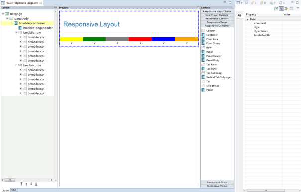
You usually have one bmobile:container control.
Under this you place several bmobile:row containers as subnodes.
Each row is divided into a maximum of 12 columns. The bmobile:col
control spans 1-12 columns. All bmobile:col controls of a
bmobile:row should not span more than 12 columns altogether.
In the example above the bmobile:rows each have 6
bmobile:col controls. Each bmobile:col spans 2
columns on every device. The number of columns spanned by a
bmobile:col is specified via CSS. The corresponding CSS style
class is set as value in the property styleclasses.
Bootstrap supports the setting of device-dependent style classes. The naming convention is:
none (for phones - screens less than 576px wide)
sm (for phones - screens equal to or greater than 576px wide)
md (for tablets - screens equal to or greater than 778px wide)
lg (for desktops - screens equal to or greater than 992px wide)
xl (for wide desktops - screens equal to or greater than 1200px wide)
The class col-6 defines that the control spans 6
columns on an extra small device. Classes for different devices can be
combined. Each class scales up, so if you wish to set the same widths for extra
small, small (=sm) and medium (=md) devices you only need to specify the extra
small class – like col-6.
Based on this you place your controls into rows/cols so that the layout adapts to the different sizes of different devices.
On a large device like a desktop, you want to arrange several input controls side by side in one row:
But on a small device like a smartphone you want to arrange the input controls underneath each other:
For the example above the following classes have been specified in the NJX layout:
<bmobile:row>
     <bmobile:col styleclasses="col-12 col-md-6">
          <bmobile:flabel name="Firstname"></bmobile:flabel>
          <bmobile:ffield valueprop="firstname"></bmobile:ffield>
     </bmobile:col>
     <bmobile:col styleclasses="col-12 col-md-6">
          <bmobile:flabel name="Lastname"></bmobile:flabel>
          <bmobile:ffield valueprop="lastname"></bmobile:ffield>
     </bmobile:col>
</bmobile:row>
It defines a row with 2 bmobile:col controls.
Each control spans 12 columns on extra small and small devices and 6 columns on
medium and larger devices. It’s sufficient to specify the classes for the extra
small (col-12) and medium (col-md-6) devices. When 12 columns are reached the
next control is rendered underneath.
Rendering including responsiveness is based on CSS. The responsive controls of NJX are built with Bootstrap which brings a set of style classes for its components.
Many of the style classes are applied automatically to the controls. You don’t need to do anything or even know about them.
But especially the Bootstrap framework also supports many
style classes which you can additionally apply to use the powerful features of
Bootstrap. You can set these classes as values of the styleclasses
property in the corresponding control.
Some of the most popular Bootstrap classes for a control are shown in the Properties view of the Layout Painter. Clicking on the button to the right of the styleclasses property, opens a dialog. You can select from the suggested styleclasses. The text below the selected class explains its usage. Add one, or several classes. Classnames of any classes can be applied when separated by a blank.
The following shows an example from the NaturalAjaxDemos:
You can also add general, control-independent style classes from Bootstrap which are not in the drop-down box.
Below is an example for the Bootstrap .mark style class:
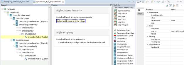
Here you find a complete list of the Bootstrap classes: https://www.w3schools.com/bootstrap4/bootstrap_ref_all_classes.asp.
The current version of Natural for Ajax is based on Bootstrap 4.6.
Like with non-responsive pages you can also apply an
additional CSS file to a layout page via setting the property
addstylesheetfile in the NATPAGE control. Then you
can also use any of your own CSS classes from your stylesheet file in the
styleclasses property.
Settings in the style property overwrite the style classes. The style details of style classes are defined in a .css style sheet file. You can easily change the .css file without changing the layouts. Also, you just define a style class once and re-use it in many layouts. When using the style property, the style is set hard coded in the controls. We recommend using style classes whenever possible. There are some rare situations in which you want to adapt the style just for a few controls in a single layout. In these cases, you use the style property.
In the example below you use a
style="text-align:center" to center text.
Another situation in which you might want to use the style property is in macro controls. A macro control is defined in a central location and just re-used. This allows to change the value of a style property in only one place and re-use the macro control in many layouts.
Besides the Bootstrap style classes, NJX itself defines some NJX-specific style classes. Ultimately, the responsive grids are built with the DataTables framework, which also brings a set of style classes.
A responsive NJX page which contains responsive grids automatically includes the following style sheet files:
A Bootstrap style sheet file, which contains the style classes for all Bootstrap components.
A DataTables style sheet file, which contains the style classes for grids.
A style sheet file, which contains NJX-specific style classes.
Optional: An own additional stylesheet.
NJX contains a default Bootstrap CSS file with the name bootstrap.min.css. This is automatically applied to each responsive page layout.
NJX uses DataTables (https://datatables.net/) for the responsive grids.
It includes 2 alternative CSS files to render the
BMOBILE:SIMPLEGRID control:
dataTables.bootstrap4.css.min: Includes style
classes for styling based on Bootstrap 4. It integrates well with the Bootstrap
CSS. For instance, the buttons of the grid are styled according to the applied
Bootstrap theme.
jquery.dataTables.css.min: Includes style
classes for styling based on the JQuery UI.
Per default NJX uses the
dataTables.bootstrap4.min.css. But you can change this default per
layout page. Simply set the url of the jquery.dataTables.css in
the datatablesstylesheetfile property of the NATPAGE tag.
The style classes are applied automatically to the controls.
You don’t need to know about these classes or even set them in the
styleclasses property. It’s all done for you by the NJX
framework.
NJX provides style classes to render controls. For non-responsive page layouts, the file <mywebapp>/cis/styles/CIS_DEFAULT.css is applied per default. For responsive page layouts, NJX applies the file <mywebapp>/cis/styles/responsive/BMOBILE4_Default.css per default.
Some of the style classes in
BMOBILE4_Default.css adapt the style classes defined for
Bootstrap and/or DataTables slightly. Some of the defined style adds new
classes to render NJX controls like the BMOBILE:DATATREE and the
BMOBILE:SIDEBAR* controls or adds helper classes, which you can
use in the styleclasses property to adapt the rendering
correspondingly.
The single style settings are described directly in the file
BMOBILE4_Default.css as comments.
Important:
DO NOT MODIFY THE
BMOBILE4_Default.css DIRECTLY! Instead, follow the
customization guide in the next section to adapt settings.
In most cases you want to apply your own specific style to your application – with your company or product's colors and shapes. The following describes the steps:
Set your Bootstrap theme.
Rebuild your NJX-specific Style Classes with your Bootstrap theme and set the adapted NJX-specific classes.
Optional: Customize your NJX-specific Style Classes.
Optional: Set your Datatables theme. Usually this is not required because the Datatables style automatically adapts very well to the Bootstrap theme.
Optional: Add your own additional style sheet.
NJX uses Bootstrap components to implement the responsive NJX controls. All Bootstrap style classes for the existing Bootstrap components are included in a .css file. Variations of this .css file exist which apply different looks and feels. These variations are called themes. One theme might define a blue button color and another theme might define a grey button color or rounded corners. NJX includes the Cerulean theme from https://bootswatch.com/cerulean/for Bootstrap version 4 as default.
If you want to use a different theme in your NJX applications, you basically have 3 options:
Download a free theme. Several providers of free themes exist. One example is https://bootswatch.com.
Buy a theme from corresponding theme providers.
Create your own theme. To create your own theme, some theme builder tools exist. An example is https://bootstrap.build/
In all 3 cases the result is a .css file containing the corresponding Bootstrap classes. Normally the name for the minified file is bootstrap.min.css.
Note:
We cannot guarantee that any downloadable samples or output
produced by such third-party services or tools will be fully compatible. Before
using and downloading, please check the licenses under which the web service,
the tool or the output are provided by the authors.
Per default, NJX uses the Bootstrap theme <mywebapp>/HTMLBasedGUI/bootstrap4/css/boostrap.min.css.
If you want to set a different Bootstrap theme in your responsive page layout, do the following:
In your NaturalONE project, place the bootstrap.min.css into the styles subfolder of your User Interface Component. If you have several User Interface Components, create a “Global User Interface Component” – as described in the NaturalONE documentation - and place it there.
If you only want to set this theme for a single layout and
not the complete application you can use the
responsivestylesheetfile property in the NATPAGE to set your
Bootstrap theme as shown in the example below:
If you want to set your own Bootstrap theme for the whole
application, you can create a corresponding NATPAGE template – as described in
the documentation NaturalONE > Ajax Developer > Getting Started
with the Layout Painter > Creating Custom Layout Templates – and
set the responsivestylesheetfile property in your template.
Alternatively, you can set the attribute defaultresponsivecss in
the cisconfig.xml file as shown below:
<cisconfig defaultresponsivecss="../myuserinterfacecomponent/styles/mybootstrap.css"
For more information on how to work with cisconfig.xml files in NaturalONE, see the documentation NaturalONE > Ajax Developer > Getting Started with Ajax Developer > Using Ajax Configuration Files.
If you change defaultresponsivecss in the
cisconfig.xml file, you need to rebuild the User Interface
Components in your Natural ONE projects.
NJX versions will be upgraded to higher Bootstrap versions from time to time. Please check the release notes if a new Bootstrap version has been applied. In case a new Bootstrap version has been applied, it is strongly recommended to replace your custom Bootstrap themes with the corresponding themes for this version. It is not guaranteed that the NJX with the new Bootstrap version will work with Bootstrap themes of lower Bootstrap versions.
Bootstrap supports Syntactically Awesome Style Sheets (SASS). This allows you to adapt Bootstrap themes to your needs by setting single variables. The big advantage is that you simply need to set the variables and don’t need to rewrite or overwrite the CSS classes themselves. A Bootstrap theme usually also consists of a file with the name _variables.scss. This file contains a set of variables you can customize and these variables can be used by other style sheets. This allows you to simply rebuild the NJX-specific style classes with the specific settings of your theme, as explained in the next section. Be sure to create or download the _variables.scss file for your theme.
The default style classes in BMOBILE4_Default.css match the style of the default Bootstrap theme used in NJX. If you are using a different Bootstrap theme you usually need to create a stylesheet file which matches the style (colors, fonts, etc.) of your custom Bootstrap theme. You don’t need to modify any CSS directly because the NJX-specific style classes are based on the Bootstrap SASS variables. You simply need to rebuild the NJX-specific CSS file.
In your NaturalONE, open the context menu (right-click) and then select “New/Responsive Style Sheet” as shown below:
Enter a name for your CSS file in the opened wizard and press “Finish”:
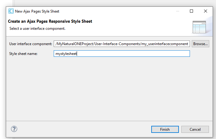
This will create the following files in the ./styles subfolder of your User Interface Component:
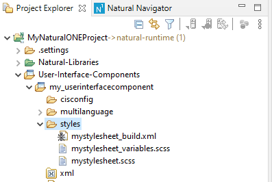
The table below explains the purposes of the three files in the ./styles subfolder:
| File name | Purpose |
|---|---|
| mystylesheet_build.xml | Ant script which generates the NJX-specific CSS file using the mystylesheet_variables.scss and mystylesheet.scss files. |
| mystylesheet_variables.scss | SASS variable settings in case you would like to customize the NJX-specific CSS (optional). |
| mystylesheet.scss | The main SASS file which contains all the imports for the generation. You only need to adapt the first import for your specific Bootstrap theme as described below. |
The file mystylesheet.scss is opened automatically in an Eclipse editor. The first import statement imports the _variables.scss file of the default Bootstrap theme of NJX. You need to adapt the path to the _variables.scss file of your Bootstrap theme.
If you copied your theme to the ./styles/mytheme subfolder of your User Interface Component, you would change the line:
@import "C:/myworkspace/.naturalone/apachetomcat/webapps/cisnatural/HTMLBasedGUI/bootstrap4/scss/bootswatch_cerulean/variables";to
@import "mytheme/variables";That’s all you need to change in the mystylesheet.scss files. For a further example, have a look at the mydarklynjx.css in the njxdemos/styles folder of the NaturalAjaxDemos.
To generate a CSS file from the SASS files, you need a SASS compiler. Currently NJX does not include a SASS compiler. NJX itself uses the SASS compiler https://github.com/sass/dart-sass, which can be downloaded via npm (see https://sass-lang.com/dart-sass). Be sure to use a Bootstrap 4.6 compatible SASS compiler as described here: https://getbootstrap.com/docs/4.6/getting-started/build-tools/#sass.
The mystylesheet_build.xml file is a ready-to-use Ant script for generating the CSS file. All you need to set is the path of your SASS compiler as Variable when running the Ant script.
Example:
ant -Dsass=c:/mynpm/npm/sass.cmd
The Ant script will create the NJX-specific CSS file mystylesheet.css for your Bootstrap theme.
Besides regenerating the NJX-specific CSS so that it reflects your Bootstrap theme, you can also customize the NJX-specific CSS classes. Instead of modifying the classes directly, the customization is done via SASS variables. The file ./cis/styles/responsive/scss/_njxvariables.scss of your NJX installation contains several variables for the NJX-specific CSS.
If you want to change specific settings, do the following:
Copy the specific variable definition you want to change from the _njxvariables.scss file into your mystylesheet_variables.scss file.
Adapt the settings.
Rebuild the NJX-specific CSS by running the Ant script mystylesheet_build.xml as described above.
You’ll find two commented-out examples in the mystylesheet_variables.scss file:
// Examples for BMOBILE:SIMPLEGRID control
// Show the edit buttons on hover
// $njx-simplegrid-edit-onhover: true;
// change color for selected lines to orange
// $njx-simplegrid-select-bg: rgba($orange, .3);
If you want to set your NJX-specific CSS file in your responsive page layout, do the following:
For a single layout you can use the
stylesheetfile property in the NATPAGE.
If you want to set it for the whole application, you can
create a corresponding NATPAGE template – as described in the documentation
NaturalONE > Ajax Developer > Getting Started with the Layout
Painter > Creating Custom Layout Templates – and set the
styleseheetfile property in your template. Alternatively, you can
set the attribute defaultbmobilecss in the
cisconfig.xml file as shown below:
<cisconfig defaultmobilecss="../myuserinterfacecomponent/styles/BMOBILE_Mystyle.css"
For more information on how to work with cisconfig.xml files in NaturalONE, see the documentation NaturalONE > Ajax Developer > Getting Started with Ajax Developer > Using Ajax Configuration Files.
If you changed the defaultbmobilecss in the
cisconfig.xml file, then you need to rebuild your User
Interface Components in your NaturalONE projects.
Newer NJX versions often bring new style classes for the new supported features. If you created a custom NJX style sheet file as described above, be sure to check the release notes for more information. Upgrading from NJX 9.1.2 and earlier (Bootstrap 3) to NJX 9.1.3 (Bootstrap 4) requires you to upgrade your style sheet file as described above.
Per default, NJX uses the DataTables theme <mywebapp>/HTMLBasedGUI/datatables/css/dataTables.bootstrap4.min.css. This renders the responsive grids using the Bootstrap style. As an alternative, you can set the file <mywebapp>/HTMLBasedGUI/datatables/css/jquery.dataTables.css as DataTables theme. This renders the responsive grids using the jquery style.
If you want to customize the rendering for either the “Bootstrap” or the “jquery” styling variant, you can create your own DataTables theme. DataTables provide an online theme creator tool to create own themes with your preferred colors and styles. It also provides downloads of customized stylesheets. For more information see https://datatables.net/manual/styling/ and https://datatables.net/download/.
The result is a .css file containing the corresponding DataTables style classes.
Note:
We cannot guarantee that any downloadable samples or output
produced by such third-party services or tools will be fully compatible. Before
using and downloading, please check the licenses under which the web service,
the tool or the output are provided by the authors.
If you want to set a different DataTables theme in your responsive page layout do the following:
In your NaturalONE project, place the corresponding .css file in the styles subfolder of your User Interface Component. If you have several User Interface Components, create a “Global User Interface Component” – as described in the NaturalONE documentation - and place the .css file there.
For a single layout, you can use the
datatablesstylesheetfile property in the NATPAGE to set your
DataTables theme as shown in the example below:
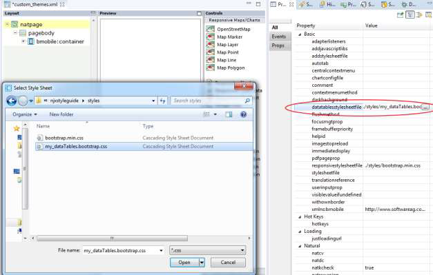
If you want to set your own DataTables theme for the whole
application, you can create a corresponding NATPAGE template – as described in
the documentation NaturalONE > Ajax Developer > Getting Started
with the Layout Painter > Creating Custom Layout Templates – and
set the datatablesstylesheetfile property in your template.
Alternatively, you can set the attribute defaultdatatablescss in
the cisconfig.xml file as shown below:
<cisconfig defaultdatatablecss="../myuserinterfacecomponent/styles/mydatatables.css"
For more information on how to work with cisconfig.xml files in NaturalONE, see the documentation NaturalONE > Ajax Developer > Getting Started with Ajax Developer > Using Ajax Configuration Files.
If you changed the defaultdatatablescss in
the cisconfig.xml file, you need to rebuild your User
Interfaces in your NaturalONE projects.
NJX versions will be upgraded to higher DataTables versions from time to time. Please check the release notes if a new DataTable version has been applied. In case a new DataTable version has been applied, it is strongly recommended to replace your custom DataTables themes by corresponding themes for this version. It is not guaranteed that the NJX with the new DataTables version will work with DataTables themes of lower DataTables versions.
Do NOT edit Bootstrap or DataTables themes directly. Otherwise, you need to manually apply these changes for each and every version upgrade. If you have for instance your Bootstrap theme, but just want to modify some settings, then use the SASS variables as described above for the customization.
Only if this is not possible you could add the corresponding
rules to an own additional stylesheet file and set this file in the property
addstylesheetfile of the NATPAGE control in your
layout page. You need to use the !important statement. The example
below changes the font size for buttons in the Bootstrap
.btn style class:
.btn
{
   font-size: 18px !important;
}
Prefer using the styleclasses property over the
style property.
If you see that you are creating many own additional style classes or having lots of additional style settings directly in your layouts, then consider using a different Bootstrap theme instead.
Prefer using themes over creating own style classes.
Always place your custom CSS files in the styles subfolder of one User Interface Component. Prefer using a “Global User Interface Component” for this.
Prefer using the cisconfig.xml settings
(defaultbmobilecss, defaultresponsivecss and
defaultdatatablescss) over using the corresponding NATPAGE
properties in all your layouts.