Positioning Elements in a Parent Object
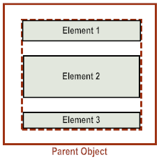
By default, when an application adds elements to a parent object, the elements are positioned vertically, one below the other, starting at the top of the parent object.
The elements are indented based on the inner padding of the parent object. When originally displayed the first element is spaced from the top of the parent object based on the vertical inner padding. For more info, see
Controlling the Inner Padding of Parent
Objects.
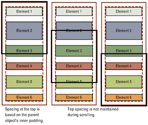
If you place elements in a scrollable parent object, for example a view or scrollable container, when a user scrolls through the contents, the top padding is not maintained.
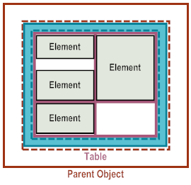
If you want to position child elements side by side within a parent object, use a table and place elements within table cells. For more information, see
Using Tables to Control the Layout of
Elements.
As an alternative to using the default layout or positioning elements using a table, you can use absolute positioning. To do so, set the X, Y, and Width attributes of the child elements that you add to the parent object. While absolute positioning gives you the greatest amount of control for exact positioning, using absolute positioning prevents the application’s user interface from automatically adapting to:

Different size devices

Different size of user interface elements among the various platforms

Re-aligning user interface elements when the orientation of the device is changed
If you use absolute positioning, you must add logic to your application to handle these types of issues.


