 Use background colors or Images to change the background of the entire table, entire rows, and/or individual cells.Use background colors or Images to change the background of the entire table, entire rows, and/or individual cells.Add borders around cells and control the thickness of the cell borders.Position elements side by side by placing the elements in table cells.Span cells horizontally and or vertically.
NativeUI Object | Attribute | Description |
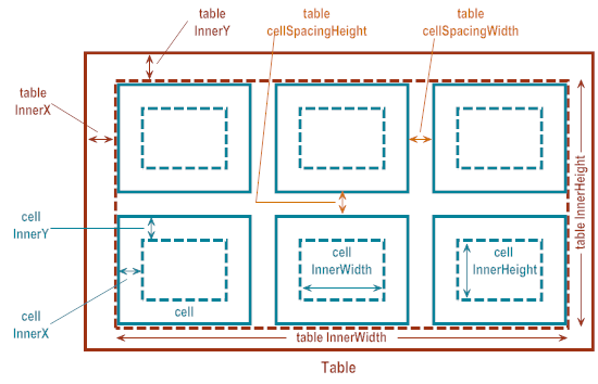
Table (nUITableElement object) | InnerX | Defines the distance from the table’s left edge to where table cells are drawn. |
InnerY | Defines the distance from the table’s top edge to where table cells are drawn. | |
InnerWidth | Defines the table’s usable width in which you can add content. | |
InnerHeight | Defines the table’s usable height in which you can add content. | |
cellSpacingWidth | Defines the distance between the table columns. | |
cellSpacingHeight | Defines the distance between table rows. | |
Table cell (nUITablecellElement object) | InnerX | Defines the distance from a cell’s left edge to where child elements are drawn. |
InnerY | Defines the distance from a cell’s left edge to where child elements are drawn. | |
InnerWidth | Defines a cell’s usable width in which you can add content. | |
InnerHeight | Defines a cell’s usable height in which you can add content. |
NativeUI Object | Attribute | Description |
Table (nUITableElement object) | Bgcolor | Defines the background color for the entire table. |
BackgroundDrawable | Defines the background color or Image for the entire table. | |
CellBorderColor | Defines the color for the borders drawn around the cells in the table. | |
CellBorderThickness | Defines the width of the borders drawn around the cells in the table. Specify a pixel value for the width. If you do not want the cells to have a border, specify 0 (zero). | |
Table row (nUITablerowElement object) | Bgcolor | Defines the background color for an entire row. |
BackgroundDrawable | Defines the background color or Image for an entire row. | |
Table cell (nUITablecellElement object) | Bgcolor | Defines the background color for a cell. |
BackgroundDrawable | Defines the background color or Image for a cell. |
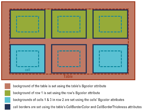 For row 1, the row background color is set to green. Because no background colors are set for the cells in row 1, the row background color displays in the cells.For row 2, the background color for the row is not set. As a result, the table background color displays for the row. Cells 1 and 3 in row 2 have a background color set to blue. The background color is not set for the cell 2 in row 2, so it takes on the background color of the table.The table’s cell borders are set to dark blue. As a result, all cells in the table have a dark blue border.For columns, you specify the relative column width sizes when using the constructor to create a nUITableElement object. For example, if you specify 1, 2, 1, the constructor creates a table with 3 columns where column 1 and 3 are half the size of column 2. In other words, column 1 uses 25% of the table width, column 2 uses 50% of the table width, and column 3 uses the remaining 25%.For table rows (nUITablerowElement objects), by default, the height of a row is determined by the height of the cells that the row contains. If you want, you can set the Height attribute of a nUITablerowElement object to specify a pixel value to use for the row height. However, if the cells in the table are larger than the pixel value you specify, the content is clipped.Cell width is determined by the size of the column in which the cell resides, and also taking into consideration the column spacing, which is the gap between columns in the table. The column spacing is set using the CellSpacingWidth attribute of the nUITableElement object.Cell height, by default, is determined by the height of the cell’s contents and inner padding. If you want, you can set the Height attribute of a nUITablecellElement object to specify a pixel value to use for the cell height. However, if the contents of a cell is larger than the pixel value you specify, the content is clipped.
 For elements that you place in table cells, the element width and height is determined the same as placing the elements in any parent object. For more information, see Sizing Child Elements.
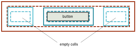