
This document covers the following topics:
Online help is accessible from the following controls:
TITLEBAR (online help for a whole page)
FIELD
CHECKBOX
RADIOBUTTON
COMBOFIX
COMBODYN2
In addition, you can place special HELPICON controls at any point of your page.
Online help is either activated by pressing F1 inside the controls or by clicking on the corresponding icon.
Each control that supports online help offers a property
helpid. In this property, you define an ID that is
used for building a URL. This points to the page which appears when invoking
the online help for the control.
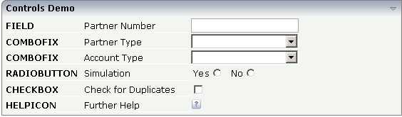
Let us have a look at the following page:
Inside the XML layout definition, you see the
helpid definitions:
<rowarea name="Controls Demo">
    <itr>
        <label name="FIELD" width="110" labelstyle="font-weight:bold">
        </label>
        <label name="Partner Number" width="150">
        </label>
        <field valueprop="businessPartnerNumber" width="150" helpid="BusinessPartnerInput">
        </field>
    </itr>
    <itr>
        <label name="COMBOFIX" width="110" labelstyle="font-weight:bold">
        </label>
        <label name="Partner Type" width="150">
        </label>
        <combofix valueprop="partnerType" width="150" size="1" helpid="PartnerType">
            <combooption name="Private" value="private">
            </combooption>
            <combooption name="Business" value="business">
            </combooption>
            <combooption name="Other" value="other">
            </combooption>
        </combofix>
    </itr>
    <itr>
        <label name="COMBOFIX" width="110" labelstyle="font-weight:bold">
        </label>
        <label name="Account Type" width="150">
        </label>
        <combodyn valueprop="accountType" optarrayprop="accountTypeOptions" size="1"
                  width="150" helpid="AccountType">
        </combodyn>
    </itr>
    <itr>
        <label name="RADIOBUTTON" width="110" labelstyle="font-weight:bold">
        </label>
        <label name="Simulation" width="150">
        </label>
        <hdist>
        </hdist>
        <label name="Yes" asplaintext="true">
        </label>
        <radiobutton valueprop="simulation" value="on" helpid="Simulation">
        </radiobutton>
        <hdist width="10">
        </hdist>
        <label name="No" asplaintext="true">
        </label>
        <radiobutton valueprop="simulation" value="off" helpid="Simulation">
        </radiobutton>
        <hdist>
        </hdist>
    </itr>
    <itr>
        <label name="CHECKBOX" width="110" labelstyle="font-weight:bold">
        </label>
        <label name="Check for Duplicates" width="150">
        </label>
        <checkbox valueprop="checkDuplicates" helpid="CheckForDuplicates">
        </checkbox>
    </itr>
    <itr>
        <label name="HELPICON" width="110" labelstyle="font-weight:bold">
        </label>
        <label name="Further Help" width="150">
        </label>
        <helpicon helpid="FurtherHelp">
        </helpicon>
        <hdist>
        </hdist>
    </itr>
</rowarea>
The default way how a URL is derived out of a help ID is:
URL = /<name of web application> +
      /<application project> +
      /help +
      /<language> +
      /<helpid>.html
Example: in the standard Application Designer installation, in the project "cisdemos", being logged on in English, the help ID "AccountType" is transferred to:
/cis/cisdemos/help/en/AccountType.html
The content of the HTML page which is called is completely up to you.
Consequently, the files containing the online help are located inside the following directory:
<web application directory>/
  <application project>
    help/
      <language>/
        <helpid>.html
| Basic | |||
| helpid |
Help id that is passed to the online help management when the user clicks onto the icon. |
Optional | |
| iconurl |
URL of image that is displayed inside the control. Any image type (.gif, .jpg, ...) that your browser does understand is valid. Use the following options to specify the URL: (A) Define the URL relative to your page. Your page is generated directly into your project's folder. Specifiying "images/xyz.gif" will point into a directory parallel to your page. Specifying "../HTMLBasedGUI/images/new.gif" will point to an image of a neighbour project. (B) Define a complete URL, like "http://www.softwareag.com/images/logo.gif". |
Optional | |
| title |
Text that is shown as tooltip for the control. Either specify the text "hard" by using this TITLE property - or use the TITLETEXTID in order to define a language dependent literal. |
Optional | |
| titletextid |
Text ID that is passed to the multi lanaguage management - representing the tooltip text that is used for the control. |
Optional | |
| visibleprop |
Name of an adapter property that provides the information if this control is displayed or not. As consequence you can control the visibility of the control dynamically. The server side property needs to be of type "boolean". |
Optional | |
| withdistance |
If set to "true" then 2 pixels of distance are kept on the left and on the right of the icon. Reason behing: if arranging several icons inside one table row (ITR, TR) then a certain distance is kept between the icons when this property is set to "true". |
Optional |
true false |
| align |
Horizontal alignment of control in its column. Each control is "packaged" into a column. The column itself is part of a row (e.g. ITR or TR). Sometimes the size of the column is bigger than the size of the control itself. In this case the "align" property specifies the position of the control inside the column. In most cases you do not require the align control to be explicitly defined because the size of the column around the controls exactly is sized in the same way as the contained control. If you want to directly control the alignment of text: in most text based controls there is an explicit property "textalign" in which you align the control's contained text. |
Optional |
left center right |
| valign |
Vertical alignment of control in its column. Each control is "packaged" into a column. The column itself is part of a row (e.g. ITR or TR). Sometimtes the size of the column is bigger than the size of the control. In this case the "align" property specify the position of the control inside the column. |
Optional |
top middle bottom |
| colspan |
Column spanning of control. If you use TR table rows then you may sometimes want to control the number of columns your control occupies. By default it is "1" - but you may want to define the control to span over more than one columns. The property only makes sense in table rows that are snychronized within one container (i.e. TR, STR table rows). It does not make sense in ITR rows, because these rows are explicitly not synched. |
Optional |
1 2 3 4 5 50 int-value |
| rowspan |
Row spanning of control. If you use TR table rows then you may sometimes want to control the number of rows your control occupies. By default it is "1" - but you may want to define the control to span over more than one columns. The property only makes sense in table rows that are snychronized within one container (i.e. TR, STR table rows). It does not make sense in ITR rows, because these rows are explicitly not synched. |
Optional |
1 2 3 4 5 50 int-value |
| comment |
Comment without any effect on rendering and behaviour. The comment is shown in the layout editor's tree view. |
Optional | |