This document covers the following topics:
The following image shows an example for a tree management:
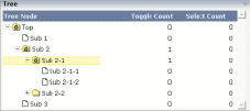
The grid contains three columns: the first column shows the tree node, the other two columns display some text information.
The XML layout definition is:
<rowarea name="Tree">
    <rowtablearea2 griddataprop="treeGridInfo" rowcount="8" width="500" withborder="false">
        <tr>
            <label name="Tree Node" width="200" asheadline="true">
            </label>
            <label name="Toggle Count" width="100" asheadline="true"
                   labelstyle="text-align:right">
            </label>
            <label name="Select Count" width="100" asheadline="true"
                   labelstyle="text-align:right">
            </label>
        </tr>
        <repeat>
            <tr>
                <treenode3 width="200" withplusminus="true"
                           imageopened="images/fileopened.gif"
                           imageclosed="images/fileclosed.gif"
                           imageendnode="images/fileendnode.gif">
                </treenode3>
                <textout valueprop="toggleCount" width="100" align="right">
                </textout>
                <textout valueprop="selectCount" width="100" align="right">
                </textout>
            </tr>
        </repeat>
    </rowtablearea2>
</rowarea>
You see that the TREENODE3 control is placed inside the control grid
just as a normal control. There are certain properties available which
influence the rendering: in the example, the name of the tree node images is
statically overwritten. The flag withplusminus is
set to true - consequently, small
"+"/"-" icons are placed
in front of the node.
The corresponding adapter code is:
// This class is a generated one.

import com.softwareag.cis.server.Adapter;
import com.softwareag.cis.server.util.NODEInfo;
import com.softwareag.cis.server.util.TREECollection;

public class tree_01Adapter
    extends Adapter
{
    // class >TreeGridInfoItem<
    public class Item extends NODEInfo
    {
        int m_toggleCount = 0;
        int m_selectCount = 0;

        public Item(String text)
        {
            super(text);
        }
        public void reactOnToggle() { m_toggleCount++; }
        public void reactOnSelect() { m_selectCount++; }
        public int getToggleCount() { return m_toggleCount; }
        public int getSelectCount() { return m_selectCount; }
    }

    // property >treeGridInfo<
    TREECollection m_treeGridInfo = new TREECollection();
    public TREECollection getTreeGridInfo() { return m_treeGridInfo; }

    /** initialisation - called when creating this instance*/
    public void init()
    {
        m_treeGridInfo = new TREECollection();
        Item item = new Item("Top");
        m_treeGridInfo.addTopNode(item,false);
        m_treeGridInfo.addSubNode(new Item("Sub 1"),item,true,false);
        Item subItem = new Item("Sub 2");
        m_treeGridInfo.addSubNode(subItem,item,false,false);
        Item subItem21 = new Item("Sub 2-1");
        m_treeGridInfo.addSubNode(subItem21,subItem,false,false);
        m_treeGridInfo.addSubNode(new Item("Sub 2-1-1"),subItem21,true,false);
        m_treeGridInfo.addSubNode(new Item("Sub 2-1-2"),subItem21,true,false);
        Item subItem22 = new Item("Sub 2-2");
        m_treeGridInfo.addSubNode(subItem22,subItem,false,false);
        m_treeGridInfo.addSubNode(new Item("Sub 2-2-1"),subItem22,true,false);
        m_treeGridInfo.addSubNode(new Item("Sub 3"),item,true,false);
        // open top node
        m_treeGridInfo.toggleNode(item);
    }
}
The grid collection is an instance of the class
TREECollection from the package
com.softwareag.cis.server.util. (Remember that the class
GRIDCollection is used for normal grids.) The
TREECollection has all functions that are required
for:
server-side scrolling,
selecting tree nodes,
opening and closing tree nodes.
The items of the tree collection are derived from a predefined class
NODEInfo from the package
com.softwareag.cis.server.util. By overwriting the
methods reactOnToggle() and
reactOnSelect(), you can react on user interaction.
Each tree node is represented by one single instance of this item class.
The tree is built inside the init() method of
the adapter. For filling the tree, the following methods of the
TREECollection class are used:
addTopNode()
addSubNode()
See the JavaDoc documentation for more information on these methods and other methods for manipulating the tree.
The tree can be filled "all at once" - as shown in this
example - or loaded step by step on the server side. For example, the tree can
be extended in the reactOnToggle() method when a node
is being opened.
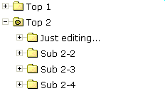
You may already have seen the property
withtextinput which you may set to
"true". If doing so, then the user can double-click
on a tree node and edit the node's text:
By pressing TAB or ENTER, the input is taken over
into the tree node and is by default transferred to the adapter with the next
request (e.g. when a button is chosen on the screen). Users can also use the
ESC key - in this case, the tree node is set back to its former
value. The server-side adapter can pick the text by the normal
getText() method which is available in the tree node
and is implemented on NODEInfo level.
If you want your server program to be explicitly notified by the text
change, then override the setText() method inside your
tree node implementation:
...
...
...
public class TreeItem extends NODEInfo
{
    ...
    ...
    ...
    public void setText(String value)
    {
        super.setText(value);
        // do your own implementation here
        outputMessage(MT_SUCCESS,"Node text changed: " + value);
    }

    ...
    ...
}
...
...
...
You can also explicitly define the point of time when the text change in
the user interface is transferred to the server. As with normal input controls
(FIELD, CHECKBOX, etc.), the text change is by default registered in the
browser, but does not trigger an immediate transfer to the server-side adapter.
By using the property flush, you can control this:
setting this property to "server" will immediately
synchronize the client with the adapter; setting it to
"screen" will immediately synchronize inside the
browser.
There is still one issue: inside the tree node item, there is the method
setDisableTextInput(boolean). Calling this method will
switch off the editing behavior for this tree node. Consequently, you can
explicitly define tree nodes that allow to edit text and others that do not
allow to do so. In case the user double-clicks onto a node that is explicitly
set to be not editable, the text will be displayed in disabled format so that
the user receives visual feedback that this operation is not supported for this
node.
It is possible to add further controls into the tree node. The typical cases are:
a check box,
an icon,
a toggle control.
The toggle control offers the possibility to manipulate a boolean value - it is similar to a check box, but allows to explicitly define a "true-image" and a "false-image". When using the toggle control inside the tree node, there is one useful feature: the toggle control allows to be defined in such a way that it show three different images:
"true-image"
"false-image"
"partial-image"
In trees, you typically have selections in which you want to select by toggle control one item and all of its subitems. The same goes for deselecting. But you also want to be able to express that inside one node, there are some selected subitems, but not all subitems are selected. The toggle control exactly matches these requirements. For more information, see the description of the TOGGLE control.
In the example at the beginning of this TREENODE3 section, the whole
TREECollection inside the adapter was filled in one
step. The following example shows how to dynamically load elements into a tree
that gets larger and larger due to the user's navigation in the tree.
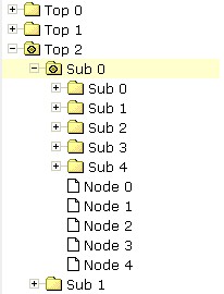
Every time the user opens a folder, the folders "Sub 0" to "Sub 4" and the end nodes "Node 0" to "Node 4" are input into the tree hierarchy:
// This class is a generated one.

import com.softwareag.cis.server.Adapter;
import com.softwareag.cis.server.util.NODEInfo;
import com.softwareag.cis.server.util.TREECollection;

public class tree_03Adapter
    extends Adapter
{
    // class >TreeItem<
    public class TreeItem extends NODEInfo
    {
        boolean m_subNodesAvailable = false;
        public TreeItem(String text)
        {
            super(text);
        }
        public void reactOnSelect() {}
        public void reactOnToggle()
        {
            if (m_subNodesAvailable == false)
            {
                m_subNodesAvailable = true;
                addSubNodesFor(this);
            }
        }
    // property >tree<
    TREECollection m_tree = new TREECollection();
    public TREECollection getTree() { return m_tree; }

    public void init()
    {
        TreeItem top;
        for (int i=0; i<10; i++)
        {
            top = new TreeItem("Top " + i);
            m_tree.addTopNode(top,false);
        }
    }

    private void addSubNodesFor(TreeItem top)
    {
        TreeItem sub;
        for (int i=0; i<5; i++)
        {
            sub = new TreeItem("Sub " + i);
            sub.setDisableTextInput(true);
            m_tree.addSubNode(sub,top,false,false);
            sub.setOpened(TREECollection.ST_CLOSED);
        }
        for (int i=0; i<5; i++)
        {
            sub = new TreeItem("Node " + i);
            m_tree.addSubNode(sub,top,true,false);
        }
    }
}
Inside the tree node class (TreeItem), a boolean
member m_subNodesAvailable indicates whether subnodes for this
instance have already been loaded. In the method
reactOnToggle(), new nodes are added by calling the
addSubNodesFor(...) method - depending on the
m_subNodesAvailable value.
If you are "very eager" or if you have for some good reason to be very strict in memory-house-keeping, then you could also remove all subnodes of a node when the node is closed.
Implementing drag-and-drop inside your tree is easy - you just have to do two things:
Set the enabledrag property to
"true" inside the TREENODE3 definitiion.
Add a method
reactOnContextMenuRequestDragTarget() into your node
class and implement your reaction.
The tree node inside your page will automatically offer the following behavior: when selecting one or more nodes, you can click on the node's text, drag the nodes, and drop them onto another node's text.
Sorry for the name
reactOnContextMenuRequestDragTarget() - it assumes
that you ought to open a context menu, but you can do any other reaction as
well. Of course, it is a nice feature to offer a context menu when the user
drops items onto another item - showing the user what functions can be executed
with the dropped items.
The following simple demo shows an example in which the node on which other nodes are dropped outputs the text of the dropped nodes:
...
...
...
// class >TreeItem< representing node object
public class TreeItem extends NODEInfo
{
    ...
    ...
    ...
    public void reactOnContextMenuRequestDragTarget()
    {
        // iterate through selected tree nodes and concatenate text
        NODEInfo[] selItems = m_tree.findSelectedItems();
        StringBuffer sb = new StringBuffer();
        for (int i=0; i<selItems.length; i++)
        {
            if (i != 0) sb.append(", ");
            sb.append(selItems[i].getText());
        }
        outputMessage(MT_SUCCESS,"Drop result: " + sb.toString());
    }
    ...
    ...
    ...
}
...
...
...
In the method
reactOnContextMenuRequestDragTarget, the selected
items are identified by using the tree collection's method
findSelectedItems().
Note:
With the TREENODE3 property
singleselect, you can change the tree from its
default "single select mode" into "multi select
mode".
There are three ways to define icons for a tree node:
No definition at all. The nodes will be rendered with the default icons.
Fixed definition of icons. Using the TREENODE3 properties
imageopened,
imageclosed and
imageendnode, you can define the icons to be
used.
Dynamic definition of icons. Each node can be assigned an own icon.
The icon is defined by a property of the server-side node object. The name of
the property is defined inside the TREENODE3 property
imageprop.
Have a look at the following example:
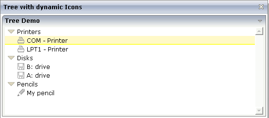
Each of the subnodes has its own icon, depending on its category. (An individual icon can also be used for folder nodes.)
The XML layout definition is:
<page model="com.softwareag.cis.demoapps.TreeDynamicIconsAdapter">
    <titlebar name="Tree with dynamic Icons">
    </titlebar>
    <pagebody>
        <rowarea name="Tree Demo">
            <rowtablearea2 griddataprop="lines" rowcount="10" width="100%" withborder="false">
                <repeat>
                    <tr>
                        <treenode3 width="100%" imageprop="imageName">
                        </treenode3>
                    </tr>
                </repeat>
            </rowtablearea2>
        </rowarea>
    </pagebody>
    <statusbar withdistance="false">
    </statusbar>
</page>
In the layout definition, you see that the TREENODE3 property
imageprop points to the property
imageName.
The adapter code is:
package com.softwareag.cis.demoapps;

// This class is a generated one.

import java.util.*;
import com.softwareag.cis.server.*;
import com.softwareag.cis.server.util.*;
import com.softwareag.cis.util.*;

public class TreeDynamicIconsAdapter
    extends Adapter
{
    public class LinesItem extends NODEInfo
    {
        public LinesItem(String text, String imageName)
        {
            super(text);
            m_imageName = imageName;
        }

        String m_imageName;
        public String getImageName() { return m_imageName; }
        public void setImageName(String value) { m_imageName = value; }

        public void reactOnSelect()
        {
        }

        public void reactOnToggle()
        {
        }
    }

    // property >lines<
    TREECollection m_lines = new TREECollection();
    public TREECollection getLines() { return m_lines; }

    public void init()
    {
        LinesItem top = new LinesItem("Printers",null);
        m_lines.addTopNode(top,false);
        m_lines.addSubNode(new LinesItem("LPT1 - Printer","images/print.gif"),top,true,true);
        m_lines.addSubNode(new LinesItem("COM - Printer","images/print.gif"),top,true,true);
        top = new LinesItem("Disks",null);
        m_lines.addTopNode(top,false);
        m_lines.addSubNode(new LinesItem("A: drive","images/save.gif"),top,true,true);
        m_lines.addSubNode(new LinesItem("B: drive","images/save.gif"),top,true,true);
        top = new LinesItem("Pencils",null);
        m_lines.addTopNode(top,false);
        m_lines.addSubNode(new LinesItem("My pencil","images/editdisabled.gif"),top,true,true);
    }

}
The imageName property is implemented on
tree node level (i.e. as property inside the inner class
LinesItem). In the init method,
the property is defined to be "null" for the top
nodes and to hold a value for the leaf nodes.
Again: you could also define an individual icon for the top nodes - in
the same way you do it for the leaf nodes. The example above shows that the
different ways of assigning icons build on one another: if the dynamic icon is
not passed (as done with the top nodes), then these icons are selected that are
defined with
imageopened/imageclosed/imageendnode
properties. If these are not defined (as in the example), the default icon is
used.
| Basic | |||
| width |
Width of the control. There are three possibilities to define the width: (A) You do not define a width at all. In this case the width of the control will either be a default width or - in case of container controls - it will follow the width that is occupied by its content. (B) Pixel sizing: just input a number value (e.g. "100"). (C) Percentage sizing: input a percantage value (e.g. "50%"). Pay attention: percentage sizing will only bring up correct results if the parent element of the control properly defines a width this control can reference. If you specify this control to have a width of 50% then the parent element (e.g. an ITR-row) may itself define a width of "100%". If the parent element does not specify a width then the rendering result may not represent what you expect. |
Optional |
1 2 3 int-value |
| comment |
Comment without any effect on rendering and behaviour. The comment is shown in the layout editor's tree view. |
Optional | |
| Appearance | |||
| withplusminus |
If set to "true" then +/- Icons will be rendered in front of the tree items. |
Optional |
true false |
| withlines |
If set to "true" then the tree elements are connected with one another by gray lines. Please pay attention: PAGE layouts (Java), if switching this property to "true" then you have to create the instance of your server side TREECollection object with a special constructor: Example: TREECollection m_tree = new TREECollection(true) |
Optional |
true false |
| withtooltip |
If set to "true" then the text of an item is also available as tool tip. Use this option in case you expect that the horizontal space of the item will not be sufficient to display the whole text of the item. |
Optional |
true false |
| withtextinput |
If set to "true" then the tree node can also be edited. Editing is started when the user double clicks the node. The text that is input is passed into the property "text" which is implemented in the default NODEInfo implementation. |
Optional |
true false |
| imageopened |
Image of a tree node that has subnodes and that is currently showing its nodes. The image either is defined statically by this property or also may be defined dynamically - see the corresponding properties defined with this control. |
Optional | |
| imageclosed |
Image of a tree node that has subnodes and that is currently not showing its nodes. The image either is defined statically by this property or also may be defined dynamically - see the corresponding properties defined with this control. |
Optional | |
| imageendnode |
Image of a tree node that is an end node (leaf node). The image either is defined statically by this property or also may be defined dynamically - see the corresponding properties defined with this control. |
Optional | |
| singleselect |
If set to "true" then only one item can be selected. If set to "false" then multiple icons can be selected. |
Optional |
true false |
| directselectevent |
Event that represents a tree node selection. A tree node selection is done when the user clicks/doubleclicks on the tree node text. In this case the select() method is called in the corresponding node object on server side. |
Optional |
ondblclick onclick |
| directselectelement |
If set to "textonly" only user clicks on the tree node text will select the node. If set to "allspace" also user clicks outside the area occupied by the node text will select the node. |
Optional |
textonly allspace |
| selectionstylevariant |
Some controls offer the possibility to define style variants. By this style variant you can address different styles inside your style sheet definition file (.css). If not defined "normal" styles are chosen, if defined (e.g. "VAR1") then other style definitions (xxxVAR1xxx) are chosen. Purpose: you can set up style variants in the style sheet defintion and use them multiple times by addressing them via the "stylevariant" property. CIS currently offerst two variants "VAR1" and "VAR2" but does not predefine any semantics behind - this is up to you! |
Optional |
VAR1 VAR2 |
| textstylevariant |
Some controls offer the possibility to define style variants. By this style variant you can address different styles inside your style sheet definition file (.css). If not defined "normal" styles are chosen, if defined (e.g. "VAR1") then other style definitions (xxxVAR1xxx) are chosen. Purpose: you can set up style variants in the style sheet defintion and use them multiple times by addressing them via the "stylevariant" property. CIS currently offerst two variants "VAR1" and "VAR2" but does not predefine any semantics behind - this is up to you! |
Optional |
VAR1 VAR2 |
| pixelshift |
Number of pixels that each hierarchy level is indented. If not defined then a standard is used. |
Optional |
1 2 3 int-value |
| pixelshiftendnode |
Number of pixels that end nodes are indented. If not defined then a standard is used. |
Optional |
1 2 3 int-value |
| colspan |
Column spanning of control. If you use TR table rows then you may sometimes want to control the number of columns your control occupies. By default it is "1" - but you may want to define the control to span over more than one columns. The property only makes sense in table rows that are snychronized within one container (i.e. TR, STR table rows). It does not make sense in ITR rows, because these rows are explicitly not synched. |
Optional |
1 2 3 4 5 50 int-value |
| rowspan |
Row spanning of control. If you use TR table rows then you may sometimes want to control the number of rows your control occupies. By default it is "1" - but you may want to define the control to span over more than one columns. The property only makes sense in table rows that are snychronized within one container (i.e. TR, STR table rows). It does not make sense in ITR rows, because these rows are explicitly not synched. |
Optional |
1 2 3 4 5 50 int-value |
| pixelheight |
Height of the control in pixels. |
Optional |
1 2 3 int-value |
| tabindex |
Index that defines the tab order of the control. Controls are selected in increasing index order and in source order to resolve duplicates. |
Optional |
-1 0 1 2 5 10 32767 |
| Binding | |||
| imageprop |
Name of property of the item objects that provides for a image for the tree node. Each node may provide for its own image, e.g. dependent on the type of node. If the adapter property passes back "null" then the image is taken from the static definitions that you may parallely do by using the properties IMAGEOPENED, IMAGECLOSED and IMAGEENDNODE. |
Optional | |
| focusedprop |
Name of property of the item objects - representing the individual rows of the collection - that indicates if the row receives the keyboard focus. Must be of type "boolean"/ "Boolean". If more than one lines are returning "true" the first of them is receiving the focus. |
Optional | |
| flush |
Flush behaviour when using the possibility of having editable tree nodes. If double clicking on the tree node then you can edit its content. The FLUSH property defines how the browser behaves when leaving the tree node's input field: If not defined ("") then nothing happens - the changed tree node text is communicated to the server side adapter object with the next roundtrip. If defined as "server" then immediately when leaving the field a roundtrip to the server is initiated - in case you want your adapter logic to directly react on the item change. If defined as "screen" then the changed tree node text is populated inside the page inside the front end. |
Optional |
screen server |
| flushmethod |
When the data synchronization of the control is set to FLUSH="server" then you can specify an explicit method to be called when the user updates the content of the control. By doing so you can distinguish on the server side from which control the flush of data was triggered. |
Optional | |
| tooltipprop |
Name of property of the item objects that provides for a text that is shown if the user moves the mouse over the tree item (tooltip). |
Optional | |
| validdraginfosprop |
Name of a property that contains a 'comma separated list' of valid drag informations. |
Optional | |
| Drag and Drop | |||
| enabledrag |
If set to true then drag and drop is enabled within the tree. |
Optional |
true false |