This document covers the following topics:
Every time a control needs a static text definition (the name of a button or the name of a label), there are always two possibilities to define this text:
Specify a name directly.
Specify a text ID. This is a literal replaced with a string that is determined inside the multi language management at runtime. For more details, see Multi Language Management.
Most controls that allow dynamic sizing offer the following properties:
colspan - number of columns occupied by
the control.
rowspan - number of rows occupied by the
control.
width - width.
height - height.
These properties influence the way how controls are placed into container rows.
For users of previous releases: the
width property is deprecated. The rendering can be
controlled by COLSPAN and ROWSPAN now. In addition, there is the CELLSPAN
control allowing you to group your controls.
Controls are put into table columns. If the column is wider or higher than the control itself, then you can explicitly control the vertical and horizontal alignment of the control inside the columns.
Most controls offer two properties:
valign
Specifies the vertical alignment. Valid values are
"top", "middle",
"bottom". "middle" is the
default value.
align
Specifies the horizontal alignment. Valid values are
"left", "center",
"right". The default value depends on the control.
For example, labels are aligned "left" by default,
the default for radio buttons is "center".
Pay attention: valign and
align only affect the position of the control
inside the column in which it is positioned if the column is larger than the
control. If the column is exactly as wide and high as the control itself, which
is the typical case, then they do not have any visual effects - and also need
not be defined.
align/valign
do not affect the control's internal alignment.
Most controls provide properties to specify the binding to the adapter processing. There is a naming convention, which is:
The names of the properties which specify the binding to a property end with "prop".
The names of the properties which specify the binding to a method end with "method".
The type of the property which is referenced by a control depends on the control itself:
Most controls directly bind to simple properties - i.e. properties returning a simple data type: String, int, boolean, float, etc.
More complex controls bind to a complex data type - e.g. a text grid binds to a TEXTGRIDCollection.
The type of the property is described with each control. See also Appendix C - Data Types to be Used by Adapter Properties.
All controls that incorporate textual information - such as labels, buttons or fields - offer the possibility to influence directly the style that is used for displaying the information.
The normal style is derived from the definition inside a cascading style definition file (file layout.css inside the html/general directory of the server). Overwrite or enhance this style information for your controls by passing the style information inside the corresponding style properties.
The properties specifying the style information end with the suffix
"style", e.g. there is a property
labelstyle for the label tag. The value of the
property can be any kind of a valid HTML style specification. If you want to
change the display style of a label to be large and blue, define the label in
the following way:
<label name="Test" width="150" labelstyle="font-size: 24pt; color: #0000FF">
</label>
See Adapting the Look & Feel in the Special Development Topics for information on how to change the style of controls.
It is possible to influence the visibility of all input controls (FIELD, BUTTON, etc.) by properties of the adapter processing.
For some of these controls there is a property
visibleprop, specifying an adapter
property that returns "true"
or "false". By this, you can control whether you
want to display the control within the client or not.
Input controls support a property
statusprop and a property
displayprop. Using the corresponding adapter
properties, you can dynamically control the display
status of the input control. The adapter property for the
statusprop can return the
following values:
INVISIBLE
ERROR
ERROR_NO_FOCUS
FOCUS
FOCUS_NO_SELECT
The adapter property for the displayprop specifies
whether the control is display-only (TRUE) or whether it can be edited (FALSE).
The adapter property can return the values
"TRUE" and "FALSE".
The combination of these two property values dynamically defines how the controls are rendered at runtime (for an example, see 80_displayprop in the cisdemos project). The following table defines the rendering of the control for the different combinations:
displayprop |
statusprop |
Control Status |
|---|---|---|
| FALSE (default) | EDIT | |
| FALSE (default) | EDIT (deprecated) 1 | EDIT |
| FALSE (default) | INVISIBLE | INVISIBLE |
| FALSE (default) | ERROR | ERROR |
| FALSE (default) | ERROR_NO_FOCUS | ERROR_NO_FOCUS |
| FALSE (default) | FOCUS | FOCUS |
| FALSE (default) | FOCUS_NO_SELECT | FOCUS_NO_SELECT |
| TRUE | DISPLAY | |
| TRUE | DISPLAY (deprecated) 1 | DISPLAY |
| TRUE | INVISIBLE | INVISIBLE |
| TRUE | ERROR | ERROR_DISPLAY |
| TRUE | ERROR_NO_FOCUS | ERROR_DISPLAY |
| TRUE | FOCUS | DISPLAY |
| TRUE | FOCUS_NO_SELECT | DISPLAY |
1 For statusprop, the above-mentioned
deprecated values are still supported to ensure compatibility with older
versions. In case you use these deprecated values for statusprop,
the values for displayprop are ignored.
The literals used for the
statusprop are available in the interface
com.softwareag.cis.util.IControlStatusConstants:
package com.softwareag.cis.util;

public interface IControlStatusConstants
{
    public static final String CS_INVISIBLE = "INVISIBLE";
    public static final String CS_ERROR = "ERROR";
    public static final String CS_FOCUS = "FOCUS";
	   ...
}
The Adapter class from which
you inherit your adapters supports this interface - consequently, you can
directly use the CS_* constants inside your adapter implementations.
The generic
com.softwareag.cis.server.Adapter class that you use as
the base class for your adapter implementation already implements the
IControlStatusConstants interface: you can directly use
the constant definitions inside your adapter implementation.
The difference in behavior between "FOCUS" and "FOCUS_NO_SELECT" affects only the FIELD and TEXT controls. For these controls, FOCUS set the focus and selects the complete text inside the control. "FOCUS_NO_SELECT" sets the focus to the control, but does not select the text. For all other controls, "FOCUS_NO_SELECT" behaves like "FOCUS".
For all other controls - and for more complex manipulations of what is visible and not - use the possibility to be able to control the visibility of rows (ITR, TR) or containers (ROWAREA, ROWTABLE0): these controls provide for a visibility property and consequently can be switched on and off.
There is an extended management of what the control status
"INVISIBLE" means. Most input controls (FIELD,
CHECKBOX, etc.) supporting a statusprop or a
visibleprop also support a property
invisiblemode. The allowed values of
invisiblemode are:
invisible
The corresponding control is completely removed. The horizontal space
it occupied before is taken out.
cleared
The corrresponding control is not visible but still occupies its
horizontal space.
disabled
The corresponding control is displayed with a disabled state. This
state is only allowed with a certain number of controls (e.g. button and
icon).
Sometimes you want to control the keyboard focus inside a page. Here are the internal rules how a page finds out where to put the focus on.
The default reaction is - if a page is displayed for the first time - to put the focus on the first input control (FIELD, CHECKBOX, RADIOBUTTON, etc.) that is available inside a page. After that, you can navigate through the input controls - and the focus is kept stable when interacting with the server.
With statusprop - as mentioned in the
previous section - you can interrupt this default reaction; there are two
possibilities:
If an input control is set to status "ERROR", it requests the focus automatically. The purpose is to guide the user automatically to those fields that are not correctly entered.
If an input control is set to status "FOCUS", it is editable - just as normal - and also requests the focus.
If several input controls are requesting the focus at the same time, the focus is put on the first corresponding input control.
A demo page is available in the standard Application Designer workplace showing an example of how to use the focus management:
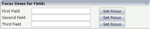
The XML layout definition for the first area "Focus Demo for Fields" looks as follows:
<rowarea name="Focus Demo for Fields">
    <itr>
        <label name="First Field" width="100">
        </label>
        <field valueprop="prop1" width="200" statusprop="prop1status">
        </field>
        <hdist width="30">
        </hdist>
        <button name="Set Focus" method="focus1">
        </button>
    </itr>
    <itr>
        <label name="Second Field" width="100">
        </label>
        <field valueprop="prop2" width="200" statusprop="prop2status">
        </field>
        <hdist width="30">
        </hdist>
        <button name="Set Focus" method="focus2">
        </button>
    </itr>
    <itr>
        <label name="Third Field" width="100">
        </label>
        <field valueprop="prop3" width="200" statusprop="prop3status">
        </field>
        <hdist width="30">
        </hdist>
        <button name="Set Focus" method="focus3">
        </button>
    </itr>
</rowarea>
In the demo, each field refers to a status property. The corresponding code of the adapter class looks as follows:
import com.softwareag.cis.server.Adapter;

// This class is a generated one.

public class FocusManagementAdapter
    extends Adapter
{
    // property >first<
    String m_first;
    public String getFirst() { return m_first; }
    public void setFirst(String value) { m_first = value; }

    // property >second<
    String m_second;
    public String getSecond() { return m_second; }
    public void setSecond(String value) { m_second = value; }

    // property >third<
    String m_third;
    public String getThird() { return m_third; }
    public void setThird(String value) { m_third = value; }

    // property >prop1<
    String m_prop1;
    public String getProp1() { return m_prop1; }
    public void setProp1(String value) { m_prop1 = value; }

    // property >prop1status<
    String m_prop1status;
    public String getProp1status() { return m_prop1status; }
    public void setProp1status(String value) { m_prop1status = value; }

    // property >prop2<
    String m_prop2;
    public String getProp2() { return m_prop2; }
    public void setProp2(String value) { m_prop2 = value; }

    // property >prop2status<
    String m_prop2status;
    public String getProp2status() { return m_prop2status; }
    public void setProp2status(String value) { m_prop2status = value; }

    // property >prop3<
    String m_prop3;
    public String getProp3() { return m_prop3; }
    public void setProp3(String value) { m_prop3 = value; }

    // property >prop3status<
    String m_prop3status;
    public String getProp3status() { return m_prop3status; }
    public void setProp3status(String value) { m_prop3status = value; }

    public void focus1() { m_prop1status = "FOCUS"; }
    public void focus2() { m_prop2status = "FOCUS"; }
    public void focus3() { m_prop3status = "FOCUS"; }

    /** start of data transfer */
    public void reactOnDataTransferStart()
    {
        super.reactOnDataTransferStart();
        // set default status of fields
        m_prop1status = "EDIT";
        m_prop2status = "EDIT";
        m_prop3status = "EDIT";
    }
}
Each time the page communicates with the adapter class, the focus
information for all fields is reset to "default"
inside the method reactOnDataTransferStart(). This
method is called prior to any set/get operations by the Application Designer runtime.
By choosing a button, the corresponding focus
method is called to set the status property to the value
"FOCUS".
Most input controls (FIELD, CHECKBOX, RADIOBUTTON, COMBOFIX, etc.)
support a property named flush. This property
controls whether data input from a user causes an immediate synchronisation
with the server or whether data input from a user is stored internally within
the client and is synchronized with the next flushing event (e.g. when choosing
a button).
There are three different values that can be specified with the
flush property:
"" (blank)
The data is not synchroized after leaving the control. This is the
default.
server
The data is synchronized with the server immediately when the data has
been entered, i.e. when the user has left the corresponding input field.
screen
The data is synchronized within the controls of the screen. This means
- if you have two fields displaying the same property - you can synchronize the
fields immediately, without interacting with the server.
Tip:
On the one hand, it is useful to flush information in a very fine
granular way; you can react on wrong entered data immediately - on the other
hand, you have to remember that each flush causes network traffic. The screen's
data is sent to the server side processing and the screen waits for the
response of the server. During this time, the page is blocked for input and the
user sees an hour glass popping up in the left top corner of the screen.
By default, the tab sequence of the controls of a page is defined by the
order of the controls inside the page's XML layout definition. Using the
property tabindex, this order can be overridden
and the order of the tab index can be explicitly defined.
The following example shows a page with three fields and one button with an explicitly defined tab sequence:
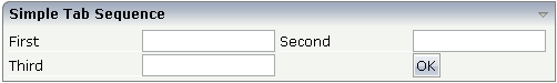
The XML layout definition is:
<rowarea name="Simple Tab Sequence">
    <itr takefullwidth="true">
        <coltable0 width="50%">
            <itr>
                <label name="First" width="120">
                </label>
                <field valueprop="first" width="120" tabindex="1">
                </field>
            </itr>
            <itr>
                <label name="Third" width="120">
                </label>
                <field valueprop="third" width="120" tabindex="3">
                </field>
            </itr>
        </coltable0>
        <coltable0 width="50%">
            <itr>
                <label name="Second" width="120">
                </label>
                <field valueprop="second" width="120" tabindex="2">
                </field>
            </itr>
            <itr>
                <hdist width="120">
                </hdist>
                <button name="OK" method="onOK" tabindex="4">
                </button>
            </itr>
        </coltable0>
    </itr>
</rowarea>
According to the sequence of controls inside the layout definition, the default tab sequence would be: field First, field Third, field Second and button .
Due to explicitly defining the tabindex
property for the fields and the button, the tab sequence is now correct: field
First, field Second, field
Third and button .
Pay attention:
Once having started to explicitly set the tab index in a page, you must consequently continue with all controls of the page. Adding new controls without tab index, is internally interpreted as if these controls were defined with tab index "0".
Equal tab indices in controls are allowed. In this case, the sequence of the controls inside the layout definition defines the tab sequence among the controls with an equal index.
Moving controls from one location to the other within a page typically means that you have to adapt the tab sequence accordingly.
The tab index usually is a positive integer value. You may define tab index "-1" for excluding certain controls from the tab sequence at all. In this case, the corresponding controls may only be reached by mouse clicking.
Conclusion:
In typical pages, you do not have to take care of the tab sequence at all because the default (tab sequence by order of controls in page layout) is adequate to the user's experience.
Only use the explicit definition of the tab sequence if really it is required - the effort for maintaing each tab index with each control should not be underestimated.
Tooltips can be applied to many controls. If the user hovers with the mouse cursor over a control for some seconds, a small yellow box appears showing some more detailed explanation.
The corresponding controls offer two properties:
title
Here you can specify a hard-coded text that is used as the
tooltip.
titletextid
Here you specify a text ID that is passed to the multi language
management..