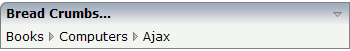
The BREADCRUMB control represents a horizontal list of method links. The number of links and the name of each link is dynamically derived from the adapter.
The control always occupies 100% of the given width.
The following topics are covered below:
The XML layout definition is:
<rowarea name="Bread Crumbs...">
    <breadcrumb breadcrumbprop="items">
    </breadcrumb>
</rowarea>
The Java code of the adapter is:
package com.softwareag.cis.test21;

import com.softwareag.cis.server.Adapter;
import com.softwareag.cis.server.util.BREADCRUMBInfo;
import com.softwareag.cis.server.util.BREADCRUMBItem;

public class BreadcrumbAdapter extends Adapter
{
    // ------------------------------------------------------------------------
    // inner classes
    // ------------------------------------------------------------------------

    // class >MyBCItem<
    public class MyBCItem extends BREADCRUMBItem
    {
        public MyBCItem(BREADCRUMBInfo info, String text)
        {
            super(info, text);
        }

        public void execute()
        {
            Object itemsInfo[] = m_items.getItems();
            MyBCItem items = this;
            m_items.clear();
            m_items = new BREADCRUMBInfo();

                if (((MyBCItem)itemsInfo[0]).equals(items))
                {
                    new MyBCItem(m_items, "Books");
                }
                else if (((MyBCItem)itemsInfo[1]).equals(items))
                {
                    new MyBCItem(m_items, "Books");
                    new MyBCItem(m_items, "Computers");
                }
                else if (((MyBCItem)itemsInfo[2]).equals(items))
                {
                    new MyBCItem(m_items, "Books");
                    new MyBCItem(m_items, "Computers");
                    new MyBCItem(m_items, "Ajax");
                }
            outputMessage(MT_SUCCESS, "Breadcrumb item: " + getText() + " was pressed!");
        }
    }

    // ------------------------------------------------------------------------
    // properties
    // ------------------------------------------------------------------------

    // property >infoText<
    String m_infoText;
    public String getInfoText() { return m_infoText; }

    // property >items<
    BREADCRUMBInfo m_items = new BREADCRUMBInfo();
    public BREADCRUMBInfo getItems() { return m_items; }

    // ------------------------------------------------------------------------
    // public usage
    // ------------------------------------------------------------------------

    /**
     */
    public void init()
    {
        m_infoText = "Please click on the breadcrumbs and see the result on the statusbar";
        new MyBCItem(m_items, "Books");
        new MyBCItem(m_items, "Computers");
        new MyBCItem(m_items, "Ajax");
    }
}
The list of items can be changed inside the adapter; the
breadcrumb list will react accordingly on the client side. When the user clicks
a link on the client side, the execute() method will
be called in the object of the BREADCRUMBInfo collection
which represents the link.
| Basic | |||
| breadcrumbprop |
Name of the adapter property that represents the control on adapter side. The property must be of name BREADCRUMBInfo. Please view the Java API Documentation for more information. |
Obligatory | |
| breadcrumbstyle |
CSS style definition that is directly passed into this control. With the style you can individually influence the rendering of the control. You can specify any style sheet expressions. Examples are: border: 1px solid #FF0000 background-color: #808080 You can combine expressions by appending and separating them with a semicolon. Sometimes it is useful to have a look into the generated HTML code in order to know where direct style definitions are applied. Press right mouse-button in your browser and select the "View source" or "View frame's source" function. |
Optional |
background-color: #FF0000 color: #0000FF font-weight: bold |
| pixeldistance |
Pixel distance between the links that are rendered. |
Optional |
1 2 3 int-value |
| comment |
Comment without any effect on rendering and behaviour. The comment is shown in the layout editor's tree view. |
Optional | |