This container represents an area surrounded by a border which may have a title text. By clicking on the title, the inner content is hidden (the container is "folded"). You can place icons (ICON, ICONLIST) into the header line (ROWAREAHEADER). Other content is placed into the ROWAREABODY container.
The following topics are covered below:
<rowareawithheader>
    <rowareaheader name="Note">
        <hdist width="20">
        </hdist>
        <icon image="../HTMLBasedGUI/images/cut.gif" method="onCut">
        </icon>
        <hdist width="6">
        </hdist>
        <icon image="../HTMLBasedGUI/images/copy.gif" method="onCopy">
        </icon>
        <hdist width="6">
        </hdist>
        <icon image="../HTMLBasedGUI/images/paste.gif" method="onPaste">
        </icon>
    </rowareaheader>
    <rowareabody>
        <itr takefullwidth="true">
            <text valueprop="text" width="100%" rows="5">
            </text>
        </itr>
    </rowareabody>
</rowareawithheader>
The above XML layout produces a page which looks as follows:
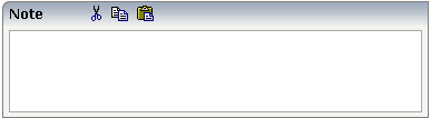
There are three icons within the header line (ROWAREAHEADER). The text box is placed into the body container (ROWAREABODY).
The adapter program looks as follows:
// property >text<
String m_text;
public String getText() { return m_text; }
public void setText(String value) { m_text = value; }

/** Method is called when clicking the Copy icon */
public void onCopy()
{
   outputMessage(MT_SUCCESS, "Copy...");
}

/** Method is called when clicking the Cut icon */
public void onCut()
{
    outputMessage(MT_SUCCESS, "Cut...");
}

/** Method is called when clicking the Paste icon */
public void onPaste()
{
    outputMessage(MT_SUCCESS, "Paste...");
}
| Basic | |||
| height |
Height of the control. There are three possibilities to define the height: (A) You do not define a height at all. As consequence the control will be rendered with its default height. If the control is a container control (containing) other controls then the height of the control will follow the height of its content. (B) Pixel sizing: just input a number value (e.g. "20"). (C) Percentage sizing: input a percantage value (e.g. "50%"). Pay attention: percentage sizing will only bring up correct results if the parent element of the control properly defines a height this control can reference. If you specify this control to have a height of 50% then the parent element (e.g. an ITR-row) may itself define a height of "100%". If the parent element does not specify a width then the rendering result may not represent what you expect. |
Optional |
100 150 200 250 300 250 400 50% 100% |
| comment |
Comment without any effect on rendering and behaviour. The comment is shown in the layout editor's tree view. |
Optional | |
| Visibility | |||
| foldable |
The "folding"-function that is available by clicking on the title of the area can be switched off ("false"). "True" is the default. |
Optional |
true false |
| foldableprop |
Name of adapter property that dynamically controls whether clicking on the title of the area will fold/unfoald this area. Valid values provided by the adapter property are TRUE (=foldable) and FALSE(=not foldable). |
Optional | |
| foldedprop |
Name of adapter property that controls whether the content of the ROWAREA is folded (true) or displayed (false). By using this property you can dynamically control the "folded"-status of the control by your adapter object. |
Optional | |
| visibleprop |
Name of an adapter property that provides the information if this control is displayed or not. As consequence you can control the visibility of the control dynamically. The server side property needs to be of type "boolean". |
Optional | |
| flush |
Flushing behaviour of the input control. By default an input into the control is registered within the browser client - and communicated to the server adapter object when a user e.g. presses a button. By using the FLUSH property you can change this behaviour. Setting FLUSH to "server" means that directly after changing the input a synchronization with the server adapter is triggered. As consequence you directly can react inside your adapter logic onto the change of the corresponding value. - Please be aware of that during the synchronization always all changed properties - also the ones that were changed before - are transferred to the adapter object, not only the one that triggered the synchonization. Setting FLUSH to "screen" means that the changed value is populated inside the page. You use this option if you have redundant usage of the same property inside one page and if you want to pass one changed value to all its representaion directly after changing the value. |
Optional |
screen server |
| flushmethod |
When the data synchronization of the control is set to FLUSH="server" then you can specify an explicit method to be called when the user updates the content of the control. By doing so you can distinguish on the server side from which control the flush of data was triggered. |
Optional | |
| Appearance | |||
| height | (already explained above) | ||
| withleftborder |
The control normally renders a black border around its area. With the properties WITHLEFTBORDER, WITHRIGHTBORDER and WITHBOTTOMBORDER you can avoid this. Reason behing: somtimes you want a ROWAREA/COLAREA to be used as "neighbour" of other ROWAERA/COLAREA controls. In this case one of the "neighbours" has to avoid the rendering of border lines - otherwise two border lines will be rendered. |
Optional |
true false |
| withtopborder |
See description of WITHLEFTBORDER property. |
Optional |
true false |
| withrightborder |
See description of WITHLEFTBORDER property. |
Optional |
true false |
| withbottomborder |
See description of WITHLEFTBORDER property. |
Optional |
true false |
| withtoppadding |
The control by default renders some blank vertical space (2 pixels) on top of its area. Reason: if you vertically arrange one ROW/COLAREA after the other then automatically some distance is put between. By specifying "false" you can avoid this behaviour. " |
Optional |
true false |
| image |
URL of image that is displayed inside the control. Any image type (.gif, .jpg, ...) that your browser does understand is valid. Use the following options to specify the URL: (A) Define the URL relative to your page. Your page is generated directly into your project's folder. Specifiying "images/xyz.gif" will point into a directory parallel to your page. Specifying "../HTMLBasedGUI/images/new.gif" will point to an image of a neighbour project. (B) Define a complete URL, like "http://www.softwareag.com/images/logo.gif". |
Optional | |
| imageprop |
Name of adapter property that provides as value the URL of the image that is shown inside the control. The URL must either be an absolute URL or a relative URL. |
Optional | |
| nameprop |
Name of adapter property that provides as value the text that is shown inside the control. |
Optional | |
| fixlayout |
The fixlayout property is important for saving rendering performance inside your browser. To become effective it requires to have specified the height and the width (if available as property) of the control. If setting fixlayout to "true" then the control's area is defined as area which is not sized dependent on its content (as normally done with table rendering). Instead the size is predefined from outside without letting the browser "look" into the content of the area. If the content is not fitting into the area then it is cut. You typically use this control if the content of the control's area is flexibly sizable. E.g. if the content (e.g. a TEXTGRID control) is following the size of the container. When using vertical percentage based sizing you should pay attention to set the fixlayout-property to "true" as often as possible. - The browser as consequence will be much faster in doing its rendering because a screen consists out of "building blocks" with simple to calculate sizes. |
Optional |
true false |
| Basic | |||
| name |
Text that is displayed inside the control. Please do not specify the name when using the multi language management - but specify a "textid" instead. |
Optional | |
| textid |
Multi language dependent text that is displayed inside the control. The "textid" is translated into a corresponding string at runtime. Do not specify a "name" inside the control if specifying a "textid". |
Optional | |
| comment |
Comment without any effect on rendering and behaviour. The comment is shown in the layout editor's tree view. |
Optional | |
| Online Help | |||
| title |
Text that is shown as tooltip for the control. Either specify the text "hard" by using this TITLE property - or use the TITLETEXTID in order to define a language dependent literal. |
Optional | |
| titletextid |
Text ID that is passed to the multi lanaguage management - representing the tooltip text that is used for the control. |
Optional | |
| Appearance | |||
| align |
Horizontal alignment of the controls inside the header line. |
Optional |
left center right |
| notabstop |
The title of the area by default can be used by the user to hide/show the area's content. In order to also reach this title with the tab-key is is part of the normal tab-sequence of a page. Set this property to "true" if you do not want to make the title reachable by tab-key. As consequnece hiding/showing will only be available by mouse-clicking on the title. |
Optional |
true false |
| tabindex |
Index that defines the tab order of the control. Controls are selected in increasing index order and in source order to resolve duplicates. |
Optional |
-1 0 1 2 5 10 32767 |
| Basic | |||
| paddingleft |
Number of pixels between the left border and the area's content. Default is 5 pixels. |
Optional |
1 2 3 int-value |
| paddingright |
Number of pixels between the right border and the area's content. Default is 5 pixels. |
Optional |
1 2 3 int-value |
| bodystyle |
CSS style definition that is directly passed into this control. With the style you can individually influence the rendering of the control. You can specify any style sheet expressions. Examples are: border: 1px solid #FF0000 background-color: #808080 You can combine expressions by appending and separating them with a semicolon. Sometimes it is useful to have a look into the generated HTML code in order to know where direct style definitions are applied. Press right mouse-button in your browser and select the "View source" or "View frame's source" function. |
Optional |
background-color: #FF0000 color: #0000FF font-weight: bold |
| withcontenttoppadding |
The control by default renders some blank vertical space (3 pixels) on bottom of the content area. By specifying "false" you can avoid this behaviour. |
Optional |
true false |
| withcontentbottompadding |
The control by default renders some blank vertical space (3 pixels) on bottom of the content area. By specifying "false" you can avoid this behaviour. |
Optional |
true false |