The ICONLIST is very similar to the BUTTONLIST, representing a list of items instead of a list of buttons. The list can either be a vertical list or a horizontal list.
The following topics are covered below:
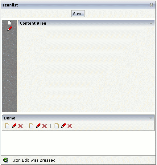
This example is already a complex example. Additional style information was added to make the icon list look like a bar which provides icons for favorites.
The XML layout definition is:
<page model="Icon_ListAdapter">
    <titlebar name="Iconlist">
    </titlebar>
    <header withdistance="false">
        <button name="Save">
        </button>
    </header>
    <pagebody>
        <vdist height="5">
        </vdist>
        <itr takefullwidth="true" height="300">
            <coltable0 width="50" takefullheight="true" fixlayout="true">
                <iconlist iconlistprop="iconList" cellspacing="3"
                          tablestyle="background-color:#808080">
                </iconlist>
                <vdist height="100%" backgroundstyle="background-color:#808080">
                </vdist>
            </coltable0>
            <coltable0 width="2" takefullheight="true" fixlayout="true"
                       tablestyle="background-color:#F7F3DE">
            </coltable0>
            <coltable0 width="100%" takefullheight="true" fixlayout="true">
                <rowarea name="Content Area" height="100%" withrightborder="false"
                         withbottomborder="false" withtoppadding="false"
                         areastyle="border-top: 0px">
                </rowarea>
            </coltable0>
        </itr>
        <vdist height="5">
        </vdist>
    </pagebody>
    <statusbar withdistance="false">
    </statusbar>
</page>
The server side adapter code that dynamically builds up the list of icons is:
import com.softwareag.cis.server.Adapter;
import com.softwareag.cis.server.util.ICONLISTInfo;
import com.softwareag.cis.server.util.ICONLISTItem;

// This class is a generated one.

public class Icon_ListAdapter
    extends Adapter
{
    // class >MyICONLISTItem<
    public class MyICONLISTItem extends ICONLISTItem
    {
        public MyICONLISTItem(ICONLISTInfo info, String imageURL, String text)
        {
            super(info, imageURL, text);
        }

        public void execute()
        {
            outputMessage(MT_SUCCESS,"Icon " + getText() + " was pressed");
        }
    }

    // property >iconList<
    ICONLISTInfo m_iconList = new ICONLISTInfo();
    public ICONLISTInfo getIconList() { return m_iconList; }

    /** initialisation - called when creating this instance*/
    public void init()
    {
        // Fill IconList
        MyICONLISTItem item;
        item = new MyICONLISTItem(m_iconList,"images/new.gif","New");
        item = new MyICONLISTItem(m_iconList,"images/edit.gif","Edit");

    }
}
Similar to the BUTTONLIST control, each icon is represented by a single
object. All objects are collected in an ICONLISTInfo
object.
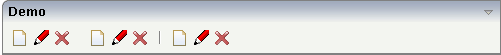
By setting the property vertical to
"false", you can build horizontal icon lists.
The layout definition is:
<rowarea name="Demo">
    <iconlist iconlistprop="iconList_02" vertical="false" cellspacing="3">
    </iconlist>
</rowarea>
The code for creating the icon list is:
public void init()
{
    // Fill IconList 02
    item = new MyICONLISTItem(m_iconList_02,"../HTMLBasedGUI/images/new.gif","New");
    item = new MyICONLISTItem(m_iconList_02,"../HTMLBasedGUI/images/edit.gif","Edit");
    item = new MyICONLISTItem(m_iconList_02,"../HTMLBasedGUI/images/remove.gif","Remove");
    m_iconList_02.addDistance();
    item = new MyICONLISTItem(m_iconList_02,"../HTMLBasedGUI/images/new.gif","New");
    item = new MyICONLISTItem(m_iconList_02,"../HTMLBasedGUI/images/edit.gif","Edit");
    item = new MyICONLISTItem(m_iconList_02,"../HTMLBasedGUI/images/remove.gif","Remove");
    m_iconList_02.addSeparator();
    item = new MyICONLISTItem(m_iconList_02,"../HTMLBasedGUI/images/new.gif","New");
    item = new MyICONLISTItem(m_iconList_02,"../HTMLBasedGUI/images/edit.gif","Edit");
    item = new MyICONLISTItem(m_iconList_02,"../HTMLBasedGUI/images/remove.gif","Remove");
}
| Basic | |||
| iconlistprop |
Name of adapter property representing the control on server side. The property must be of type ICONLISTInfo. Read further information inside the Java API Documentation. |
Obligatory | |
| vertical |
Direction of the icon list. If not specified (or set to "true") then the icons are arranged in one column, one below the other. If specified as "false" then the icons are arrange in one row, one aside the other. |
Optional |
true false |
| cellspacing |
An icons of the ICONLIST control is embedded into an internal cell. The CELLSPACING property defined the number of pixels that are kept between the icon an the border of this cell. Use the CELLSPACING in order to define a certain distance each icon keeps from the next item. |
Optional |
1 2 3 int-value |
| comment |
Comment without any effect on rendering and behaviour. The comment is shown in the layout editor's tree view. |
Optional | |
| Appearance | |||
| imagewidth |
Pixel width of the image that is shown inside the icon. If not defined then the icon is rendered with its normal width. |
Optional | |
| imageheight |
Pixel height of the image that is shown inside the icon. If not defined then the icon is rendered with its normal height. |
Optional | |
| align |
Horizontal alignment of control in its column. Each control is "packaged" into a column. The column itself is part of a row (e.g. ITR or TR). Sometimes the size of the column is bigger than the size of the control itself. In this case the "align" property specifies the position of the control inside the column. In most cases you do not require the align control to be explicitly defined because the size of the column around the controls exactly is sized in the same way as the contained control. If you want to directly control the alignment of text: in most text based controls there is an explicit property "textalign" in which you align the control's contained text. |
Optional |
left center right |
| tablestyle |
Style definition (following CSS style sheet definitions) that is used for the background area of the ICONLIST control. |
Optional |
background-color: #FF0000 color: #0000FF font-weight: bold |
| cellstyle |
Style definition (following CSS style sheet definitions) that is used for each cell area of the ICONLIST control in which an icon is kept. |
Optional |
background-color: #FF0000 color: #0000FF font-weight: bold |
| displaymenuindicator |
If set to true a small indicator signals that there is a corresponding menu 'behind this icon'. Default is false. |
Optional |
true false |
| additionaltextposition |
Position of the text that is displayed inside the control. Use method ICONLISTItem.setName to set the text. |
Optional |
aside below |
| textsize |
The HTML font size of the text. Corresponding to the HTML definition "1" means "smallest" and "6" means "biggest". |
Optional |
1 2 3 4 5 6 |
| withrightpadding |
Flag (boolean) that indicates whether to insert a padding right hand of the last icon. This attribute does apply for horizontal ICONLIST only (see attribute VERTICAL). Default is true. |
Optional |
true false |
| Miscellaneous | |||
| testtoolid |
Use this attribute to assign a fixed control identifier that can be later on used within your test tool in order to do the object identification |
Optional | |