Customize Themes for Basic Apps and Views
Themes control the visual properties of:

Title bars for both the app and each view within a basic app.

Borders and backgrounds for the App Framework that is wrapped around the views for a basic app.

Dialogs for tools, such as forms for input parameters, and for messages.

Icons used for toolbar buttons.
Users choose a theme from ten different colors when they create basic apps. Gray is the default theme. Users also determine whether view title bars are visible.
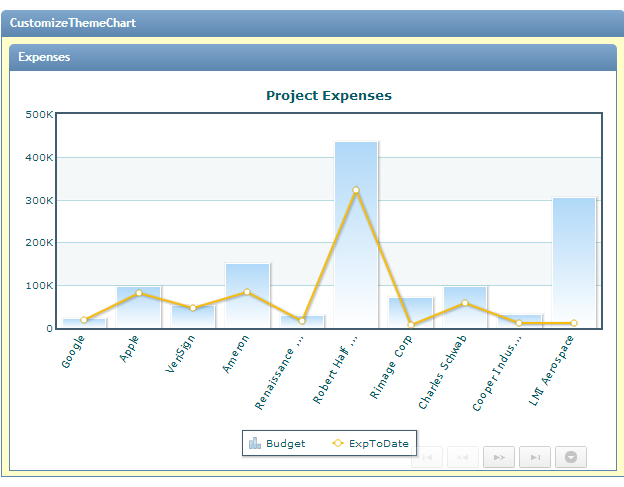
Themes are fully visible when basic apps are published individually such as this example:
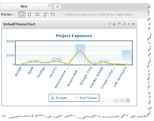
When basic apps are included in workspace apps, however, the workspace hides both the app title bar and all view title bars by default. The workspace supplies a standard app title bar for all apps within the workspace. Users can choose to show the view and basic app title bar, but generally the impact of themes within a workspace is much more limited. This example shows the same basic app within a workspace with only a small background of the blue theme showing:
You can customize any visual property defined in the CSS for the theme used for a basic app.
To customize a basic app’s theme
1. If needed, create a basic app with the views you want to use. Open the basic app in the App Editor. See Customize a Basic App or View for instructions. This example uses the blue theme and a single chart view shown previously:
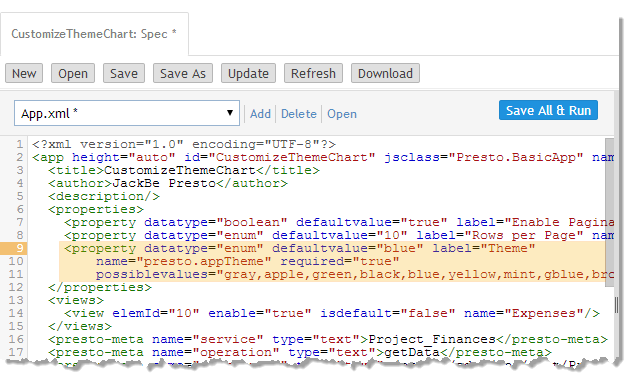
The App Specification for this basic app contains a <property> element named Theme which defines the built-in theme for the app as the default value:
2. Create a CSS file with the style overrides for the theme for this app.
The CSS selectors you use make use of standard classes provided in the App Framework elements that wrap basics apps. See
App Framework for Basic Apps for an illustration of these elements and class names. There are unique class names to select the app as a whole and to select each view which you can use for customization:
 App-specific class
 =
app-app-name, such as
app-CustomizeThemeApp for this example. This selects the root node for the basic app including all elements provided by the App Framework.
The app name is defined in the app specification on the <app> element. If the name includes spaces, spaces are transformed to underscores (_) in the class name.
 All views
 =
views-container wraps all the views in the basic app.
 View-specific class
 =
view-view-name, such as
view-Expenses for this example.
View names are also specified in the app spec in <view> elements. Spaces in view names are replaced with underscores (_) in the corresponding class names.
Note: | There are many more selectors used in themes and other attributes you can use in selectors that are specific to basic apps. See CSS Selectors for Themes for more information. |
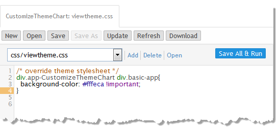
In this example, we are simply going to change the color of the background for the app’s theme:
This uses the app-specific class app-CustomizeThemeChart to select the basic app and selects the <div> element containing the content area with the basic-app class to apply a different background color. Use of the !important directive helps to ensure that this overrides the default property for the theme.
3. Add this CSS file to the basic app:
a. Click Add and select CSS as the resource type to add.
b. Click Browse and find the CSS file to use to customize the theme for this basic app.
c. Click Add Local Resource to upload this file and add it to this basic app.
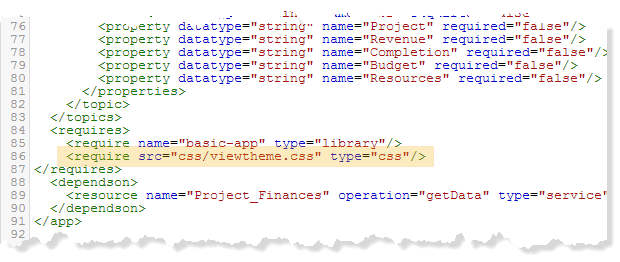
The App Spec for this basic app now has a new <require> element with the relative URL to this CSS file.
4. Click Save and run to apply this CSS.
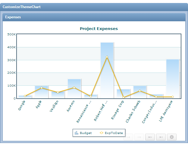
The default blue background for the theme now reflects the customized CSS:
5. Select the CSS file and update the styles as needed to further customize the theme.
You could, for example, change the background color of the view title bar by adding a style to the CSS like this:
/* overrider theme styleshee */
div.app-CustomizeAppTheme{
background-color: #ffeaca !important;
}
div.app-CustomizeAppTheme div.view-Expenses .view-header{
background-image: none !important;
background-color: #ffbd58 !important;
}
