
In Application Designer, there is the possibility to embed pages into other pages. Or vice versa: you can create pages which consist of other embedded pages. In this case, the (master) page and the embedding page operate independently from each other by having a channel to cooperate.
Use this technique to build pages for different scenarios. Example: embed a page showing an order detail into another page displaying a list of all orders. When you select an order from the list, it will be displayed in detail in the "inner" page.
The technology described in this part is very nice for modularising complex or large screens. It is not appropriate to use this technology for very fine modularisation, e.g. for just a couple of fields. (For more information on how to deal with "fine modularisation", see the Java Custom Controls documentation.)
There are two controls which support embedding of pages into pages:
The SUBCISPAGE2 control represents a rectangular area inside a page in which another Application Designer page can be included.
The ROWTABSUBPAGES control is a tab selection control where a dynamic set of pages can be arranged.
The information provided in this part is organized under the following headings:
The SUBCISPAGE2 control allows you to place one page into another page. You may already have read the section describing the SUBPAGE control which allows to place any HTML page into an Application Designer page. The differences between the SUBCISPAGE2 and the SUBPAGE tag are:
With SUBCISPAGE2, you embed Application Designer pages, not normal HTML pages.
Application Designer pages are normally started using a servlet "StartCISPage" which creates an embedding frame in which the Application Designer page is placed. The SUBCISPAGE2 control automatically creates this frame, you do not have to take care of this.
There is a defined communication channel allowing the "outside page" to interact with the "embedded page", and vice versa.
The embedded page is automatically linked to the Application Designer session management. It runs in the same session - and typically also in the same subsession as the embedding page.
This section covers the following topics:
The following example shows the input of an article number and its article detail data:
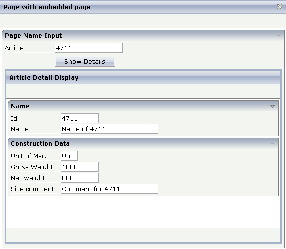
The detail data page is embedded into the whole (outer) page. The XML code of the outer page is:
<page model="OuterPageAdapter" pagename="Demo.html">
    <titlebar name="Page with embedded page">
    </titlebar>
    <header>
    </header>
    <pagebody takefullheight="true">
        <rowarea name="Page Name Input">
            <itr>
                <label name="Article" width="100">
                </label>
                <field valueprop="article" length="20">
                </field>
            </itr>
            <vdist height="5">
            </vdist>
            <itr>
                <hdist width="100">
                </hdist>
                <button name="Show Details" method="showDetails">
                </button>
            </itr>
            <vdist height="5">
            </vdist>
            <rowtable0>
                <itr width="100%">
                        <subcispage2 subcispageprop="innerPage" width="100%" height="350" borderwidth="1">
                        </subcispage2>
                </itr>
            </rowtable0>
            <vdist height="5">
            </vdist>
        </rowarea>
    </pagebody>
    <statusbar withdistance="false">
    </statusbar>
</page>
The SUBCISPAGE2 control references a property innerPage
which is provided by the adapter class of the page. The height can be specified
depending on the whole page's height or can be fixed.
The corresponding adapter source is:
// This class is a generated one.

import com.softwareag.cis.server.Adapter;
import com.softwareag.cis.server.util.SUBCISPAGEInfo;

public class SubCisPage2Adapter
	extends Adapter
{
    // property >innerPage<
    SUBCISPAGEInfo m_innerPage = new SUBCISPAGEInfo();
    public SUBCISPAGEInfo getInnerPage() { return m_innerPage; }

    // property >article<
    String m_article;
    public void setArticle(String value) { m_article = value; }
    public String getArticle() { return m_article; }

    /** */
    public void init()
    {
        m_innerPage.showPage("ArticlePage.html");
    }

    /** */
    public void showDetails()
    {
        // fetch adapter of inner page
        ArticlePageAdapter ipa = (ArticlePageAdapter) findAdapter(ArticlePageAdapter.class);
        ipa.init(m_article);

        // trigger a refresh of the innerpage
        m_innerPage.refreshContentOfCurrentPage();
    }
}
The property innerPage is of type
com.softwareag.cis.server.util.SUBCISPAGEInfo. With method
SUBCISPAGEInfo.showPage, the article page is started within
the subarea. This does not have to be flexible all the time - but it may be on request.
(Maybe there are several versions of displaying the detail data, depending on the
article type).
When choosing the button, the method
showDetails() is called. It prepares the adapter of the inner
page to display the detail data of the requested article. Afterwards, the method
SUBCISPAGEInfo.refreshContentOfCurrentPage is called in order
to reload the embedded page. Consequently, the article details are shown.
See the JavaDoc documentation of class SUBCISPAGEInfo.
| Basic | |||
| subcispageprop |
Name of adapter property representing the control on server side. The property must be of type "TABSUBPAGESInfo". View the Java API Documentation for further information. |
Optional | |
| width |
Width of the control. There are three possibilities to define the width: (A) You do not define a width at all. In this case the width of the control will either be a default width or - in case of container controls - it will follow the width that is occupied by its content. (B) Pixel sizing: just input a number value (e.g. "100"). (C) Percentage sizing: input a percantage value (e.g. "50%"). Pay attention: percentage sizing will only bring up correct results if the parent element of the control properly defines a width this control can reference. If you specify this control to have a width of 50% then the parent element (e.g. an ITR-row) may itself define a width of "100%". If the parent element does not specify a width then the rendering result may not represent what you expect. |
Optional |
100 120 140 160 180 200 50% 100% |
| height |
Height of the control. There are three possibilities to define the height: (A) You do not define a height at all. As consequence the control will be rendered with its default height. If the control is a container control (containing) other controls then the height of the control will follow the height of its content. (B) Pixel sizing: just input a number value (e.g. "20"). (C) Percentage sizing: input a percentage value (e.g. "50%"). Pay attention: percentage sizing will only bring up correct results if the parent element of the control properly defines a height this control can reference. If you specify this control to have a height of 50% then the parent element (e.g. an ITR-row) may itself define a height of "100%". If the parent element does not specify a width then the rendering result may not represent what you expect. |
Optional |
100 150 200 250 300 250 400 50% 100% |
| comment |
Comment without any effect on rendering and behaviour. The comment is shown in the layout editor's tree view. |
Optional | |
| Appearance | |||
| width | (already explained above) | ||
| height | (already explained above) | ||
| borderwidth |
Border size of control in pixels. Specify "0" not to render any border at all. |
Optional |
1 2 3 int-value |
| withownborder |
Default is false. If WITHOWNBORDER is set to true, the subcispage2 control is rendered with its own 3D lookalike border. Set BORDERWIDTH to 0 if WITHOWNBORDER is set to true. |
Optional |
true false |
| pagestyle |
CSS style definition that is directly passed into this control. With the style you can individually influence the rendering of the control. You can specify any style sheet expressions. Examples are: border: 1px solid #FF0000 background-color: #808080 You can combine expressions by appending and separating them with a semicolon. Sometimes it is useful to have a look into the generated HTML code in order to know where direct style definitions are applied. Press right mouse-button in your browser and select the "View source" or "View frame's source" function. |
Optional | |
| colspan |
Column spanning of control. If you use TR table rows then you may sometimes want to control the number of columns your control occupies. By default it is "1" - but you may want to define the control to span over more than one columns. The property only makes sense in table rows that are snychronized within one container (i.e. TR, STR table rows). It does not make sense in ITR rows, because these rows are explicitly not synched. |
Optional |
1 2 3 4 5 50 int-value |
| rowspan |
Row spanning of control. If you use TR table rows then you may sometimes want to control the number of rows your control occupies. By default it is "1" - but you may want to define the control to span over more than one columns. The property only makes sense in table rows that are snychronized within one container (i.e. TR, STR table rows). It does not make sense in ITR rows, because these rows are explicitly not synched. |
Optional |
1 2 3 4 5 50 int-value |
The ROWTABSUBPAGES control allows to switch between several Application Designer pages using tabs. The displayed number of tabs and names are derived dynamically from its adapter properties.
Optionally, the ROWTABSUBPAGES control may contain exactly one STRAIGHTTABPAGE as a subnode. STRAIGHTTABPAGE must be the first tab. This allows for combining ROWTABAREA behavior with ROWTABSUBPAGES behavior. Having a STRAIGHTTABPAGE as the first tab improves the loading behavior of ROWTABSUBPAGES. For an example, see the 80_straighttabpage layout in the cisdemos project.
The XML definition is:
<pagebody>
    <rowtabsubpages pagesprop="tabpages" height="600" borderwidth="0">
    </rowtabsubpages>
</pagebody>
The ROWTABSUBPAGES control references a property tabPages
which is provided by the adapter class of the page. The height can be specified depending
on the whole page’s height or can be fix. The page style can be manipulated directly.
The corresponding adapter source is:
// This class is a generated one.
import com.softwareag.cis.server.Adapter;
import com.softwareag.cis.server.util.TABSUBPAGESInfo;
public class RowTabSubPageAdapter
extends Adapter
{
// property >tabpages<
TABSUBPAGESInfo m_tabPages = new TABSUBPAGESInfo();
public TABSUBPAGESInfo getTabpages() { return m_tabPages; }
/** initialisation - called when creating this instance*/
public void init()
{
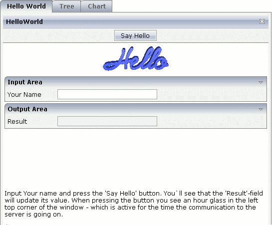
m_tabPages.addItem("Hello World","HelloWorld.html");
m_tabPages.addItem("Tree","trees_01.html");
//m_tabPages.addItem("Dynamic Combo", "HelloWorld.html");
m_tabPages.addItem("Chart", "HelloWorld.html");
}
}
The property tabPages is of type
com.softwareag.cis.server.util.TABSUBPAGESInfo. There are methods
for adding and removing items from the tabPages object. See
the JavaDoc documentation. The number of items can be changed at any time.
This section covers the following topics:
| Basic | |||
| pagesprop |
Name of adapter property representing the control on server side. The property must be of type "TABSUBPAGESInfo". View the Java API Documentation for further information. |
Obligatory | |
| triggerserver |
Flag indicating whether the adapter should be triggered if the user switches between pages. If set to true, method trigger() inside the TABSUBPAGESInfo object is called - before switching the page. Therefore the adapter can abort a page switch - maybe a user has to enter some data first on the current page before switching to another one. |
Optional |
true false |
| height |
Height of the control. There are three possibilities to define the height: (A) You do not define a height at all. As consequence the control will be rendered with its default height. If the control is a container control (containing) other controls then the height of the control will follow the height of its content. (B) Pixel sizing: just input a number value (e.g. "20"). (C) Percentage sizing: input a percentage value (e.g. "50%"). Pay attention: percentage sizing will only bring up correct results if the parent element of the control properly defines a height this control can reference. If you specify this control to have a height of 50% then the parent element (e.g. an ITR-row) may itself define a height of "100%". If the parent element does not specify a width then the rendering result may not represent what you expect. |
Optional |
100 150 200 250 300 250 400 50% 100% |
| scrollable |
If set to "true" then small icons will appear on the right border of the control. If the size of the "tabs" is too big and some tabs are cut as consequence then you can use these icons for scrolling left and right. |
Optional |
true false |
| textid |
Multi language dependent text that is displayed inside the control. The "textid" is translated into a corresponding string at runtime. Do not specify a "name" inside the control if specifying a "textid". |
Optional | |
| fastbufferswitch |
If this property is switched to "true" (default is "false") then the contained subpages are buffered in a way that switching between tabs is not done by loading a new page but by just switching the visibility of pages. Please pay attention to that switching between pages in this case does not reload the page content from the server when switching! In order to enable fast switching you have to set the framebuffersize in cisconfig (n +1), n being the number of tabs to switch. |
Optional |
true false |
| comment |
Comment without any effect on rendering and behaviour. The comment is shown in the layout editor's tree view. |
Optional | |
| Appearance | |||
| borderwidth |
Border width (in pixels) of the sub-page that is contained inside this control. Define "0" to avoid rendering any border. |
Optional |
1 2 3 int-value |
| leftindent |
Inserts a horizontal distance left of the first "tab" and shifts the "tabs" to the right as consequence. The value you may define represents the number of pixels that are inserted. |
Optional |
1 2 3 int-value |
| paddingleft |
Number of pixels which you want to keep as margin between the tab control's left border and the inner sub page. Default is 5 pixel. |
Optional |
1 2 3 int-value |
| paddingtop |
Number of pixels which you want to keep as margin between the upper tab row and the inner sub page. Default is 5 pixel. |
Optional |
1 2 3 int-value |
| paddingright |
Number of pixels which you want to keep as margin between the tab control's right border and the inner sub page. Default is 5 pixel. |
Optional |
1 2 3 int-value |
| paddingbottom |
Number of pixels which you want to keep as margin between the bottom of the tab control and the inner sub page. Default is 5 pixel. |
Optional |
1 2 3 int-value |
| pagestyle |
CSS style definition that is directly passed into this control. With the style you can individually influence the rendering of the control. You can specify any style sheet expressions. Examples are: border: 1px solid #FF0000 background-color: #808080 You can combine expressions by appending and separating them with a semicolon. Sometimes it is useful to have a look into the generated HTML code in order to know where direct style definitions are applied. Press right mouse-button in your browser and select the "View source" or "View frame's source" function. |
Optional | |
| Miscellaneous | |||
| testtoolid |
Use this attribute to assign a fixed control identifier that can be later on used within your test tool in order to do the object identification |
Optional | |
Many users like the subdivision of pages into "tabs". Application Designer offers several controls for this - let us compare the ROWTABSUBPAGES control described in this section with the ROWTABAREA control described in the Layout Elements documentation.
The ROWTABAREA control has certain content areas (TABPAGEs) and always makes one of them visible. This means: the page has much more HTML code and controls then are visible. The size of the page is important for the performance of the page in the browser: the bigger the size, the longer it takes the browser to render a page (also if it is already cached).
The ROWTABSUBPAGES control offers a subpage in which you can place contained pages.
Now imagine that you have 500 fields to be displayed inside "tabs": in this case, it is more performant to build one "mother page" containing the ROWTABSUBPAGES control and to have five "detail pages", one for each "tab", than having one big page with all 500 fields, arranged by a ROWTABAREA control.
In the demo workplace, there is an example in which you can "feel" the difference - please have a look!
This section describes one - important - technique for modularisation: embedding of pages into other pages.
This technique is useful for "rough granular" integration aspects: it is used to arrange pages with a dedicated task (e.g. the maintenance of an order) into other screens (e.g. an overview of all orders). Each page - both the "outer" page and the "inner" page - keep their "page behavior", i.e. they are talking independently to the server.
The hour glass icon indicates that a page is talking to its server adapter. If an "outer" page refreshes its "inner" page, the "outer" page first talks to the server, and afterwards the "inner" page. Therefore, there is more than one roundtrip between the client and the server.
As a consequence, it does not make sense (and it is not intended at all by Application Designer) to build up fine granular integration scenarios in which a group of fields is defined as an embeddable unit being used in several screens. This is the job of controls to easily build up your own one. Controls which you build render a group of controls (e.g. an area for entering an address) and can be re-used in different pages. Controls always talk to the server within the same roundtrip. They are available as design time controls - if you change the behavior of one control definition, all pages using this control have to be regenerated.
It is comparable with C programming. You have libraries that you put directly into your compilation process. If the libraries change, you have to recompile. This is the level of controls. On the other hand, you have units of rougher granularity: e.g. DLLs. These can be changed without letting your program know. This is the level of page integration.
