
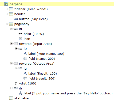
You will now create the layout for your "Hello World!" application. When you have completed all exercises in this document, the layout should look as shown below and the XML code should be the same as shown in the section About this Tutorial.
This document contains the following exercises:
Tip:
Preview the
layout and view the XML
code each time you have completed an exercise. When important properties are not set,
this is indicated in the Problems view. To get more
information about problems, you can also choose from the
menu.
You will now specify the following for the Natural page:
Name for the Natural Adapter
(natsource)
The value in the property
natsource defines the name of the adapter. The
adapter is a Natural object that your application will use to communicate with
the page. It will be generated when you save the page layout.
If you do not specify a value for
natsource, the name that you have specified for
the layout (without the extension ".xml") will be
used as the name for the Natural adapter. If you want to use the adapter in a
development environment other than NaturalONE, you must make sure that the
resulting name matches the naming conventions for Natural object names.
Handling of Strings
(natsinglebyte)
Using the property natsinglebyte,
you can specify how the strings displayed on this page are to be handled in the
Natural application. Natural knows two types of strings: Unicode strings
(format U) and code page strings (format A). By default, the strings displayed
in web pages are mapped to Unicode strings in Natural. For this tutorial, you
will specify that code page strings are to be used. Therefore, you will set the
property natsinglebyte to
"true".
If you do not specify a value for
natsinglebyte or when you set it to
"false", Unicode strings will be used.
 To specify the properties for the Natural page
In the layout tree, select the node natpage.
The properties for this control are now shown in the Properties view.
Make sure that the following properties are specified:
| Property | Value |
|---|---|
natsinglebyte |
true |
natsource |
HELLO-A |
You will now specify the string "Hello World!" which is to appear in the title bar of your application.
To specify the name for the title bar
In the layout tree, select the node titlebar (New Natural Page).
The properties for this control are now shown in the
Properties view. You can see the
default entry "New Natural Page" for the
name property.
Specify the following property:
| Property | Value |
|---|---|
name |
Hello World! |
When you press ENTER, the node in the layout tree changes to titlebar (Hello World!).
Note:
Properties that are left blank are not shown in the XML
code.
You will now specify the string "Say Hello" which is to appear on the button. And you will specify the name of the method that is to be invoked when the user chooses this button.
To specify the name and the method for the button
In the layout tree, open the header node.
Note:
By clicking the icon of a node, you hide or expand the
node's subnodes.
You can now see the entry for the button with the default name "Exit".
Select the node button (Exit).
Specify the following properties:
| Property | Value |
|---|---|
method |
sayHello |
name |
Say Hello |
The method needs to be programmed in the adapter. This will be explained later in this tutorial.
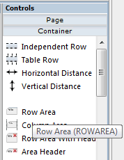
The input and output areas in this tutorial are created using Row Area controls. These controls can be found in the section of the controls palette.
Each row area will contain an Independent Row control which in turn contains a Label and a Field control. These controls can be found in the section of the controls palette.
For adding controls to your layout, you drag them from the controls palette onto the corresponding tree node in the layout tree. This is explained below.
To create the input area
Open the section of the controls palette.
When you move the mouse over a control, a tool tip appears which also displays the control name which will be used in the XML layout. For example:
Drag the Row Area control from the controls palette onto the pagebody node in the layout tree.
The row area is added as a subnode of the pagebody node. The new subnode is automatically selected so that you can maintain the properties of the row area directly in the Properties view.
Specify the following property:
| Property | Value |
|---|---|
name |
Input Area |
Drag the Independent Row control from the controls palette onto the rowarea (Input Area) node in the layout tree.
When you drop information into the tree, the system will sometimes respond by offering a context menu with certain options about where to place the control. In this case, the following context menu appears.
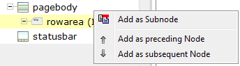
Choose the command.
The control is now inserted below the rowarea (Input Area) node. The new node is shown as itr.
Open the section of the controls palette.
Drag the Label control from the controls palette onto the itr node you have just inserted and specify the following properties:
| Property | Value |
|---|---|
name |
Your Name |
width |
100 |
Drag the Field control from the controls palette onto the itr node you have previously inserted.
A context menu appears and you have to specify where to place the control.
From the context menu, choose the command.
Specify the following properties for the field:
| Property | Value |
|---|---|
valueprop |
name |
width |
200 |
To create the output area
Create the output area in the same way as the input area (add it as the last subnode of the pagebody node), with the following exceptions:
You will now add the image which is to be shown above the input area. To do so, you will use the Icon control which can be found in the section of the controls palette.
All resources that your user interface component needs (such as images) must be contained in your project directory in the Eclipse workspace. It is good practice to create a specific folder for these resources.
To create a folder for images
In the Project Explorer view or in the Natural Navigator view, select the user interface component for which you want to create a folder.
Invoke the context menu and choose .
In the resulting dialog box, expand the General node, select Folder and choose the button.
Specify a folder name (for example, "images") and then choose the button.
The image that you need for this tutorial (hello.gif) is provided in the /.naturalone/apache-tomcat/webapps/cisnatural/njxdemos/images directory in your Eclipse workspace. Copy it to the images folder that you have just created.
To add the image
Drag the Icon control from the controls palette onto the pagebody node in the layout tree.
The icon is added as the last subnode of the pagebody node. It is automatically placed into an itr (independent row) node.
Specify the following property for the icon:
| Property | Value |
|---|---|
image |
images/hello.gif |
Note:
You can also choose the icon using the
browse button which is shown next to the property name.
Select the itr node containing the icon and choose the following button below the layout tree:
The selected node is now moved up so that it appears as the first subnode of the pagebody node.
Specify the following property for the itr node containing the icon:
| Property | Value |
|---|---|
takefullwidth |
true |
You will now move the image to the right side of the page. To do so, you will use the Horizontal Distance control which can be found in both the section and the section of the controls palette.
To add the horizontal distance
Drag the Horizontal Distance control from the controls palette onto the itr node containing the icon.
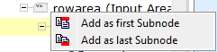
From the resulting context menu, choose the command.
The node hdist is inserted into the tree.
Specify the following property:
| Property | Value |
|---|---|
width |
100% |
You will now enter a text which is to appear below the output area and which tells the user what to do.
To do so, you will once again use the Independent Row control into which you will insert a Label control.
Note:
The Independent Row control can be
found in both the section and the
section of the controls palette.
To add the independent row with the label
Drag the Independent Row control from the controls palette onto the pagebody node in the layout tree.
From the resulting context menu, choose the command.
The node itr is inserted into the tree.
Drag the Label control from the controls palette onto the itr node you have just created.
Specify the following properties for the label:
| Property | Value |
|---|---|
name |
Input your name and press the 'Say Hello' button. |
asplaintext |
true |
When you preview the layout, you will see that the text you have just added appears directly below the output area. You will now move the text 100 pixels to the bottom.
To do so, you will use the Vertical Distance control which can be found in both the section and the section of the controls palette.
To add the vertical distance
Drag the Vertical Distance control from the controls palette onto the itr node containing the label.
From the resulting context menu, choose the command.
The node vdist is inserted into the tree.
Specify the following property:
| Properties | Value |
|---|---|
height |
100 |
If you have not already done so, you should now save your layout. Layouts are saved using the standard Eclipse functionality.
When you save a layout for the first time, an HTML file is generated (in addition to the XML file) which is placed into your user interface component (however, this HTML file can only be seen in the file system and not in Eclipse itself). This HTML file is updated each time you save the layout.
The Natural adapter is also created when you save your layout for
the first time. The
adapter has the name that you have specified in the
natsource property of the Natural page, plus the
extension that is used for adapters (HELLO-A.NS8) and is
located in the SRC folder of your Natural library.
Your application program will use the adapter to communicate with the
page.
To save the layout
From the menu, choose .
Or:
Press CTRL+S.
Or:
Choose the following button from the Eclipse toolbar:
You can now proceed with the next exercise: Creating the Natural Code.