
This section describes how to use NaturalONE functionality to create and maintain Natural Construct resources. The following topics are covered:
Note:
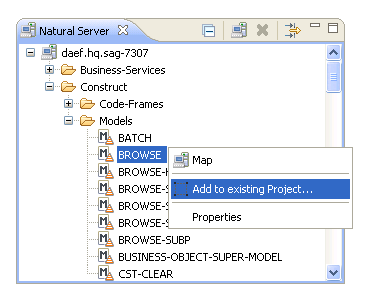
If you have customized any of the supplied modules on the server,
you can either add them to the current project or add them to the downloaded
Construct runtime project (which will overwrite the supplied modules). For more
information, see
Add
Customized Modules to the Construct Runtime
Project.
The most significant difference between Natural Construct in NaturalONE and on the server is the user interface. Instead of entering "NCSTG" and invoking the Modify server subprogram panels, a local wizard is used. This wizard is created using the model record file (.cstmdl extension), the model PDA, customizable XML files for the model UI file (.cstmdlui extension) and any reusable dialog UI files (.cstmdldg extension) or page UI files (.cstmdlpg extension), and a wizard engine. The engine calls the clear subprogram (called before the wizard is invoked and used to set defaults) or read subprogram (used to read the specifications for regeneration) on the server, displays the user interface and populates the PDA with data from the interface, and then calls the validation subprogram on the server to validate the user input. The model record data is identical to the data on the Natural server and must exist in the local environment. The wizard uses this data to determine the model PDA and clear, validate, and read subprograms for the model.
 To create a new client generation wizard
Download the model record from the server installation.
Note:
For information on downloading the model record and PDA
from the server, see
Download
Natural Construct Resources to a Local Project.
Use the model record to determine the name of the model PDA.
Download the model PDA from the SYSCST library.
Create the model UI file and, optionally, the reusable page UI and dialog UI files.
These files include the main model UI file to map the user interface to the model PDA (.cstmdlui extension), as well as any reusable dialog UI files (.cstmdldg extension) or page UI files (.cstmdlpg extension).
This section describes how to create a client generation wizard for a model that has not been implemented locally. The following topics are covered:
This section describes the user interface (UI) files used in the client generation framework. The following topics are covered:
This section describes the model UI file (.cstmdlui
extension). In the same way the model panels on the server relate to the model
PDA, this file connects the client user interface with the model parameter data
area (PDA) and/or specifications. On the client, these relationships are
created using document nodes that associate the model PDA via the
pda: keyword. or specs: keyword when the required
input is not found in the model PDA. This information is then used during the
generation process.
The following example illustrates the model UI file (.cstmdlui extension) for the supplied STARTUP wizard:
<model name="STARTUP" constructID="STARTUP" category="Construct">
     <version major="5" minor="3" release="1" />
     <description>Startup Model</description>
         <pages>
              <page id="StartupPage" title="Specify Standard Parameters">
                   <description>Enter settings for the startup program.</description>
                   <layout class="gridLayout" columns="3" />
              <children>
                   <group text="Target  ">
                        <layoutData class="gridLayoutData" horizontalSpan="3"
                             grabExcessHorizontalSpace="true" />
                        <layout class="gridLayout" columns="3" />
                        <children>
                        <!-- PROJECT -->
                             <label text="Project:" />
                                  <text id="ProjectTextText" text="{specs:project}"
                                       default="selection:project">
                                       <layoutData class="gridLayoutData"
                                            horizontalSpan="1" grabExcessHorizontalSpace="true" />
                                  </text>
                                  <cstBrowseProject />
                        <!-- LIBRARY -->
                             <label text="Library:" />
                                  <text id="LibraryText" text="{specs:library}"
                                       default="selection:library">
                                       <layoutData class="gridLayoutData"
                                            grabExcessHorizontalSpace="true" />
                                  </text>
                                  <cstBrowseLibrary />
                         <!-- MODULE -->
                              <label text="Module:" />
                                   <text id="ModuleText" text="{specs:module}">
                                       <layoutData class="gridLayoutData"
                                            grabExcessHorizontalSpace="true" />
                                   </text>
                              <label></label>
                        </children>
                    </group>
                    <group text="Details  ">
                         <layoutData class="gridLayoutData" horizontalSpan="3"
                              grabExcessHorizontalSpace="true" />
                         <layout class="gridLayout" columns="3" />
                         <children>
                         <!-- GDA -->
                             <label text="Global data area:" />
                                  <text id="ModuleText" text="{pda:CUSTPDA.#PDAX-GDA}"
                                       default="CDGDA">
                                       <layoutData class="gridLayoutData"
                                            grabExcessHorizontalSpace="true" />
                                  </text>
                                  <cstBrowseNaturalObject text="Browse..."
                                       resultType="BrowseResults.NAME" fileExtension="NSG"
                                       result="{pda:CUSTPDA.#PDAX-GDA}" />
                         <!-- GDA with block -->
                              <label text="With block:" />
                                   <text id="GdaWithBlockText" text="{pda:CUSTPDA.#PDAX-GDA-BLOCK}">
                                        <layoutData class="gridLayoutData"
                                             grabExcessHorizontalSpace="true" />
                                   </text>
                              <label text="" />
                         <!-- TITLE -->
                              <label text="Title:" />
                                   <text id="TitleText" text="{specs:title}" default="Startup Program.">
                                        <layoutData class="gridLayoutData"
                                             grabExcessHorizontalSpace="true" />
                                   </text>
                              <label text="" />
                         <!-- DESCRIPTION -->
                              <label text="Description:" />
                                   <cstMulti id="DescriptionText" text="{pda:CUSTPDA.#PDAX-DESCS}"
                                        default="This is the main startup program ....">
                                       <layoutData class="gridLayoutData"
                                            horizontalSpan="1" verticalAlignment="4" heightHint="60" />
                                   </cstMulti>
                              <label></label>
                        </children>
                   </group>
                   <!-- Group for SPECIFIC PARAMETERS -->
                   <group text="Specific parameters  ">
                        <layoutData class="gridLayoutData" horizontalSpan="3"
                             grabExcessHorizontalSpace="true" />
                        <layout class="gridLayout" columns="3" />
                        <children>
                        <!-- MAIN MENU PROGRAM -->
                             <label text="Main menu program:" />
                                  <text id="ModuleText" text="{pda:CUSTPDA.#PDAX-MAIN-MENU-PROGRAM}">
                                       <layoutData class="gridLayoutData"
                                            horizontalSpan="1" grabExcessHorizontalSpace="true" />
                                  </text>
                                  <cstBrowseNaturalObject text="Browse..."
                                       resultType="BrowseResults.NAME" fileExtension="NSP"
                                       result="{pda:CUSTPDA.#PDAX-MAIN-MENU-PROGRAM}" />
                        <!-- QUIT PROGRAM -->
                             <label text="Quit program:" />
                                  <text id="ModuleText" text="{pda:CUSTPDA.#PDAX-QUIT-PROGRAM}">
                                       <layoutData class="gridLayoutData"
                                            horizontalSpan="1" grabExcessHorizontalSpace="true" />
                                  </text>
                                  <cstBrowseNaturalObject text="Browse..."
                                        resultType="BrowseResults.NAME" fileExtension="NSP"
                                        result="{pda:CUSTPDA.#PDAX-QUIT-PROGRAM}" />
                        <!-- COMMAND PROCESS -->
                             <label text="Command processor:" />
                                  <text id="CommandText" text="{pda:CUSTPDA.#PDAX-PROCESSOR}">
                                       <layoutData class="gridLayoutData"
                                            horizontalSpan="1" grabExcessHorizontalSpace="true" />
                                  </text>
                                  <button style="SWT.CHECK" text="Error transaction processing"
                                       selection="{pda:CUSTPDA.#PDAX-ERROR-TA}">
                                       <layoutData class="gridLayoutData"
                                            horizontalSpan="3" grabExcessHorizontalSpace="true" />
                                  </button>
                            </children>
                      </group>
                 </children>
           </page>
      </pages>
</model>
The Natural Construct client generation framework supports reusable dialogs and pages. The dialog UI or page UI code can be created once as a separate file and then included in multiple model UI files. In this way, changes to the page or dialog UI code will be automatically reflected in any client generation wizard that includes that page or dialog UI file.
The following example illustrates a model UI file (.cstmdlui extension) for MYMODEL, which includes reusable page and dialog UI files:
<model name="MYMODEL" constructID="MODELA" category="Construct">
      <version major="5" minor="3" release="1" />
      <description> This model demonstrates reusable page/dialogs.
      </description>
      <pages>
            <page id="Page1" title="Page1 title">
                  <description>Enter settings for this non-reusable page.</description>
                  <children>
                        ... UI nodes go here ...

                        <cstDialogButton id="button" text="Show a dialog...">
                              <dialog include="MyReusableDialog">
                                    <replacements>
                                          <stringReplacement target="%DIALOG_PDA_NAME%"
                                                replacement="NEWPDA" />
                                    </replacements>
                              </dialog>
                        </cstDialogButton>

                        ... more UI nodes go here ...
                  </children>
            </page>
            <page include="MyReusablePage">
                  <replacements>
                        <stringReplacement target="%PAGE_PDA_NAME%"
                              replacement="NEWPDA" />
                  </replacements>
            </page>
      </pages>
</model>
The following example illustrates the reusable dialog UI file (.cstmdldg extension) for MYMODEL:
<modelUIDialog>
      <dialog windowTitle="My Dialog" title="My dialog title" message="My dialog message.">
            <children>
                  <button style="SWT.CHECK" text="My button"
                        selection="{pda:%DIALOG_PDA_NAME%.#PDA-BOOLEAN-FIELD}">
                  </button>

                  ... more UI nodes go here …

            </children>
      </dialog>
</modelUIDialog>
The following example illustrates a reusable page UI file (.cstmdlpg extension) for MYMODEL:
<modelUIPage>
      <page id="Page2" title="Page2 title">
             <description>Enter settings for this reusable page.</description>
             <children>
                   <text id="MyText" text="{pda:%PAGE_PDA_NAME%.#PDA-FIELD}" required="true" />

                   ... UI nodes go here ...

                   <cstDialogButton id="button" text="Show a dialog...">
                         <dialog include="MyReusableDialog">
                               <replacements>
                                     <stringReplacement target="%DIALOG_PDA_NAME%"
                                           replacement="NEWPDA" />
                               </replacements>
                         </dialog>
                   </cstDialogButton>

                   ... more UI nodes go here …

             </children>
       </page>
</modelUIPage>
The page node represents a page displayed through the wizard. Within this node, child nodes represent SWT GUI controls. This section describes the elements and attributes you can define within the page node:
When defined, this attribute provides a brief description of the page. For example:
page id="StartupPage" title="Specify Standard Parameters">
     <description>Enter settings for the startup program.</description>
When defined, this attribute enables the help button on the page and links the Eclipse help system to the applicable help ID. For example:
<page id="StParms" title="Specify Standard Parameters" helpID="StParmsHelpID">
This attribute defines the name of the page. For example:
page id="StartupPage" title="Specify Standard Parameters">
When defined, this attribute defines the name of a reusable page used by the model. For example:
<page include="MyReusablePage">
When defined as true, this attribute disables validation for the page; if the remaining pages are also defined as optional, the button will be enabled. For example:
<page id="2" title="TWO" optional ="true">
By default, a page is not optional (i.e., it is mandatory).
Tip:
To allow users to select when
only optional pages remain, group all optional pages together at the end of the
XML file.
When defined, this element defines nested stringReplacement elements that allow simple string replacements to be performed (for example, PDA bindings) for a reusable page. For example:
<replacements>
      <stringReplacement target="pda:MYPDA" replacement="pda:MYPDA2" />
</replacements>
In this example, all occurrences of "pda:MYPDA" in the reusable page will be replaced with "pda:MYPDA2" when a client generation wizard imports and uses the page.
This attribute defines the title displayed on the page.
The dialog node represents a dialog that will be displayed to a user. For example:
<dialog windowTitle="Edit Row" title="Row Details" message="Enter row details">
<children>
<label text="&Code:" />
<text id="Oms11" text="{pda:CUMNPDA.#PDA-CODE}">
<layoutData class="gridLayoutData" horizontalSpan="2"
grabExcessHorizontalSpace="false">
</layoutData>
</text>
<label text="&Function:" />
<text id="Oms12" text="{pda:CUMNPDA.#PDAX-FUNCTIONS}">
<layoutData class="gridLayoutData" horizontalSpan="2"
grabExcessHorizontalSpace="true">
</layoutData>
</text>
<label text="&Program name:" />
<text id="Omsb13" text="{pda:CUMNPDA.#PDA-PROGRAM-NAME}">
<layoutData class="gridLayoutData" horizontalSpan="1"
grabExcessHorizontalSpace="false" />
<style type="naturalObject" />
</text>
<cstBrowseNaturalObject text="Browse..."
fileExtension="NSP" result="{pda:CUMNPDA.#PDA-PROGRAM-NAME}">
</cstBrowseNaturalObject>
</children>
</dialog>
This node is similar to the page node; any XML control that can be defined for a page can also be defined for a dialog; in addition, any stringReplacement can be defined for a reusable dialog. The following attributes are defined within the dialog node:
| Attribute | Description |
|---|---|
include |
Name of a reusable dialog (only used when the dialog parent node is cstDialogButton). For information, see Reusable Dialog and Page UI Files. |
message |
Banner text displayed on the dialog. |
title |
Title displayed on the dialog. |
windowTitle |
Internal name used for the dialog. |
Note:
If you do not select to close the
edit window, the edits will not be applied (i.e., the values in the table will
not change).
The item node represents a value/display combination to map between the text displayed on a GUI control and the actual underlying value. For example:
<items>
      <item value="1" display="Winter"/>
      <item value="2" display="Spring"/>
      <item value="3" display="Summer"/>
      <item value="4" display="Fall"/>
</items>
The following attributes are defined within the item node:
| Attribute | Description |
|---|---|
value |
Value that will be saved internally. |
display |
Value that will be displayed on the page. |
GUI controls are represented by nodes in the client generation framework and are used to bind user input from the interface to associated fields in the model PDA or specifications. Before the first specification panel is displayed, the model's clear subprogram on the server is invoked and typically populates default values in the PDA. These default values will be presented to the user (unless they have been overridden at the XML node level).
All controls have the following traits in common:
Any property of an SWT (Standard Widget Toolkit) control can be modified with an attribute in the XML file. The XML attribute in the XML must map to a Get/Set method in the corresponding SWT control.
All controls have an ID attribute. Whenever there is an error with a control, the ID attribute will be displayed to assist in diagnosing the problem. Although there is no checking for duplicate ID attributes, it is highly recommended that each control have a unique ID.
All controls support the tool tip option, which provides information about its use.
Note:
For more information, see
Bind Data to GUI
Controls and
Default
Properties Applied to GUI Controls.
This section covers the following topics:
This GUI control is a button the user can select to initiate an action.
- Attributes
Attribute Description styleAn SWT constant indicating the style of the button. For example, SWT.CHECK will create a check box. textText displayed on the button. selectionBoolean binding value indicating whether the button is selected or not. If the button is a check box, this attribute indicates whether the button is marked or not. onWidgetSelectedLink to an event to be handled. - Example
<button style="SWT.CHECK" text="Check" selection="{pda:CUSTPDA.#PDAX-ERROR-TA}"/>In this example, the value of the checked box (either true or false) will be placed in the #PDAX-ERROR-TA Boolean field in the CUSTPDA parameter data area for the STARTUP model.
This GUI control is a drop-down list that allows the user to either enter text or select a value from a list of available choices.
- Attributes
Attribute Description textBinding property used to bind the text property for the combo box to an underlying field. valuesA list of items to display in the combo box, separated by commas. - Example
<combo id="myCombo" text="{pda:level1.selection}" values="A,B,C,D" />In this example, the user will be able to select A, B, C, or D as an input value for the specified PDA field. The field cannot be blank.
Note:
If this is not a required field, add a 5th entry to represent a blank (for example, values=" ,A,B,C,D").
This GUI control is an invisible control that hosts other controls.
- Child Nodes
Node Description layout Defines settings for the layout strategy to use. children Defines the child controls. - Example
<composite>
  <layout class="gridLayout" columns="2" />
  <children>
    <label text="Array 1" />
    <text text="{pda:level1.Array(1)}" />
    <label text="Array 2" />
    <text text="{pda:level1.Array(2)}" />
  </children>
</composite>
When the number of columns are defined for a table, the cells are filled from left to right and top to bottom. In this example, there will be 2 columns and 2 rows where the first row is ARRAY 1 and the data is in array(1).
This section describes the cstCombo control. This control is similar to the combo control, except it allows one value to be displayed on a panel and a second, different value to be stored in the PDA.
- Attributes
Attribute Description valueBound field that stores the value of the combo box. defaultValueValue to use when the bound field is not set. - Child Nodes
Node Description item For information, see Item Node. - Set Default Values
Unless otherwise specified, the default value is the first item in the list. When a blank is not acceptable, you can provide a default value. For example:
<cstCombo value="{pda:#INPUT.VALUE}"  defaultValue="1">
      <items>
            <item value="1" display="Ontario"/>
            <item value="2" display="Quebec"/>
      </items>
</cstCombo>
When a blank is acceptable, you can provide an item for blanks. For example:
<cstCombo value="{pda:#INPUT.VALUE}">
      <items>
            <item value="" display=""/>
            <item value="1" display="Ontario"/>
            <item value="2" display="Quebec"/>
      </items>
</cstCombo>
Note:
Thevalueattribute is used, as opposed to thetextattribute, to ensure that the number (for example, "1") goes into the PDA, while the text indisplay(for example, "Ontario") is displayed on the wizard panel.
This section describes the cstDeriveServerButton control, which calls a subprogram to derive data from the server.
Note:
For information on using the cstDeriveServerButton control
to refresh defaults in the model PDA or derive values from the server, see
Set Up a Server
Call. For example, you can use this control if I wanted to
start my first browse row on line 3 and there are 2 lines of input how many
rows could I fit on the screen…the number 3 and 2 the user enters in and the
button goes off and calculates the number of rows that fit on the screen)
values for the model PDA,
- Attributes
Attribute Description styleAn SWT constant indicating the style of the button. For example, SWT.PUSH will create a button. textText displayed on the button. serverCallIDCall ID for the server call that defines how the data from the proxy PDA (the fields on the server) gets populated into the model PDA (the fields on the client) and vice versa. For more information, see Set Up a Server Call. - Example
<cstDeriveServerButton style="SWT.PUSH"
     text="Refresh Default Methods" serverCallID="Default_Methods">
</cstDeriveServerButton>
This section describes the cstDialogButton control, which displays a custom dialog when selected.
- Attributes
Attribute Description textText displayed on the button. - Child Nodes
Node Description dialog For information, see Dialog Node. - Example
<cstDialogButton id="button" text="Display Options..."> <dialog windowTitle="Display Options" title="Display Options" message="Select options for display"> <children> <label text="&Option Code:" /> <text id="Oms11" text="{PDA:#INPUT.VALUE}"> </text> </children> </dialog> </cstDialogButton>
This section describes the cstRadioGroup control, which creates a group box containing radio buttons (one radio button for each item child node).
- Attributes
Attribute Description valueBound field that stores the value of the group box. defaultValueValue to use when the bound field is not set. orientationAlignment of the radio buttons. Valid values are horizontal or vertical (the default). textText displayed on the group box. - Child Nodes
Node Description item For information, see Item Node. - Example
<cstRadioGroup value="{pda:#INPUT.VALUE}" text="Province" defaultValue="2" orientation="horizontal">
     <items>
          <item value="1" display="Ontario"/>
          <item value="2" display="Quebec"/>
     </items>
</cstRadioGroup>
This section describes the cstTable control, which provides a table (grid) for an array.
Notes:
- Attributes
Attribute Description countFieldName of the field that stores the actual count of rows (©# field). If the count field is not specified, the table will use the number of elements declared in the array as the row count. For example, A (A10/1:10) will have 10 rows displayed in the table. editOnlyWhen this attribute is set to true, the rows in cstTable can only be edited (i.e., the Add and Delete buttons will be disabled). By default, rows in cstTable can be added, deleted, and edited. maxRowsMaximum number of rows displayed for the table. By default, this number is the upper bound of the array field. numberColumnDisplayColumn header for the row number column; the default is "#". numberColumnWidthColumn width; the default is 25 pixels. - Cascading Deletes
If the first dimension of an array is defined as a Group field and the second dimension is defined as a group under the first dimension, cstTable will automatically cascade deletes to the second dimension. In the following example, if Parent-Row(5) is deleted, Child-Row(5,*) will be deleted as well:
01 Parent-Row (1:10) 02 Field2 (A10) 02 Field3 (A10) 02 Child-Row (1:5) 03 Child1 (A10) 03 Child2 (A10)- Nested Array Indexes
You can nest array indexes within a table. For example, you can create a table on one dialog that contains the first dimension of an array and pass the indexes for a second and third dimension to a second table in another dialog. For example:
<statement display="DREW" id="DREW" velocityTemplate="ESCAPE.vm">
      <pages>
            <page id="Start" title="ESCAPE statement">
                  <description>Enter statement options</description>
                  <layout class="gridLayout" columns="1" />
                  <children>
                        <cstTable>
                              <layoutData class="gridLayoutData" horizontalSpan="1"grabExcessHorizontalSpace="true" />
                              <columns>
                                    <column fieldName="A" display="A" width="75" />
                                    <column fieldName="B" display="B" width="50" />
                              </columns>
                              <dialog>
                                    <layout class="gridLayout" columns="2" />
                                    <children>
                                          <label text="A:" />
                                          <text text="{pda:A}">
                                                <layoutData class="gridLayoutData" horizontalSpan="1"grabExcessHorizontalSpace="true" />
                                          </text>
                                          <label text="B:" />
                                          <text text="{pda:B}">
                                                <layoutData class="gridLayoutData" horizontalSpan="1"grabExcessHorizontalSpace="true" />
                                          </text>
                                          <label text="C(n,1):" />
                                          <text text="{pda:C(1)}">
                                                <layoutData class="gridLayoutData" horizontalSpan="1"grabExcessHorizontalSpace="true" />
                                          </text>
                                          <label text="C(n,2):" />
                                          <text text="{pda:C(2)}">
                                                <layoutData class="gridLayoutData" horizontalSpan="1"grabExcessHorizontalSpace="true" />
                                          </text>
                                    </children>
                              </dialog>
                        </cstTable>
                  </children>
            </page>
      </pages>
      <pda>
      <![CDATA[
         01 Group1(1:3)
          02 A (A) DYNAMIC
          02 B (A) DYNAMIC
          02 Group2 (1:2)
           03 C (A) DYNAMIC
           03 D (A) DYNAMIC]]>
      </pda>
</statement>
In this example, the user selected the second row of the table for editing and the first index (2) is populated; the C field will be generated as C(2,1) and C(2,2).
- Group a Nested Table
You can group a nested table, which allows you to place a border around the table and provide a title for the group. For example:
<group text="Window location"> <layoutData class="gridLayoutData"horizontalSpan="2" grabExcessHorizontalSpace="true" /> <children> <cstTable id="table"> <layoutData class="gridLayoutData"horizontalSpan="3" grabExcessHorizontalSpace="true"grabExcessVerticalSpace="true" horizontalAlignment="SWT.FILL"verticalAlignment="SWT.FILL" /> <columns> <column fieldName="CUOMPDA.#PDAX-SCROLL-LINE"display="Line" width="150" /> <column fieldName="CUOMPDA.#PDAX-SCROLL-COL"display="Column" width="150" /> </columns> </cstTable> </children> </group>- Child Nodes
columns
This node defines attributes for a column within the cstTable control. These attributes are:
Attribute Description fieldNameName of the field in the PDA to which the column is bound. displayHeading used for the column. widthWidth of the column. The default is 25 pixels. blankTestUsed to detect empty rows within a table. A row is considered empty when all the flagged columns for the row are empty. By default, all columns within a row are flagged as being part of the blank test. To un-flag a column, set the blankTestattribute to "false".A field within a specific row/column is considered empty using the following rules for the value:
Numeric fields (INPF): zero (0, 0.0, 00.00, etc.)
Any other field is blank when its string representation is blank or only contains whitespace ("", " ", "<tab>", etc.)
In the following example, only the first column is used to determine whether a row is empty:
<cstTable>
<columns>
<column fieldName="A" display="A" width="75" />
<column fieldName="B" display="B" width="50" blankTest="false"/>
<column fieldName="C" display="C" width="50" blankTest="false" />
</columns>
</cstTable>
dialog
For information, see Dialog Node.
- Example
The following example illustrates a cstTable control for the supplied Menu wizard:
<cstTable id="table" countField="CUMNPDA.#PDA-TOTAL-MENU-LINES"> <layoutData class="gridLayoutData" horizontalSpan="3" grabExcessHorizontalSpace="true" grabExcessVerticalSpace="true" horizontalAlignment="SWT.FILL" verticalAlignment="SWT.FILL" /> <columns> <column fieldName="CUMNPDA.#PDA-CODE" display="Code" width="100" /> <column fieldName="CUMNPDA.#PDAX-FUNCTIONS" display="Function" width="100" /> <column fieldName="CUMNPDA.#PDA-PROGRAM-NAME" display="Program Name" width="100" /> </columns> <dialog windowTitle="Edit Row" title="Row Details" message="Enter row details"> <children> <label text="&Code:" /> <text id="Oms11" text="{pda:CUMNPDA.#PDA-CODE}"> <layoutData class="gridLayoutData" horizontalSpan="2" grabExcessHorizontalSpace="false" > </layoutData> </text> <label text="&Function:" /> <text id="Oms12" text="{pda:CUMNPDA.#PDAX-FUNCTIONS}"> <layoutData class="gridLayoutData" horizontalSpan="2" grabExcessHorizontalSpace="true" > </layoutData> </text> <label text="&Program name:" /> <text id="Omsb13" text="{pda:CUMNPDA.#PDA-PROGRAM-NAME}"> <layoutData class="gridLayoutData" horizontalSpan="1" grabExcessHorizontalSpace="false" /> <style type="naturalObject" /> </text> <cstBrowseNaturalObject text="Browse..." fileExtension="NSP" result="{pda:CUMNPDA.#PDA-PROGRAM-NAME}" > </cstBrowseNaturalObject> </children> </dialog> </cstTable>
This GUI control is an edit control that accepts a date and/or time, and optionally presents a drop-down calendar (depending on the SWT style). For information, see:
- Attributes
Attribute Description valueBinding value indicating the location in which to store and retrieve the date value. - Example
<dateTime style="SWT.DATE \| SWT.DROP_DOWN \| SWT.BORDER " value="{pda:level1.date}"/>In this example, the user is restricted to only entering a date; this value will go into the specified field in the model PDA.
This GUI control is a rectangular border/frame that groups related controls and has a group heading on its border.
- Attributes
Attribute Description textText displayed on the group box border. - Child Nodes
Node Description layout Settings for the layout strategy to use. children Node under which the child controls are placed. - Example
<group text="Arrays">
  <layout class="gridLayout" columns="2" />
  <children>
    <label text="Array 1" />
    <text text="{pda:level1.Array(1)}" />
    <label text="Array 2" />
    <text text="{pda:level1.Array(2)}" />
  </children>
</group>
Note:
For more examples of group boxes, such as the target group, see the startup.xml example in Model UI File.
This GUI control is an SWT (Standard Widget Toolkit) label used to display text.
Note:
A label control does not receive focus nor generate input
events.
- Attributes
Attribute Description textText displayed for the label. - Example
In this example, the label is used as the prompt for the Library input field. For more examples of labels, see the startup.xml example in Model UI File.
This GUI control is a text box that allows users to input a single line of text. The text control can also be read-only.
Note:
As text fields have no description, define a label control
to describe their purpose.
- Attributes
Attribute Description textBinding property indicating how to bind the text in a text box to an underlying data source. For example: <text id="LibraryText" text="{specs:library}" required="false">defaultDefault value shown when the text box is first displayed. requiredBoolean value indicating whether the text box must be defined. When this attribute is set to true, an error message will be displayed and the user will not be allowed to navigate off the page until the text is filled in. displayNameWhen the required attribute is set to true and the field is blank, this name will be displayed as the field name in the error message. For example: "<displayName> cannot be blank"Note:
If displayName has not been specified, the control ID will be used as the field name in the error message.SWTstyleIndicates the Eclipse (SWT) style for the text box, such as scroll bars or multi-line. The following example binds a non-array field to a multi-line text box with scroll bars: <text text="{pda:LOGICAL-CONDITION}" id="condition" SWTstyle="SWT.MULTI | SWT.BORDER | SWT.V_SCROLL | SWT.H_SCROLL"> <layoutData class="gridLayoutData" grabExcessHorizontalSpace="true" heightHint="40" /> </text>- Child Nodes
style
The style node allows you to specify the style of the text box. The valid styles are:
Style Description maxLength Maximum number of characters the text box will accept. For example: <text id="ModuleText" text="{specs:Module}"> <style maxLength="20"/> </text>case Converts the user input into a particular case. The valid values are: "upper", "lower", or "mixed" (no conversion takes place). For example: <text id="ModuleText" text="{specs:Module}"> <style case="upper"/> </text>numbersOnly Boolean value indicating whether only numbers 0-9 will be accepted. For example: <text id="ModuleText" text="{specs:Module}"> <style numbersOnly="true" /> </text>Note:
Signs (+/-) cannot be used.numericOnly Boolean value indicating whether only numeric keys will be accepted. For example: <text id="ModuleText" text="{specs:Module}"> <style numericOnly="true" /> </text>Note:
Signs (+/-) can be used.type Value indicating a combination of styles. Possible values are "naturalObject" and "naturalFieldName". For example: <text id="ModuleText" text="{specs:Module}"> <style type=”naturalObject”/> </text>
This GUI control is a multi-line text box that can be bound to an array of string fields.
- Attributes
Attribute Description textBinding property indicating how to bind the text in a text box to an underlying data source. For example: <cstMulti id="LibraryText" text="{specs:library}" required="false">defaultDefault value shown when the text box is first displayed. requiredBoolean value indicating whether the text box must be defined. When this attribute is set to true, an error message will be displayed and the user will not be allowed to navigate off the page until the text is filled in. displayNameWhen the requiredattribute is set to true and the field is blank, this name will be displayed as the field name in the error message. For example:"<displayName> cannot be blank"Note:
If displayName has not been specified, the control ID will be used as the field name in the error message.- Example
<cstMulti id="DescriptionText" text="{pda:CUSTPDA.#PDAX-DESCS}" required="true">In this example, #PDAX-DESCS is an array in CUSTPDA.
This section describes the standard button controls, which are used in combination with the edit field (text box) controls whenever an existing object is referenced within a wizard. The edit field is used to enter the name of an existing object; the button is used to browse and select the object from a list of all possible choices.
The standard button controls are:
- Message Number
This button displays a dialog to select a message number. The selected message text is stored in the location indicated by the
resultattribute.By default, cstBrowseMessage creates a button that, when selected, will search the Natural SYSERR library on the server and return all error messages associated with the Natural Construct application library (CSTAPPL). The user can search for messages in other languages or libraries by changing the input values, or can start browsing at a different error number. The user can then select a message to populate the location specified in the
resultattribute.Attributes
Attribute Description resultBinding attribute indicating where to store the selected message text. If no view or is selected, the bound field will not change from its previous value. Example
<cstBrowseMessage result="{pda:level1.Module}"/>- Natural Library
This button displays a dialog to select a Natural library in the local environment. The button is bound to the ModelSpecs library property.
Attributes
Attribute Description allowDefaultBoolean value indicating whether the ModelSpecs library value should be set based on the current user selection in the Eclipse environment. For example, if the user selects a Natural library (or descendant of the library), that library name can be used as the default value. Example
<cstBrowseLibrary allowDefault="true"/>Note:
Since all generated code must be stored in a Natural library, you can define this node to use the current user library as the default library.- Natural Object
This button displays a dialog to select one or more Natural objects in the local environment. The list of modules can be restricted to a specified module type. The selected value is used to populate the location specified by the
resultattribute.Attributes
Attribute Description fileExtensionFile extension used to limit the available selections. resultBinding attribute indicating where to store the user selection. Module Types and Extensions
Module Type Extension DDM NSD GDA NSG Helproutine NSH LDA NSL Map NSM PDA NSA Program NSP Subprogram NSN Text NST Example
<cstBrowseNaturalObject text="Select PDA" fileExtension="NSA" result="{pda:level1.PDA}" />This example illustrates a button for PDA files.
- Natural Project
This button displays a dialog to select a Natural project. The selected project is stored in the location indicated by the ModelSpecs project property.
Attributes
Attribute Description allowDefaultBoolean value indicating whether the ModelSpecs project value should be set based on the user selection in the Eclipse environment. For example, if the user selects a Natural project (or descendant of the project), that name can be used as the default value. Example
<cstBrowseProject allowDefault="true"/>In this example, the name of the current Natural project is used to populate the project name in the model specifications.
- Predict Field
This button displays a dialog to browse all the fields in a DDM and select a field from the previously selected Predict view. The selected field is stored in the location indicated by the
resultattribute.Attributes
Attribute Description autoClearClears the bound result when the associated view value changes. This will prevent a view from not containing the desired field. descriptorsOnlyAttribute indicating whether the Descriptors only field on the field selection panel is selected by default and only descriptor fields will be displayed. When true, the Descriptors only field is selected by default; when false or not specified, the Descriptors only field is not selected. resultBinding attribute indicating where to store the selected Predict field. If no field or is selected, the bound field will not change from its previous value. viewBinding attribute indicating the view for which to list fields. Example
<cstBrowsePredictField autoClear="true" view="{pda:CUBOPDA.#PDAX-PRIME-FILE}" result="{pda:CUBOPDA.#PDAX-PHYSICAL-KEY(1,1)}" descriptorsOnly="true"/>- Predict View
This button displays a dialog to select a Predict view. The selected view is stored in the location indicated by the
resultattribute.Attributes
Attribute Description resultBinding attribute indicating where to store the selected Predict view. If no view or is selected, the bound field will not change from its previous value. Example
<cstBrowsePredictView result="{pda:level1.#PDAX-PRIME-FILE}"/>
A tool tip provides information about using a control when the cursor is moved over the control. All SWT controls have a tool tip text property and all XML control nodes support the tool tip option. For example:
<text id=”MyTextID” toolTipText="Tool tip text" displayName="displayName" required="true" text=”{pda:Mypda.MyField}”/>
While the wizard's clear subprogram provides default values for the model PDA when the wizard is started, values that the user specifies, such as the file name, can be used to derive more information. The derived information, however, requires a server call, which can be made when a wizard panel is left (onLeave) or entered (onEnter) or via a button. For example, after the user selects on a wizard panel, a subprogram can be called to fill in the appropriate values on the subsequent panel. This is particularly useful when input data on the first panel (for example, the name of the object-browse subprogram or file) is required to derive data for the second screen.
This section describes the two methods used to set values on wizard panels:
A subprogram can be called whenever a wizard panel is left (onLeave) or entered (onEnter) to provide values for the model PDA. For obvious reasons, the onEnter event will never be called on the first page. Similarly, the onLeave event will never be called on the last page. In all cases, the server call must be defined.
This section covers the following topics:
| Term | Description |
|---|---|
| Model PDA | Parameter data area associated with the model; it contains fields used for the user interface (i.e., the PDA specified in the .cstmdl file for the model). |
| Proxy | Subprogram on the server that is used to serialize data for any subprogram that was not generated by the CST-PROXY model. |
| Proxy PDA | Parameter data area associated with the subprogram called by the proxy subprogram; it contains fields used to input data into the model PDA fields. |
The onEnter and onLeave events and the cstDeriveServerButton control call serverCalls, which are defined as child nodes within the model node in the XML.
| Attribute | Description |
|---|---|
id |
Unique identifier of the server call. This ID is used to identify which server call to invoke from an onLeave or onEnter event or button control, which in turn identifies which subprogram proxy to execute on the server. |
pdas |
A comma-delimited list of client text files that represents the definitions found in the PDA for the subprogram the proxy calls. |
proxyName |
The name of the proxy subprogram to invoke on the server. |
The following example illustrates a serverCall to provide default methods for the Object-Browse-Select-Subp wizard:
<model name="OBJECT-BROWSE-SELECT-SUBP" constructID="OBJECT-BROWSE-SELECT-SUBP"
category="Construct"
     >
     <serverCalls>
          <serverCall id="Default_Methods" pdas="WTCBUDEF-inlinePDA,CSASTD"
           proxyName="WTPBUDEF">
     >
where:
WTPBUDEF is a proxy subprogram (generated
with the CST-PROXY model) used to access the WTCBUDEF subprogram.
WTCBUDEF has the following parameters:
DEFINE DATA
  PARAMETER
  01 #INPUTS
    02 #OBJECT-BROWSE (A8)
  01 #OUTPUTS
    02 #METHOD-MAPPING (1:15)
      03 #BROWSE-KEY (A32)
      03 #BROWSE-COUNT (L)
      03 #METHOD-NAME (A32)
    02 #METHOD-MAPPING-COUNT (N2)
  PARAMETER USING CSASTD
  LOCAL USING CUBUPDA
END-DEFINE
CSASTD is a .NSA file on the client that
contains the parameter data area (PDA) definitions for the CSASTD PDA (standard
messaging parameters used by all models). It passes messages between
subprograms and is typically used for error handling.
WTCBUDEF-inlinePDA is a .NSA file on the
client that contains all the other variables:
01 #INPUTS
  02 #OBJECT-BROWSE (A8)
01 #OUTPUTS
  02 #METHOD-MAPPING (1:15)
    03 #BROWSE-KEY (A32)
    03 #BROWSE-COUNT (L)
    03 #METHOD-NAME (A32)
  02 #METHOD-MAPPING-COUNT (N2)
In the serverCall example, the
pdas attribute defines both .NSA files above.
For example:
pdas="WTCBUDEF-inlinePDA,CSASTD"
Each server call can have one or more field mappings. Field mappings define how data is copied from and to the model and proxy PDAs. The attributes for the field mappings are:
| Attribute | Description |
|---|---|
modelField |
Name of the field in the model PDA to be copied. |
proxyField |
Name of the field in the proxy PDA to be copied. |
direction |
Determines when the field will be
copied. Valid values are:
|
The following example illustrates the field mappings for the serverCalls example above:
<serverCall id="Default_Methods" pdas="DefaultMethods,CSASTD"
proxyName="WTPBUDEF">
     <mappings>
          <mapField modelField="CUBUPDA.#PDAX-OBJECT-BROWSE"
               proxyField="#INPUTS.#OBJECT-BROWSE" direction="in" />
          <mapField modelField="CUBUPDA.#PDAX-BROWSE-KEY" proxyField="#OUTPUTS.#BROWSE-KEY"
               direction="out" />
          <mapField modelField="CUBUPDA.#PDAX-BROWSE-COUNT"
               proxyField="#OUTPUTS.#BROWSE-COUNT" direction="out" />
          <mapField modelField="CUBUPDA.#PDAX-METHOD-NAME"
               proxyField="#OUTPUTS.#METHOD-NAME" direction="out" />
     </mappings>
The following example illustrates a sample of code from the .cstmdlui file for the Object-Browse-Select-Subp wizard:
<model name="OBJECT-BROWSE-SELECT-SUBP" constructID="OBJECT-BROWSE-SELECT-SUBP"
     category="Construct">
          <serverCalls>
               <serverCall id="Default_Methods" pdas="DefaultMethods,CSASTD"
                    proxyName="WTPBUDEF">
                   <mappings>
                        <mapField modelField="CUBUPDA.#PDAX-OBJECT-BROWSE"
                             proxyField="#INPUTS.#OBJECT-BROWSE" direction="in" />
                        <mapField modelField="CUBUPDA.#PDAX-BROWSE-KEY" proxyField="#OUTPUTS.#BROWSE-KEY"
                             direction="out" />
                        <mapField modelField="CUBUPDA.#PDAX-BROWSE-COUNT"
                             proxyField="#OUTPUTS.#BROWSE-COUNT" direction="out" />
                        <mapField modelField="CUBUPDA.#PDAX-METHOD-NAME"
                             proxyField="#OUTPUTS.#METHOD-NAME" direction="in_out" />
                        <mapField modelField="CUBUPDA.#PDA-METHOD-MAPPING-COUNT"
                             proxyField="#OUTPUTS.#METHOD-MAPPING-COUNT" direction="out" />
                   </mappings>
               </serverCall>
     </serverCalls
     <onLeave serverCallID="Default_Methods" schedule="FIELD_CHANGED"
				     fieldNames="CUBUPDA.#PDAX-OBJECT-BROWSE" />
Once the server call has been defined, it can be connected to:
The button via the onLeave event
The button via the onEnter event
A user-defined button via the cstDeriveServerButton control
To eliminate unnecessary calls to the server, the onLeave and
onEnter events contain a schedule attribute that
can be set to only call the server when required.
Note:
This option is not available for the cstDeriveServerButton
control, as it is assumed that a server call will always be required when this
button is selected.
When navigating from one page to another (i.e., by selecting ), the order of events are:
Current page onLeave event.
Copy the contents of the model PDA to the proxy PDA using the input mappings.
Issue a CALLNAT statement to the server.
Copy the contents of the proxy PDA to the model PDA using the output mappings.
Next page onEnter event.
Copy the contents of the model PDA to the proxy PDA using the input mappings.
Issue a CALLNAT statement to the server.
Copy the contents of the proxy PDA to the model PDA using the output mappings.
Show next page.
Note:
Selecting on the wizard page
has no effect; onLeave and onEnter are only invoked when
is selected.
The onLeave and onEnter events are defined as child nodes within the page node in the XML. These events specify which subprogram will be called whenever the page is entered or left. The attributes for these events are:
| Attribute | Description |
|---|---|
serverCallID |
Call ID for the server call that defines how the data from the proxy PDA (the fields on the server) gets populated into the model PDA (the fields on the client) and vice versa. |
schedule |
Determines when the CALLNAT will be
issued. Values are "ALWAYS",
"FIELD_CHANGED",
"FIRST_TIME_ONLY".
Note: |
fieldNames |
When
schedule is set to
"FIELD_CHANGED", this attribute provides a
comma-delimited list of fields in the PDA that the user may have changed. If
the user does change one of the fields, the subprogram will be called.
|
The following example illustrates the onLeave event:
<page id="StdParms" title="Specify Standard Parameters"
helpID="com.softwareag.naturalone.gen.doc.code.2acgw100"
     >
     <description>Enter settings for the standard parameters.
     </description>
     <onLeave serverCallID="Default_Methods" schedule="FIELD_CHANGED"
     fieldNames="CUBUPDA.#PDAX-OBJECT-BROWSE" />
When the user selects on the
wizard panel, the subprogram (identified by the
serverCallID attribute) retrieves the method
names, key names, and count.
Server data can be derived using the cstDeriveServerButton control in the client generation framework. When the user selects this button on a wizard panel, the appropriate subprogram is called to derive data from the server. Use this GUI control whenever user input is required.
The following example creates a button called :
<cstDeriveServerButton style="SWT.PUSH"
     text="Refresh Default Methods" serverCallID="Default_Methods">
</cstDeriveServerButton>
Whenever the user selects on the wizard panel, the subprogram (identified by the
serverCallID attribute) is called to retrieve
the method names, key names, and count.
Note:
For more information, see
cstDeriveServerButton.
Within the XML file for a client generation wizard, certain nodes represent the GUI controls to be created for the screen. To allow data from the parameter data area (pda) or specification (specs) object to be bound to a GUI control, you can specify what data and which default values to display for the control.
Notes:
The following example illustrates how to bind the Mypda.MyField PDA field to a text box control:
<text id=”MyTextID” text=”{pda:Mypda.MyField}”/>
In this example, text=”{pda:Mypda.MyField}”
indicates that the text property for the GUI control is bound to the PDA field
called Mypda.MyField, where Mypda is the level 1 structure within the model PDA
and MyField is typically a #PDAX field name within the model PDA. Any changes
to the GUI will be automatically reflected in the underlying PDA field.
Note:
For this example, the GUI control must have a text property.
If not, an error is displayed.
The notation to bind data to a GUI control is:
<source>:<binding>[=<default>]
where:
source is the pda or specs keyword
binding is the name of a field or property with
which to bind
Notes:
default is the default value to display for a
field.
The default value (typically set in the model's clear subprogram on the server) has two possible notations: one for the current selection and one for data settings on the dialog.
Note:
If the default value is set in the model's clear
subprogram, the =<default> notation is not required in the XML; if the
=<default> notation is specified, this value will override the value set
in the clear subprogram.
This section covers the following topics:
You can bind a control property to a logical field in a parameter data area (PDA).
- Example
Assume the following PDA settings:
01 FIELDS
02 LOGICAL (L)
02 TEXT (A) DYNAMIC
And the following syntax:
<text text="{pda:level1.TEXT}" enabled = "!{pda:level1.LOGICAL}"/>In this example, when the LOGICAL field is true, the enabled property for the text control will be false (i.e., the text field will be disabled).
Although default values for the PDA are typically set by the model's clear subprogram on the server, they can be overridden on the client by a value from cache or by directly assigning a value. If more than one method is used, the value taken is the last one assigned in the following order:
From the model's clear subprogram on the server.
From the dialog: notation.
From the direct assignment of the default value.
Some GUI controls have a separate
default attribute, which can be expressed
as:
<text text=”{pda:MY.FIELD=A}”/>
or
<text text=”{pda:MY_FIELD} default=“A”/>
The GUI controls with separate
default attributes are: combo box, button, text
box, and multiline text box.
The following table describes which properties the
default attribute applies to each GUI
control:
| GUI Control | Default Property |
|---|---|
| Button | Selected |
| Check box | Selected |
| Combo box | Text |
| Text box | Text |
When a wizard is started from the Navigator view, an item is usually selected in the view. Depending on which item is selected, you can set default values for GUI controls. For example, the name of a Natural library on the wizard panels can be defaulted to the name of the library selected in the view.
Note:
If the default value cannot be determined, the value will
not be set for the control.
The notation to define the default value for a view selection is:
<source>:<binding>=selection:<selection Type>
where selection Type is the default value to
display for the field. The selection types are:
| Selection Type | Default Value |
|---|---|
| natProject | Name of the selected Natural project. |
| project | Name of the selected project. |
| container | Name of the selected container (package). |
| file | Name of the selected file. |
| library | Name of the selected Natural library. |
| extension | Name of the selected file with the
specified extension. To define this default value, add the following notation:
where |
For example, the following notation defines a checkbox that is bound and defaulted to unchecked:
<button style=”SWT.CHECK” selected=”{pda:level1.MyBoolean}” default=”false”/>
Data a user has previously specified for a GUI control can be saved and then reloaded as a default value for the control, which eliminates the need for users to enter repetitive information. Each piece of saved data is stored as a key value pair, where both the key and the value are strings. The notation is:
<source>:<binding>=dialog:<key>
where key contains the default value to display
for the field.
For example, the following notation defines a text box that is bound and defaulted to the My.Dialog.Key dialog setting:
<text id=”MyText” text=”{pda:level1.MyField}” enabled=“{pda:level1.MyBoolean}” default=”{dialog:My.Dialog.Key}”/>
The following table illustrates examples of binding notations:
| Example | Will bind the GUI control to: |
|---|---|
pda:INPUT.NAME="FRED" |
A PDA field called INPUT.NAME with a default value of FRED. |
specs:project=selection:project |
The project property for the specs object and use the selected project name as the default value. |
specs:module=selection.extension="NSN" |
The module property for the specs object and use the selected file for the default value when its extension is .NSN. |
pda:INPUT.PREFIX=dialog:"My.Dialog.KEY" |
A PDA field called INPUT.PREFIX and use the value stored in My.Dialog.KEY in the dialog settings as the default value (i.e., the last value entered in this field when the wizard was last invoked). |
When the validation subprogram for a client generation wizard returns a field in error, the fieldMatchHint attribute can be used to provide a "hint" to "match" the error field to one or more redefined fields. This allows for the scenario where a field is redefined and the wrong field is returned. You can also match multiple fields by separating each one with a comma. For example:
<text id="Predict view is required" required="true"
            text="{pda:CUSCPDA.#PDAX-PRIME-FILE}" fieldMatchHint="FIELDS.DUMMY_BEFORE_REAL_FIELD,CUSCPDA.#PDAX-PFILE">
Note:
Although the fieldMatchHint applies to all bindable controls,
do not use the fieldMatchHint attribute with buttons. Typically, buttons are
associated with a text box and focus should be set on the text box instead of
the button.
When errors are encountered, the following search order is used to find the bound field corresponding to the field in error:
Field match with index
Field match without index
Field match with hint
If the NATdoc option is enabled in the supplied CSXDEFLT subprogram, the code generated by the client generation wizards will include a user exit containing the name of the author, as well as the date and time the module was generated. Once this exit has been added to the module, it must be manually maintained. For example:
**SAG DEFINE EXIT NAT-DOCS
/** :author PWRUSR -- Generated Feb 14,2011 at 10:09:17
**SAG END-EXIT
In addition, NATdoc comments will be added to the external PDAs. For example:
DEFINE DATA
   PARAMETER USING ACUSTK  /** :in /* Search key values
   PARAMETER USING ACUSTD  /** :out /* Returned row data
   PARAMETER USING ACUSTP  /** :inout /* Restricted data
   PARAMETER USING CDBRPDA  /** :inout /* Generic browse object parms
   PARAMETER USING CDPDA-M  /** :out /* Msg info
The runtime modules on the client also contain external PDAs containing NATdoc comments. For example:
DEFINE DATA PARAMETER
/* >Natural Source Header 000000
/* :Mode S
/* :CP
/* <Natural Source Header
 1 CDHASHA /** used in object maint to calculate hash value
   2 #FUNC (I4) /** :inout not required
   2 #CTX (B156) /** :inout not required
   2 #TEXT (A) DYNAMIC /** :in data to be hashed
END-DEFINE
NATdoc documentation can then use this information to generate documentation based on your selection. For example, you can generate NATdoc documentation for all the modules in a library.
Notes:
To create a new client generation wizard or customize an existing model or code frame, you must download the resources from the server.
To download Construct resources to your local project
Locate the Natural Construct installation on the server.
Note:
Natural Construct must be
installed on the server.
Open the context menu for the Construct root node.
Or:
Expand the root node and select one or more model and/or
code frame nodes or files using standard selection techniques.
Note:
Children of the selected nodes are automatically included
in the download (for example, selecting the Models root
node will download all models from the server).
Select .
For example:
A list of available projects is displayed.
Select the project into which you want to download the models (or code frames).
For example:
Select .
A progress window is displayed as the model record is downloaded from the Natural Server view to the local project in the Navigator view. Expand the Construct root node to display the downloaded resources. For example:
This section describes how to modify an existing Natural Construct resource from your server installation, such as a model or code frame, in the Eclipse environment. To modify existing models and/or code frames:
Download the resource from your Natural Construct installation on the server to your local environment. For information, see Download Natural Construct Resources to a Local Project.
Modify the resource as desired. For information, see Modify an Existing Model, Modify an Existing Code Frame, or Modify an Existing Model UI.
Upload the modified resource to the server using standard NaturalONE functionality.
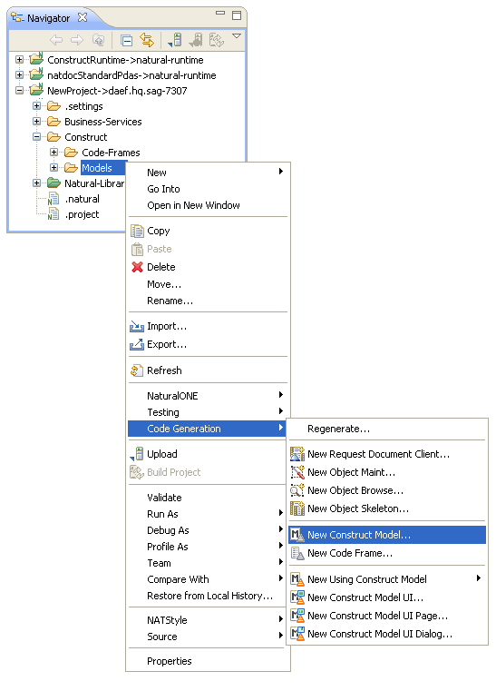
This section describes how to create and maintain a Natural Construct model. The following topics are covered:
To create a new Natural Construct model
Open the context menu in the Navigator view for the NaturalONE project into which you want to generate the model.
Or:
Open the context menu in the
Navigator view for the Construct root
node or Construct > Models node into which you want to
generate the model.
Select .
For example:
The Define model details panel is displayed. For example:
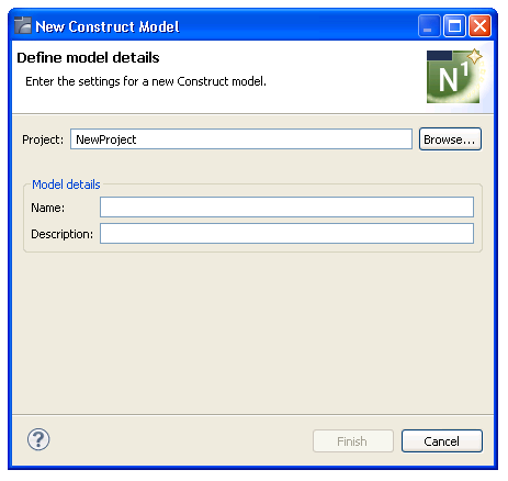
Note:
To change the name of the project, type the name of a
new project in Project or select
to display the available projects for
selection.
Type the name of the new model UI file in Name.
Type a brief description of the model in Description.
Select .
The new model file is listed in the Navigator view and displayed in the editor. For example:
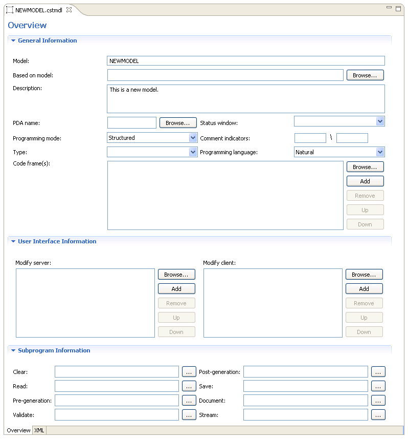
Specify the parameters for the new model.
For information on these parameters, see Creating New Models in the Natural Construct Administration guide.
Create the model UI file (.cstmdlui extension), as well as any reusable dialog UI files (.cstmdldg extension) or page UI files (.cstmdlpg extension).
For information, see Create a New Client Generation Wizard..
Note:
You can only create the XML file after the PDA has been
downloaded from the server. For information, see
Download
Natural Construct Resources to a Local Project.
Upload the new model to your Natural Construct installation on the server.
A model is comprised of the following components:
Model record file (.cstmdl extension)
One or more XML files to define the user interface.
For example, the model UI file (.cstmdlui extension) and any reusable dialog UI files (.cstmdldg extension) or page UI files (.cstmdlpg extension).
Model PDA
Tip:
To modify the model PDA, first download the model record
and determine the name of the PDA. Once you know the name, you can download the
PDA from the SYSCST library on the server, modify it in the local editor, and
then upload it to the SYSCST library.
Code frames
Subprograms
This section describes how to modify a Natural Construct model record in the local environment.
To modify an existing model record
Download the model record from the Natural Server view.
For information, see Download Natural Construct Resources to a Local Project.
Expand the Construct > Models root node in the Navigator view.
For example:
Open the model file (.cstmdl extension) in the editor.
Modify the model record as desired.
For information about the editor, see Create a New Model.
Save the model record changes.
Upload the model record to the Natural Construct server installation using standard NaturalONE functionality.
This section describes how to create and maintain a code frame. The following topics are covered:
This section describes how to create a new code frame. The following topics are covered:
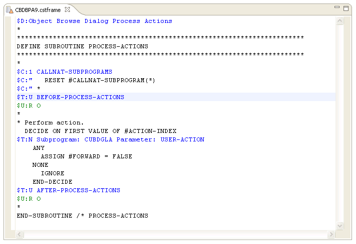
To create a new code frame, use the NaturalONE code frame editor to replicate the code frame data defined in the standard editor on the server. The NaturalONE code frame editor uses a combination of special $ variables and line text to represent the server editor columns and input boxes (for example, type codes, condition codes, description input box, etc.).
The editor allows three types of code frame lines:
| Line | Description | Text Color |
|---|---|---|
| $D:n | Contains a description of the code frame, where n is a description of up to 45 characters (equivalent to the description line on the server). Maximum of one $D line per code frame. | Blue |
| $U:n | Contains details about user exits
included within the code frame (equivalent to the user exit edit window on the
server), where:
|
Green |
| {$C:n} {$T:n} TEXT | Contains text and optional fields,
where { } indicates optional fields and:
|
Black (inserted directly into the
generated program, based on the $C: value)
Blue (represents logic, such as user exit names, subprogram/parameter names, boolean values, etc., and will not be inserted directly into the generated program) |
The following example illustrates the CBDBPA9 code frame defined in the local code frame editor:
Note:
For more information on defining a code frame, see
Creating New Models in the Natural Construct
Administration guide.
To create a new code frame
Open the context menu in the Navigator view for the NaturalONE project into which you want to generate the code frame.
Or:
Open the context menu in the
Navigator view for the Construct root
node or Construct > Code-Frames node into which you
want to generate the code frame.
Select .
The Define code frame details panel is displayed. For example:
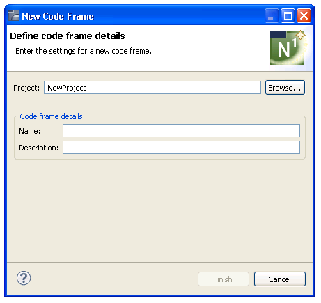
Note:
To change the name of the project, type the name of a
new project in Project or select
to display the available projects for
selection.
Type the name of the new code frame in Name.
Type a brief description of the code frame in Description.
Select .
The new code frame is displayed in the editor. For example:
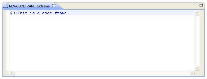
Define the new code frame.
For information, see Use the Code Frame Editor.
Save the specifications for the code frame.
You can now upload the new code frame to your Natural Construct installation on the server.
This section describes how to modify a Natural Construct code frame in the local environment.
To modify an existing code frame
Download the code frame from the Natural Server view.
For information, see Download Natural Construct Resources to a Local Project.
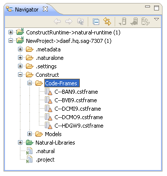
Expand the Construct > Code-Frames root node in the Navigator view.
For example:
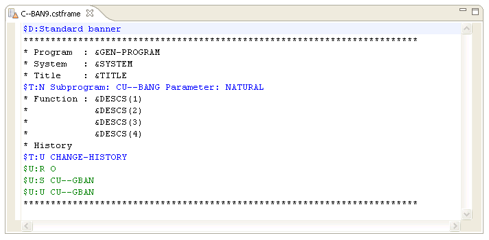
Open the code frame file (.cstframe extension) in the editor.
For example:
Modify the code frame as desired.
For information about the editor, see Introduction.
Save the code frame changes.
Upload the code frame to the Natural Construct server installation using standard NaturalONE functionality.
When editing a code frame in the code frame editor, the Outline view displays the main code frame editor statements (Condition code lines, Type code lines, User exit lines, etc.) in a tree form, using the condition codes to determine the parent/child relationships.
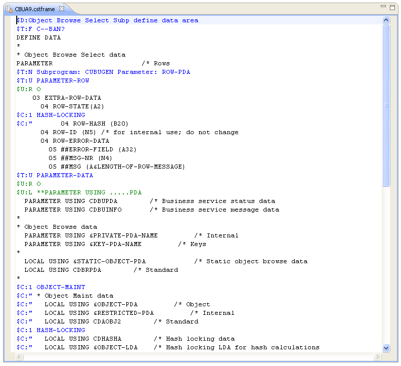
The following example illustrates the CBUA9 code frame in the code frame editor:
The code frame is also displayed in the Outline view. For example:
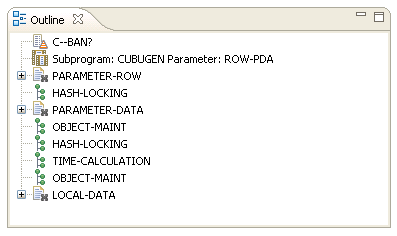
Expand each node to display the data. For example:
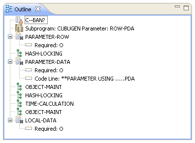
When you select a node in the Outline view, the corresponding item is also highlighted in the code frame editor. For example, if you select the "Subprogram: CUBUGEN Parameter: ROW-PDA" node in the Outline view, the code frame editor will automatically highlight the "$C:" $T:N Subprogram: CUBUGEN Parameter: ROW-PDA" line. Conversely, when you select an item in the code frame editor, the corresponding node is highlighted in the Outline view.
The Outline view does not display all code frame lines in the editor. The following lines are displayed:
Condition code statements that indicate different levels ($C:1-9).
Type code statements that indicate subprograms ($T:N), code frames ($T:F), user exits ($T:U), and conditional user exits ($T:X).
User exit property statements that indicate user exit required ($U:R), generate as subroutine ($U:G), sample subprogram ($U:S), GUI sample subprogram ($U:U), and code frame lines ($U:L).
This section describes how to create and maintain the user interface (UI) for a Natural Construct model. The following topics are covered:
This section describes how to generate and maintain a model UI file. The following topics are covered:
To generate a new Natural Construct model UI file
Open the context menu in the Navigator view for the NaturalONE project into which you want to generate the model UI file.
Or:
Open the context menu in the
Navigator view for the Construct root
node or Construct > Models node into which you want to
generate the model UI file.
Select .
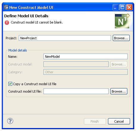
The Define Model UI Details panel is displayed. For example:
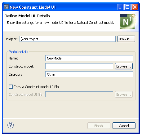
Note:
To change the name of the project in which to
generate the model UI, type the name of a new project in
Project or select to display
the available projects for selection.
Type the name of the model UI file in Name.
Type the name of the Construct model file (.cstmdl extension) for which you are creating the interface model in Construct model.
Or:
Select Browse.
A selection window is displayed, listing the .cstmdl files for the standard models. Select the name of the Construct model file for which you are creating the interface and select . The file name is then displayed in Construct model.
Note:
Alternatively, you can copy a Natural
Construct model UI file and modify it to suit your requirements.
For information, see Copy a
Model UI File.
Type the name of a category in Category.
Categories are used to sort models for selection.
Select .
The XML file for the model is generated and a simplified representation of the file is displayed in the editor. Each entry displayed in the Design tab corresponds to an entry in the XML file for the model. For example:
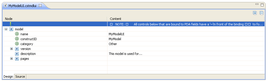
In this example, you can expand the version and pages nodes to view other nodes and contents:
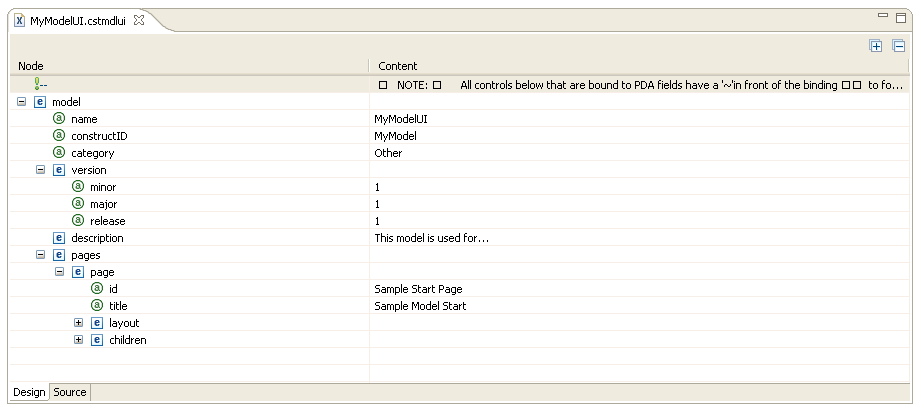
Note:
Any control listed in the
Design tab that is bound to a PDA field has a
"~" character preceding the binding, which forces
the binding to be invalid when the field does not exist in the PDA. To enable
the binding, add the field definition to the PDA and then delete the
"~" character.
Select the Source tab.
The generated XML file (.cstmdlui extension) is displayed. For example:
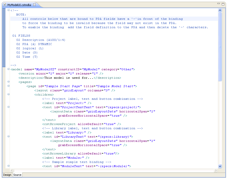
The default settings used to generate the file are based on the Construct model selected on the Define Model Details panel.
Define the settings for the model UI.
For information, see Create a New Client Generation Wizard.
This section describes how to create a new model UI file from an existing model UI file supplied with NaturalONE and the Natural Construct plug-in. Using this method is a quick way to create your own model UI files by modifying existing files to suit your requirements. If the selected model UI file includes any reusable dialog or page UI files that do not currently exist in the workspace, these files will also be copied.
To copy a model UI file
Select Copy a Construct model UI file.
Construct model and Category are disabled and Construct model UI file is enabled. For example:
Type the path for a Natural Construct model UI file (.cstmdlui extension) in Construct model UI file (for example, C:\folder\filename.cstmdlui).
Or:
Select Browse.
A selection window is displayed, listing the .cstmdlui files for the supplied models. Select the file you want to copy and select . The location of the file is then displayed in Construct model UI file.
Note:
When this option is not selected, Construct
model and Category are enabled and must be
specified.
This view lists all modules referenced by the model UI file you are creating, including the modules shipped with the Construct runtime project. For example:
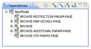
In this example, NewModel was created by copying the Natural Construct Browse model UI file and the Dependencies view displays model UI file, as well as the reusable pages used by that model. Expand the nodes to view the dependencies. For example:
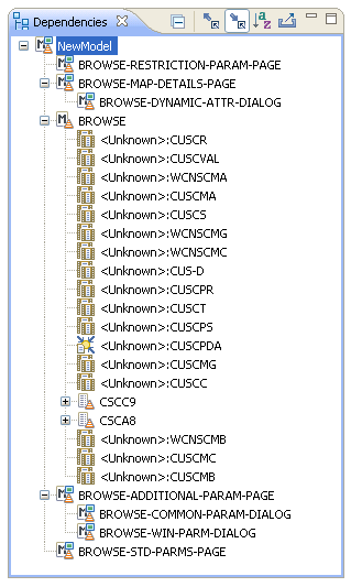
If <Unknown> is displayed beside the name of a referenced module, the module is not available within the current project or referenced locally. You must either create the module locally or download it from the server. Any required compile/runtime modules are shipped in the Construct runtime project.
Notes:
The Outline view displays an outline of the settings defined in the Design tab. For example:
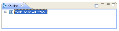
Expand the model name node. For example:
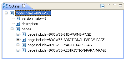
The model UI file in this example was copied from the BROWSE model UI file, which included several reusable pages.
Note:
For information about reusable pages, see
Reusable Dialog
and Page UI Files.
This section describes how to modify an existing model UI file.
To modify an existing model UI file
Open the model UI file (.cstmdlui extension) in the editor.
Modify the model UI information as desired.
For information, see Create a New Client Generation Wizard.
Save the model UI changes.
This section describes how to create and maintain the user interface (UI) for a Natural Construct dialog UI file, a reusable file that can be included in multiple model UI files. The following topics are covered:
Note:
For more information, see
Reusable Dialog
and Page UI Files.
To generate a new dialog UI file
Open the context menu in the Navigator view for the NaturalONE project into which you want to generate the dialog UI file.
Or:
Open the context menu in the
Navigator view for the Construct root
node or Construct > Models node into which you want to
generate the dialog UI file.
Select .
The Define Dialog UI Details panel is displayed. For example:
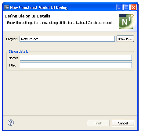
Note:
To change the name of the project in which to
generate the dialog UI file, type the name of a new project in
Project or select to display
the available projects for selection.
Type the name of the new dialog UI file in Name.
Type a title for the dialog in Title.
Select .
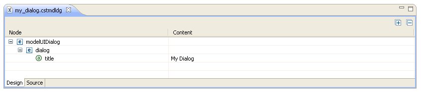
The XML file (.cstmdldg extension) for the reusable dialog is generated and a simplified representation of the file is displayed in the editor in the Design tab. Each entry corresponds to an entry in the .cstmdldg file. For example:
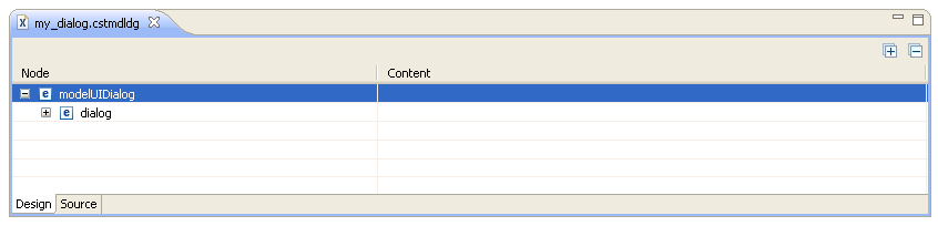
In this example, you can expand the dialog node to view the contents:
Note:
Any control listed in the
Design tab that is bound to a PDA field has a
"~" character preceding the binding, which forces
the binding to be invalid when the field does not exist in the PDA. To enable
the binding, add the field definition to the PDA and then delete the
"~" character.
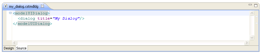
Select the Source tab.
The generated skeleton file is displayed. For example:
Define the settings for the dialog UI.
For information, see Dialog Node.
This section describes how to modify an existing dialog UI file.
To modify an existing dialog UI file
Open the dialog UI file (.cstmdldg extension) in the editor.
Modify the dialog UI information as desired.
For information, see Dialog Node.
Save the dialog UI changes.
This section describes how to create and maintain the user interface (UI) for a Natural Construct page UI file, a reusable file that can be included in multiple model UI files. The following topics are covered:
The following topics are covered:
Note:
For more information, see
Reusable Dialog
and Page UI Files.
To generate a new page UI file
Open the context menu in the Navigator view for the NaturalONE project into which you want to generate the page UI file.
Or:
Open the context menu in the
Navigator view for the Construct root
node or Construct > Models node into which you want to
generate the page UI file.
Select .
The Define Page UI Details panel is displayed. For example:
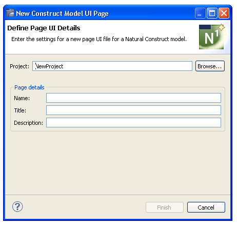
Note:
To change the name of the project in which to
generate the page UI file, type the name of a new project in
Project or select to display
the available projects for selection.
Type the name of the new page UI file in Name.
Type a title for the page in Title.
Type a description of the page in Description.
Select .
The XML file (.cstmdlpg extension) for the reusable page is generated and a simplified representation of the file is displayed in the editor in the Design tab. Each entry corresponds to an entry in the .cstmdlpg file. For example:
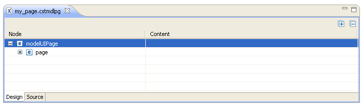
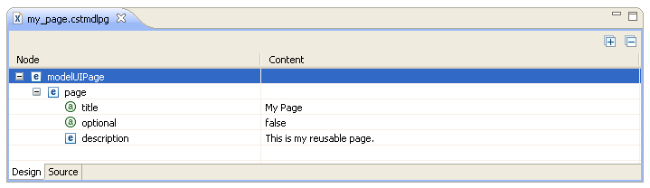
In this example, you can expand the page node to view the contents. For example:
Note:
Any control listed in the
Design tab that is bound to a PDA field has a
"~" character preceding the binding, which forces
the binding to be invalid when the field does not exist in the PDA. To enable
the binding, add the field definition to the PDA and then delete the
"~" character.
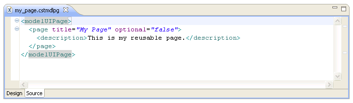
Select the Source tab.
The generated skeleton file is displayed. For example:
Define the settings for the page UI.
For information, see Page Node.
This section describes how to modify an existing page UI file.
To modify an existing page UI file
Open the page UI file (.cstmdlpg extension) in the editor.
Modify the page UI information as desired.
For information, see Page Node.
Save the page UI changes.