
This document covers the following topics:
Normally, the status bar is located at the bottom of a page. It is a
grey area (if using the standard style sheet) where status information can be
seen. The status information is derived dynamically from the
parameters sent with the nat:page.message event (see
Sending Events to the User
Interface). The information consists of three
parts:
Type of the status message - whether it is an error message (E), a warning (W) or a success message (S). Depending on the type, a small icon is displayed to the left of the message.
The status message itself - the text displayed within the status message.
A long text for the status - optional text shown in a dialog when clicking on the status message.
As an alternative to applying the status information as
parameters of the nat:page.message event, you can apply
your own typeprop,
shorttextprop and
longtextprop properties to the STATUSBAR control.
This will generate the corresponding fields in your Natural variable. At
runtime, you can apply the corresponding values in the usual way. Applying
values to the generated fields has the same effect as sending the parameter
values with the nat:page.message event. You can even mix
both methods.
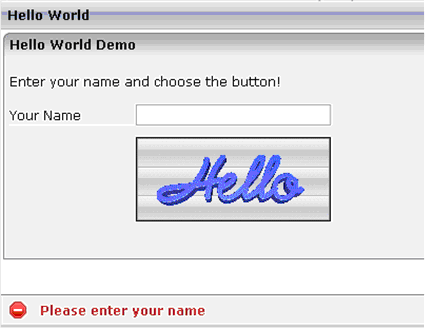
In the "Hello World!" application of the
Natural for Ajax demos (HELLOW-P.NSP), you want to display an
error message if the user clicks the button
and has not yet entered a name.
DECIDE ON FIRST *PAGE-EVENT
...
  VALUE U'onHelloWorld'
  IF YOURNAME = ' '
    PROCESS PAGE UPDATE FULL AND SEND EVENT 'nat:page.message' WITH
      PARAMETERS
        NAME 'type'  VALUE 'E'
        NAME 'short' VALUE 'Please enter your name'
      END-PARAMETERS
  ELSE
      COMPRESS "HELLO WORLD" YOURNAME INTO RESULT
      PROCESS PAGE UPDATE FULL
  END-IF
...
The screen including the error message looks as follows:
| Basic | |||
| typeprop |
Name of the adapter parameter that provides as value the type of the status message. The type defines the image that is rendered at the beginning of the message. Currently there are 3 supported values: E for error, W for warning, S for success. Please pay attention: Do not use the name messageType. This name is internally used when no property name is specified. |
Optional | |
| shorttextprop |
Name of the adapter parameter that provides as value the message text that is visible inside the status bar. Please pay attention: Do not use the name messageShortText. This name is internally used when no property name is specified. |
Optional | |
| longtextprop |
Name of the adapter parameter that provides as value the long message text. The long text pops up if clicking onto the short text mesage. Please pay attention: Do not use the name messageLongText. This name is internally used when no property name is specified. |
Optional | |
| straighttext |
If the text of the control contains HTML tags then these are by default interpreted by the browser. Specifiying STRAIGHTTEXT as "true" means that the browser will directly render the characters without HTML interpretation. Example: if you want to output the source of an HTML text then STRAIGHTTEXT should be set to "true". |
Optional |
true false |
| resetbefore |
If set to TRUE, the control is reset before a server roundtrip is done. |
Optional |
true false |
| withdistance |
If set to TRUE then an additional distance will be added at the top of the statusbar. Default is FALSE: |
Optional |
true false |
| comment |
Comment without any effect on rendering and behaviour. The comment is shown in the layout editor's tree view. |
Optional | |
| Miscellaneous | |||
| testtoolid |
Use this attribute to assign a fixed control identifier that can be later on used within your test tool in order to do the object identification |
Optional | |