
The SUBCISPAGE2 control allows you to embed Application Designer pages such as a NATPAGE into another Application Designer page. You may already have read the section describing the SUBPAGE control which allows you to embed any HTML page into an Application Designer page. The differences between the SUBCISPAGE2 control and the SUBPAGE control are:
With SUBCISPAGE2, you embed an Application Designer page. With SUBPAGE, you embed a normal HTML page.
Application Designer pages are usually started using the servlet "StartCISPage" which creates an embedding frame in which the Application Designer page is placed. The SUBCISPAGE2 control automatically creates this frame.
The embedded page is automatically linked to the Application Designer session management. It runs in the same session. This allows the outer page to interact with the embedded page.
This document covers the following topics:
The following is one usage scenario for the SUBCISPAGE2 control:
Have a page which allows you to select a product from a list.
Have an embedded page which shows the details of the selected product.
This way, you can modularize complex or large screens. The details can also be delivered by a Natural application which is different from the one which does the search.
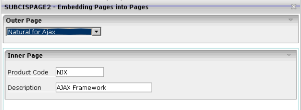
Normally, it is not appropriate to use this feature if you just have a few simple fields as shown in the example below. However, this simple example clearly explains how this feature works. You can find it in the Natural for Ajax demos. The outer page allows you to select a product. The inner page shows the product details.
The XML code for the SUBCISPAGE2 control in the outer page is:
<rowtable0>
  <itr width="100%">
    <subcispage2 subcispageprop="innerPage" width="100%" height="300" borderwidth="1">
    </subcispage2>
  </itr>
</rowtable0>
1 INNERPAGE
2 CHANGEINDEX (I4)
2 PAGE (A) DYNAMIC
2 PAGEID (A) DYNAMIC
| Element | Description |
|---|---|
CHANGEINDEX |
Change this value if the embedded page is to be refreshed. Refreshing means that a server roundtrip will be executed for the embedded page. This allows the corresponding Natural program to send new data to the browser. |
PAGE |
The URL for opening the embedded page.
Example for a NATPAGE:
|
PAGEID |
For each PAGEID in the same
Application Designer subsession, a new Natural session is created. Identical
PAGEID elements within a subsession will refer to the same Natural
session.
|
A NATPAGE runs in an Application Designer subsession. For information on session management in workplaces, see Session Management inside the Workplace.
For non-workplace applications, all NATPAGE pages run in the same
Application Designer subsession. Exactly one Natural session is applied to this subsession. If
the embedded NATPAGE pages would also use this Natural session, it would not
work. Instead, you have to specify a PAGEID for each embedded
page. For each different PAGEID within an Application Designer subsession, a new
Natural session is opened. All Natural sessions opened during the lifetime of
an Application Designer subsession exist as long as the Application Designer subsession exists. For example,
if you close the browser, all Natural sessions are closed.
| Basic | |||
| subcispageprop |
Name of the adapter parameter that provides the content of the control. |
Optional | |
| width |
Width of the control. There are three possibilities to define the width: (A) You do not define a width at all. In this case the width of the control will either be a default width or - in case of container controls - it will follow the width that is occupied by its content. (B) Pixel sizing: just input a number value (e.g. "100"). (C) Percentage sizing: input a percantage value (e.g. "50%"). Pay attention: percentage sizing will only bring up correct results if the parent element of the control properly defines a width this control can reference. If you specify this control to have a width of 50% then the parent element (e.g. an ITR-row) may itself define a width of "100%". If the parent element does not specify a width then the rendering result may not represent what you expect. |
Optional |
100 120 140 160 180 200 50% 100% |
| height |
Height of the control. There are three possibilities to define the height: (A) You do not define a height at all. As consequence the control will be rendered with its default height. If the control is a container control (containing) other controls then the height of the control will follow the height of its content. (B) Pixel sizing: just input a number value (e.g. "20"). (C) Percentage sizing: input a percentage value (e.g. "50%"). Pay attention: percentage sizing will only bring up correct results if the parent element of the control properly defines a height this control can reference. If you specify this control to have a height of 50% then the parent element (e.g. an ITR-row) may itself define a height of "100%". If the parent element does not specify a width then the rendering result may not represent what you expect. |
Optional |
100 150 200 250 300 250 400 50% 100% |
| comment |
Comment without any effect on rendering and behaviour. The comment is shown in the layout editor's tree view. |
Optional | |
| Appearance | |||
| width | (already explained above) | ||
| height | (already explained above) | ||
| borderwidth |
Border size of control in pixels. Specify "0" not to render any border at all. |
Optional |
1 2 3 int-value |
| withownborder |
Default is false. If WITHOWNBORDER is set to true, the subcispage2 control is rendered with its own 3D lookalike border. Set BORDERWIDTH to 0 if WITHOWNBORDER is set to true. |
Optional |
true false |
| pagestyle |
CSS style definition that is directly passed into this control. With the style you can individually influence the rendering of the control. You can specify any style sheet expressions. Examples are: border: 1px solid #FF0000 background-color: #808080 You can combine expressions by appending and separating them with a semicolon. Sometimes it is useful to have a look into the generated HTML code in order to know where direct style definitions are applied. Press right mouse-button in your browser and select the "View source" or "View frame's source" function. |
Optional | |
| colspan |
Column spanning of control. If you use TR table rows then you may sometimes want to control the number of columns your control occupies. By default it is "1" - but you may want to define the control to span over more than one columns. The property only makes sense in table rows that are snychronized within one container (i.e. TR, STR table rows). It does not make sense in ITR rows, because these rows are explicitly not synched. |
Optional |
1 2 3 4 5 50 int-value |
| rowspan |
Row spanning of control. If you use TR table rows then you may sometimes want to control the number of rows your control occupies. By default it is "1" - but you may want to define the control to span over more than one columns. The property only makes sense in table rows that are snychronized within one container (i.e. TR, STR table rows). It does not make sense in ITR rows, because these rows are explicitly not synched. |
Optional |
1 2 3 4 5 50 int-value |
| Natural | |||
| njx:natname |
If a Natural variable with a name not valid for Application Designer (for instance #FIELD1) shall be bound to the control, a different name (for instance HFIELD1) can be bound instead. If the original name (in this case #FIELD1) is then specified in this attribute, the original name is generated into the parameter data area of the Natural adapter and a mapping between the two names is generated into the PROCESS PAGE statement of the Natural adapter. This mapping must not break a once defined group structure. If for instance a grid control that is bound to a name of GRID1 contains fields that are bound to FIELD1 and FIELD2 respectively, the corresponding njx:natname values may be #GRID1.#FIELD1 and #GRID1.#FIELD2, but not #GRID1.#FIELD1 and #MYGRID1.#FIELD2. |
Optional | |
| njx:natcomment |
The value of this attribute is generated as comment line into the parameter data area of the Natural adapter, before the field name. The Map Converter, for instance, uses this attributes to indicate for a generated statusprop variable to which field the statusprop belongs. |
Optional | |