
The STRIPSEL control is very similar to the TABSTRIP2 control: the user selects one option out of many.
The STRIPSEL control is typically located somewhere at the top of a page, but it can also be positioned anywhere else.
The following topics are covered below:
Programming a STRIPSEL control is the same as programming the TABSTRIP2 control - just the rendering of the control differs:
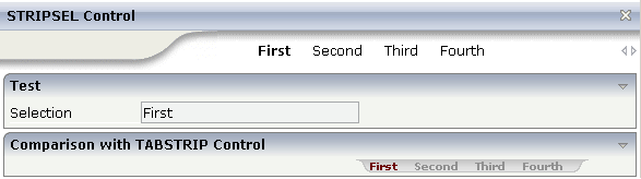
In this example, the STRIPSEL control is the control below the titlebar. For comparison, the TABSTRIP2 control has also been added.
| Basic | |||
| tabstripprop |
Name of the adapter parameter that represents the control in the adapter. |
Optional | |
| align |
Horizontal alignment of control in its column. Each control is "packaged" into a column. The column itself is part of a row (e.g. ITR or TR). Sometimes the size of the column is bigger than the size of the control itself. In this case the "align" property specifies the position of the control inside the column. In most cases you do not require the align control to be explicitly defined because the size of the column around the controls exactly is sized in the same way as the contained control. If you want to directly control the alignment of text: in most text based controls there is an explicit property "textalign" in which you align the control's contained text. |
Optional |
left center right |
| scrollable |
Flag that indicates if the control shows scroll icons on the right upper corner. Default is true |
Optional |
true false |
| backgroundstyle |
CSS style definition that is directly passed into this control. With the style you can individually influence the rendering of the control. You can specify any style sheet expressions. Examples are: border: 1px solid #FF0000 background-color: #808080 You can combine expressions by appending and separating them with a semicolon. Sometimes it is useful to have a look into the generated HTML code in order to know where direct style definitions are applied. Press right mouse-button in your browser and select the "View source" or "View frame's source" function. |
Optional |
background-color: #FF0000 color: #0000FF font-weight: bold |
| scrolllefttitle |
Help text that is displayed if the user moves the mouse of the scroll to left icon. |
Optional | |
| scrolllefttitletextid |
Multi language dependent text that is displayed inside the control. The "textid" is translated into a corresponding string at runtime. Do not specify a "name" inside the control if specifying a "textid". |
Optional | |
| scrollrighttitle |
Help text that is displayed if the user moves the mouse of the scroll to right icon. |
Optional | |
| scrollrighttitletextid |
Multi language dependent text that is displayed inside the control. The "textid" is translated into a corresponding string at runtime. Do not specify a "name" inside the control if specifying a "textid". |
Optional | |
| scrollleftimage |
URL of image that is displayed inside the control. Any image type (.gif, .jpg, ...) that your browser does understand is valid. Use the following options to specify the URL: (A) Define the URL relative to your page. Your page is generated directly into your project's folder. Specifiying "images/xyz.gif" will point into a directory parallel to your page. Specifying "../HTMLBasedGUI/images/new.gif" will point to an image of a neighbour project. (B) Define a complete URL, like "http://www.softwareag.com/images/logo.gif". |
Optional |
gif jpg jpeg |
| scrollleftimagertl |
URL of image that is displayed inside the control. Any image type (.gif, .jpg, ...) that your browser does understand is valid. Use the following options to specify the URL: (A) Define the URL relative to your page. Your page is generated directly into your project's folder. Specifiying "images/xyz.gif" will point into a directory parallel to your page. Specifying "../HTMLBasedGUI/images/new.gif" will point to an image of a neighbour project. (B) Define a complete URL, like "http://www.softwareag.com/images/logo.gif". |
Optional |
gif jpg jpeg |
| scrollrightimage |
URL of image that is displayed inside the control. Any image type (.gif, .jpg, ...) that your browser does understand is valid. Use the following options to specify the URL: (A) Define the URL relative to your page. Your page is generated directly into your project's folder. Specifiying "images/xyz.gif" will point into a directory parallel to your page. Specifying "../HTMLBasedGUI/images/new.gif" will point to an image of a neighbour project. (B) Define a complete URL, like "http://www.softwareag.com/images/logo.gif". |
Optional |
gif jpg jpeg |
| scrollrightimagertl |
URL of image that is displayed inside the control. Any image type (.gif, .jpg, ...) that your browser does understand is valid. Use the following options to specify the URL: (A) Define the URL relative to your page. Your page is generated directly into your project's folder. Specifiying "images/xyz.gif" will point into a directory parallel to your page. Specifying "../HTMLBasedGUI/images/new.gif" will point to an image of a neighbour project. (B) Define a complete URL, like "http://www.softwareag.com/images/logo.gif". |
Optional |
gif jpg jpeg |
| comment |
Comment without any effect on rendering and behaviour. The comment is shown in the layout editor's tree view. |
Optional | |
| Natural | |||
| njx:natname |
If a Natural variable with a name not valid for Application Designer (for instance #FIELD1) shall be bound to the control, a different name (for instance HFIELD1) can be bound instead. If the original name (in this case #FIELD1) is then specified in this attribute, the original name is generated into the parameter data area of the Natural adapter and a mapping between the two names is generated into the PROCESS PAGE statement of the Natural adapter. This mapping must not break a once defined group structure. If for instance a grid control that is bound to a name of GRID1 contains fields that are bound to FIELD1 and FIELD2 respectively, the corresponding njx:natname values may be #GRID1.#FIELD1 and #GRID1.#FIELD2, but not #GRID1.#FIELD1 and #MYGRID1.#FIELD2. |
Optional | |
| njx:natcomment |
The value of this attribute is generated as comment line into the parameter data area of the Natural adapter, before the field name. The Map Converter, for instance, uses this attributes to indicate for a generated statusprop variable to which field the statusprop belongs. |
Optional | |