Nearly all controls which can be sized offer vertical sizing by a
corresponding height property. You can set the
value of this property either as a pixel value or as a percentage value.
This document covers the following topics:
This is the default. Controls either occupy their standard height or the height is explicitly defined in pixels. The whole page is sized from the bottom to the top.
Look at the following example:
<pagebody>
    <rowarea name="Comment Input">
        <itr>
            <label name="Text" width="100">
            </label>
            <text valueprop="comment" width="200" height="200">
            </text>
        </itr>
        <vdist>
        </vdist>
        <itr>
            <hdist width="100">
            </hdist>
            <button name="Clear" method="onClear">
            </button>
        </itr>
    </rowarea>
</pagebody>
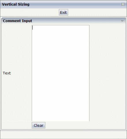
The corresponding screen looks as follows:
![]()
The vertical size of the ROWAREA is exactly as big as required by its content. The TEXT control is defined to be 200 pixels high.
Use the same example, but this time the size of the TEXT control should be as big as possible - depending on the size of the browser window. It should take the full available height.
The XML layout definition looks as follows:
<pagebody takefullheight="true">
    <rowarea name="Comment Input" height="100%">
        <itr height="100%">
            <label name="Text" width="100">
            </label>
            <text valueprop="comment" width="200" height="100%">
            </text>
        </itr>
        <vdist>
        </vdist>
        <itr>
            <hdist width="100">
            </hdist>
            <button name="Clear" method="onClear">
            </button>
        </itr>
    </rowarea>
    <vdist>
    </vdist>
</pagebody>
The TEXT control now occupies a height of 100%. However, the definition of the whole size of the page is passed down from the PAGEBODY to the control:
In the PAGEBODY, the property
takefullheight is set to
"true". This means that the content of the page body
gets passed 100% of the available height.
On the next level, the ITR row - in which the TEXT control is placed - is defined to have a height of "100%". This means it tries to grab as much height as possible. On the same level, there is also a VDIST (vertical distance) control and another ITR row - with no height defined. This means that these controls get as much height as they require due to their content - but the whole remaining vertical space is assigned to the first ITR row with the HEIGHT of "100%".
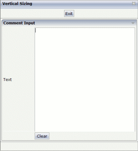
The result page looks as follows:

By changing the size of the browser window, the height of the whole control arrangement will follow accordingly.
You see that sizing by percentage values means that you have to think from top to bottom - just the opposite direction as you think with pixel values. This is nothing new for you if you are used to work with normal HTML tables - in fact, everything that is done below the diverse container controls is done by table rendering.
Conclusion: The example shows you that the
height property of controls can be defined as a
percentage value - but needs an outside reference to depend on. Some of the
controls, such as the PAGEBODY, do not offer explicitly a
height property but only a property
takefullheight that can be set to
"true". This is equivalent to a definition of
HEIGHT="100%".
This has nothing to do with vertical sizing, but with horizontal sizing. We cannot finish the example without having changed it also in a way that it occupies the full available horizontal width. The layout definition now looks as follows:
<pagebody takefullheight="true">
    <rowarea name="Comment Input" height="100%">
        <itr takefullwidth="true" height="100%">
            <label name="Text" width="100">
            </label>
            <text valueprop="comment" width="100%" height="100%">
            </text>
        </itr>
        <vdist>
        </vdist>
        <itr>
            <hdist width="100">
            </hdist>
            <button name="Clear" method="onClear">
            </button>
        </itr>
    </rowarea>
    <vdist>
    </vdist>
</pagebody>
The width property of the TEXT control is
set to "100%". Similar to the vertical height
management, the available width is passed from the ITR row definition above -
which occupies 100% of the available width inside the ROWAREA. The ROWAREA
always occupies the whole available width - it does not require an explicit
width definition.
The result is now:
