Bar graph: Bar group
Properties in this group control the appearance of the graph’s bars, including gradient style, color, and fill style. The group also includes properties that control the visibility and appearance of the text used to display bar values, including font, color, size, and position. You can also specify an image to be displayed within each bar.
Bar group properties
This group contains the following properties:
barGradientStyle
Select one of the following in order to set the gradient style of the bars:
 None
None: Default setting.
 Shaded
: Display bars with a flat gradient
 Rounded
: Display bars with a rounded gradient
This property is in the Bar property group.
barImage
Specifies an image (.gif, .jpg, or .png file) to display in each bar. Select the name of the image file from the drop down menu, or enter the pathname of the file. The drop down menu contains the names of image files located in the current directory (typically, the dashboards directory of your project directory, under your Apama installation’s work directory), as well as image files located in the first level of subdirectories. If you enter a pathname, use an absolute pathname or a pathname that is relative to the current directory.
Note: If necessary, the image will be stretched to fit the bar size.
This property is in the Bar property group.
barProperties
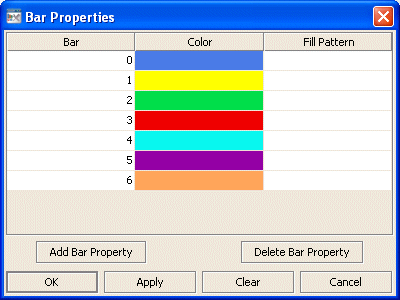
Specifies the color and fill pattern for each bar in the graph. In the Object Properties window, double-click on barProperties in the Property Name field to bring up the Bar Properties dialog. In the Bar Properties dialog you can assign attributes to each bar in a bar graph.
The dialog contains three columns of fields:
 Bar
Bar: There is one entry for each bar that is currently displaying data in the bar graph. The Color and Fill Pattern columns list the current settings for each bar.
 Color
Color: Select the ellipsis button in the Color column and choose a color from the palette to set the color of the bar. Close the Color Chooser window.
 Fill Pattern
: Select the ellipsis button in the Fill Pattern column and choose a pattern from the palette to set the fill pattern of the bar. Close the Fill Pattern window.
Note: The fill patterns in your bar graph are ignored unless the
barGradientStyle property is set to
None.
The dialog contains the following buttons:
 Add Bar Property
: Click to add a Bar Property entry. This does not add a bar to your graph, it adds a bar entry so that you can set properties for bars that will display data that is not yet available. This is useful if the data attachment is not available when you setup your bar graph, or if the number of rows or columns returned by your data attachment varies.
 Delete Bar Property
: Removes the last bar property entry from the
Bar Properties dialog.
 OK
OK: Applies values and closes the dialog.
 Apply
Apply: Applies values without closing the dialog.
 Reset
Reset: Resets all fields to last values applied.
 Clear
Clear: Clears all fields. Detaches object from data source (once Apply or OK is selected).
 Cancel
: Closes the dialog with last values applied.
This property is in the Bar property group.
barValueTextColor
Sets the color of the text used to display bar values. This property is visible in the Builder’s
Object Properties pane only if
barValueVisFlag is selected.
To set the color, select the ... button and choose a color from the palette. Close the Color Chooser window when you are done.
This property is in the Bar property group.
barValueTextFont
Sets the font of the text used to display bar values. This property is visible in the Builder’s
Object Properties pane only if
barValueVisFlag is selected. To set the font, select an item from the drop down list.
This property is in the Bar property group.
barValueTextHeight
Sets the point size of the text used to display bar values. This property is visible in the Builder’s
Object Properties pane only if
barValueVisFlag is selected. To set the point size, enter a number in the text field.
This property is in the Bar property group.
barValueTextPos
Sets the position, relative to the bar, of the text used to display bar values. This property is visible in the Builder’s
Object Properties pane only if
barValueVisFlag is selected. To set the text position, choose an item from the drop down list. By default, digits after a decimal point are not displayed on the labels.
This property is in the Bar property group.
barValueVisFlag
Select to display a value for each bar. Selecting this property causes the following properties to appear in the Object Properties panel:
This property is in the Bar property group.
Copyright © 2013
Software AG, Darmstadt, Germany and/or Software AG USA Inc., Reston, VA, USA, and/or Terracotta Inc., San Francisco, CA, USA, and/or Software AG (Canada) Inc., Cambridge, Ontario, Canada, and/or, Software AG (UK) Ltd., Derby, United Kingdom, and/or Software A.G. (Israel) Ltd., Or-Yehuda, Israel and/or their licensors.
