Configuring Object Grids
The Object Grid is in the Composite tab of the object palette.
The Object Grid is initialized to display the same sample data as the Table object. The sample data contains seven rows so there are seven instances of the object in the grid.
After adding an Object Grid to your dashboard, you need to attach its valueTable property to the tabular data that you want to display. It can be attached to any tabular data source, including the following:

Apama DataViews

Dashboard functions that produce tabular data

Tabular XML data
The iconProperties property is used to select and configure the objects that are displayed in the grid. With the grid object selected, in the Object Properties panel, double-click the iconProperties property to display the Icon Properties dialog.
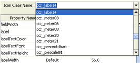
By default the Object Grid is configured to display a single object for each row in its tabular data. The Icon Class Name field is where you select the type of object that you want to display in the grid:
The properties listed correspond to the properties of the object type selected. Properties in the Icon Properties dialog can have their value set in one of three ways. How a property is being set is indicated in the Map column of the property list:
 Default
: The property will take the default value. If the default value changes in a future version of Dashboard Builder, the property will take the new default.
 Value
Value: The property has a user-supplied value. This value will be the same for all instances of the object displayed in the grid.
 Column
: The property value comes from the tabular data that the grid object is attached to. Each instance of the object in the grid corresponds to one row in the tabular data. Binding a property to a column causes each instance of the object to use the value of that column in the corresponding row in the tabular data.
If you click in the Map column for a property, the Builder displays a list that you can use to select how the property value is set.
If you select Value, the value for the property is entered in the Property Value column. If you select Column, clicking in the Property Value column will display a list of all the columns in the tabular data.
When you bind a property to a column in the tabular data, each instance of the object displayed in the grid has that property bound to the value of that column in the corresponding row in the tabular data.
To display multiple objects for each data row, enable the Allow multiple icon types check box at the bottom of the Icon Properties dialog.
When enabled, the dialog will change to allow you to add multiple objects for display in the grid.
Use Add Icon and Delete Icon buttons to add and remove objects from the grid.


