Graphical Visualization
To visualize the impact of an asset in graphical form, do one of the following:

Choose
Impact Analysis from the context menu of the asset's link.
- OR -
Choose
Impact Analysis from the
Actions menu in the asset's detail page.
By default, the impact analysis is show in graphical form. You can switch to the tabular view using the link Switch to Tabular View. When you are using the tabular view, you can switch to the graphical view using the link Switch to Graphical View.
The graphical view shows a visual representation of the selected asset, the objects referred to by the selected asset, the objects that refer to the selected asset and the associations.
Here is an example of the impact analysis diagram for the asset CalculatorService, which is an asset of type Service:
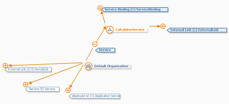
The asset for which the impact analysis is being displayed is shown in a box with orange colored text (in the example, CalculatorService). The objects that are associated with the central asset are displayed initially in boxes with dark blue text on a lighter background (for example, the node Default Organization).
Associations between assets are represented by orange-colored arrows. Each association has a name and a direction (indicated by the arrowhead). For example, the diagram shows the association with the name Service that connects the Default Organization node to the CalculatorService node. This indicates that an association of type "Service" connects the two nodes. The arrowhead points to the CalculatorService node, indicating that Default Organization contains a service CalculatorService.
The display of the associations can be expanded or collapsed as required. If an association is shown with an orange plus sign, you can click on the plus sign to expand the association; this reveals the node or nodes at the other end of the association, and the plus sign changes to a minus sign. To collapse the association, that is, to hide the other end of the association, click on the minus sign, and the display reverts to its original state.
When you expand an association, the association's background color changes to blue. If you collapse a previously expanded association, its color remains blue; this way you can identify the associations that you have already visited. Associations that have not yet been expanded are displayed with a neutral background (that is, the same background color as the drawing canvas).
The text in the box for any collapsed association shows three items of information:
The type of the association;
The number of currently invisible target nodes that are attached to the visible source node;
The object type of the invisible target node(s).
So, for example, the association labeled deployed on (1) Application Server in the diagram indicates an association of type deployed on between the visible source node Default Organization and a currently invisible node of type Application Server.
If you click on an object (as opposed to an association), a window appears with a short summary of the object's definition.
You can move the whole diagram within the web browser display by moving the cursor to an empty part of the diagram and dragging the diagram in the required direction.
You can rearrange the position of any node in the diagram by clicking on the node and dragging it to a new location on the canvas.
The display also contains a bird's eye view of the impact analysis diagram, for example:
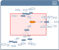
The shaded central part is the part that is shown in detail in the full display. You can drag the shaded central part to any location in the bird's eye view, and the focus of the full display will move accordingly. You can minimize the bird's eye view by choosing the - icon. The minimized view shows just a menu bar with a + icon. To restore the view, click the + icon.
