Selecting Columns for View Configuration
The showConfig method is called in the second step of the MashZone NextGen View Maker wizard. The Data Table with the mashable/mashup response is passed as well as a configuration object for the view and a selector for the node in this page where the configuration form will be rendered.
self.showConfig = function(dataTable, selector, config){
config = config || self.config;
var form = $(selector);
self.form = form;
form.html('<div><div>Select Column:</div><div><select></select></div></div>');
config.columns.each(function(col){
var name = col.name,
selected = name == config.selectedColumn ? 'selected="selected"' : '';
form.find('select').append('<option value="' + name + '" ' + selected + ' >' + name + '</option>');
});
};
The config parameter may contain:

Properties for the view itself, such as the name, and the underlying view library.

Properties for the fields in this configuration form, if the user is editing an existing view or has simply moved back to a previous step in the wizard.

A
columns property with an array of objects containing configuration for each column that the user has chosen to include in this view in the previous step (Data Configuration). Each configuration object for a column can contain these properties:
name | The name of this column. If the data for this row or cell is complex, this may be a path separated by / marks. |
header | The label to display for this column. This defaults to the column name, but users can change this to provide a more useful display label. |
data-type | One of several formats for the data in this column.  date date = a date and the format to show it in (either mm/dd/yyyy or dd/mm/yyyy)  html html = the data also contains HTML markup tags which should be rendered  image image = a URL to an image to show in an <img> tag.  link link = a URL to make into a link with an <a> tag.  longstring longstring = long text content will be truncated and ellipsis added  number number = numeric data and the formats to apply  string string = text content. This is the default |
template | An optional template of how to construct the data for this column. |
Note: | The MashZone NextGen View Maker wizard shows users options to set alternate formats and templates for columns in the Data Configuration step. You can easily apply this configuration when the view is rendered in the draw or update methods. See Selecting Columns for View Configuration for an example. |
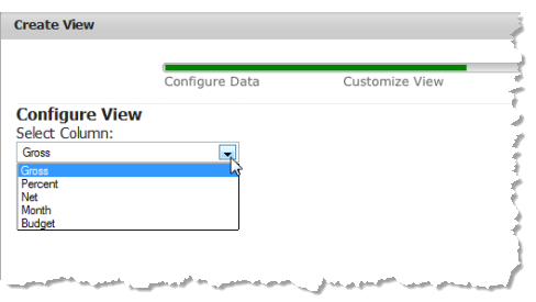
This columns array is used to build the options for a <select> field in this form so that users can select one column, such as this example:

The getConfig method is called when users click Next to move to the Preview step in the View Maker wizard. This method retrieves the name of the selected column and saves it in the config object for the view.
if(self.form){
self.config.selectedColumn = self.form.find('select').val();
}
