Spark Charts, Bullet Graphs and Percentages
You can display several different types of mini-charts in each cell of columns for numeric data to make this data easier to understand:
 Bullet Graphs
: display a numeric value in relationship to a numeric target that you define.
Percentage Bars: display a numeric value between 0 and 100 as a percentage of a horizontal bar.
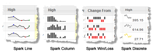
Spark Charts: Line, Column, Win/Loss or Discrete
Spark charts graphically show a distilled view of a trend for a column that contains multiple numeric values for each row. Typically, this is a trend over some time period.
You can choose from these Spark Chart formats:
Since Spark Charts require multiple values for a single column, the data for that column must be either comma-separated values or XML. See
Data for Spark Chart Columns for details.
To display Spark Charts for comma-separated values
1. Select a column with numeric CSV data in the preview area or the Column list.
2. Change Show As to the Spark Chart format you want to use.
4. Set the Show Latest Value option if you wish to show the last value in this column as well as the Spark Chart.
5. For Discrete Spark Charts, optionally set a Threshold Value to display the chart lines in an alternate color if any values are below the threshold. Either:
Enter the single value to use as the threshold for all charts in this column.
If this field has a list of columns, click

to return to edit mode where you can enter a value.
Click

to get different threshold values from another column. Then select the column to use as the threshold from the list of available columns.
To display Spark Charts for XML structures
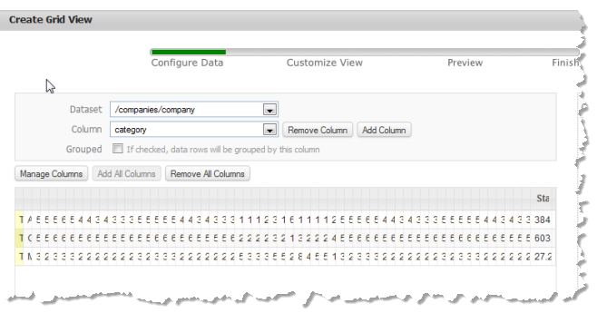
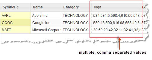
1. In many cases, the initial grid preview for XML structures with multiple values in a column is not useful, such as this example:
When this happens, it is better to remove all the default columns and add back only those columns you want:
a. Click Remove All Columns.
b. Add columns for any simple data that you want, skipping any of the columns listed that contain trend data for the chart. See
Add Columns and Assign Values for instructions.
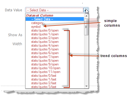
2. Click Add Column to add a column for trend data and the Spark Chart you want to use.
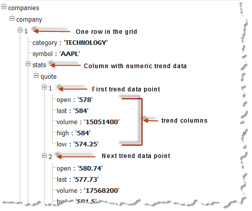
3. In Data Value, scroll to the bottom of the list of columns to the Dataset Arrays section and select the repeating item with trend data. For this example, that is stats/quote:
4. In Series Column, choose the trend column you want to display as a Spark Chart.
5. Choose the type of Spark Chart you want to use in Show As.
7. Set the Show latest value option if you want to display both the last value for this trend column along with the Spark Chart.
8. For Discrete Spark Charts, optionally set a Threshold Value to display the chart lines in an alternate color if any values are below the threshold. Either:
Enter the single value to use as the threshold for all charts in this column.
If this field has a list of columns, click
to return to edit mode where you can enter a value.
Click
to get different threshold values from another column. Then select the column to use as the threshold from the list of available columns.
Data for Spark Chart Columns
To show Spark Charts in a column, the column must contain multiple values in one of these formats:
Comma-separated values, such as this:
An XML structure, such as this:
In this case, each row of the grid is populated from a set of repeating items, such as company in this example. Each item, in turn, has a child that wraps trend data, such as the stats field. This wrapper is the parent to another set of repeating items, quote in this example, with trend data you can use for Spark Charts. Each repeating quote has one or more fields (the trend columns) with the numeric data for one point in the trend, such as the open field in this example.
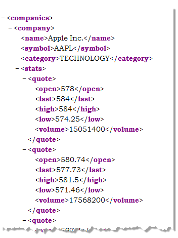
The actual XML for this example looks something like this:
Bullet Graphs
Bullet graphs graphically show progress for a column with one numeric value per cell as compared to a target number. For example:
You can enter a single target value or compare the values for this column to values in another column, such as comparing actual to a budget.
To use bullet graphs for a column in a grid
1. Select a column with numeric values in the preview area or the Column list.
2. Change Show As to Bullet.
4. If desired, set the Show Value option.
5. Optionally, change the Performance Color (the fill color of the bar showing current progress for each bullet graph).
6. Enter or choose the Target for the graph:
Enter the single value to use one target for all bullet graphs in this column.
If this field has a list of columns, click
to return to edit mode where you can enter a value.
Click
to get have target values comes from another column. Then select the column to use as the target from the list of available columns.
7. Optionally, change the percentages for the Lower Range, Middle Range or Upper Range to change the background gradient for the graph.
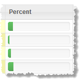
Percentage Bars
For percentage bars, the column must contain a single numeric value between 0 and 100. For example:
You can also choose to show the value in addition to the percentage bar.
1. Select a column with numeric values in the preview area or the Column list.
2. Change Show As to Percentage.
3. If needed, set the Show Value option.
Change the Chart Size
For Spark Charts or Bullet Graphs, you can change the size (both width and height) of the chart that is displayed in each row. By default Chart Size is set to Small. Simply select another size.
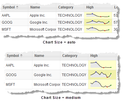
A chart size of Auto fits the height of the chart into the existing height of each row. All the other chart sizes may adjust the height of the row to fit the chart height. For example: