 Valid states for the check box are 0 (zero) meaning clear and 1 (one) meaning selected.Valid states for the check box are 0 (zero) meaning clear and 1 (one) meaning selected.The nUICheckboxButton object provides the following check box types. Use the type that is most appropriate for your application’s target platforms.nUICheckboxButton.TYPE_DEFAULT, which indicates the application uses the check box type that is considered the most appropriate for the target platform.nUICheckboxButton.TYPE_OFF_ON indicates a check box that uses “On” and “Off”.nUICheckboxButton.TYPE_YES_NO specifies a check box that uses “Yes” and “No”. For platforms that do not support yes/no check boxes, Mobile Designer implements a nUIButtonElement object with equivalent “Yes” and “No” text labels.
Platform | Platform-Specific Class and Illustration | |
Android | android.widget.CheckBox | |
Cleared 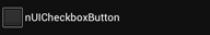 | Selected 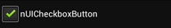 | |
iOS 7 | UISwitch | |
Cleared 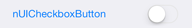 | Selected  | |
iOS 6 | UISwitch | |
Cleared 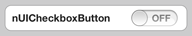 | Selected 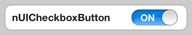 | |
Windows Phone | ToggleButton | |
Cleared  | Selected  | |
Windows RT Windows 8 | Windows.UI.Xaml.Controls.CheckBox | |
Other | Cleared  | Selected  |
