Customizing the Welcome Page
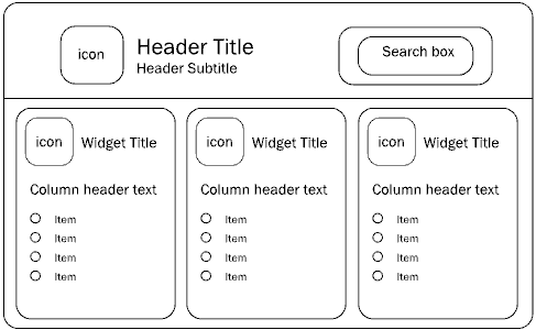
The Welcome page of CentraSite Control can be customized as required. You can change the icons used, colors, text, fonts, and layouts. You can also define links that take you directly to the CentraSite Control pages that are frequently used and links to external web sites. In the Welcome page you can specify the language you use for CentraSite Control and the date format to be used in the various displays. This is the schematic layout for the Welcome page.

In the header section you can change the texts, the fonts, and colors used to display the text in the title and subtitle. You can add an icon adjacent to the title. A search box allows you to perform a keyword search for registry assets and objects whose name or description contains the given keyword. You can hide the search box or change the background color of the search box as part of the page customization. You can change the background color for the whole header section as well.
Below the header section, are the widgets. Each widget contains a title, with an icon adjacent to the text and have a list of entries under the title, each representing some executable action. Typically, an action contains a URL to either a page of your choice within CentraSite Control, or to an external web page that you regularly visit within the context of your work with CentraSite. The Welcome page can contain up to 10 widgets. The widgets are displayed side by side in a single row.
There are several kinds of widget:
 Single-column widget
 - The executable actions are displayed as a table consisting of a single column. Each table cell contains one executable action. Each cell can also have an icon beside it. There is a header text above the table.
 Multi-column widget
 - The executable actions are displayed as a table consisting of two or more columns. Each table cell contains one executable action. Each cell can also have an icon beside it. There is a header text above each column of the table.
 HTML-style widget
 - The contents are freely programmable as HTML code. The HTML statements you use must be valid within the context of an HTML table cell, that is, there is an implicit HTML <td> element enclosing the HTML code you supply.
In general, you can use the CSS stylesheet statements to customize the appearance of text and colors in the Welcome page.
