
What is an ApplinX Transformation?
Using ApplinX Predefined Transformations
Transforming a Repeating Characters Pattern to a Line
Mapping a Transformation to a Screen/Screen Group
Overriding an Inherited Transformation
An ApplinX transformation contains the definitions required for transforming a certain pattern in the host screen into a Web element. For example, a line pattern in the host screen may be transformed into an HTML Web line.
A transformation can be applied to a Screen Group or to a Screen. Transformations minimize the need to write custom Web code in order to modify the appearance and behavior of ApplinX Web pages.
Refer to Code Transformations for more information regarding the concept of Instant Transformations.
ApplinX Transformations provide many options for transforming host patterns into Web elements. However, it may be the case that it will not be possible to define certain required transformations using the Transformations wizards, as their flexibility is limited. In such cases, it is possible to complement the wizard-defined Transformation entities with code-defined Transformation classes. For more information, see Instant Pages Customization, Code Transformations.
Refer to the Instant demo application and to the self-training files included in the ApplinX installation to see examples of transformations.
ApplinX predefined built-in transformations provide you a basic kit of commonly used transformations. You can import the predefined transformation entities to help start building up your own transformation library. Once you have imported the transformations, you can use them as-is or customize them to suit your exact needs.
 To use ApplinX predefined built-in transformations
Right-click on the Repository node of the selected application and choose .
To create a transformation:
Select the relevant application or the Root node of the application.
In the ApplinX Explorer tool bar, click on the arrow to the right of the icon and select . The New Transformation wizard is displayed.
Enter a name for the transformation, a suitable description and determine the folder where the transformation is to be located. Click .
In the Transformation Outline screen select the initial host pattern and the replacing element. screen. The available Host Pattern Elements:
Repeating Characters - a repeating sequence of text.
Text - a textual pattern.
Input field - an unprotected (input) field.
Input field with values - an unprotected (input) field followed by a list of its possible values that appears on the same row.
Date input field - an unprotected (input) field that contains date data.
Menu - a structured list of options. Each option is preceded by the option code that is placed in a selection input field.
The host pattern elements can be transformed to one of the following application components. The list of application components which appears on the right frame of the Layout screen changes according to the selected host pattern element:
Line - a horizontal line.
Text - textual string.
Hyperlinks - a hyperlink. When relating to menus, each link represents a menu option and its corresponding option code.
Image - an image loaded from a file.
Button - a button performing an action when clicked.
Text field - an input field.
Combo box - a drop down list with single selection.
Radio buttons - a list of single-selection buttons.
Check box - a selected / unselected input element.
Calendar - a trigger element (image, button or link) that opens a Calendar window.
Hide - Does not create an alternative component.
Click . You have now created a new transformation entity in the repository.
For details regarding creating a specific transformation, refer to:
Transforming a Repeating Characters Pattern to a Line
Transforming a Text Pattern to Text
Transforming a Text Pattern to Hyperlink
Transforming a Text Pattern to an Image
Transforming a Text Pattern to a Button
Transforming an Input Field to a Text Field
Transforming an Input Field to a Combo Box
Transforming an Input Field to Radio Buttons
Transforming an Input Field to a Check Box
Transforming an Input Field with Values to a Combo Box
Transforming an Input Field with Values to Radio Buttons
Transforming a Date Input Field to a Calendar
Transforming a Menu to Hyperlinks
This transformation is used to replace repeating characters with a line. It can also be used when you need to remove repeating patterns from text without adding a line (for example, removing unnecessary hyphens or stars, without adding a line). This is done by setting the line element's length to 0.
Refer to:
Host Pattern Elements for an example of this pattern.
To transform a Repeating Characters Pattern to a line:
Create a new transformation as detailed in Creating a Transformation and select the relevant type of pattern.
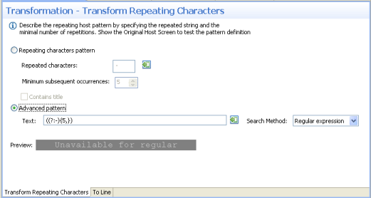
In the Transform Repeating Characters tab in the Editor, describe the pattern that is to be searched for in the original host application. Select whether to locate a Repeating characters pattern or a more complex (Advanced) pattern.
When selecting a Repeating characters pattern, enter the Repeated characters and the minimum times that this string is repeated (Minimum subsequent occurrences). Select the Contains title check box if text may appear between the repeated string. The Preview area will display a preview of the pattern definition.
When selecting Advanced pattern, either type in the pattern or use the Capture from Screen feature to directly take a pattern from the host screen. Select the search method to use when searching for this text:
Contains text: Searches for the given text anyway in the defined region (default).
Exact phrase: Searches for the given text within the defined region. The text must be preceded and followed by at least two white space characters.
Contains word: Searches for the given text as word(s) within the defined region.
Regular expression: Searches for the given pattern within the defined region. Refer to Regular Expression Syntax.
Note:
When selecting a different option, after defining a regular expression search definition, the value of the previous regular expression definition will be lost.
When a screen image is displayed in the Session view, the pattern definition will be marked in the screen image.
Note:
You can view and check the pattern definition by looking at the
screen image displayed.
In the To Line tab in the Editor:
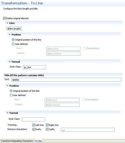
Select the Delete original element check box to delete the host pattern that was located.
Define the length, position and format of the line:
Enter the length of the line. By default the length is the length
of the original pattern, represented by a variable -
$(line.length). Refer to
Transformation
Variables and their Attributes for further details about setting
variables.
Define the position of the line. By default the position is the
original position of the repeating character pattern. Select the User
defined radio button to define the row and column (by default these
values are the row and column of the original pattern: $(line.row)
and $(line.column)). Select From bottom to
define the row and column number relative to the bottom of the screen.
Define the format of the line. Enter a name of a style class (pre-defined in the Framework) that will be used to determine the format of the line element.
If the original host component includes a title (and you selected Contains title in the previous screen), define the line element's title text, position and format:
Enter the title text. By default the title name is the original
title text and is represented by a variable - $(title).
Define the position of the title. By default the position is the
original position of the line. Select the User defined
radio button to define the row and column (by default these values are the row
and column of the original pattern: $(title.row) and
$(title.column)). Select From bottom to
define the row and column number relative to the bottom of the screen.
Define the format of the title. Enter a name of a style class (pre-defined in the Framework) that will be used to determine the format of the line element. Select the Left trim and/or Right trim check boxes to trim spaces from the right and left of the title. When necessary, enter characters to be removed (when typing in more than one character, the contents of the field are related to as individual characters and not as a string of characters) and select Prefix or Suffix to determine the place of these characters.
Save the transformation.
Test the transformation: Select a screen/screen group and click on the menu. Select . When there is an existing Web application, test the transformation by refreshing the relevant screen.
This transformation can not only be used to replace text with other
text, but also to format a certain text (for example - remove unwanted
characters), leaving the textual data as is, or to move text from one position
to another. The latter two usages are implemented by leaving the new text as
the default (in the To Text tab in the Editor, in the
Text field, the default value is $(text)),
preserving the original textual data, and then performing other manipulations
such as changing the position, removing unwanted characters or applying a
certain style.
Refer to:
Host Pattern Elements for an example of this pattern.
To transform a host text pattern to text
Create a new transformation as detailed in Creating a Transformation and select the relevant type of pattern .
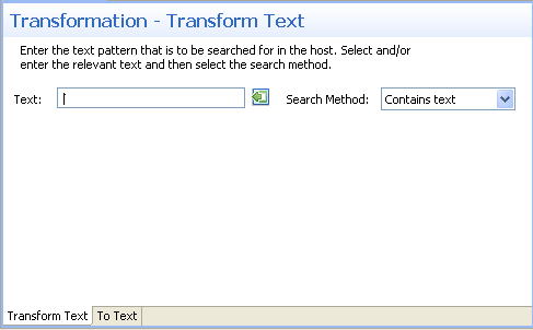
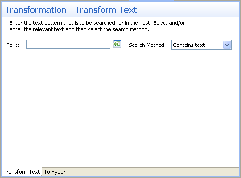
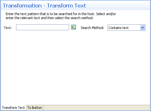
In the Transform Text Tab in the Editor, enter the text pattern that is to be searched for in the host. Either type in the pattern or use the Capture from Screen feature to directly take a pattern from the host screen. Select the search method to use when searching for this text:
Contains text: Searches for the given text anyway in the defined region (default).
Exact phrase: Searches for the given text within the defined region. The text must be preceded and followed by at least two white space characters.
Contains word: Searches for the given text as word(s) within the defined region.
Regular expression: Searches for the given pattern within the defined region. Refer to Regular Expression Syntax.
Note:
When selecting a different option, after defining a regular expression search definition, the value of the previous regular expression definition will be lost.
When a screen image is displayed in the Session view, the pattern definition will be marked in the screen image.
In the To Text Tab in the Editor:
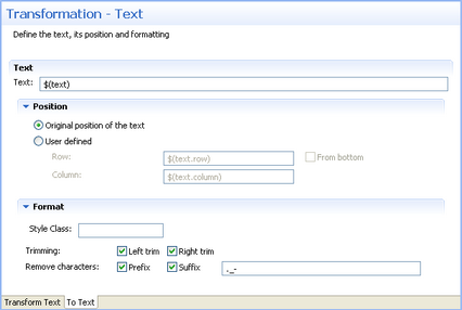
Enter the new text. By default the text is the original text and is
represented by a variable - $(text). Refer to
Transformation
Variables and their Attributes for further details about setting
variables.
Define the position of the text. By default the position is the
original position of the text. Select the User defined radio button to define
the row and column (by default these values are the row and column of the
original pattern: $(text.row) and $(text.column)).
Select From bottom to define the row and column number
relative to the bottom of the screen.
Define the format of the text. Enter a name of a style class (pre-defined in the Framework) that will be used to determine the format of the text element. Select the Left trim and/or Right trim check boxes to trim spaces from the right and left of the title. When necessary, enter the characters to be removed (when typing in more than one character, the contents of the field are related to as individual characters and not as a string of characters) and select Prefix or Suffix to determine the place of these characters.
Save the transformation.
Test the transformation: Select a screen/screen group and click on the menu. Select . When there is an existing Web application, test the transformation by refreshing the relevant screen.
This transformation enables you to transfer a text pattern to a hyperlink. Note that the hyperlink element is a textual element. If you'd like to create a link with an image, refer to Transforming a Text Pattern to an Image and select an action that will be performed when the image is clicked (implementing the link behavior).
Refer to:
Host Pattern Elements for an example of this pattern.
To transform a text pattern to a hyperlink
Create a new transformation as detailed in Creating a Transformation and select the relevant type of pattern .
In the Transform Text Tab in the Editor, enter the text pattern that is to be searched for in the host. Either type in the pattern or use the Capture from Screen feature to directly take a pattern from the host screen. Select the search method to use when searching for this text:
Contains text: Searches for the given text anyway in the defined region (default).
Exact phrase: Searches for the given text within the defined region. The text must be preceded and followed by at least two white space characters.
Contains word: Searches for the given text as word(s) within the defined region.
Regular expression: Searches for the given pattern within the defined region. Refer to Regular Expression Syntax.
Note:
When selecting a different option, after defining a regular expression search definition, the value of the previous regular expression definition will be lost.
When a screen image is displayed in the Session view, the pattern definition will be marked in the screen image.
In the To Hyperlink Tab in the Editor:
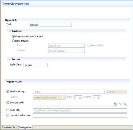
Enter the new text. By default the text is the original text and is
represented by a variable - $(text). Refer to
Transformation
Variables and their Attributes for further details about setting
variables.
Define the position of the text. By default the position is the
original position of the text. Select the User defined radio button to define
the row and column (by default these values are the row and column of the
original pattern: $(text.row) and $(text.column)).
Select From bottom to define the row and column number
relative to the bottom of the screen.
Define the format of the hyperlink. Enter a name of a style class (pre-defined in the Framework) that will be used to determine the format of the text element.
In the Trigger Action section define the action that is going to be performed once the hyperlink is clicked. It is possible to:
Send a host key - Select or enter the host key to be sent.
Execute a path - Browse to locate the folder where the path is saved. Select the path from the drop-down list.
Go to URL - Type in the relevant URL.
Enter a User defined action - Type in customized code to perform a customized action.
Save the transformation.
Test the transformation: Select a screen/screen group and click on the menu. Select . When there is an existing Web application, test the transformation by refreshing the relevant screen.
This transformation enables you to transfer a text pattern to an image.
Refer to:
Host Pattern Elements for an example of this pattern.
To transform a text pattern to an image
Create a new transformation as detailed in Creating a Transformation and select the relevant type of pattern .
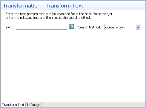
In the Transform Text Tab in the Editor, enter the text pattern that is to be searched for in the host. Either type in the pattern or use the Capture from Screen feature to directly take a pattern from the host screen. Select the search method to use when searching for this text:
Contains text: Searches for the given text anyway in the defined region (default).
Exact phrase: Searches for the given text within the defined region. The text must be preceded and followed by at least two white space characters.
Contains word: Searches for the given text as word(s) within the defined region.
Regular expression: Searches for the given pattern within the defined region. Refer to Regular Expression Syntax.
Note:
When selecting a different option, after defining a regular expression search definition, the value of the previous regular expression definition will be lost.
When a screen image is displayed in the Session view, the pattern definition will be marked in the screen image.
In the To Image Tab in the Editor:
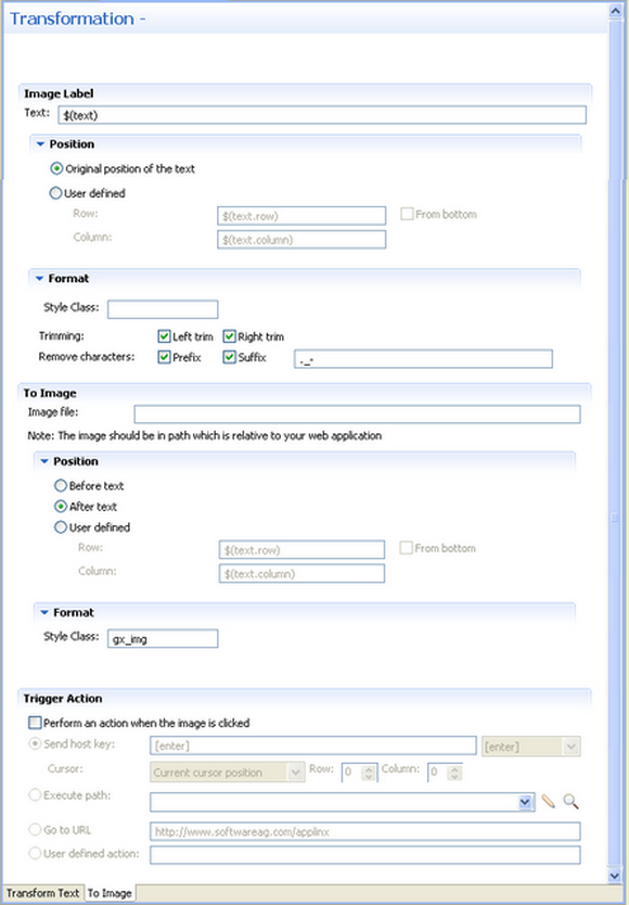
Enter the text label for the image. By default the text is the
original text and is represented by a variable - $(text). Refer to
Transformation
Variables and their Attributes for further details about setting
variables.
Define the position of the text. By default the position is the
original position of the text. Select the User defined radio button to define
the row and column (by default these values are the row and column of the
original pattern: $(text.row) and $(text.column)).
Select From bottom to define the row and column number
relative to the bottom of the screen.
Define the format of the text. Enter a name of a style class (pre-defined in the Framework) that will be used to determine the format of the text element. Select the Left trim and/or Right trim check boxes to trim spaces from the right and left of the title. When necessary, enter the characters to be removed (when typing in more than one character, the contents of the field are related to as individual characters and not as a string of characters) and select Prefix or Suffix to determine the place of these characters.
Enter the image file name. It is possible to include references to variables, for example $(text).gif, and in this way use dynamic image names. Often, the image path is used in the Web application which is normally on a different machine and therefore it is recommended to write the relative path. Note that the default image, points to an image that exists in the framework's built-in Web applications.
Define the position of the image. By default the position is
Before text. It is also possible to select After
text or User defined. Select the User
defined radio button to define the row and column (by default these
values are the row and column of the original pattern: $(text.row)
and $(text.column)). Select From
bottom to define the row and column number relative to the bottom of
the screen.
Define the format of the image. Enter a name of a style class (pre-defined in the Framework) that will be used to determine the format of the image element.
In the Trigger Action section define the action that is going to be performed once the image is clicked. It is possible to:
Send a host key - Select or enter the host key to be sent.
Execute a path - Browse to locate the folder where the path is saved. Select the path from the drop-down list.
Go to URL - Type in the relevant URL.
Enter a User defined action - Type in customized code to perform a customized action.
Save the transformation.
Test the transformation: Select a screen/screen group and click on the menu. Select . When there is an existing Web application, test the transformation by refreshing the relevant screen.
This transformation enables you to transfer a text pattern to a button.
Refer to:
Host Pattern Elements for an example of this pattern.
To transform a text pattern to a button
Create a new transformation as detailed in Creating a Transformation and select the relevant type of pattern .
In the Transform Text Tab in the Editor, enter the text pattern that is to be searched for in the host. Either type in the pattern or use the Capture from Screen feature to directly take a pattern from the host screen. Select the search method to use when searching for this text:
Contains text: Searches for the given text anyway in the defined region (default).
Exact phrase: Searches for the given text within the defined region. The text must be preceded and followed by at least two white space characters.
Contains word: Searches for the given text as word(s) within the defined region.
Regular expression: Searches for the given pattern within the defined region. Refer to Regular Expression Syntax.
Note:
When selecting a different option, after defining a regular expression search definition, the value of the previous regular expression definition will be lost.
When a screen image is displayed in the Session view, the pattern definition will be marked in the screen image.
In the To Button Tab in the Editor:
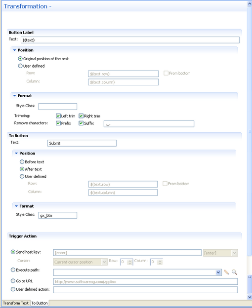
Enter the text that will be displayed near to the button. By
default the text is the original text and is represented by a variable -
$(text). Refer to
Transformation
Variables and their Attributes for further details about setting
variables.
Define the position of the text. By default the position is the
original position of the text. Select the User defined radio button to define
the row and column (by default these values are the row and column of the
original pattern: $(text.row) and $(text.column)).
Select From bottom to define the row and column number
relative to the bottom of the screen.
Define the format of the text. Enter a name of a style class (pre-defined in the Framework) that will be used to determine the format of the text element. Select the Left trim and/or Right trim check boxes to trim spaces from the right and left of the title. When necessary, enter the characters to be removed (when typing in more than one character, the contents of the field are related to as individual characters and not as a string of characters) and select Prefix or Suffix to determine the place of these characters.
Enter the text that will appear on the button.
Define the position of the button. By default the position is
Before text. It is also possible to select After
text or User defined. Select the User
defined radio button to define the row and column (by default these
values are the row and column of the original pattern: $(text.row)
and $(text.column)). Select From
bottom to define the row and column number relative to the bottom of
the screen.
Define the format of the button. Enter a name of a style class (pre-defined in the Framework) that will be used to determine the format of the text.
In the Trigger Action section define the action that is going to be performed once the image is clicked. It is possible to:
Send a host key - Select or enter the host key to be sent.
Execute a path - Browse to locate the folder where the path is saved. Select the path from the drop-down list.
Go to URL - Type in the relevant URL.
Enter a User defined action - Type in customized code to perform a customized action.
Save the transformation.
Test the transformation: Select a screen/screen group and click on the menu. Select . When there is an existing Web application, test the transformation by refreshing the relevant screen.
This transformation enables you to transfer an input field to a text field.
Refer to:
Host Pattern Elements for an example of this pattern.
To transform an input field to a text field
Create a new transformation as detailed in Creating a Transformation and select the relevant type of pattern .

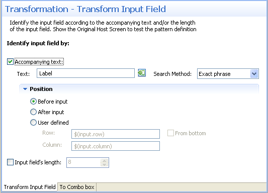
In the Transform Input FieldTab in the Editor identify the input field according to accompanying text and/or the length of the input field.
Accompanying text - select this check box to identify the input field according to accompanying text. The text field will become enabled. Either type in the text or use the Capture from Screen feature to directly take text from the host screen. Select the search method to use when searching for this text:
Contains text: Searches for the given text anyway in the defined region (default).
Exact phrase: Searches for the given text within the defined region. The text must be preceded and followed by at least two white space characters.
Contains word: Searches for the given text as word(s) within the defined region.
Regular expression: Searches for the given pattern within the defined region. Refer to Regular Expression Syntax.
Note:
When selecting a different option, after defining a regular expression search definition, the value of the previous regular expression definition will be lost.
When a screen image is displayed in the Session view, the pattern definition will be marked in the screen image.
Define the position of the text: By default the position is
Before input. It is also possible to select
After input or User defined. Select
the User defined radio button to define the row and column
(by default these values are the row and column of the input to allow relative
position calculations: $(input.row) and
$(input.column)). Refer to
Transformation
Variables and their Attributes for further details about setting
variables. Select From bottom to define the row and column
number relative to the bottom of the screen.
Input field's length - select this check box to identify the input field according to the input field's length. The Length field will become enabled. Type in the length of the input field.
Note:
You can view and check the pattern definition by looking at the
screen image displayed.
In the To Text FieldTab in the Editor define the label of the text field (text, position and format), as well as the position and the format of the text field:
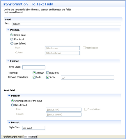
Enter the label text. By default the text is the original text and
is represented by a variable - $(text).
Define the position of the text: By default the position is
Before input. It is also possible to select
After input or User defined. Select
the User defined radio button to define the row and column
(by default these values are the row and column of the input to allow relative
position calculations: $(input.row) and
$(input.column)). Refer to
Transformation
Variables and their Attributes for further details about setting
variables. Select From bottom to define the row and column
number relative to the bottom of the screen.
Define the format of the label. Enter a name of a style class (pre-defined in the Framework) that will be used to determine the format of the text element. Select the Left trim and/or Right trim check boxes to trim spaces from the right and left of the title. When necessary, enter the characters to be removed (when typing in more than one character, the contents of the field are related to as individual characters and not as a string of characters) and select Prefix or Suffix to determine the place of these characters.
Define the position of the text field. By default the position is
the original position of the input field. Select the User
defined radio button to define the row and column (by default these
values are the row and column of the original pattern:
$(input.row) and $(input.column)). Select
From bottom to define the row and column number relative to the
bottom of the screen.
Define the format of the text field. Enter a name of a style class (pre-defined in the Framework) that will be used to determine the format of the text.
Save the transformation.
Test the transformation: Select a screen/screen group and click on the menu. Select . When there is an existing Web application, test the transformation by refreshing the relevant screen.
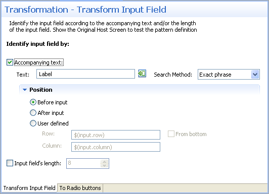
This transformation enables you to transfer an input field to a combo box.
Refer to:
Host Pattern Elements for an example of this pattern.
To transform an input field to a combo box
Create a new transformation as detailed in Creating a Transformation and select the relevant type of pattern .
In the Transform Input FieldTab in the Editor identify the input field according to accompanying text and/or the length of the input field.
Accompanying text - select this check box to identify the input field according to accompanying text. The text field will become enabled. Either type in the text or use the Capture from Screen feature to directly take text from the host screen. Select the search method to use when searching for this text:
Contains text: Searches for the given text anyway in the defined region (default).
Exact phrase: Searches for the given text within the defined region. The text must be preceded and followed by at least two white space characters.
Contains word: Searches for the given text as word(s) within the defined region.
Regular expression: Searches for the given pattern within the defined region. Refer to Regular Expression Syntax.
Note:
When selecting a different option, after defining a regular expression search definition, the value of the previous regular expression definition will be lost.
When a screen image is displayed in the Session view, the pattern definition will be marked in the screen image.
Define the position of the text: By default the position is
Before input. It is also possible to select
After input or User defined. Select
the User defined radio button to define the row and column
(by default these values are the row and column of the input to allow relative
position calculations: $(input.row) and
$(input.column)). Refer to
Transformation
Variables and their Attributes for further details about setting
variables. Select From bottom to define the row and column
number relative to the bottom of the screen.
Input field's length - select this check box to identify the input field according to the input field's length. The Length field will become enabled. Type in the length of the input field.
Note:
You can view and check the pattern definition by looking at the
screen image displayed.
In the To Combo BoxTab in the Editor define the combo box values and label definitions:
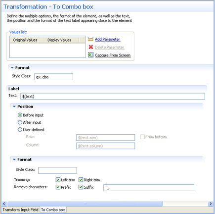
Define the list of values for the combo box. Click the Add Parameter to add rows. Click on the cell in the Original Value column and either type in the original value or use the Capture from Screen feature to directly take the value from the host screen. Click on the cell in the Display Values column and either type in the value to be displayed or use the Capture from Screen feature to directly take the value from the host screen. Use the Move Up and Move Down arrows to determine the order of appearance of the display values.
Define the format of the combo box: Enter a name of a style class (pre-defined in the Framework) that will be used to determine the format of the element.
Enter the text that will appear before the combo box. By default
the text is the original text and is represented by a variable -
$(text).
Define the position of the text: By default the position is
Before input. It is also possible to select
After input or User defined. Select
the User defined radio button to define the row and column
(by default these values are the row and column of the input to allow relative
position calculations: $(text.row) and
$(text.column)). Refer to
Transformation
Variables and their Attributes for further details about setting
variables. Select From bottom to define the row and column
number relative to the bottom of the screen.
Define the format of the text. Enter a name of a style class (pre-defined in the Framework) that will be used to determine the format of the text element. Select the Left trim and/or Right trim check boxes to trim spaces from the right and left of the title. When necessary, enter the characters to be removed (when typing in more than one character, the contents of the field are related to as individual characters and not as a string of characters) and select Prefix or Suffix to determine the place of these characters.
Save the transformation.
Test the transformation: Select a screen/screen group and click on the menu. Select . When there is an existing Web application, test the transformation by refreshing the relevant screen.
This transformation enables you to transfer an input field to a radio buttons.
Refer to:
Host Pattern Elements for an example of this pattern.
To transform an input field to radio buttons
Create a new transformation as detailed in Creating a Transformation and select the relevant type of pattern .
In the Transform Input FieldTab in the Editor identify the input field according to accompanying text and/or the length of the input field.
Accompanying text - select this check box to identify the input field according to accompanying text. The text field will become enabled. Either type in the text or use the Capture from Screen feature to directly take text from the host screen. Select the search method to use when searching for this text:
Contains text: Searches for the given text anyway in the defined region (default).
Exact phrase: Searches for the given text within the defined region. The text must be preceded and followed by at least two white space characters.
Contains word: Searches for the given text as word(s) within the defined region.
Regular expression: Searches for the given pattern within the defined region. Refer to Regular Expression Syntax.
Note:
When selecting a different option, after defining a regular expression search definition, the value of the previous regular expression definition will be lost.
When a screen image is displayed in the Session view, the pattern definition will be marked in the screen image.
Define the position of the text: By default the position is
Before input. It is also possible to select
After input or User defined. Select
the User defined radio button to define the row and column
(by default these values are the row and column of the input to allow relative
position calculations: $(input.row) and
$(input.column)). Refer to
Transformation
Variables and their Attributes for further details about setting
variables. Select From bottom to define the row and column
number relative to the bottom of the screen.
Input field's length - select this check box to identify the input field according to the input field's length. The Length field will become enabled. Type in the length of the input field.
Note:
You can view and check the pattern definition by looking at the
screen image displayed.
In the To Radio ButtonsTab in the Editor define the radio button values and label definitions:
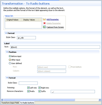
Define the list of values for the radio buttons. Click the Add Parameter to add rows. Click on the cell in the Original Value column and either type in the original value or use the Capture from Screen feature to directly take the value from the host screen. Click on the cell in the Display Values column and either type in the value to be displayed or use the Capture from Screen feature to directly take the value from the host screen. Use the Move Up and Move Down arrows to determine the order of appearance of the display values.
Define the format of the radio buttons: Enter a name of a style class (pre-defined in the Framework) that will be used to determine the format of the element.
Enter the text that will appear before the radio buttons. By
default the text is the original text and is represented by a variable -
$(text).
Define the position of the text: By default the position is
Before input. It is also possible to select
After input or User defined. Select
the User defined radio button to define the row and column
(by default these values are the row and column of the input to allow relative
position calculations: $(text.row) and
$(text.column)). Refer to
Transformation
Variables and their Attributes for further details about setting
variables. Select From bottom to define the row and column
number relative to the bottom of the screen.
Define the format of the text. Enter a name of a style class (pre-defined in the Framework) that will be used to determine the format of the text element. Select the Left trim and/or Right trim check boxes to trim spaces from the right and left of the title. When necessary, enter the characters to be removed (when typing in more than one character, the contents of the field are related to as individual characters and not as a string of characters) and select Prefix or Suffix to determine the place of these characters.
Save the transformation.
Test the transformation: Select a screen/screen group and click on the menu. Select . When there is an existing Web application, test the transformation by refreshing the relevant screen.
This transformation enables you to transfer an input field to a check box.
Refer to:
Host Pattern Elements for an example of this pattern.
To transform an input field to a check box
Create a new transformation as detailed in Creating a Transformation and select the relevant type of pattern .
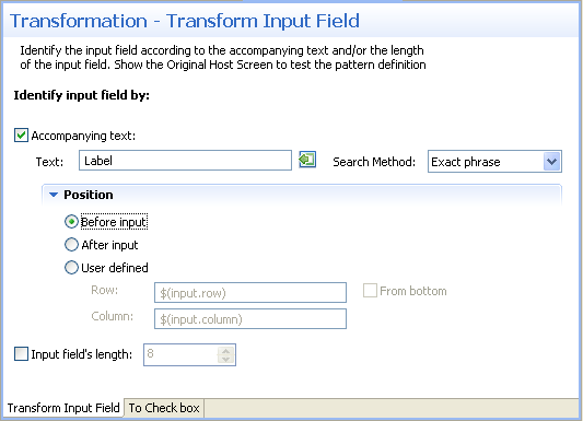
In the Transform Input FieldTab in the Editor identify the input field according to accompanying text and/or the length of the input field.
Accompanying text - select this check box to identify the input field according to accompanying text. The text field will become enabled. Either type in the text or use the Capture from Screen feature to directly take text from the host screen. Select the search method to use when searching for this text:
Contains text: Searches for the given text anyway in the defined region (default).
Exact phrase: Searches for the given text within the defined region. The text must be preceded and followed by at least two white space characters.
Contains word: Searches for the given text as word(s) within the defined region.
Regular expression: Searches for the given pattern within the defined region. Refer to Regular Expression Syntax.
Note:
When selecting a different option, after defining a regular expression search definition, the value of the previous regular expression definition will be lost.
When a screen image is displayed in the Session view, the pattern definition will be marked in the screen image.
Define the position of the text: By default the position is
Before input. It is also possible to select
After input or User defined. Select
the User defined radio button to define the row and column
(by default these values are the row and column of the input to allow relative
position calculations: $(input.row) and
$(input.column)). Refer to
Transformation
Variables and their Attributes for further details about setting
variables. Select From bottom to define the row and column
number relative to the bottom of the screen.
Input field's length - select this check box to identify the input field according to the input field's length. The Length field will become enabled. Type in the length of the input field.
Note:
You can view and check the pattern definition by looking at the
screen image displayed.
In the To Check BoxTab in the Editor define the check box values when selected and when not selected, the position and format of the check box as well as the text, the position and the format of the text label appearing close to the check box.
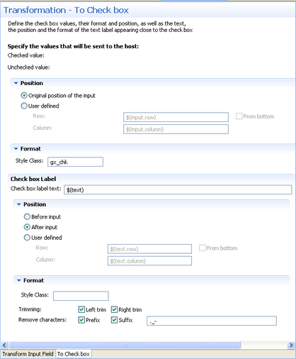
Define the values that will be sent to the host when the check box is selected, and when the check box is not selected.
Define the position of the field: By default the position is the
original position of the input field. Select the User
defined radio button to define the row and column (by default these
values are the row and column of the input, to allow relative position
calculations: $(input.row) and $(input.column)).
Select From bottom to define the row and column number
relative to the bottom of the screen.
Define the format of the check box. Enter a name of a style class (pre-defined in the Framework) that will be used to determine the format of the element.
Enter the text that will appear before the check box. By default
the text is the original text and is represented by a variable -
$(text).
Define the position of the text: By default the position is
Before input. It is also possible to select
After input or User defined. Select
the User defined radio button to define the row and column
(by default these values are the row and column of the input to allow relative
position calculations: $(text.row) and
$(text.column)). Refer to
Transformation
Variables and their Attributes for further details about setting
variables. Select From bottom to define the row and column
number relative to the bottom of the screen.
Define the format of the text. Enter a name of a style class (pre-defined in the Framework) that will be used to determine the format of the text element. Select the Left trim and/or Right trim check boxes to trim spaces from the right and left of the title. When necessary, enter the characters to be removed (when typing in more than one character, the contents of the field are related to as individual characters and not as a string of characters) and select Prefix or Suffix to determine the place of these characters.
Save the transformation.
Test the transformation: Select a screen/screen group and click on the menu. Select . When there is an existing Web application, test the transformation by refreshing the relevant screen.
This transformation enables you to transfer an input field with a value to a check box. .
Refer to:
Host Pattern Elements for an example of this pattern.
To transform an input field with values to a combo box
Create a new transformation as detailed in Creating a Transformation and select the relevant type of pattern .
In the Transform Input Field with ValuesTab in the Editor define the pattern of the input field as well as whether to identify the input field according to accompanying text and/or the length of the input field:
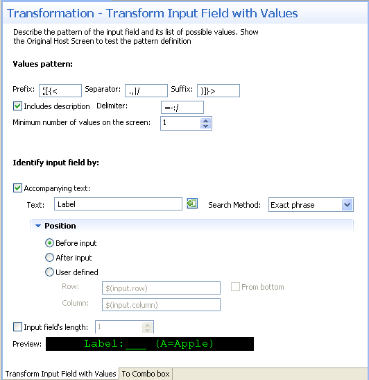
Define the input field - the possible prefix, separator and suffix, indicate whether each value is preceded by text, the possible delimiter characters and the minimum number of values in the list of values.
Accompanying text - select this check box to identify the input field according to accompanying text. The text field will become enabled. Either type in the text or use the Capture from Screen feature to directly take text from the host screen. Select the search method to use when searching for this text:
Contains text: Searches for the given text anyway in the defined region (default).
Exact phrase: Searches for the given text within the defined region. The text must be preceded and followed by at least two white space characters.
Contains word: Searches for the given text as word(s) within the defined region.
Regular expression: Searches for the given pattern within the defined region. Refer to Regular Expression Syntax.
Note:
When selecting a different option, after defining a regular expression search definition, the value of the previous regular expression definition will be lost.
When a screen image is displayed in the Session view, the pattern definition will be marked in the screen image.
Define the position of the text. By default the position is
Before input. It is also possible to select
After input or User defined. Select
the User defined radio button to define the row and column
(by default these values are the row and column of the input to allow relative
position calculations: $(input.row) and
$(input.column)). Refer to
Transformation
Variables and their Attributes for further details about setting
variables. Select From bottom to define the row and column
number relative to the bottom of the screen.
Input field's length - select this check box to identify the input field according to the input field's length. The Length field will become enabled. Type in the length of the input field.
Note:
You can view and check the pattern definition by looking at the
screen image displayed.
In the To Combo BoxTab in the Editor define the Combo box display value, the format of the combo box, as well as the label, the position and the format of the text label appearing close to the combo box:
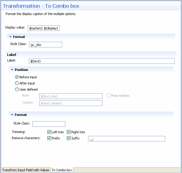
Define the values that will be displayed. By default the display
value is $(action): $(display).
For example, if the pattern was (A=Apple, B=Banana, C=Coconut), the combo box value list will be:
A: Apple
B: Banana
C: Coconut
Changing the Display value field to $(display)
($(action)) will result in the following value list:
Apple (A)
Banana (B)
Coconut (C)
Changing the Display value field to $(display) will
result in the following value list:
Apple
Banana
Coconut
In all the above examples, the actual value sent to the host is the
value represented by $(action). For example, when Apple is
selected, A will be sent to the host.
Define the format of the check box. Enter a name of a style class (pre-defined in the Framework) that will be used to determine the format of the element.
Enter the text that will appear before the combo box. By default
the text is the original text and is represented by a variable -
$(text).
Define the position of the text: By default the position is
Before input. It is also possible to select
After input or User defined. Select
the User defined radio button to define the row and column
(by default these values are the row and column of the input to allow relative
position calculations: $(text.row) and
$(text.column)). Refer to
Transformation
Variables and their Attributes for further details about setting
variables. Select From bottom to define the row and column
number relative to the bottom of the screen.
Define the format of the text. Enter a name of a style class (pre-defined in the Framework) that will be used to determine the format of the text element. Select the Left trim and/or Right trim check boxes to trim spaces from the right and left of the title. When necessary, enter the characters to be removed (when typing in more than one character, the contents of the field are related to as individual characters and not as a string of characters) and select Prefix or Suffix to determine the place of these characters.
Save the transformation.
Test the transformation: Select a screen/screen group and click on the menu. Select . When there is an existing Web application, test the transformation by refreshing the relevant screen.
This transformation enables you to transfer an input field with a value to radio buttons.
Refer to:
Host Pattern Elements for an example of this pattern.
To transform an input field with values to radio buttons
Create a new transformation as detailed in Creating a Transformation and select the relevant type of pattern .
In the Transform Input Field with ValuesTab in the Editor define the pattern of the input field as well as whether to identify the input field according to accompanying text and/or the length of the input field:
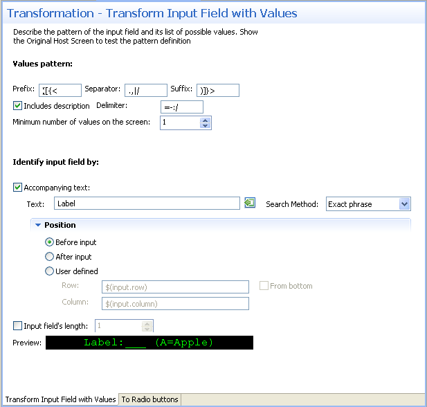
Define the input field - the possible prefix, separator and suffix, indicate whether each value is preceded by text, the possible delimiter characters and the minimum number of values in the list of values.
Accompanying text - select this check box to identify the input field according to accompanying text. The text field will become enabled. Either type in the text or use the Capture from Screen feature to directly take text from the host screen. Select the search method to use when searching for this text:
Contains text: Searches for the given text anyway in the defined region (default).
Exact phrase: Searches for the given text within the defined region. The text must be preceded and followed by at least two white space characters.
Contains word: Searches for the given text as word(s) within the defined region.
Regular expression: Searches for the given pattern within the defined region. Refer to Regular Expression Syntax.
Note:
When selecting a different option, after defining a regular expression search definition, the value of the previous regular expression definition will be lost.
When a screen image is displayed in the Session view, the pattern definition will be marked in the screen image.
Define the position of the text. By default the position is
Before input. It is also possible to select
After input or User defined. Select
the User defined radio button to define the row and column
(by default these values are the row and column of the input to allow relative
position calculations: $(input.row) and
$(input.column)). Refer to
Transformation
Variables and their Attributes for further details about setting
variables. Select From bottom to define the row and column
number relative to the bottom of the screen.
Input field's length - select this check box to identify the input field according to the input field's length. The Length field will become enabled. Type in the length of the input field.
Note:
You can view and check the pattern definition by looking at the
screen image displayed.
In the To Radio ButtonsTab in the Editor define the radio buttons' display value, the format of the radio buttons, as well as the label, the position and the format of the text label appearing close to the radio buttons:
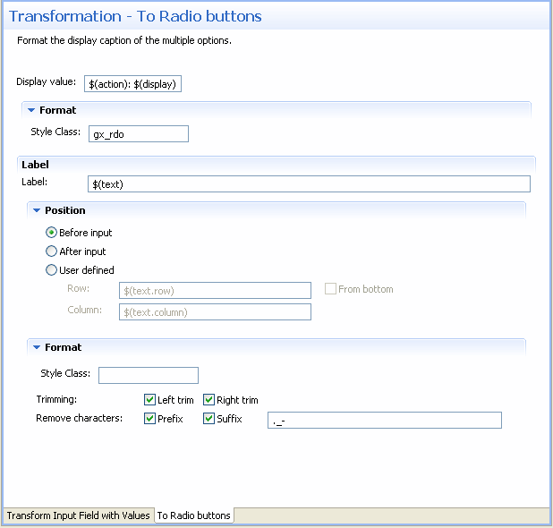
Define the values that will be displayed. By default the display
value is $(action): $(display).
For example, if the pattern was (A=Apple, B=Banana, C=Coconut), the combo box value list will be:
A: Apple
B: Banana
C: Coconut
Changing the Display value field to $(display)
($(action)) will result in the following value list:
Apple (A)
Banana (B)
Coconut (C)
Changing the Display value field to $(display) will
result in the following value list:
Apple
Banana
Coconut
In all the above examples, the actual value sent to the host is the
value represented by $(action). For example, when Apple is
selected, A will be sent to the host.
Define the format of the check box. Enter a name of a style class (pre-defined in the Framework) that will be used to determine the format of the element.
Enter the text that will appear before the radio buttons. By
default the text is the original text and is represented by a variable -
$(text).
Define the position of the text: By default the position is
Before input. It is also possible to select
After input or User defined. Select
the User defined radio button to define the row and column
(by default these values are the row and column of the input to allow relative
position calculations: $(text.row) and
$(text.column)). Refer to
Transformation
Variables and their Attributes for further details about setting
variables. Select From bottom to define the row and column
number relative to the bottom of the screen.
Define the format of the text. Enter a name of a style class (pre-defined in the Framework) that will be used to determine the format of the text element. Select the Left trim and/or Right trim check boxes to trim spaces from the right and left of the title. When necessary, enter the characters to be removed (when typing in more than one character, the contents of the field are related to as individual characters and not as a string of characters) and select Prefix or Suffix to determine the place of these characters.
Save the transformation.
Test the transformation: Select a screen/screen group and click on the menu. Select . When there is an existing Web application, test the transformation by refreshing the relevant screen.
This transformation enables you to transfer a date input field to a calendar component.
Note:
The Calendar component language is determined according to the
operating system. When ApplinX identifies that the Operating System is English,
French, German, Spanish or Portuguese, the Calendar component is displayed in
the identified language. Other operating systems are displayed in English.
Refer to:
Host Pattern Elements for an example of this pattern.
To transform a Date Input Field to a Calendar
Create a new transformation as detailed in Creating a Transformation and select the relevant type of pattern .
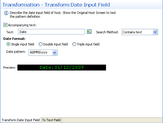
In the Transform DateTab in the Editor determine whether to identify the date input field according to accompanying text and define the date format:
Identify the input field by the accompanying text - select this check box to identify the input field according to accompanying text. The text field will become enabled. Either type in the text or use the Capture from Screen feature to directly take text from the host screen. Select the search method to use when searching for this text:
Contains text: Searches for the given text anyway in the defined region (default).
Exact phrase: Searches for the given text within the defined region. The text must be preceded and followed by at least two white space characters.
Contains word: Searches for the given text as word(s) within the defined region.
Regular expression: Searches for the given pattern within the defined region. Refer to Regular Expression Syntax.
Define the date format - define whether the date in the host is in a single input field, in two input fields or in three input fields. Select the date pattern from the drop-down list of available patterns or type a different date pattern. Refer to Date and Time Patterns for further information regarding date formats.
Note:
You can view and check the pattern definition by looking at the
screen image displayed.
In the To CalendarTab in the Editor determine whether the calendar will be represented by an image, a button or a hyperlink. After determining the representation, define the relevant image file/text and format that will appear:
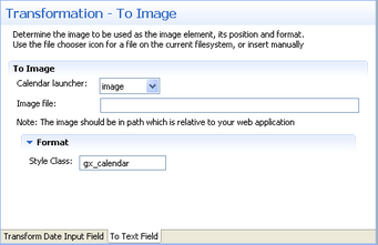
Click on the arrow of the Calendar Launcher drop-down list and
select Button, Link or Image. When selecting Button or Link, enter the text
that will appear on the button/link. When selecting image, select the image
file or type in its path (it is possible to include references to variables,
for example $(text).gif, and in this way use dynamic image names).
Often, the image path is used in the Web application which is normally on a
different machine and therefore it is recommended to write the relative path.
Note that the default image, points to an image that exists in the framework's
built-in Web applications.
Define the format of the element. Enter a name of a style class (pre-defined in the Framework) that will be used to determine the format of the element.
Save the transformation.
Test the transformation: Select a screen/screen group and click on the menu. Select . When there is an existing Web application, test the transformation by refreshing the relevant screen. Note that the calendar component is not displayed in the HTML preview.
This transformation enables you to transfer a menu to hyperlinks.
Refer to:
Host Pattern Elements for an example of this pattern.
To transform a menu to hyperlinks
Create a new transformation as detailed in Creating a Transformation and select the relevant type of pattern .
In the Transform MenuTab in the Editor define the identifying parameters of the menu:
Type in the string that appears before the leading token. The leading token is one or more characters that appear in front of the menu item description. These characters are often used by the host, to identify the menu item value. The leading token may be for example a number such as 1, 2, 3, or a letter such as a, b, c. Defining the string that appears in front of the leading token, helps identifying the menu pattern. By default the value of this field is two spaces. Refer to Host Pattern Elements for an example of this pattern.
Define the maximum number of characters that the leading token may be.
Define one or more possible delimiters. A specific menu will be identified only if it has exactly one type of delimiter, but the same transformation definition can match several different types of menus.
Type in the string that appears after the menu item. By default the value of this field is two spaces.
Select the minimum number of items required in order to identify the menu pattern.
Define where to search for the field where the menu item is selected: in the current cursor position, the first unprotected field, the last unprotected field, the previous unprotected field, the next protected field or in a user defined position.
Note:
You can view and check the pattern definition by looking at the
screen image displayed.
In the To HyperlinksTab in the Editor define the text that is going to be displayed: define the values that are going to be displayed, the format of the hyperlinks, and determine whether the field where the menu item is selected will be shown or hidden.
Define the values that will be displayed. By default the display
value is $(action): $(display). Refer to
Transformation
Variables and their Attributes for further details about setting
variables.
For example, if the pattern was:
1. Inventory Management
2. Inventory Purchasing
3. Sales Order Processing
The display will be:
1: Inventory Management
2: Inventory Purchasing
3: Sales Order Purchasing
Define the format of the element. Enter a name of a style class (pre-defined in the Framework) that will be used to determine the format of the element.
Select whether to hide the field where the menu item is selected or to show it.
Save the transformation.
Test the transformation: Select a screen/screen group and click on the menu. Select . When there is an existing Web application, test the transformation by refreshing the relevant screen.
Mapping transformations to screens or screen groups enables applying the same transformation to multiple screens or screen groups, and when necessary to different screen regions. Transformations are mapped to screens/screen groups in the Screen/Screen Group dialog box, Transformations tab. When deciding to use a transformation it is necessary to define a region in which to search for the original host pattern. The region can be an entire screen, a rectangle in a screen, a number of specific consequent rows or specific application fields.
To map a transformation to a screen/screen group
Open the relevant screen or screen group and display the Transformations tab.
Either click on a transformation that is in the list of transformations, or click Add Transformation, to add an additional transformation to this screen/screen group and select a transformation from the drop down list.
Select a Region type:
Select Anywhere on screen to search the entire screen for the host pattern.
Select Row range to search within specific consequent rows. Define the first and last row or use the Capture from Screen feature to select these rows. Select From bottom to define that the row numbers in the Start Row and End Row fields are calculated from the bottom of the screen.
Select Rectangle to search for the host pattern within a defined rectangle. Define the beginning of the rectangle by its Row and Column and then define the end of the rectangle by its Row and Column (it is also possible to use the capture from Screen feature to identify a range (rectangle)).
Select Application field to search for a specific application field and then select the field. It is possible to select a number of fields.
Transformations can be mapped to screens or to screen groups. Screens associated with a particular screen group will inherit from the screen group the field mappings and transformations mapped to that screen group. Sometimes, not all the transformations defined in the screen group are relevant to a particular screen and then it is necessary to override the inherited transformation and not use it. Another situation where you may need to override an inherited transformation is when you would like to apply the transformation to a different screen region than the screen region defined in the inherited transformation. In such a case, override the transformation (as detailed below), and then remap the transformation by adding it to the screen with the suitably defined screen region.
To override an inherited transformation
Access the relevant screen by either double-clicking on the screen in the repository or navigating to the relevant screen in the session view and clicking Open screen in the right-click pop-up menu.
Select the Transformations tab.
Focus on the relevant transformation.
Click on the Disable Transformation hyperlink.
Note:
Redefine that this transformation is to be used in the screen by
clicking on the Enable Inherited Transformation
hyperlink.