HSPLIT or VSPLIT allows to define a container area that is subdivided into two split cells. Between the split cells there is a border. By dragging and dropping the border, you can change the size of the split cells. Each split cell itself is a container that can be used just as normal.
While an HSPLIT control subdivides an area into two split cells by a horizontal line, VSPLIT uses a vertical line.
The following topics are covered below:
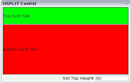
The following example shows the usage of the HSPLIT control:

The split area is divided into two cells: a green cell and a red cell. In addition, there is a line at the bottom in which you can provide the split factor.
The XML layout definition is:
<rowarea name="HSPLIT Control" height="100%">
    <hsplit height="100%" heighttopprop="heighttop" hsplitstyle="border:1 solid #000000">
        <splitcell takefullheight="true" cellstyle="background-color: #00FF00">
            <tr height="100%">
                <label name="Top Split Cell" asplaintext="true">
                </label>
            </tr>
        </splitcell>
        <splitcell takefullheight="true" cellstyle="background-color: #FF0000">
            <tr height="100%">
                <label name="Bottom Split Cell" asplaintext="true">
                </label>
            </tr>
        </splitcell>
    </hsplit>
    <vdist>
    </vdist>
    <itr>
        <hdist width="100%">
        </hdist>
        <label name="Set Top Height" width="100">
        </label>
        <field valueprop="heighttop" width="100" flush="server" validation="[0-9%]+"
               validationuserhint="100, 200, 500, 30%, 50%">
        </field>
    </itr>
</rowarea>
You see that the vertical split area consists of
one VSPLIT definition, and
two SPLITCELL definitions.
It is not allowed to have more than two split cells inside one HSPLIT container.
The sizing of the split cells can be done by using a property that is
referenced by the HSPLIT property heighttopprop.
The property must return either a percentage value or a pixel value. When the
user changes the size by moving the line between the split cells, then the
current new pixel width of the left split cell is written back into the
property.
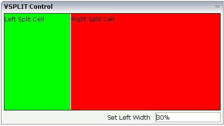
The VSPLIT control is defined in the same way as the HSPLIT control - but now transferred to vertical dimension. It looks like:

The VSPLIT part of the XML layout definition is:
<vsplit height="200" widthleftprop="widthleft" vsplitstyle="border: 1 solid #000000">
    <splitcell takefullheight="true" cellstyle="background-color:#00FF00">
        <itr>
            <label name="Left Split Cell" asplaintext="true">
            </label>
        </itr>
    </splitcell>
    <splitcell takefullheight="true" cellstyle="background-color: #FF0000">
        <itr>
            <label name="Right Split Cell" asplaintext="true">
            </label>
        </itr>
    </splitcell>
</vsplit>
| Basic | |||
| height |
Height of the control. There are three possibilities to define the height: (A) You do not define a height at all. As consequence the control will be rendered with its default height. If the control is a container control (containing) other controls then the height of the control will follow the height of its content. (B) Pixel sizing: just input a number value (e.g. "20"). (C) Percentage sizing: input a percentage value (e.g. "50%"). Pay attention: percentage sizing will only bring up correct results if the parent element of the control properly defines a height this control can reference. If you specify this control to have a height of 50% then the parent element (e.g. an ITR-row) may itself define a height of "100%". If the parent element does not specify a width then the rendering result may not represent what you expect. |
Optional |
100 150 200 250 300 250 400 50% 100% |
| heighttop |
Definition of the initial height of the top split area. The height either is a pixel value ("100") or a percentage value ("50%"). You can also define the height dynamically by your adapter - see documentation for HEIGHTTOPPROP property. |
Optional |
1 2 3 int-value |
| heighttopprop |
Name of adapter property that specifies the height of the top split area. The adapter property must return either a pixel value ("100") or a percentatge value ("50%"). |
Optional | |
| hsplitstyle |
CSS style definition that is directly passed into this control. With the style you can individually influence the rendering of the control. You can specify any style sheet expressions. Examples are: border: 1px solid #FF0000 background-color: #808080 You can combine expressions by appending and separating them with a semicolon. Sometimes it is useful to have a look into the generated HTML code in order to know where direct style definitions are applied. Press right mouse-button in your browser and select the "View source" or "View frame's source" function. |
Optional |
background-color: #FF0000 color: #0000FF font-weight: bold |
| comment |
Comment without any effect on rendering and behaviour. The comment is shown in the layout editor's tree view. |
Optional | |
| vscroll |
Definition of the vertical scrollbar's appearance. You can define that scrollbars only are shown if the content is exceeding the control's area ("auto"). Or scrollbars can be shown always ("scroll"). Or scrollbars are never shown - and the content is cut ("hidden"). Default is "auto". |
Optional |
auto scroll hidden |
| Basic | |||
| height |
Height of the control. There are three possibilities to define the height: (A) You do not define a height at all. As consequence the control will be rendered with its default height. If the control is a container control (containing) other controls then the height of the control will follow the height of its content. (B) Pixel sizing: just input a number value (e.g. "20"). (C) Percentage sizing: input a percentage value (e.g. "50%"). Pay attention: percentage sizing will only bring up correct results if the parent element of the control properly defines a height this control can reference. If you specify this control to have a height of 50% then the parent element (e.g. an ITR-row) may itself define a height of "100%". If the parent element does not specify a width then the rendering result may not represent what you expect. |
Optional |
100 150 200 250 300 250 400 50% 100% |
| widthleftprop |
Name of adapter property that specifies the width of the left split area. The adapter property must return either a pixel value ("100") or a percentatge value ("50%"). |
Optional | |
| vsplitstyle |
CSS style definition that is directly passed into this control. With the style you can individually influence the rendering of the control. You can specify any style sheet expressions. Examples are: border: 1px solid #FF0000 background-color: #808080 You can combine expressions by appending and separating them with a semicolon. Sometimes it is useful to have a look into the generated HTML code in order to know where direct style definitions are applied. Press right mouse-button in your browser and select the "View source" or "View frame's source" function. |
Optional |
background-color: #FF0000 color: #0000FF font-weight: bold |
| comment |
Comment without any effect on rendering and behaviour. The comment is shown in the layout editor's tree view. |
Optional | |
| overflow |
Definition of the vertical scrollbar's appearance. You can define that the scrollbars only are shown if the content is exceeding the control's area ("auto"). Or scrollbars can be shown always ("scroll"). Or scrollbars are never shown - and the content is cut ("hidden"). Default is "auto". |
Optional |
auto scroll hidden |
| Basic | |||
| takefullheight |
Indicates if the content of the control's area gets the full available height. If you use percentage sizing inside the control's area then this property must be switched to 'true'. If you use no explicit vertical sizing at all - or you use vertical pixel sizing for your controls - the property must be switched to 'false'. Background information: container control's internally open up a table in which you place rows (ITR/TR) which then hold controls (e.g. LABEL/FIELD). The table that is opened up normally has no explicit height and grows with its content as consequence. By specifying "takefullheight=true" the table itself is sized to fill the maximum height of the available area. |
Optional |
true false |
| cellstyle |
CSS style definition that is directly passed into this control. With the style you can individually influence the rendering of the control. You can specify any style sheet expressions. Examples are: border: 1px solid #FF0000 background-color: #808080 You can combine expressions by appending and separating them with a semicolon. Sometimes it is useful to have a look into the generated HTML code in order to know where direct style definitions are applied. Press right mouse-button in your browser and select the "View source" or "View frame's source" function. |
Optional |
background-color: #FF0000 color: #0000FF font-weight: bold |
| comment |
Comment without any effect on rendering and behaviour. The comment is shown in the layout editor's tree view. |
Optional | |
The split size of HSPLIT and VSPLIT can be set in the following ways:
Fixed definition if initial split size: by using the HSPLIT property
heighttop and the VSPLIT property
widthleft, you can preset the size in a
"hard way". The value will be used as the initial size.
By using the HSPLIT property
heighttopprop and the VSPLIT property
widthleftprop, the size can be defined by a server
side property. Maybe you have some personalization in which the size is kept
for every split area - and proposed the next time the user visits the page.