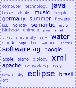
The TAGCLOUD control represents a collection of tags. A tag is a keyword assigned to an information resource (picture, video clip or others). In a tag cloud, the tags are mainly shown by their popularity.
The following topics are covered below:

As you can see, different tags can be added to a tag cloud. They differ by their popularity. The most popular tags are those with a bigger font size.
The XML layout definition is:
<itr>
   <tagcloud tagcloudprop="tagCloud"
          width="300" height="350"
          borderstyle="dotted" borderwidth="1px"
          bordercolor="#0000FF" backgroundcolor="#E6E6FA"
          textcolor="#0000FF">
   </tagcloud>
</itr>
The tag cloud can be customized by defining a background color. Use the Style Sheet Editor to apply your own style.
The Java code of the adapter is:
public classTagcloudAdapter
    extends Adapter
{
    /** sub class TAGCLOUDInfo to react on click events*/
    public class MyTagcloudInfo extends TAGCLOUDInfo
    {
      public void trigger()
      {
        outputMessage(MT_SUCCESS, getSelectedTagName());
      }
    }

    // property >tagCloud<
    MyTagcloudInfo m_tagCloud=new MyTagcloudInfo();
    public MyTagcloudInfo getTagCloud() { return m_tagCloud; }

    /** called on page load*/
    public void init()
    {
        m_tagCloud.addTag("computer");
        m_tagCloud.addTag("technology");
        m_tagCloud.addTag("java", TAGCLOUDInfo.TAGPOPULARITY_5_VERYBIG);
        m_tagCloud.addTag("books");
        m_tagCloud.addTag("drinks");
        m_tagCloud.addTag("music", TAGCLOUDInfo.TAGPOPULARITY_4_BIG);
        m_tagCloud.addTag("people");
        m_tagCloud.addTag("germany", TAGCLOUDInfo.TAGPOPULARITY_4_BIG);
        m_tagCloud.addTag("summer", TAGCLOUDInfo.TAGPOPULARITY_4_BIG);
        m_tagCloud.addTag("flowers");
        m_tagCloud.addTag("kids", TAGCLOUDInfo.TAGPOPULARITY_2_SMALL);
        m_tagCloud.addTag("holiday");
        m_tagCloud.addTag("semantic", TAGCLOUDInfo.TAGPOPULARITY_4_BIG);
        m_tagCloud.addTag("micro", TAGCLOUDInfo.TAGPOPULARITY_2_SMALL);
        m_tagCloud.addTag("birthday");

        . . .

        . . .
    }
}
A tag cloud is bound to a TAGCLOUDInfo
object. Using this object you can add tags with different popularities. All
tags with the same popularity have their own stylesheet class. You can also
remove tags and get the last tag which has been selected by the user. When you
want to react on click events, you can override the
trigger() function of the
TAGCLOUDInfo object and add specific code.
| Basic | |||
| tagcloudprop |
Name of the adapter property that represents the control on server side. Return type must be "TAGCLOUDInfo". |
Obligatory | |
| width |
Width of the control. There are three possibilities to define the width: (A) You do not define a width at all. In this case the width of the control will either be a default width or - in case of container controls - it will follow the width that is occupied by its content. (B) Pixel sizing: just input a number value (e.g. "100"). (C) Percentage sizing: input a percantage value (e.g. "50%"). Pay attention: percentage sizing will only bring up correct results if the parent element of the control properly defines a width this control can reference. If you specify this control to have a width of 50% then the parent element (e.g. an ITR-row) may itself define a width of "100%". If the parent element does not specify a width then the rendering result may not represent what you expect. |
Optional |
100 120 140 160 180 200 50% 100% |
| height |
Height of the control. There are three possibilities to define the height: (A) You do not define a height at all. As consequence the control will be rendered with its default height. If the control is a container control (containing) other controls then the height of the control will follow the height of its content. (B) Pixel sizing: just input a number value (e.g. "20"). (C) Percentage sizing: input a percantage value (e.g. "50%"). Pay attention: percentage sizing will only bring up correct results if the parent element of the control properly defines a height this control can reference. If you specify this control to have a height of 50% then the parent element (e.g. an ITR-row) may itself define a height of "100%". If the parent element does not specify a width then the rendering result may not represent what you expect. |
Optional |
100 150 200 250 300 250 400 50% 100% |
| borderstyle |
Choose the style the controls border. |
Optional |
solid double groove dotted dashed inset outset ridge hidden |
| borderwidth |
Border size of control in pixels. Specify "0" not to render any border at all. |
Optional |
thin medium thick 1px 2px 5px 10px |
| bordercolor |
Sets the border color of the control. |
Optional |
#FF0000 #00FF00 #0000FF #FFFFFF #808080 #000000 |
| backgroundcolor |
Sets the background color of the control. |
Optional |
#FF0000 #00FF00 #0000FF #FFFFFF #808080 #000000 |
| textcolor |
Sets the text color of the control. |
Optional |
#FF0000 #00FF00 #0000FF #FFFFFF #808080 #000000 |