
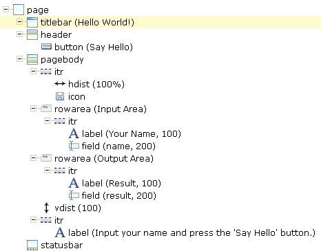
You will now create the layout for your "Hello World!" application. When you have completed all exercises in this document, the layout should look as shown below and the XML code should be the same as shown in the section About this Tutorial.
This document contains the following exercises:
Tip:
Preview the layout
and view the XML code each time
you have completed an exercise. If the system finds some wrong or missing
definitions while generating the preview page, there will be a corresponding
message in the status bar. From the tab of the
Layout Painter, choose to get more information
about these problems.
You will now specify the string "Hello World!" which is to appear in the title bar of your application.
 To specify the name for the title bar
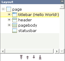
In the layout tree, select the node titlebar (Template).
The properties for this control are now shown in the properties area
at the bottom. You can see the default entry "Template" for the
name property.
Specify the following property:
| Property | Value |
|---|---|
name |
Hello World! |
When you click on the layout tree, the node in the layout tree changes to titlebar (Hello World!).
Note:
Properties that are left blank are not shown in the XML
code.
You can also specify the property values using the Property Editor. In this case, you can access detailed help information on each property.
To use the Property Editor
Select the control in the layout tree for which you need help, for example, the titlebar (Hello World!) node.
From the tab of the Layout Painter, choose .
The following dialog appears.
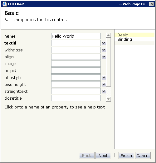
The properties of the control are listed.
Click on the name of a property to display detailed information on this property. This information is shown below the list of properties.
Choose the button to close the dialog.
Any changes you have applied in the dialog will be saved.
You will now specify the string "Say Hello" which is to appear on the button. And you will specify the name of the method that is to be invoked when the user chooses this button.
To specify the name and the method for the button
In the layout tree, open the header node.
Note:
By clicking the icon of a node, you hide or expand the node's
subnodes.
You can now see the entry for the button with the default name "Save".
Select the node button (Save).
Specify the following properties:
| Property | Value |
|---|---|
name |
Say Hello |
method |
sayHello |
The method needs to be programmed in the adapter class. This will be explained later in this tutorial.
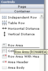
The input and output areas in this tutorial are created using Row Area controls. These controls can be found in the section of the controls palette.
Each row area will contain an Independent Row control which in turn contains a Label and a Field control. These controls can be found in the section of the controls palette.
For adding controls to your layout, you drag them from the controls palette onto the corresponding tree node in the layout tree. This is explained below.
To create the input area
Open the section of the controls palette.
When you move the mouse over a control, a tool tip appears which also displays the control name which will be used in the XML layout. For example:
Drag the Row Area control from the controls palette onto the pagebody node in the layout tree.
The row area is added as a subnode of the pagebody node. The new subnode is automatically selected so that you can maintain the properties of the row area directly in the properties area.
Specify the following property:
| Property | Value |
|---|---|
name |
Input Area |
Drag the Independent Row control from the controls palette onto the rowarea (Input Area) node in the layout tree.
When you drop information into the tree, the system will sometimes respond by offering a context menu with certain options about where to place the control. In this case, the following context menu appears.
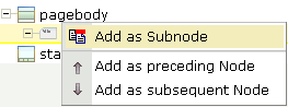
Note:
When you move the mouse outside the context menu, the context menu
disappears. The control is not inserted in this case.
Choose the command.
The control is now inserted below the rowarea (Input Area) node. The new node is shown as itr.
Open the section of the controls palette.
Drag the Label control from the controls palette onto the itr node you have just inserted and specify the following properties:
| Property | Value |
|---|---|
name |
Your Name |
width |
100 |
Drag the Field control from the controls palette onto the itr node you have just inserted.
A context menu appears and you have to specify where to place the control.
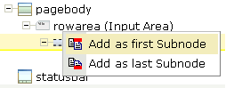
From the context menu, choose the command.
Specify the following properties for the field:
| Property | Value |
|---|---|
valueprop |
name |
width |
200 |
Note:
As long as the adapter class is not defined, the
field is dimmed and it is not possible to enter information in this field. The
adapter class will be defined later in this tutorial.
To create the output area
Create the output area in the same way as the input area (add it as the last subnode of the pagebody node), with the following exceptions:
- Row Area
Specify a different value for the following property:
Property Value nameOutput Area - Label
Specify a different value for the following property:
Property Value nameResult - Field
Specify different values for the following properties:
Property Value valuepropresult displayonlytrue Note:
To display thedisplayonlyproperty, choose the Appearance tab at the bottom of the properties area. You can then select the required value from a drop-down list box.
You will now add the image which is to be shown above the input area. To do so, you will use the Icon control which can be found in the section of the controls palette.
Note:
The image is provided in Application Designer's /cisdemos/images
directory.
To add the image
Drag the Icon control from the controls palette onto the pagebody node in the layout tree.
The icon is added as the last subnode of the pagebody node. It is automatically placed into an itr (independent row) node.
Specify the following property for the icon:
| Property | Value |
|---|---|
image |
../cisdemos/images/hello.gif |
Select the itr node containing the icon and choose the following button below the layout tree:
The selected node is now moved up so that it appears as the first subnode of the pagebody node.
Specify the following property for the itr node:
| Property | Value |
|---|---|
takefullwidth |
true |
When you preview the layout, you will see that the image you have just added appears centered.
You will now move the image to the right side of the page. To do so, you will use the Horizontal Distance control which can be found in both the section and the section of the controls palette.
To add the horizontal distance
Drag the Horizontal Distance control from the controls palette onto the itr node containing the icon.
From the resulting context menu, choose the command.
The node hdist is inserted into the tree.
Specify the following property:
| Property | Value |
|---|---|
width |
100% |
You will now enter a text which is to appear below the output area and which tells the user what to do.
To do so, you will once again use the Independent Row control into which you will insert a Label control.
Note:
The Independent Row control can be found in
both the section and the
section of the controls palette.
To add the independent row with the label
Drag the Independent Row control from the controls palette onto the pagebody node in the layout tree.
From the resulting context menu, choose the command.
The node itr is inserted into the tree.
Drag the Label control from the controls palette onto the itr node you have just created.
Specify the following properties for the label:
| Property | Value |
|---|---|
name |
Input your name and press the 'Say Hello' button. |
asplaintext |
true |
Note:
Go to the Appearance tab to display the
property asplaintext.
When you preview the layout, you will see that the text you have just added appears directly below the output area. You will now move the text 100 pixels to the bottom.
To do so, you will use the Vertical Distance control which can be found in both the section and the section of the controls palette.
To add the vertical distance
Drag the Vertical Distance control from the controls palette onto the itr node containing the label.
From the resulting context menu, choose the command.
The node vdist is inserted into the tree.
Specify the following property:
| Properties | Value |
|---|---|
height |
100 |
If you have not already done so, you should now save your layout.
When you save a layout for the first time, an HTML file is generated (in addition to the XML file) which is placed into the root directory of your application project. This HTML file is updated each time you save the layout.
To save the layout
Choose the following button which is shown at the top of the Layout Painter.
You can now proceed with the next exercise: Setting Up Your Environment.