
In the previous sections, you saw the basics that make a flexible grid:
ROWTABLEAREA2, REPEAT, STR as controls for defining a grid structure.
GRIDCOLHEADER for defining header columns and getting move, resize events.
FLEXLINE for defining a column's layout (both for header and for items).
SELECTOR for selecting rows.
Even though each control has its dedicated task and is itself fairly uncomplex, the combination of all controls is not easy for developers to cope with in order to build flexible grids.
The FLEXGRID control is a pre-packaged arrangement of all these controls,
combined with a server-side processing that is available using the
corresponding FLEXGRIDInfo class. With a FLEXGRID
control, you can easily (and dynamically) set up the layout of a grid - and all
the advantages such as reacting on moving columns are automatically
available.
Have a look at the following grid:
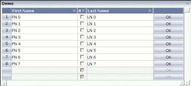
It looks like a normal grid - the corresponding layout definition shows the difference:
<rowarea name="Demo">
    <flexgrid infoprop="grid" selectprop="selected" rowcount="10" singleselect="false">
    </flexgrid>
</rowarea>
The definition of the grid is very compact - only pointing to a certain
property on the server side (gridinfoprop),
defining a selection property (selectprop) and a
row count.
The server-side code is also quite simple:
package com.softwareag.cis.test40;

import java.util.*;
import com.softwareag.cis.server.*;
import com.softwareag.cis.server.util.*;
import com.softwareag.cis.util.*;

public class FlexGrid2Adapter
    extends Adapter
{
    public class MyLine extends SelectableLine
    {
        String m_firstName;
        String m_lastName;
        boolean m_released;
        public String getFirstName() { return m_firstName; }
        public void setFirstName(String firstName) { m_firstName = firstName; }
        public String getLastName() { return m_lastName; }
        public void setLastName(String lastName) { m_lastName = lastName; }
        public boolean getReleased() { return m_released; }
        public void setReleased(boolean released) { m_released = released; }
    }

    FLEXGRIDInfo m_grid = new FLEXGRIDInfo(this);
    public FLEXGRIDInfo getGrid() { return m_grid; }
    public void setGrid(FLEXGRIDInfo value) { m_grid = value; }

    public void init()
    {
        m_grid.clearColumnStructure();
        m_grid.addFieldColumn("firstName","50%","name;First Name","transparentbackground;true");
        m_grid.addCheckboxColumn("released","30","name;Rel","transparentbackground;true");
        m_grid.addFieldColumn("lastName","50%","name;Last Name","transparentbackground;true");
        m_grid.addButtonColumn("100","name;","name;OK");
        for (int i=0; i<8; i++)
        {
            MyLine ml = new MyLine();
            ml.setFirstName("FN " + i);
            ml.setLastName("LN " + i);
            m_grid.getLines().add(ml);
        }
    }
}
There is a property grid of type
FLEXGRIDInfo that is referenced by the control. In the
init() method of the adapter, the grid is prepared:
diverse controls are added (the same controls as with FLEXLINE are available
for dynamic adding).
Have a look at the following Java statement:
m_grid.addFieldColumn("firstName","50%","name;First Name","transparentbackground;true");
There are four parameters that are passed:
The name of the "valueprop" for the FIELD control that is internally generated.
The width of the control.
The additional properties of the GRIDCOLHEADER control that is internally generated as header column.
The additional properties of the FIELD control that is generated as content.
At any point of time, you can change the column layout inside your
adapter by calling the method clearColumnStructure()
and then recalling the
addField/addCheckbox etc.
methods.
This document covers the following topics:
| Basic | |||
| infoprop |
Name of the adapter property that provide a FLEXGRIDInfo object that serves the control on server side. The structure of columns is defined within this object using a JAVA API. |
Obligatory | |
| selectprop |
Name of the item property that indicates if a grid line is selected. |
Obligatory | |
| rowcount |
Number of rows that are rendered inside the control. There are two ways of using this property - dependent on whether you in addition define the HEIGHT property: If you do NOT define the HEIGHT property then the control is rendered with exactly the number of rows that are defined as ROWCOUNT value. If a HEIGHT value is defined in addition (e.g. as percentage value "100%") then the number of rows depend on the actual height of the control. The ROWCOUNT value in this case indicates the maximum number of rows that are picked from the server. You should define this value in a way so that it is not too low - otherwise your grid will not be fully filled. On the other hand it should not be defined too high ("100") because this causes more communication traffic and more rendering effort inside the browser. |
Optional |
1 2 3 int-value |
| height |
Height of the control. There are three possibilities to define the height: (A) You do not define a height at all. As consequence the control will be rendered with its default height. If the control is a container control (containing) other controls then the height of the control will follow the height of its content. (B) Pixel sizing: just input a number value (e.g. "20"). (C) Percentage sizing: input a percantage value (e.g. "50%"). Pay attention: percentage sizing will only bring up correct results if the parent element of the control properly defines a height this control can reference. If you specify this control to have a height of 50% then the parent element (e.g. an ITR-row) may itself define a height of "100%". If the parent element does not specify a width then the rendering result may not represent what you expect. |
Optional |
100 150 200 250 300 250 400 50% 100% |
| vscroll |
Definition of the vertical scrollbar's appearance. You can define that scrollbars only are shown if the content is exceeding the control's area ("auto"). Or scrollbars can be shown always ("scroll"). Or scrollbars are never shown - and the content is cut ("hidden"). Default is "scroll". |
Optional |
auto scroll hidden |
| withblockscrolling |
If switched to "true" then the grid will show small scroll icons by which the user can scroll the grid's content. Scrolling typically is done by using the grid's scrollbar - the scroll icons that are switched on by this property are an additional possibility to scroll. |
Optional |
true false |
| showemptylines |
Flag that indicates if a line that is not used at the moment is visible. Example: if set to false a grid with rowcount of ten and collection size of seven the last three remaining lines become invisible. Default is true. |
Optional |
true false |
| Selector | |||
| selectorwidth |
Width of the control. There are three possibilities to define the width: (A) You do not define a width at all. In this case the width of the control will either be a default width or - in case of container controls - it will follow the width that is occupied by its content. (B) Pixel sizing: just input a number value (e.g. "100"). (C) Percentage sizing: input a percantage value (e.g. "50%"). Pay attention: percentage sizing will only bring up correct results if the parent element of the control properly defines a width this control can reference. If you specify this control to have a width of 50% then the parent element (e.g. an ITR-row) may itself define a width of "100%". If the parent element does not specify a width then the rendering result may not represent what you expect. |
Optional |
100 120 140 160 180 200 50% 100% |
| singleselect |
Indicates if the multiple lines can be selected ("false") or only one line can be selected ("true"). Default is "true". |
Optional |
true false |
| withlinenum |
There are two usage variants: either the line number of the corresponding row is shown as content of the SELECTOR control ("true") - or nothing is shown inside ("false"). In case of selecting "true" then the line number is automatically retrieved, i.e. you do not have to specify a property on adapter side to indicate the value of the line number. |
Optional |
true false |
| image |
If specifying WITHLINENUM to be "false" then a small arrow icon is shown inside the control if selecting a corresponding row. Input the URL of the icon to be shown if you do not want to use the default icon. If specifying WITHLINENUM to be "true" then the line number of selected lines is output in bold font. |
Optional | |
| imageprop |
The URL of the image to be shown for displaying selected rows is not hard wires via the IMAGE property but "soft wired": you refer an adapter property that dynamically passes the URL of the image to be shown. |
Optional | |
You can override the FLEXGRIDInfo class at any
time and build up your own, extended class. See the Java API documentation for
more details.