
It is possible to define flexible areas in which absolutely positioned controls are displayed. There are three possibilities:
You define all controls directly inside the page tag.
You define the page body to hold the controls.
You define explicitly the area for control positioning inside any part of the page.
The following topics provide more details on how to use each possibility.
This is the easiest way to use absolutely positioned controls - and it is used in the example previously in this part. Each coordinate of a control relates to the whole generated HTML page, i.e. the coordinate "(0;0)" positions a control at the left-top corner of the page.
Though this is the fastest way to start with, there are some disadvantages:
If a control is positioned outside the page, the user is unable to scroll to this point.
If you add controls which are not absolutely positioned, you have to mix both variants in a dangerous way: e.g. define a title bar and a header inside a page. Therefore, you will not position your controls on top of these elements - i.e. you will position them at a y-coordinate "60" in order to keep a distance. If further elements are added inside the header, the height of the header increases and all absolutely positioned controls need to be redefined by a new y-coordinate.
The page body (PAGEBODY tag) typically reflects the area between header and status bar. It is possible to add a ROWABSAREA control inside the page body. Inside the ROWABSAREA container, you can position your controls.
If you do not define any further parameters by this ROWABSAREA control,
it will occupy the whole page body if necessary. Defining the
vscroll and hscroll
properties (set to true) inside the PAGEBODY tag, you can scroll to any control
that is outside the visible range of the page body.
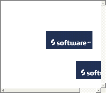
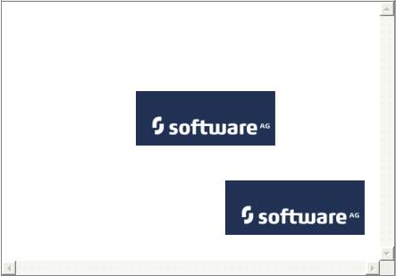
Look at the following example: it contains two absolutely positioned icons inside the page body. If the window size is too small to show both icons, the scroll bars are shown accordingly.
The layout definition of this example looks as follows:
<pagebody vscroll="true" hscroll="true">
    <rowabsarea>
        <absfolder>
            <absicon image="images/logo.gif" x="150" y="100" z="10">
            </absicon>
            <absicon image="images/logo.gif" x="250" y="200" z="10">
            </absicon>
        </absfolder>
    </rowabsarea>
</pagebody>
The controls are positioned relative to the page body's coordinates. I.e. the coordinate "(0;0)" is the left-top corner of the page body.
Use this method to position the controls within a page where the page body is used for positioned controls absolutely.
Use the ROWABSAREA container, which is explained above, to define areas inside a page where you want to position controls.
Have a look at the following example:
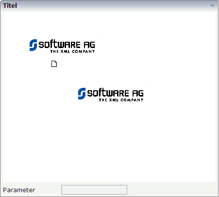
An area was embedded for absolute positioning inside the normal flow of controls of a page. The corresponding XML layout definition looks as follows:
<rowarea name="Titel">
    <rowabsarea width="100%" height="350">
        <absfolder>
            <absicon image="images/logo.gif" x="50" y="50" z="100">
            </absicon>
            <absicon image="images/new.gif" x="120" y="120" z="100">
            </absicon>
            <absicon image="images/logo.gif" x="150" y="150" z="100">
            </absicon>
        </absfolder>
    </rowabsarea>
    <vdist height="5">
    </vdist>
    <itr>
        <label name="Parameter" width="120" asplaintext="false">
        </label>
        <field valueprop="factor1" length="20">
        </field>
    </itr>
</rowarea>
Inside the ROWAREA definition, a ROWABSAREA is placed - holding a defined width and size. Below the ROWABSAREA, the normal definition of a set of absolutely positioned controls are defined, i.e. an ABSFOLDER with some ABSICON definitions.
In the row following the ROWABSAREA, normal controls are defined - just as usual.
| Basic | |||
| width |
Width of the control. There are three possibilities to define the width: (A) You do not define a width at all. In this case the width of the control will either be a default width or - in case of container controls - it will follow the width that is occupied by its content. (B) Pixel sizing: just input a number value (e.g. "100"). (C) Percentage sizing: input a percantage value (e.g. "50%"). Pay attention: percentage sizing will only bring up correct results if the parent element of the control properly defines a width this control can reference. If you specify this control to have a width of 50% then the parent element (e.g. an ITR-row) may itself define a width of "100%". If the parent element does not specify a width then the rendering result may not represent what you expect. |
Optional |
100 120 140 160 180 200 50% 100% |
| height |
Height of the control. There are three possibilities to define the height: (A) You do not define a height at all. As consequence the control will be rendered with its default height. If the control is a container control (containing) other controls then the height of the control will follow the height of its content. (B) Pixel sizing: just input a number value (e.g. "20"). (C) Percentage sizing: input a percantage value (e.g. "50%"). Pay attention: percentage sizing will only bring up correct results if the parent element of the control properly defines a height this control can reference. If you specify this control to have a height of 50% then the parent element (e.g. an ITR-row) may itself define a height of "100%". If the parent element does not specify a width then the rendering result may not represent what you expect. |
Optional |
100 150 200 250 300 250 400 50% 100% |
| comment |
Comment without any effect on rendering and behaviour. The comment is shown in the layout editor's tree view. |
Optional | |