
Application Designer provides an "outside-in approach" which allows you to integrate Application Designer controls and functionality in standard HTML pages using a standard HTML editor or text editor.
Important:
The HTML document containing your Application Designer controls must be
XHTML-formatted. As a rule, XHTML format has to be switched on
manually.
This document covers the following topics:
The following is a standard HTML page that contains a registration form for a technical discussion forum. This registration form contains Application Designer controls.
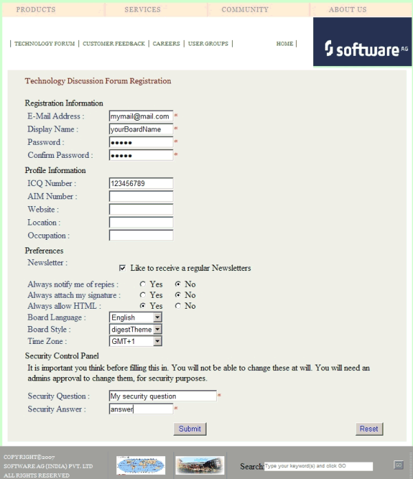
The layout of the above page is defined in the following way:
<html>
<head>
<pghead stylesheetfile="../cis/styles/CIS_DEFAULT.css"></pghead>
<meta http-equiv="Content-Type" content="text/html; charset=utf-8" />
<title>TechForum Registration </title>
</head>
<body>
<table>...</table>

        // standard HTML coding here

 <pgcontainer model="RegistrationAdapter">
    // normal Application Designer XML coding
    <pagebody>
      ...
    </pagebody>
    <statusbar>
    </statusbar>
 </pgcontainer>

        // standard HTML coding here

</body>
</html>
To include Application Designer controls in an HTML page, you simply use an HTML editor or text editor to write the HTML code and then you include the following HTML elements in this code:
PGHEAD
This element is placed in the HTML header.
In the above example, the following code is used:
<pghead stylesheetfile="../cis/styles/CIS_DEFAULT.css">
The stylesheetfile attribute
references the style sheet file that is to be used for the Application Designer controls. In
this example, it references the standard CIS_DEFAULT.css
file.
Make sure to specify a valid file reference. Have a close look at this reference, especially when your web application uses one or more subdirectories (for example, when your page is placed in <web-application>/sub1/sub2/mypage.html).
PGCONTAINER
This element is placed in the HTML body. You put the Application Designer controls
into this element. The code is the same as for a standard Application Designer page.
Make sure you have valid Application Designer XML in this container element. We strongly recommend that you use Application Designer's XSD file editor.xsd for XML validation. For information on how to get an up-to-date editor.xsd, see XML Schema (XSD) in the Development Workplace documentation.
In the above example, the following code is used:
<pgcontainer model="RegistrationAdapter">
The model attribute references the
associated adapter in which you use standard Application Designer classes:
// This class is a generated one.
...
public class RegistrationAdapter
extends Adapter
{
  /** initialisation - called when creating this instance*/
  public void init()
  {
  ...
  }
}
In the browser, an HTML page containing Application Designer controls is addressed the same way as a normal Application Designer page. For example:
http://localhost:51000/cis/servlet/StartCISPage?PAGEURL=/cismyproject/mypage.html
| Basic | |||
| stylesheetfile |
URL of a style sheet file used for control rendering. i.e. '../cis/styles/CIS_DEFAULT.css'. |
Obligatory |
css |
| addstylesheetfile |
URL of an additional style sheet file. You may use this additional style sheet file in order to define more styles than are provided in the "normal" style sheet file. Typical situations are: (A) Some controls offer the possibility to render defined content by style-class definitions (e.g. inside a TEXTGRID you can dynamically define which style-class is used for a certain cell). (B) If you define own controls by using the control extension framework and if these controls require own style classes then these style classes may be provided inside the additional style sheet file. By using the additional style sheet file you are able to avoid doing manipulations to the "normal" style sheet files that come from CIS or that are generated inside the tool "Style Sheet Editor". |
Optional |
css |
| openajaxsupport |
Adds registration code into the page that registers globally used objects / evets etc. to the Open AHAX Hub in order to potencially synchronize the co-existance of different toolsets within one page. Only used when being familiar with OpenAJAX aspects. |
Optional |
true false |
| Basic | |||
| model |
This is the name of the Java class that is the logical counter part of the page on server side. The name must include the full class name e.g. including the package name. Example: if you have a class DemoAdapter inside the package com.xyz.demo, the MODEL value is: com.xyz.demo.DemoAdapter. The class must be a valid adapter class i.e. it must support the interface "com.softwareag.cis.server.IModel". This is implicitly done when deriving your adapter class from "com.softwareag.cis.server.Model". The class source code may be generated by using the Code Assistant - or may be directly coded in a development environment of your choice. You may use the class "DummyAdapter" for testing your layout - before specifying your "real" class. |
Optional | |
| translationreference |
This is the "translation reference" that is passed to the multi language management. The "tranlation reference" is a logical term representing a group of textids together with their translation. If using the standard file based multi language management that comes with CIS as default then a "translation reference" represents one file containing text-ids and translations in a comma separated format. Translation information is loaded by the multi language management "per translation reference". I.e. if a page links to a certain translation reference then all the translation information that is avaible through this reference is loaded in one step and is also buffered. You can set up different scenarios: either each page may address an own translation reference. E.g. if your page is named "abc.xml" then it references to "abc" - as consequence there is (per language) one abc.csv file holding translation information for this page. If you have a second page "def.xml" then you may define "def" accordingly. In this case each page is independent from the other. - On the other side you are required to translate certain "common text-ids" mulitple times. If you on the other hand define one translation reference for multiple pages then you can share text-ids throughout the various pages. Please set up a strategy for using translation references when starting using the multi language management. The strategy should also include a structured way of naming text-ids. Text-ids may only be shared in an efficient way if it is clear what they stand for. E.g. you may names of buttons in the following way: "btn_save" and "btn_saveas". |
Optional | |
| popupwidth |
Each CIS page can be opened as a popup dialog. This properties define the pixel width preferred for the page. - See the property "popupheight" for more information. |
Optional |
100px 200px 300px 400px |
| popupheight |
Each CIS page can be opened as a popup dialog. This property defines the pixel height preferred for the page. A popup is typically opened by calling the "openPopup"-method in your adapter code. If no further definition is done then the popup will open in the height that is defined by this value. You can also dynamically manipulate the size and position of the popup by using the Model-method "setPopupFeatures" - please read corresponding documentation inside the Java API documentation. |
Optional |
100px 200px 300px 400px |
| popupfeatures |
In addition to POPUPWIDTH and POPUPHEIGHT you can control the appearance of the popup dialog in which the current page may be displayed. You define a string to maintain different feature aspects, separated by semi-colon. center:yes|no edge:sunken|raised resizable:yes|no scroll:yes|no status:yes|no (to display or hide a status bar) An example string looks as follows: "dialogLeft:100px" There is one special function built in by which you can position a popup relative to its caller's window (the dialogLeft and dialogTop definition normally refer to absolute coordinates of the screen): by specifying "dialogLeft: SCRX(100)px" you define that the position is 100 pixels right from the left top corner of the current window. - Use "dialogTop: SCRY(100)px" in the same way for vertical positioning. Please also pay attention to the methods "setPopupTitle()" and "setPopupPageFeatures()" in the com.casabac.server.Model class. By using these method you can define popup parameters in a dynamic way inside your adapter implementation. |
Optional |
dialogLeft: 200px dialogTop: 100px edge: sunken resizable: yes status: no |
| imagestopreload |
Semicolon separated list of image-URLs that are directly preloaded in an invisible area of the page. If images are used inside a tree or a text grid then they are loaded by dynamically generated HTML that is placed into a corresponding area of the page. In order to optimise the loading you can preload such images by listing them in this property. The URL of the images must be relative to your generated HTML page. Example: if your page has a tree with certain node images then you may define: "images/nodeopened.gif" images/nodeclosed.gif; images/nodeendnode.gif". |
Optional | |
| occupiedimage |
URL of the image that is displayed to indicate that the screen is just communicating to the server. This is the image that is located in the top left corner and which by default is a flashing hour glass. You can specify any image, e.g. also animated GIF files. If you want your image not to be visible in the top left corner but "somewhere" in the screen then draw an image with some transparent area on the left and above the image that you want to show. |
Optional | |
| occupiedpixelheight |
When the screen is busy, because the client is exchanging information with the server, an hour glass image is displayed at the top left corner. With this property you define the pixel height of this hour glass image. |
Optional | |
| occupiedpixelwidth |
When the screen is busy, because the client is exchanging information with the server, an hour glass image is displayed at the top left corner. With this property you define the pixel width of this hour glass image. |
Optional | |
| helpid |
This is the id that is passed into the help management for the page. If a user clicks F1 inside the page and if there is no specific context sensitive control help available (e.g. help for field) then the help for the page is popped up. |
Optional | |
| visiblevalueifundefined |
Several CIS controls support a VISIBLEPROP property. The VISIBLEPROP contains the binding to an adapter property that decides at runtime if a control is visible or not. This property defines how these controls behave if there is no implementation available for the property. Example: the VISIBLEPROP of a CHECKBOX is binding to a property "cbvisible" but there is not corresponding implementation "getCbvisible". If set to "true" then all controls with undefined visibility are displayed. If set to "false" then they are hidden. |
Optional |
true false |
| addjavascriptlibs |
Comma separated list of URLs of additional javascript libraries. Example: "../yourproject/js/yourlib.js". Used to include non-CIS javascript. Example of Usage: with the DATEINPUT control you can run own rules to convert and validate user input. |
Optional | |
| contextmenumethod |
Name of an adapter method that is invoked if the user clicks into the page with the right mouse button and no other control (e.g. texgrid, tree,...) handled the click so far. |
Optional | |
| hotkeys |
Comma separated list of hot keys. A hotkey consists of a list of keys and a method name. Separate the keys by "-" and the method name again with a comma Example: ctrl-alt-65;onCtrlAltA;13;onEnter ...defines two hot keys. Method onCtrlAltA is invoked if the user presses Ctrl-Alt-A. Method "onEnter" is called if the user presses the ENTER key. Use the popup help within the Layout Painter to input hot keys. |
Optional | |
| immediatedisplay |
Flag that indicates if the screen is visible within the initial loading phase. Default is false. When using the default you see a light HTML page showing a "just loading" image. Use property "justloadingurl" to specify a page of choice. |
Optional |
true false |
| flushmethod |
Name of an adapter method that is invoked in case the page loses the focus to another CIS page. |
Optional | |
| comment |
Comment without any effect on rendering and behaviour. The comment is shown in the layout editor's tree view. |
Optional | |
| justloadingurl |
URL of the page that is displayed to indicate that screen is just loading. Typically this is a light HTML page showing a loading image of choice. Use plain HTML - not a generated CIS page. |
Optional | |
| adapterlisteners |
Semicolon separated list of classes which connect to the server side adapter processing as adapter listeners (each one supporting the interface IAdapterListener). |
Optional | |