
The PIVOT control offers an easy way to create interactive pivot tables
in a short period of time. All that is required is passing an array of data to
the PivotChartInfo object which is the server-side
representation of the PIVOT control.
This document covers the following topics:
The XML layout definition is:
<pagebody>
  <rowarea name="Simple Pivot Chart Demo">
    <pivot pivotprop="pivot" height="390" showpdf="true">
    </pivot>
  <rowarea>
</pagebody>
The Java code of the adapter is:
PIVOTInfo  m_pivot = new PIVOTInfo(this);
public PIVOTInfo getPivot() { return m_pivot; }
public void setPivot(PIVOTInfo value) { m_pivot = value; }

/** initialization - called when creating this instance */
public void init()
{
  PIVOTDataArray pda = new PIVOTDataArray
  (
    new String[] // Column Headers
    {
      "Country","Product","Region","Revenue","Pieces"
      },
    new String[][] // Column Content
    {
      { "D","Laptop","WHOLE","100","10" },
      { "D","PC","WHOLE","110","20" },
      { "US", "Laptop","CA","120","10" },
      { "US", "Laptop","MI","130","40" },
      { "US", "Laptop","NY","100","33" },
      { "US", "Laptop","OR","110","45" },
      { "US","PC","CA","120","31" },
      { "US","PC","MI","130","32" },
      { "US","PC","NY","78","25" },
      { "US","PC","OR","115","43" }
      }
  );

  pda.setGroupColumns(new int[] {0,1,2});
  pda.setDataColumns(new int[] {3, 4});

  m_pivot.setComputedValueType(m_pivot.COMPUTE_SUM);
  m_pivot.setPivotData(pda);
}
The PIVOT control is represented by an PIVOTInfo
object on the adapter side. When you look at the constructor, you will see that
the PIVOInfo constructor needs a valid adapter, that is
new PIVOTInfo(this).
To generate a simple pivot table, you just need to fill a
PIVOTDataArray object with two string arrays. The first string
arry contains the column headers (that is "Country",
"Product", "Region",
"Revenue" and "Pieces").
The second string array holds the contents of the rows.
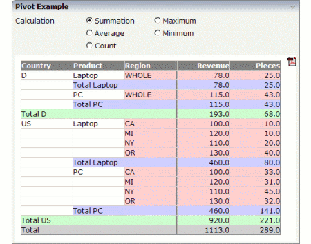
In this simple example, the third row contains the following data: "US", "Laptop", "CA", "120" and "10".
The server needs to know which columns contain data that are relevant for sorting and which columns only contain descriptional information that can be used for grouping the columns.
In this example, the first three columns are the so-called "group columns" which only contain descriptional information. You define these three group columns as follows:
pda.setGroupColumns(new int[]{0,1,2});
You define the columns which contain the data in a similar way:
pda.setDataColumns(new int[] {3, 4});
There are different ways of sorting or grouping the PIVOT table. The
default value is COMPUTE_SUM. You can change this value
dynamically using the setComputedValueType( ) method.
Valid values for this method are:
| Constant | Value |
|---|---|
COMPUTE_SUM |
0 |
COMPUTE_AVERAGE |
1 |
COMPUTE_MAX |
2 |
COMPUTE_MIN |
3 |
COMPUTE_COUNT |
4 |
You can change the detail of the corresponding level of each group by simply clicking in the pivot table:
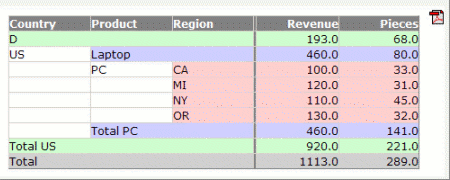
The first row now just shows the sum of data group "D"; and within the data group "US", the "Laptop" group also just shows the sum.
| Basic | |||
| pivotprop |
Name of adapter property that represents the pivot report on server side. Must be of type "PIVOTInfo". |
Obligatory | |
| height |
Height of the control. There are three possibilities to define the height: (A) You do not define a height at all. As consequence the control will be rendered with its default height. If the control is a container control (containing) other controls then the height of the control will follow the height of its content. (B) Pixel sizing: just input a number value (e.g. "20"). (C) Percentage sizing: input a percantage value (e.g. "50%"). Pay attention: percentage sizing will only bring up correct results if the parent element of the control properly defines a height this control can reference. If you specify this control to have a height of 50% then the parent element (e.g. an ITR-row) may itself define a height of "100%". If the parent element does not specify a width then the rendering result may not represent what you expect. |
Obligatory |
100 150 200 250 300 250 400 50% 100% |
| showpdf |
If set to "true" then a PDF icon is rendered in the right top corner of the control. When the user clicks on the icon then the report is automatically rendered as PDF - and the result will show up in a popup window. Pay attention: if setting this property to "true" then you also have to choose a special constructor when creating the REPORTInfo instance on server side, in which the instance of the model is passed as argument. Example: public class XYZAdapter extends Adapter { REPORTInfo m_report = new REPORTInfo(this) ... } |
Optional |
true false |
| areastyle |
CSS style definition that is directly passed into this control. With the style you can individually influence the rendering of the control. You can specify any style sheet expressions. Examples are: border: 1px solid #FF0000 background-color: #808080 You can combine expressions by appending and separating them with a semicolon. Sometimes it is useful to have a look into the generated HTML code in order to know where direct style definitions are applied. Press right mouse-button in your browser and select the "View source" or "View frame's source" function. |
Optional |
background-color: #FF0000 color: #0000FF font-weight: bold |