This is a set of very powerful absolute controls because they are very generic in what happens below.
The ABSTABLE0 represents a table that you place with its top left corner onto a certain x, y, z position. Inside the table, you can do what you want - i.e. you can include any other controls reachable inside the table.
The ABSTR represents a row that you place in the same way as ABSTABLE0.
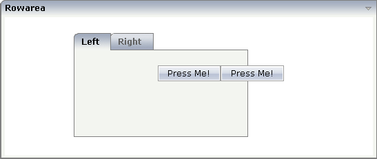
This is an example:

The XML layout definition is:
<rowarea name="Rowarea">
    <rowabsarea width="100%" height="200">
        <abstable0 x="100" y="20" z="1" width="250">
            <rowtabarea height="150" name1="Left" page1="idPage1"
                        name2="Right" page2="idPage2">
                <tabpage id="Left" takefullheight="true">
                </tabpage>
                <tabpage id="Right" takefullheight="true">
                </tabpage>
            </rowtabarea>
        </abstable0>
        <abstr x="220" y="70" z="2">
            <button name="Press Me!" method="onPressMe">
            </button>
            <button name="Press Me!" method="onPressMe">
            </button>
        </abstr>
    </rowabsarea>
</rowarea>
The following topics are covered below:
| Basic | |||
| x |
X-coordinated (in pixels) of the left top corner of the area. |
Optional | |
| y |
Y-coordinated (in pixels) of the left top corner of the area. |
Optional | |
| z |
Z-coordinated (in pixels) of the left top corner of the area. |
Optional | |
| xprop |
Name of adapter properties for the x-coordinate. |
Optional | |
| yprop |
Name of adapter properties for the y-coordinate. |
Optional | |
| zprop |
Name of adapter properties for the z-coordinate. |
Optional | |
| height |
Height in pixels. Only required if you use percentage sizing inside the ABSTABLE0. Otherwise the height of the table follows the height of its content. |
Optional |
100 150 200 250 300 250 400 50% 100% |
| width |
Width in pixels. If not defined then ABSTABLE0 will be as wide as required by its content. |
Optional |
100 120 140 160 180 200 50% 100% |
| takefullheight |
Indicates if the content of the control's area gets the full available height. If you use percentage sizing inside the control's area then this property must be switched to 'true'. If you use no explicit vertical sizing at all - or you use vertical pixel sizing for your controls - the property must be switched to 'false'. Background information: container control's internally open up a table in which you place rows (ITR/TR) which then hold controls (e.g. LABEL/FIELD). The table that is opened up normally has no explicit height and grows with its content as consequence. By specifying "takefullheight=true" the table itself is sized to fill the maximum height of the available area. |
Optional |
true false |
| fixlayout |
The fixlayout property is important for saving rendering performance inside your browser. To become effective it requires to have specified the height and the width (if available as property) of the control. If setting fixlayout to "true" then the control's area is defined as area which is not sized dependent on its content (as normally done with table rendering). Instead the size is predefined from outside without letting the browser "look" into the content of the area. If the content is not fitting into the area then it is cut. You typically use this control if the content of the control's area is flexibly sizable. E.g. if the content (e.g. a TEXTGRID control) is following the size of the container. When using vertical percentage based sizing you should pay attention to set the fixlayout-property to "true" as often as possible. - The browser as consequence will be much faster in doing its rendering because a screen consists out of "building blocks" with simple to calculate sizes. |
Optional |
true false |
| tablestyle |
CSS style definition that is directly passed into this control. With the style you can individually influence the rendering of the control. You can specify any style sheet expressions. Examples are: border: 1px solid #FF0000 background-color: #808080 You can combine expressions by appending and separating them with a semicolon. Sometimes it is useful to have a look into the generated HTML code in order to know where direct style definitions are applied. Press right mouse-button in your browser and select the "View source" or "View frame's source" function. |
Optional |
background-color: #FF0000 color: #0000FF font-weight: bold |
| comment |
Comment without any effect on rendering and behaviour. The comment is shown in the layout editor's tree view. |
Optional | |
| Basic | |||
| x |
X-coordinated (in pixels) of the left top corner of the area. |
Optional | |
| y |
Y-coordinated (in pixels) of the left top corner of the area. |
Optional | |
| z |
Z-coordinated (in pixels) of the left top corner of the area. |
Optional | |
| xprop |
Name of adapter properties for the x-coordinates. |
Optional | |
| yprop |
Name of adapter properties for the y-coordinates. |
Optional | |
| zprop |
Name of adapter properties for the z-coordinates. |
Optional | |
| visibleprop |
Name of an adapter property that provides the information if this control is displayed or not. As consequence you can control the visibility of the control dynamically. The server side property needs to be of type "boolean". |
Optional | |
| comment |
Comment without any effect on rendering and behaviour. The comment is shown in the layout editor's tree view. |
Optional | |