The TABSTRIP2 control is used to navigate through certain aspects of your application. The way you navigate depends completely on your implementation.
Note:
TABSTRIP2 is a wrapper around the TABSTRIP control which
was available with previous releases. In the TABSTRIP control, you had to do
quite a lot of references to adapter properties that are now replaced by one
TABSTRIPInfo object. The TABSTRIP control is still supported.
The following topics are covered below:
The control looks as follows:
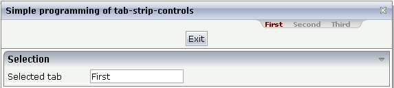
For each aspect, there is one tab holding a name and an index. The left-most tab holds index 0, the next one 1, etc.
The XML layout definition is:
<page model="tabstripAdapter">
    <titlebar name="Simple programming of tab-strip-controls">
    </titlebar>
    <tabstrip2 tabstripprop="titletab" scrollable="false">
    </tabstrip2>
    <header withdistance="false">
        <button name="Exit">
        </button>
    </header>
    <pagebody>
        <rowarea name="Selection">
            <itr>
                <label name="Selected tab" width="120">
                </label>
                <field valueprop="selTabText">
                </field>
            </itr>
        </rowarea>
    </pagebody>
    <statusbar withdistance="false">
    </statusbar>
</page>
Note:
Whereas the ROWTABAREA and COLTABAREA controls explicitly open one
container (TABPAGE) per tab, the TABSTRIP2 control is just a "tab
line" itself without any container included.
The adapter class looks as follows:
import com.softwareag.cis.server.Adapter;
import com.softwareag.cis.server.util.TABSTRIPInfo;

// This class is a generated one.

public class tabstripAdapter
    extends Adapter
{
    // ------------------------------------------------------------------------
    // inner classes
    // ------------------------------------------------------------------------

    public class TitleTABSTRIPInfo
    extends TABSTRIPInfo
    {
        public void reactOnTabSelection(int index)
        {
            m_selTabText = this.findSelectedItem().getName();

        }
    }

    // ------------------------------------------------------------------------
    // property access
    // ------------------------------------------------------------------------

    // property >selTabText<
    String m_selTabText;
    public String getSelTabText() { return m_selTabText; }
    public void setSelTabText(String value) { m_selTabText = value; }

    // property >titletab<
    TABSTRIPInfo m_titletab = new TitleTABSTRIPInfo();
    public TABSTRIPInfo getTitletab() { return m_titletab; }
    public void setTitletab(TABSTRIPInfo value) { m_titletab = value; }

    // ------------------------------------------------------------------------
    // standard adapter methods
    // ------------------------------------------------------------------------

    /** initialisation - called when creating this instance*/
    public void init()
    {
        m_titletab.addItem("First"); // tab 0
        m_titletab.addItem("Second"); // tab 1
        m_titletab.addItem("Third"); // tab 2
        m_titletab.selectTab(0);
    }
}
The TABSTRIP2 control is represented by a
TABSTRIPInfo object on the server side. You see that a
subclass of its own is generated (TitleTABSTRIPInfo) in
which the method reactOnTabSelection(...) is
overwritten. This method is called when the user selects a tab.
The TitleTABSTRIPInfo object is initialised
inside the init() method: there are corresponding
methods for adding items and for selecting the one that represents the
currently selected one. You can change the information behind this (e.g. the
number of tabs to be shown) at any time - also at a later point in time, after
initialisation. But: do not create new instances of the object, use the
clear() method instead.
The TABSTRIP2 control may not only be used below the titlebar. It can also be arranged on top or below many other controls. The following example shows the usage together with a ROWAREA control:
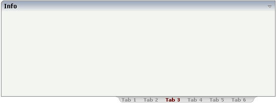
The XML layout definition is:
<rowarea name="Info" height="200">
</rowarea>
<tabstrip2 tabstripprop="tabstrip" backgroundstyle="background-color: #FFFFFF">
</tabstrip2>
You see that the background style of the TABSTRIP2 control was explicitly set to white in order to fit into the coloring of the ROWAREA.
| Basic | |||
| tabstripprop |
Name of the adapter property that represents the control on server side. The property must be a subclass of "TABSTRIPInfo". In your implementation you must override mehotd "reactOnTabSelection(index)". |
Optional | |
| align |
Horizontal alignment of the control's content. Default is "center". |
Optional |
left center right |
| scrollable |
If set to "true" then small icons will appear on the right border of the control. If the size of the "tabs" is too big and some tabs are cut as consequence then you can use these icons for scrolling left and right. |
Optional |
true false |
| backgroundstyle |
CSS style definition that is directly passed into this control. With the style you can individually influence the rendering of the control. You can specify any style sheet expressions. Examples are: border: 1px solid #FF0000 background-color: #808080 You can combine expressions by appending and separating them with a semicolon. Sometimes it is useful to have a look into the generated HTML code in order to know where direct style definitions are applied. Press right mouse-button in your browser and select the "View source" or "View frame's source" function. |
Optional |
background-color: #FF0000 color: #0000FF font-weight: bold |
| comment |
Comment without any effect on rendering and behaviour. The comment is shown in the layout editor's tree view. |
Optional | |
| scrollleftimage |
URL of image that is displayed inside the control. Any image type (.gif, .jpg, ...) that your browser does understand is valid. Use the following options to specify the URL: (A) Define the URL relative to your page. Your page is generated directly into your project's folder. Specifiying "images/xyz.gif" will point into a directory parallel to your page. Specifying "../HTMLBasedGUI/images/new.gif" will point to an image of a neighbour project. (B) Define a complete URL, like "http://www.softwareag.com/images/logo.gif". |
Optional |
gif jpg jpeg |
| scrollleftimagertl |
URL of image that is displayed inside the control. Any image type (.gif, .jpg, ...) that your browser does understand is valid. Use the following options to specify the URL: (A) Define the URL relative to your page. Your page is generated directly into your project's folder. Specifiying "images/xyz.gif" will point into a directory parallel to your page. Specifying "../HTMLBasedGUI/images/new.gif" will point to an image of a neighbour project. (B) Define a complete URL, like "http://www.softwareag.com/images/logo.gif". |
Optional |
gif jpg jpeg |
| scrollrightimage |
URL of image that is displayed inside the control. Any image type (.gif, .jpg, ...) that your browser does understand is valid. Use the following options to specify the URL: (A) Define the URL relative to your page. Your page is generated directly into your project's folder. Specifiying "images/xyz.gif" will point into a directory parallel to your page. Specifying "../HTMLBasedGUI/images/new.gif" will point to an image of a neighbour project. (B) Define a complete URL, like "http://www.softwareag.com/images/logo.gif". |
Optional |
gif jpg jpeg |
| scrollrightimagertl |
URL of image that is displayed inside the control. Any image type (.gif, .jpg, ...) that your browser does understand is valid. Use the following options to specify the URL: (A) Define the URL relative to your page. Your page is generated directly into your project's folder. Specifiying "images/xyz.gif" will point into a directory parallel to your page. Specifying "../HTMLBasedGUI/images/new.gif" will point to an image of a neighbour project. (B) Define a complete URL, like "http://www.softwareag.com/images/logo.gif". |
Optional |
gif jpg jpeg |