The SCHEDULELINE control is used to define screens like the following:
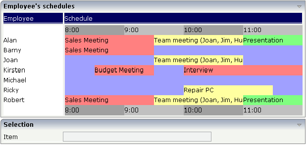
You can display a certain sequence of items, each item holding a text, a color value, a size and an identifier. When clicking on an item, a certain method is called inside your adapter and the ID of the selected item is returned to perform activities in your program.
The following topics are covered below:
The SCHEDULELINE control is very useful when used inside grids as shown in the above example screen. In principle, it is a standalone control that can (like any other control) be used inside a TABLEAREA grid. In this section, you find the explanation of the control. In Working with Grids, you will learn how to arrange single controls inside a grid.
First, have a look at a simple scenario in which the SCHEDULELINE control is used without a grid:
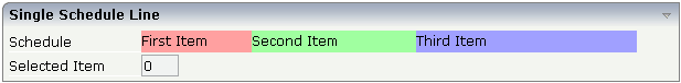
The XML layout definition looks as follows:
<rowarea name="Single Schedule Line">
    <itr>
        <label name="Schedule" width="120">
        </label>
        <scheduleline valueprop="schedule" width="450" pixelheight="20"
                      selectmethod="selectSchedule" selscheduleprop="selectedID"
                     seltypeprop="simpleSelType">
        </scheduleline>
    </itr>
    <itr>
        <label name="Selected Item" width="120">
        </label>
        <field valueprop="selectedID" flush="screen" length="3" displayonly="true">
        </field>
    </itr>
</rowarea>
The SCHEDULELINE definition links to a property
schedule from which it derives the item
information. If a selected method (selectmethod
property) is called in the adapter, the ID of the selected item is passed into
the property (selschedule property) before.
Let us have a look at the adapter code:
import com.softwareag.cis.server.Adapter;

// This class is a generated one.

public class Schedule_LineAdapter
    extends Adapter
{
    // property >schedule<
    String m_schedule;
    public String getSchedule() { return m_schedule; }
    public void setSchedule(String value) { m_schedule = value; }

    // property >selectedID<
    int m_selectedID;
    public int getSelectedID() { return m_selectedID; }
    public void setSelectedID(int value) { m_selectedID = value; }

/** */
    public void selectSchedule(){ }

    /** initialisation - called when creating this instance*/
    public void init()
    {
        setSchedule("#FFa0a0;100;First Item;1;#A0FFA0;150;Second Item;2;#A0A0FF;200;Third Item;3");
    }
}
The most significant property is the
schedule property. It derives its value from the
class member m_schedule. The member is initialised
with a string that represents the item information.
The string is structured in the following way:
It contains values that are separated by semicolons, i.e. it follows the common "comma separated value" structure.
Each item consists of four values, one after the other:
The color of the item in an HTML-understandable way.
The width of the item.
The text of the item - which can be blank.
The ID of the item. This ID can be blank. The control automatically changes the cursor no matter whether the item contains an ID or not. Items holding a key are selectable - items without a key are not selectable.
If one of the four values is not available (e.g. no ID), it must not be left out. There must always be a sequence of four values. Example: if you want to display just an item with a color and a width value, this looks like "...;#FF0000;100;;;...".
You can add as many items into the string as you desire.
The visible width of an item depends on the width of the SCHEDULELINE
control itself (which is defined by the width
property) and on the width value of the item. If the total width of a control
is defined to be 100 pixels and each item ID is specified to get a width of
"25%", then each item is actually getting 25% of the
available 100 pixels.
Property selectedId receives the selected
ID. Method selectSchedule is called whenever an item
is selected. There is no implementation code in this example, but you could
trigger e.g. page navigation or open a pop-up dialog on demand.
Inside the Application Designer classes, there is the class
CSVManager (package
com.softwareag.cis.file) that supports the building of
comma separated value strings. The class also covers the management of cases in
which content parts of a CSV string themselves contain the separator character
(conversion of ";" into
"\;"). Documentation on this class is provided in
the API JavaDoc documentation.
Use this class when encoding strings into CSV strings:
String csv = CSVManager.encodeString(new String[] {"1","2","3"});
| Basic | |||
| valueprop |
Name of the adapter property representing the control's content on server side. The property must be of type "String". It returns a semicolon separated list of schedule items. Each item is represented by a color, a width, a text and a selection id. The width is not a pixel width but represents a "portion" that this schedule item represents. Example: #FF0000\"1000;Text 1;1;#00FF00;500;Text 2;2 The total "logical width" is 1500. The first item occupies 2/3 of the width, the right item occupies 1/3 of the width. The selection is required in case you want to react on user selections. If a user clicks onto one schedule item then the adapter is notified by a certain method - the id of the schedule item is passed as reference. Please have a look into the corresponding property descriptions. |
Obligatory | |
| width |
Width of the control. There are three possibilities to define the width: (A) You do not define a width at all. In this case the width of the control will either be a default width or - in case of container controls - it will follow the width that is occupied by its content. (B) Pixel sizing: just input a number value (e.g. "100"). (C) Percentage sizing: input a percantage value (e.g. "50%"). Pay attention: percentage sizing will only bring up correct results if the parent element of the control properly defines a width this control can reference. If you specify this control to have a width of 50% then the parent element (e.g. an ITR-row) may itself define a width of "100%". If the parent element does not specify a width then the rendering result may not represent what you expect. |
Obligatory |
100 120 140 160 180 200 50% 100% |
| pixelheight |
Height of the control in pixels. |
Optional | |
| comment |
Comment without any effect on rendering and behaviour. The comment is shown in the layout editor's tree view. |
Optional | |
| Appearance | |||
| width | (already explained above) | ||
| pixelheight | (already explained above) | ||
| pixelsizemode |
A schedule line consists of sections, each one rendered with a certain width. By default the width does not represent a pixel value but represents a logical size. The width of the section depends on the logical size of one section compared with the logical size of the other sections. When switching this property to "true" then the size of the sections are interpreted as real pixel values. |
Optional |
true false |
| cellalign |
Horizontal alignment of the text inside the control's schedule items. |
Optional |
left center right |
| cellvalign |
Vertical alignement of the text inside the control's schedule items. |
Optional |
top middle bottom |
| cellstyle |
Style that is used inside the schedule item cells. Can be any CSS style. |
Optional |
background-color: #FF0000 color: #0000FF font-weight: bold |
| cellnowrap |
If switched to "true" then the text inside the schedule item cells is not broken if exceeding the size of the control - the text is cut instead. Default is "false". |
Optional |
true false |
| valign |
Vertical alignment of control in its column. Each control is "packaged" into a column. The column itself is part of a row (e.g. ITR or TR). Sometimtes the size of the column is bigger than the size of the control. In this case the "align" property specify the position of the control inside the column. |
Optional |
top middle bottom |
| colspan |
Column spanning of control. If you use TR table rows then you may sometimes want to control the number of columns your control occupies. By default it is "1" - but you may want to define the control to span over more than one columns. The property only makes sense in table rows that are snychronized within one container (i.e. TR, STR table rows). It does not make sense in ITR rows, because these rows are explicitly not synched. |
Optional |
1 2 3 4 5 50 int-value |
| rowspan |
Row spanning of control. If you use TR table rows then you may sometimes want to control the number of rows your control occupies. By default it is "1" - but you may want to define the control to span over more than one columns. The property only makes sense in table rows that are snychronized within one container (i.e. TR, STR table rows). It does not make sense in ITR rows, because these rows are explicitly not synched. |
Optional |
1 2 3 4 5 50 int-value |
| crosslineids |
Flag (true | false) that indicates that cells of different lines (within ROWTABLEAREA2) does not have same ids. If set to false the control is able to detect and skip unnecessary re-draws (performance). |
Optional |
true false |
| tablestyle |
CSS style definition that is directly passed into this control. With the style you can individually influence the rendering of the control. You can specify any style sheet expressions. Examples are: border: 1px solid #FF0000 background-color: #808080 You can combine expressions by appending and separating them with a semicolon. Sometimes it is useful to have a look into the generated HTML code in order to know where direct style definitions are applied. Press right mouse-button in your browser and select the "View source" or "View frame's source" function. |
Optional |
background-color: #FF0000 color: #0000FF font-weight: bold |
| Binding | |||
| valueprop | (already explained above) | ||
| selectmethod |
Adapter method that is called when the user selects one schedule item with the mouse. |
Optional | |
| selscheduleprop |
Name of adapter property in which the id of the selected schedule item is passed. The property is correctly set before the method for reacting on the selection event is called. |
Optional | |
| seltypeprop |
Name of an adapter property that is used in the following way: If the user selects an item it can also be determined, if the item is selected by the left or by the right mouse button. In case the user uses the left mouse button, the value LEFT is passed into the property, which is referenced by the SELTYPEPROP property. In case the user uses the right mouse button, the value RIGHT is passed. |
Optional | |
| preselectmode |
If set to "true" then schedule items holding an id can be "preselected": the user can click on a schedule item and it is "grayed" as consequence - without directly calling the selection method. The selection method is called when double clicking onto the schedule item. Default is "false". The reaction of the control when clicking with the right mouse button remains untouched: still the selection method is called by a single right mouse button click. |
Optional |
true false |
| Vertical | |||
| verticalschedule |
Flag that indicates if the line is rendered vertically. Default is false. |
Optional |
true false |
| tooltipprop |
Name of an adapter property of type "String" that contains the comma separated list of help texts that are displayed on mouse over (tooltip). |
Optional | |
| imageprop |
Name of the adapter property that returns a comma separated string of image URLs. An URL either is an absolute URL or a relative URL. If using a relative URL then be aware of that the generated page is located directly inside your project's directory. Example: "images/green.gif;;red.gif" |
Optional | |
| imageorientation |
Flag that indicates to render the image at the left or right hand of the text. |
Optional |
left right |
| dropinfoprop |
Name of an adapter property to that the id of the dragged cell is set. Do not use this property if you do not want to support drag and drop within the SCHEDULELINE. The server side property needs to be of type "String". |
Optional | |
| onmovemethod |
Name of an adapter method that is called on drop of one cell (source) over another cell (target). Use property DROPINFOPROP to get the id of the dragged cell (source). Use SELSCHEDULEPROP to get the id of the cell that got the drop (target). |
Optional | |
| controlkeyprop |
Name of an adapter property to that the information is set whether the user pressed the CTRL key when selecting a cell. Property needs to be of type "boolean". |
Optional | |